weekly BarrySprout's 52 for 23 - Week 52 - Complete!

Love the colours in the shot and thanks for explaining how it was done.
Not keen on the dot on the green background.

Pete
 
You certainly have a huge element of creativity going into this.. I look forward to more of the same.
 
Love the colours in the shot and thanks for explaining how it was done.
Not keen on the dot on the green background.

Pete

Thanks Pete, The dot was either something on my sensor or something on the cling film. I noticed it in the first couple of shots but because of the grainy/blurred image I was aiming for decided to leave it as is, knowing that I could easily clone it out if I decided to. When I got down to editing my decision was that i preferred the imperfection and even considered adding more.
You certainly have a huge element of creativity going into this.. I look forward to more of the same.

Just be prepared for the creativity and enthusiasm to waver over the next few weeks before I abandon the whole project. It's my way :D
 
Week 5 - Snappers Choice

Juxtaposition by barrysprout, on Flickr
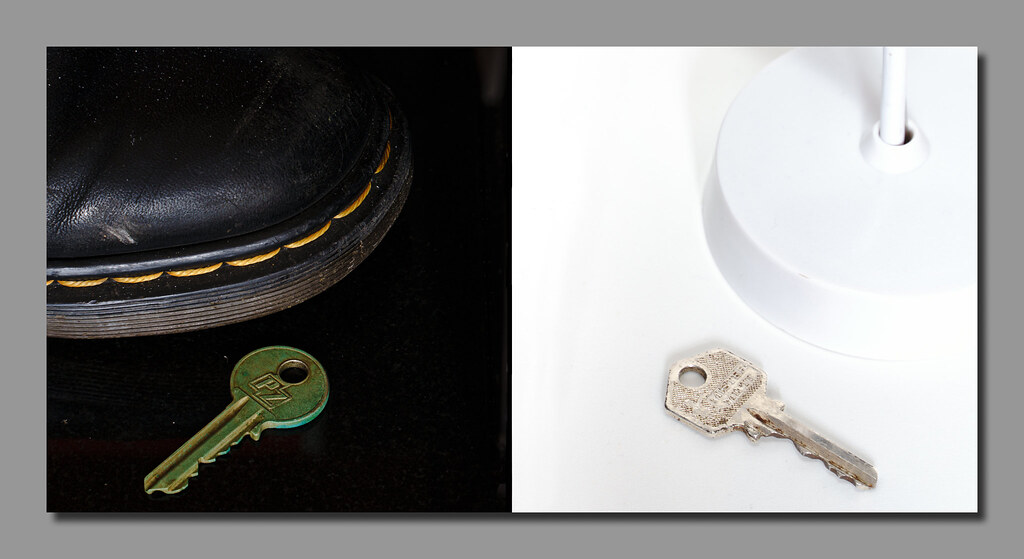
Although I already completed my "juxtaposition" last week I thought I'd do another.
This time the juxtaposition is between high key and low key (see what I did there?)

So my challenge was to create the pun, achieve the juxtaposition, try as best as I could to achieve a high key and a low key shot and just for the giggles try and achieve all this in a single frame.

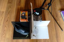
Gravity was on my side for the low key pun/shot part of things and I had to improvise the look of the key being high for the other half.......... It's probably easier to explain with a behind the scenes shot.

untitled-1-2.jpg
 
LOL, your commentary for Transparent made me chuckle Colin. Very creative image.

I also like your "key" shots.
 
Good idea, well executed couldn't figure it out at first but I am a bit slow
 
That's very good to get both sides of the 'key' image in one shot, I wouldn't have known it wasn't two stitched together until you said.
 
  • Like
Reactions: Nod
LOL, your commentary for Transparent made me chuckle Colin. Very creative image.

I also like your "key" shots.
Thanks Bill
Good idea, well executed couldn't figure it out at first but I am a bit slow
Sometimes my ideas are a bit convoluted, but I'm having some fun again with cameras and that's the main thing.
Nice idea for week 5, thank you for showing your set up (y)
Thanks, think it was easier to show the set up than try to explain :D
That's very good to get both sides of the 'key' image in one shot, I wouldn't have known it wasn't two stitched together until you said.
It was much easier than I thought it would be. I did think about flipping the half with the ceiling rose and key so that it was the right way up for a ceiling but decided it went against the "single shot challenge" that I set myself. The border between the two halves was tidied up in photoshop to give a clean edge and give the impression of it being two shots from first glance.
 
Nicely done - I assumed the join between the two shots had been tidied up - well done getting both parts taken in one shot though.

Good lighting on each - the stitching on the DM stands out really well
 
This week's shot was an easy decision for me as soon as I saw the theme.
I purchased a 20 year old coffee machine on Monday afternoon and have spent the past few days refurbishing it.
Monday night I tested it to make sure it was functioning. Tuesday I started stripping the machine down and ordered a few upgrades and necessities. Wednesday I completely stripped everything down to individual components and cleaned/descaled everything. And on Thursday I was completing the rebuild when Cobra posted the theme. Final piece to add to the machine was the Knob on the side to control the steam. Shot chose itself!

Spent a fair bit of time adjusting lighting for this, various white boards, reflectors, flash lights and needless to say the diffusion panels from that TV were back in play.

Gaggia brought back to life by barrysprout, on Flickr


This is how it looked yesterday morning....

Gaggia (1) by barrysprout, on Flickr

Gaggia (2) by barrysprout, on Flickr
 
Last edited:
Excellent work Colin. Lighting is spot on to my mind. Machine looks beautifully clean, you can see the wiping marks in the sides, but I think that's nicer than the nothing you'd get if they were perfectly polished.

I could take or leave the bits on top of the machine, there's so much interest in the lower arrangement I don't want to have my gaze drawn to the red cup on top! Nice work though
 
Like that - even more impressive that you took it apart and cleaned it all.

If I was being critical, I'd like to see a bit more space on the left. It feels a bit tight to the edge to me.

Just been watching James Hoffman with his restored 1950s coffee machine.

View: https://www.youtube.com/watch?v=bGw5ZSdVAkA&list=RDCMUCMb0O2CdPBNi-QqPk5T3gsQ&index=2

Thanks, surprisingly simple to strip down and reassemble.

James has cost me a fair bit of money this week..

Niche by barrysprout, on Flickr

Doesn't fit the theme as it's a switch rather than a knob .

The tightness in frame was caused by the reflective base being of limited width, hindsight tells me I should have reduced the angle of the machine but I did like this composition with the steam wand neatly curling over the max indicator.
Excellent work Colin. Lighting is spot on to my mind. Machine looks beautifully clean, you can see the wiping marks in the sides, but I think that's nicer than the nothing you'd get if they were perfectly polished.

I could take or leave the bits on top of the machine, there's so much interest in the lower arrangement I don't want to have my gaze drawn to the red cup on top! Nice work though

Thanks. I was perhaps trying to fit too many coffee related things in the frame. I think it may be improved without the orange cup and probably without the shaker on the bottom right,
I would still leave the other cup and saucers though as there design / age I think suits the image.

To keep with the aging classics I used a Minolta 135mm manual lens for the shot.
 
That's some effort for a knob shot!

Look great.
 
Great work on both image and restoration. I have say on first glance I thought "where's the splashes and the fingermarks?". Pristine indeed.
 
Looks like you did a great job of giving it some life, if that was mine it would of been put back together all wrong.

Who says I put it all back correctly? :ROFLMAO:
Nice bit of restoration work and a nicely lit picture all your hard work has paid off
Thanks Allan
Where the bits you missed putting back in?

That looks very clean, a job well done.
Extra bits are all safely in a bag :oops: :$
That's some effort for a knob shot!

Look great.
Thanks Dave
That's a lovely bit of work restoring that and I think you've framed the shot really nicely.
Thanks Simon
Great work on both image and restoration. I have say on first glance I thought "where's the splashes and the fingermarks?". Pristine indeed.
Splashes and fingermarks? How dare you! I know how to use photoshops clone stamp :ROFLMAO:
 
Week 07 - Letters

Letters by barrysprout, on Flickr

Minimal effort this week! Single flash low and left for added contrast. Awkward angle for awkwardnesses sake and B&W conversion because the colours were distracting in my opinion.
 
Last edited:
Quick off the mark! Bang on theme :)
 
I knew the Scrabble boards would come out this week. Thanks @Fuji Dave for saying dutch angle... Thanks Google for also bringing the results of that up at a tilt!!

Clever use of all the themes and nicely lit. B&w is appropriately used
 
Really like the dutch angle of this shot Colin, also goes great in B&W.
Yes, that works well.

Like it. very creative.

Quick off the mark! Bang on theme :)

I really like this, it's fun and such an interesting angle.

I see what you did there. Nicely set up and shot.
Thanks everyone

I knew the Scrabble boards would come out this week. Thanks @Fuji Dave for saying dutch angle... Thanks Google for also bringing the results of that up at a tilt!!

Clever use of all the themes and nicely lit. B&w is appropriately used
Yes I figured scrabble would be put to use this week so I tried to be the first in with it :) This was my second idea when I saw the theme so I may do another entry this week with my original idea.
 
Really like the Dutch tilt on the shot works really well as does the mono conversion.
 
Looked at my scrabble board the other night but just didn't think! Excellent picture and right on theme! I agree that colour would have been distracting.
 
Bah beaten to it! I thought about a scrabble board this morning, your picture is really clever highlighting all the themes so far.
 
very clever
 
Back
Top