Corporate portrait preferred lighting setup?

Messages
371
Name
Tom
Edit My Images
No
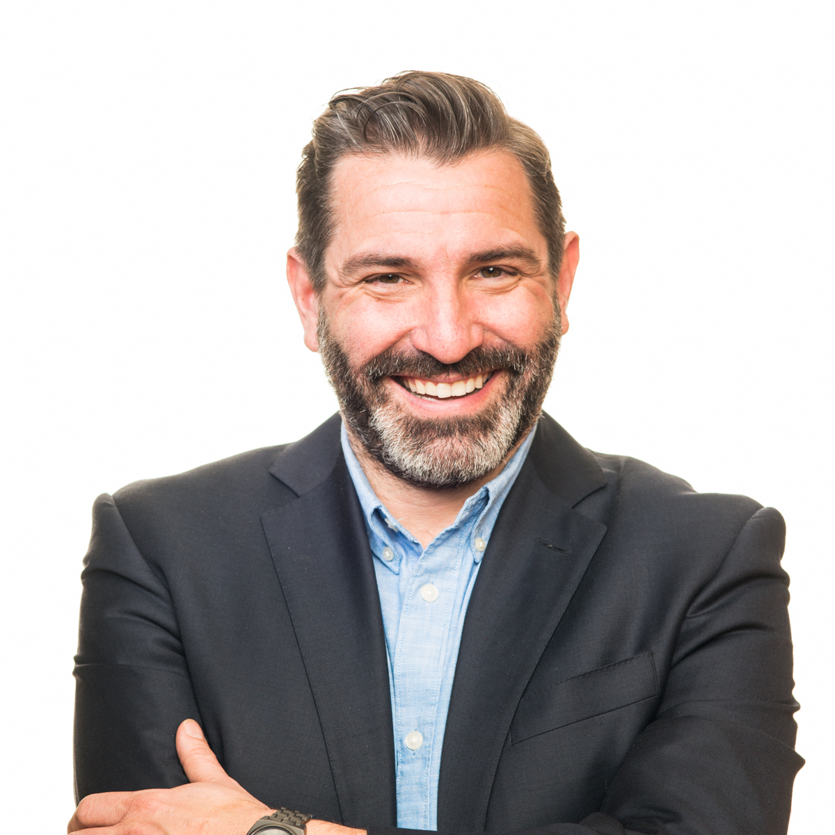
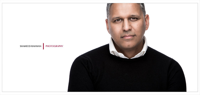
My mate's company have had a 'photographer' in to do some head shots and environmental portraits. The results are shocking, tog clearly inept despite advertising as a professional and a member of SWPP. Less than half in decent focus, blurred office shots of staff in action taken without flash at 1/20, head shots taken at a short focal length, uncorrected WB leaving some with yellow teeth... I'd love to post them but...

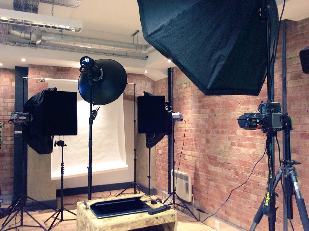
Anyway it's not something I've done before but happy to be asked. What lighting setup do you folk use for corporate head shots and 3/4 shots ? It'll be standard white bg stuff and I'll be taking my studio lights. Clamshell or standard 45 degree with fill... Some of them are glasses wearers so maybe best to light well off camera axis...

It's 12 employees so not a mammoth task at all but something new and I'd like to have a plan before I land as its something I might want to do more and want to look like I know what I'm doing.
 
Probably not what you're looking to hear but 'what do they want?'.

What kind of company
What kind of image
What kind of people

I'm no expert, but forget it's corporate, you're shooting portraits, why do you presuppose a white background, why have you started dismissing options before you have a real idea what you want to achieve?
 
Yes very funny Bob. I'd like to think I'm pretty competent at shooting and lighting portraits thank you. I've certainly got more of a clue than the lady who tuned up :p

Phil, white background is what he wants not me, fits in with his website. They are a health and safety consultancy, images for website bios and promo material.
 
As a rough guide to corporate portrait lighting, in my experience of assisting a lot of photographers and shooting a handful myself....

1 key light at 45 degrees - beauty dish - high up angled down straight at person
1 fill light - large soft box just of camera on the other side
1 hair/rim light from over the shoulder - high up angled down
1 light on background - power dependent on what colour you want background

Get them to stand facing beauty dish then head and eyes look back to camera.

This should be a good starting point I reckon.
 
Don't just do the white background, it doesn't always work with LinkedIn, etc. And bear in mind that a pose/lighting set-up that works well for a website CV shot may not work so well at a smaller LinkedIn/Facebook avatar size.
 
Yes very funny Bob. I'd like to think I'm pretty competent at shooting and lighting portraits thank you. I've certainly got more of a clue than the lady who tuned up :p

Phil, white background is what he wants not me, fits in with his website. They are a health and safety consultancy, images for website bios and promo material.
In that case, I'd short light them, it's more flattering than clamshell for average looking people.

Edit: but as above, I'd try for a different background colour.
 
Last edited:
In my experience, companies tend to like fresh, clean looking images. They aren't too bothered whether their staff are good looking, it's all about their expression, friendly, competent and approachable. That's the hard bit, especially when they really don't wanna be there!

Personally, I'd shoot an off white BG and make sure the employees are well lit.
 
Thanks for all the advice guys, much appreciated.
I take the point re the bg, I'll have a chat to my mate and point him to some examples. I can take a slate grey backdrop and have gels to hand. Can just pre meter for white and grey / gelled and quickly do both.
Yes I guess its an odd genre to shoot. I think the staff should be all up for it.
 
I always, always try to pursuade headshot clients to go with something other than white. Always always. Then they ask their design agency and bam, yep, white cutout, got it :(

Here's one I had last week, and I'm pretty happy with the look - Beauty dish for key, big soft fill right next to camera, and strips on the background for white is my goto - flagging off the back lights. Not too fond of an overly hair light-y look, you get some rear light bounced back from the white anyway.

Vr5ECth.jpg
 
Thats a nice looking studio. Should be able to replicate something similar on site thanks. What lighting ratio do you aim for there? Most corporate headshots I've seen tend to be lit pretty flat.
 
I always, always try to pursuade headshot clients to go with something other than white. Always always. Then they ask their design agency and bam, yep, white cutout, got it :(

Here's one I had last week, and I'm pretty happy with the look - Beauty dish for key, big soft fill right next to camera, and strips on the background for white is my goto - flagging off the back lights. Not too fond of an overly hair light-y look, you get some rear light bounced back from the white anyway.

Vr5ECth.jpg
Dave how big is that BD? Is it 70cm one?
 
yep it's fairly flat. Control the ratio with the fill power


uh it's the 22" calumet beauty dish on the B1, which I keep meaning to paint the inside of white rather than silver...

that's at their offices too rather than a studio btw, all breaks down fairly neatly
 
Last edited:
thanks Steven and everyone else for the pointers, I've got a couple of weeks before the shoot so can try those setups before hand
 
There's too much light sloshing around in these examples.

Backgrounds are too hot, easting away at the outline, especially hair. It only needs a minimum of over-exposure, something like 1/3rd to 1/2 a stop, not the often-quoted two stops.

And there's tons of flare that's killing contrast, from the large areas of bright white background blasting back at the lens. Needs blocking out - studio flats are good for that (white polystyrene foam insulation boards, painted black one side).

I assure you that even on crisp white shirts worn by other subjects, and in blonde hair, I lost nothing around the edges or in subject detail whatsoever ;) Two stops is indeed way too much over. My white *just* clipped on the histo at capture.

A wee bit of blooming on his shoulders agreed, with less to no effect on other outfits worn by others - ideally polyboards but flags as pictured took the worst off and prevented flare back from the background - and as I said, a bit of kick coming back from the background helps imo, I'm not a huge fan of seperating them by miles and surrounding them with black poly, it's less flattering for corporates
 
Last edited:
There's too much light sloshing around in these examples.

Backgrounds are too hot, easting away at the outline, especially hair. It only needs a minimum of over-exposure, something like 1/3rd to 1/2 a stop, not the often-quoted two stops.

And there's tons of flare that's killing contrast, from the large areas of bright white background blasting back at the lens. Needs blocking out - studio flats are good for that (white polystyrene foam insulation boards, painted black one side).

Maybe you have your screen turned up to bright, I also assure you there is information in every part of my example.

I guess the rest is down to personal preference, and what the company does that you're shooting for. Some might like contrasty, saturated images, some like something a bit softer.
 
Don't guess, ask the client! Show them different styles, ask for their ideas and simply give them what they want.

Ask questions like "where will the shots be used?" expect to hear website, marketing brochures, company reports, etc. Ask if they want you to talk to their web guy so your shots match their website styles and ask for example of their branding - logos, company colours. Will they want logos/products in the images? Will they be studio style or taken in the workplace?

If it was your company commissioning the photographer and you were in the same business your client is in, what would you want?
 
Last edited:
Maybe you have your screen turned up to bright, I also assure you there is information in every part of my example.

Unless I'm going blind there's something off about the shot, the subject looks like they've been cut out of another photo and pasted onto a white background.
 
One of the problems is that a lot of people STILL believe (and even teach) that 2 stops of difference is needed, which is ridiculous.
I used to be almost true once, when we shot on negative film, but it was never true for transparency film or digital. With transparency film, 1 stop is enough, and with digital it is .7 of a stop.

And yet, a Company that sells illuminated white backgrounds makes videos that tell people it needs to be 2 stops :thinking:

I think in my recent experiment I was somewhere between .6 and 1 stop. I dread to think how much worse it would have been had I have gone the whole two stops!!
 
very interested in this thread myself, great reading everyone's contributions.
i'm not a pro photographer so I won't chime in on lighting, but I do deal with specs.
I would repeat the above, and ask the marketing people what they want and what the 'customer' expects.
Get the "failed" images and get them to detail what they really didn't like.
I'd also be tempted to do two shoots. If you can get someone to help, shoot against white for cutouts and bits and pieces. and then remove that and shoot again against something more interesting or the company logo
Then you everything twice and a mixture of what is required without much extra effort.
Something with a corporate background works much better for linkedin or website staff images in my opinion
 
Yeah, I do quite a lot of this...... (and I don't _think_ I'm either of the photographers referred to above :) ).

Biggest softbox I can get over my left shoulder. Sorted. Unless they want white b/gs (which are a really bad idea) when I'd use something like @itsdavedotnet 's setup above though possibly without the beauty dish. Or (as often) when I'm working in a stupidly small meeting room when I'd use several lights to replicate one light.

Expression is way more important than lighting.
 
Some great stuff here guys thanks. The company have informed the original tog that they weren't happy. The reply was interesting, admitted they weren't happy with the shots either, she didn't have a full brief and the blurring was due to a shaky hand...! (SWPP member...)
I'll ensure that I get a full brief and send them some examples of different shots. I will push for something other than white but should have time to do a couple of setups as suggested.
 
There's too much light sloshing around in these examples.

Backgrounds are too hot, easting away at the outline, especially hair. It only needs a minimum of over-exposure, something like 1/3rd to 1/2 a stop, not the often-quoted two stops.

And there's tons of flare that's killing contrast, from the large areas of bright white background blasting back at the lens. Needs blocking out - studio flats are good for that (white polystyrene foam insulation boards, painted black one side).

Hoppy nails it :)
 
I really don't like white backgrounds for corporate headshots (or actors, which I do). In my humble opinion, they make people look like Ebay product photos.

There were a fad for a while and, thank goodness, it's now a fad that is at least dieing.

I messed about with it for hours in a small studio space, it is a total pain in the proverbial and in the end, no one wants it anyway! What a waste of time that was :D

Gradient grey all the way. Brighter or dimmer dependent on the atmosphere you want to create. Two lights for subject, one for background is an easy go-to setup.
 
The company have informed the original tog that they weren't happy. The reply was interesting, admitted they weren't happy with the shots either, she didn't have a full brief and the blurring was due to a shaky hand...! (SWPP member...)
.

why not just use a tripod then?
 
Some great stuff here guys thanks. The company have informed the original tog that they weren't happy. The reply was interesting, admitted they weren't happy with the shots either, she didn't have a full brief and the blurring was due to a shaky hand...! (SWPP member...)
I'll ensure that I get a full brief and send them some examples of different shots. I will push for something other than white but should have time to do a couple of setups as suggested.

SWPP member just means you pay ten quid a month.

If they have a qualification that probably holds more weight.

DOI : I have a qualification from the SWPP
 
Nothing wrong with a nice clean (not overly hot ;)) white bg, ask Peter Hurley! Plus it can go from white - grey - black depending how it's lit so it's a very versatile base to start with in terms of a single setup.
 
Nothing wrong with a nice clean (not overly hot ;)) white bg, ask Peter Hurley! Plus it can go from white - grey - black depending how it's lit so it's a very versatile base to start with in terms of a single setup.

I like hurley's work (he's the only famous person who follows me on twitter).

I think you need to have the white background in your repertoire, regardless of your own personal feelings on it!
 
I guess the bottom line is that you can light your shot in a number of ways, you can use whatever colour background you like or use an environmental background. It really is personal preference, and as much as you have your own opinions and want to shoot in your own style etc etc, it's not up to you, it's up to your client. Try to 'educate' them if you want to, as to what you think is a better style, but you should do what they need. Right/left hand orientation, portrait/landscape etc.

Shoot a clean frame and get the right expressions and you can't go too far wrong.
 
Nothing wrong with a nice clean (not overly hot ;)) white bg, ask Peter Hurley! Plus it can go from white - grey - black depending how it's lit so it's a very versatile base to start with in terms of a single setup.

I like hurley's work (he's the only famous person who follows me on twitter).

I think you need to have the white background in your repertoire, regardless of your own personal feelings on it!

I agree, obviously can't speak for anyone else, but it gets asked for a lot by companies who already have existing shots to match or a mainly white website.
 
I agree, obviously can't speak for anyone else, but it gets asked for a lot by companies who already have existing shots to match or a mainly white website.

The only people that don't like white backgrounds are photographers that have done it 100 times already...
 
Back
Top