@Fla5h What I've noticed nobody else has asked, is why you feel the need for more editing and to get more blue into the sky?
Ignoring number 1 which has plenty of blue sky, IMO 2 and 3 both have decent enough sky detail and a very natural look with that sort of hazy background.
I think doing any more PP work in that area is going to give them a very unnatural feel and it's going to be very obvious that you've edited them.
The last one does have a rather bland sky with a lot of cloud cover, although as
@Nawty already picked up on, it's the weakest image of the set and there isn't a LOT of interest in the foreground to pull your eye away from the sky.
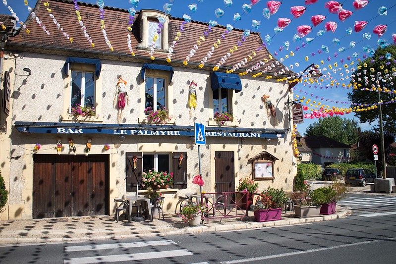
In terms of composition, number 1 works very nicely for me.
Strong leading lines with those garland things(?) and the shadows are a very nice touch - They really draw your eye to the building and I like that element of it a lot.
The only area that I think could have done with a bit more thought is the LHS of the frame.
The building cuts off very abruptly which emphasises that it's not quite vertical and leaves you with half a bush in shot - The pub sign being "end on" to the viewer is a touch uncomfortable too.
I don't know what was there to your left, but maybe an anti-clockwise rotation of the camera angle and a bit more room on that side of the shot would have worked better.
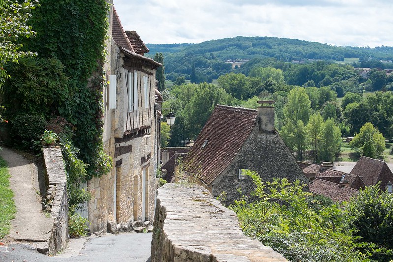
Nawty has already covered off some good points on number 2.
What stands out to me is that the top of the wall right in the centre of the frame really grabs your attention but doesn't lead anywhere which sort of adds to the confusion of the image.
What's the focal point and what's the image supposed to be about?
I think Ned's suggestion of moving to the left and shooting down the road was a very good one.
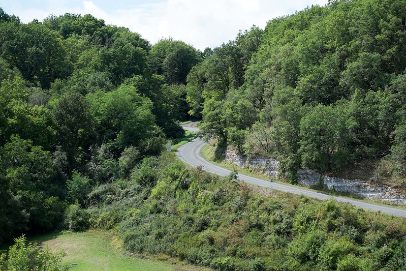
I don't know whether it was intentional or not, but number 3 actually has a very clever compositional touch.
Those splashes of red from foreground flowers to road sign, to shutters and to car work very, very well to guide your eye through the image and give it lovely depth and perspective.
Yes, the car spoils the rural scene a little, but if if there's nothing you can do about it you had may as well make it work for you.
I think a lower angle to give the car more prominence and place the flowers & sign higher in the frame on a third rather than right at the bottom edge and you would have had a very clever and engaging shot there.
The only thing left to think about would be your angle onto the car and how you framed the left and right sides to avoid those awkward crops.
Maybe a few steps back and to your left . . . possibly a portrait orientation (although I think that would mean you'd lose the flowers)
Last one, I can see what you were going for and I think it's actually not a bad composition at all.
However, in the absence of anything really attention grabbing about the foreground, I think you either needed exceptional light and sky to give it a lift - or something to provide a real focal point, like a brightly coloured car on the road or something.


 [/url][/url][/url]
")