

Hi,
I have been taking photo's for just over three months now and I'm really enjoying it. I have found that i'm mainly drawn to the coast due to living near it and sunrise being the best time for me to get out. Anyway I took this last week whilst trying out my new lens.
The tide was really high so my options were very limited but I wanted to see what I could get with this lens.
What do you think of the composition? The sky was quite clear except this one batch of cloud so I managed to use that and the colour of the rising sun. With the tide so high I was restricted to a small amount of visible rocks but thought that these seemed to have a nice flow to them in this shot.
 High tide at Cresswell by John Haswell, on Flickr
I have been taking photo's for just over three months now and I'm really enjoying it. I have found that i'm mainly drawn to the coast due to living near it and sunrise being the best time for me to get out. Anyway I took this last week whilst trying out my new lens.
The tide was really high so my options were very limited but I wanted to see what I could get with this lens.
What do you think of the composition? The sky was quite clear except this one batch of cloud so I managed to use that and the colour of the rising sun. With the tide so high I was restricted to a small amount of visible rocks but thought that these seemed to have a nice flow to them in this shot.
High tide at Cresswell by John Haswell, on Flickr Cresswell at high tide
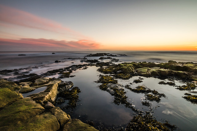 High tide at Cresswell