weekly Fullfast's 2012 52 week Challenge - Week 14 "ENTRANCE to the fish" added

Messages
437
Name
Simon
Edit My Images
No
Hopefully this year I will be able to spend more time in doing this....due to work commitments last year it turned out to be an epic fail.........in actual fact I have already done more this year than last year.........I have started the thread....

I look forward to getting engrossed in it this year and look forward to receiving all c+c as I hope it will make me better...

As always thanks for looking......
 
Last edited:
Right all.......have started....weather has been atrocious so couldn't really get out and get anything decent, what I have decided to also do is try and teach myself a photoshop technique each week to learn that at the same time...this week I have chosen layers......here are multiple directions.....

http://www.flickr.com/photos/fullfast/sets/72157628702188853/
 
Last edited:
d'oh took me a few seconds to understand lol, clever interpretation, I'm afraid I don't see this as a photograph (just my opinion though, personal taste n all that)
 
Have decided very quickly not to use the one above as this weeks submission, instead going for a "proper" photograph instead......hopefully a bit better.....thanks for the honesty summer......must admit when I look at it again it doesnt really work

Here is the proper version


Directions by Fullfast, on Flickr
 
The idea is good. Unfortunately, for me, the processing to achieve the depth of field look looks too processed and added after, sorry. The different colour shadow also doesn't add anything and is distracting. Good attempt though and the beauty of a 52 is that it gives you the chance to try lots of different things and experiment (which you've done) and find out what works and doesn't :)
 
The idea is good. Unfortunately, for me, the processing to achieve the depth of field look looks too processed and added after, sorry. The different colour shadow also doesn't add anything and is distracting. Good attempt though and the beauty of a 52 is that it gives you the chance to try lots of different things and experiment (which you've done) and find out what works and doesn't :)

Thanks for that....as you say hopefully it will improve......the pic has actually come straight out of the camera with no pp done to it......the different colour shadow is actually the lens casting the shadow towards the word as was taken with on camera flash.........tried with off camera but looked to staged and lifeless....
 
Not to bad really. It does make me work to read the 'direction' and I'm really drawn to the 'gno' centre left.

Rather than flash, a window composition with direct sunlight might have improved :thinking:

Cheers and as you stated it's a learning process. (y)

Cheers.
 
oh I didn't mean to sound 'mean' lol, I did think the idea of directions on a pill bottle was good though as your 2nd pic shows :banana:
 
Hi Simon,

I actually rather like the shadow from the lens, it draws my attention into “directions”, although I think it could do with a WB adjustment to match the tone to the rest of the image – in fact a B&W treatment across the whole image might help it all blend in. Nicely controlled focus and DoF though.

I’m going to against the grain slightly though and say that I really prefer the collage that you originally did. Very different, very creative and the colours draw me right in. It’s one of those things that I could just keep looking at.
 
Hi Simon & welcome aboard...you're in it for the long haul by the way...week 52 here you come :p

I actually quite like your 1st image( link to flickr)...plays hell with the eyes but still like it (y)

Think Sarah hit the nail on the head by suggesting mono for the 2nd image....the shadow for me is a little to " in your face " but like the idea & the angle .Agree also with Andy about lighting it by a window...

Good luck with your challenge & look forward to seeing your next 51 weeks (y)

ps...don't forget to update the spreadsheet....makes it far simpler to keep track of who's done what...link in the 1st post where the themes are posted...I've updated wk 1 for you :)
 
Last edited:
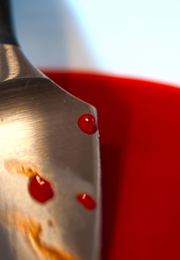
hi Simon, a good idea for this theme and its good to see a close up.

I think I would prefer to see a bit more in focus and if I'm being really picky to see the 'blood' running a bit!!

Well done and I look forward to seeing more of your photos!
 
hi Simon, a good idea for this theme and its good to see a close up.

I think I would prefer to see a bit more in focus and if I'm being really picky to see the 'blood' running a bit!!

Well done and I look forward to seeing more of your photos!

Thanks for that Sarah, taken with the macro lens so will have a play over the coming days......may have to rope in some help to try something....
 
Directions... the first one really did cause my eyes to go funny... The second is better... it works well for the theme and I like the DOF... not so keen on the lens shadow across the bottom... perhaps natural light would have worked better ?

Fear : Fits the theme well. Good use of DOF.
 
Its a good take on a tough theme. I think all the themes so far this year could symbolise the 'new year' feelings.

Like the idea of the set of images together, further supports what you are trying to convey.
 
Like it. A lot! The extra images add to the "on theme" element.
 
I like this idea - I'd almost like more junk hanging over the exercise contraption in the middle shot.
 
hi Simon, a good idea for this theme and its good to see a close up.

I think I would prefer to see a bit more in focus and if I'm being really picky to see the 'blood' running a bit!!

Well done and I look forward to seeing more of your photos!
I agree with Sarah for your Fear shot.

Sigh - Not as brave as the other person who did weighing scales and showed his weight :LOL:
 
Hi Simon


just having a quick catch up ....


Fear....keep looking at it & finally decided , yup...like it....nice color in the blood...maybe a little more of the image on show & a trickle rather than a blob but still ....like it (y)

Sigh.....I've got one of those machines...use mine as a clothes horse as well :LOL: Spot on theme....good idea :clap:
 
Hi Simon am also catching up

Direction - nice idea, but i too would have liked the whole of "Direction" in focus if you didn't know the theme you would pick out the bold "gno" as the focal point which makes no sense.

Fear - like the imagination behind it would have liked to have seen at least one more blood spot in focus.

Sigh, like a lot, tells a nice story, just my opinion but would have swapped the two exercise machine ones round, ie

we get on the scales and get a shock, we set off exercising with the best of intentions, and then we give it up with a sigh, thats how i see it anyway
 
Wow thats bright on the eyes :cool:
A very punchy image, liking the bright, vibrant colours and the dof works really well too. Good work. Iain
 
Hi there...hope that's not real blood :puke: Good agttempt. I'm not keen on the shadow and the lower left blood being OOF is a bit strange.

Sigh...I feel this one. Tryptic works well, but I feel the first would work on its own...I'd like to see the actual weight though.

Sweet is a bit bright for me. Bit too much going on. I think more focus/attention on the strawberry would benefit.

Cheers and keep going (y)
 
I think that I must truly be an idiot! Can some kind person direct me to where these 'themes' originate - as I cannot seem to locate them? Thanks in hope :)
 
sweet - i love, its bright sharpe and punchy

Secure - we live in a modern world and most of our lives is done electronically and we need to be secure, so bang on theme, the only thing that bothers me is the clipping of the phone on the bottome corner
 
Interesting interpretation, well executed but I'm a bit unsure about the cut-off at the bottom.
 
Back
Top