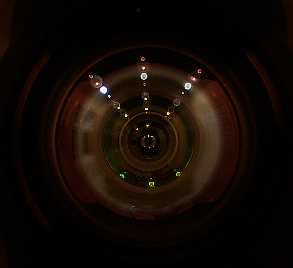
weekly Fullfast's 2012 52 week Challenge - Week 14 "ENTRANCE to the fish" added

You've used up a few brain cells for that shot! Great effort :clap:
 
Hi Simon

Handmade - such a simple yet effective shot. Dof spot on and great colours too.

Money - wonderful idea on the theme and cracking shot to boot :)
 
Handmade simple and effective. Money, a brilliant idea and bang on theme
 
Great image; I love it! It does look a little like the mannequin needs a pee, but other than that it's spot on!
 
'Handmade' - very nice composition and lighting. Nice interpretation for 'money' and nice to see something a little different. (y)
 
handmade is lovely and money too - I think money was a difficult one if you wanted to be different :clap:
 
Handmade - simple and effective. I would maybe like to see what it would have looked like with the needle a bit further round. Nice green colour.

Money - great idea and a innovative take on the idea.
 
Industry – More shiny than industry but nice picture all the same

Handmade – I like this but would have liked the needle also to have been in full sharpness

Money – Very clever idea. I like it

Win – Nice shot
 
A winning hand, definately and well thought out DOF. Good choice of BG as well
 
winning hand, works for me
 
Was hoping to add this yesterday as I know the sun comes into the room first thing and as it was St Patricks Day, he had a smile on his face and I thought of the old song Shiny Happy People....unfortunately the sun came one day to late to fit bang on but this I took this morning anyway as I should imagine there are still a few happy souls out there....


Shiny Happy People by Fullfast, on Flickr

Thanks for the comments
 
I like that Simon, the lighting is particularly pleasing on the eye. Good choice of dof, and the colour tone of the image I like too.
I think it needs a crop on the lhs, there is quite a bit of dead space there which isnt required. IMHO. Good work (y) Iain
 
Hi like the lighting and the colours on this, but i do agree he sits a little central
 
I'm playing catch up this week due to not coming up with anything I was happy with for Shiny and won't post the one I have come up with last night 'til I've gone through everyone elses.

I like the idea and the depth of field but there's definitely too much dead space on the left and the space on the right, I'm not sure what the blobs of yellow are?
 
Hi Simon

Win - really good shot, bang on theme, dof spot on any colouring bang on too.

Shiny - good interpretation on the theme and well lit.

Magical - certainly spot on with the theme, and a cracking shot too boot!!!
 
Shiny - The subject is well lit but I'd be inclined to crop out some of the black on the left hand side.

Magical - Definitely on theme - Disney is very magical to kids and quite a few adults.
 
Hi Simon

Magical....lovely shot , nicely exposed & great colors...I sooo wanna go back there (y)

Handmade....great shot....love the angle....& a great little model....nice thinking mister :clap:

Win.....BG works really well & right on theme...possibly crop the bottom a touch to lose the dark patch but other than that it's a (y) from me
 
Have decided to be a bit freaky this week and try something..>VERY different

This is the view at the ENTRANCE of my camera as taken with my fisheye lens......not to everyones tast but C+C are always welcom

Cant make up my mind which one

Image 1


Entrance 2 by Fullfast, on Flickr

Image 2


Entrance by Fullfast, on Flickr
 
Hi Simon

Magical....lovely shot , nicely exposed & great colors...I sooo wanna go back there (y)

Handmade....great shot....love the angle....& a great little model....nice thinking mister :clap:

Win.....BG works really well & right on theme...possibly crop the bottom a touch to lose the dark patch but other than that it's a (y) from me

Thanks for the comments Lynne,,,,most appreciated
 
Wow, deffinately number 1, but I can't work out what it is even with your description!

Love the little lighting highlights!
 
Wow, deffinately number 1, but I can't work out what it is even with your description!

Love the little lighting highlights!

Basically I had a moment of madness.....mounted the camera and fisheye lens onto the tripod and put it flush up against a mirror in the bathroom...the lighting highlights are the downlighters in the bathroom....the only light that was let in was from the slight openings on the sides of the hood...

Glad you like it
 
Hi, Simon, entrance, now I like that a lot. Very well done :clap:

#1 for me, much prefer the closer crop. Minor point, but I'll like the light patches on the outer corners (3 at least) removed.

The photograph has a real clicky linky feel to it.
 
Back
Top