
Haven't taken much since the first time I used these lights. again single soft box shot with a 85mm
 studio xiu 2 by peter mcallister, on Flickr
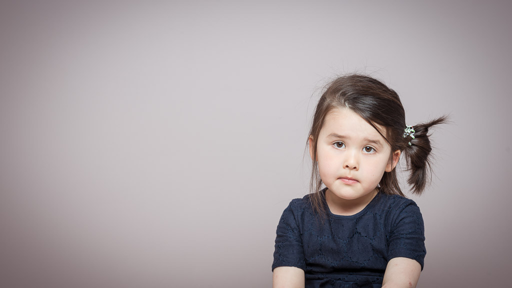 studio mia by peter mcallister, on Flickr
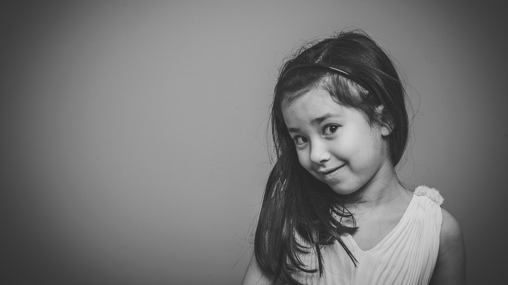 studio xiu 4 bw by peter mcallister, on Flickr
studio xiu 2 by peter mcallister, on Flickrstudio mia by peter mcallister, on Flickrstudio xiu 4 bw by peter mcallister, on Flickr")

 studio cry baby