

You are using an out of date browser. It may not display this or other websites correctly.
You should upgrade or use an alternative browser.
You should upgrade or use an alternative browser.
- Messages
- 2,981
- Name
- Chris
- Edit My Images
- Yes
Before pontificating,two questions.
What do you think wants improving?
What editing software do you use?
What do you think wants improving?
What editing software do you use?
OP
- Messages
- 4
- Name
- richard
- Edit My Images
- Yes
Before pontificating,two questions.
What do you think wants improving?
What editing software do you use?
i think composition is a big one, and the correct settings for long exposure, i mainly use lightroom cc
Fuji Dave
I'm in Clover
- Messages
- 21,611
- Name
- Dave
- Edit My Images
- No
The main thing in our journey in photography is, if you are happy with your images then don`t worry if other folk don`t like it. In my photography I take images for one person only and that is ME, you might like/love an image you have taken but then someone might not like it at all so always remember it is your photography and knowone elses. On your image I`d leave it as is as for me I think you did a great job on taking it, great reflection and lighting is lovely.
- Messages
- 2,981
- Name
- Chris
- Edit My Images
- Yes
I will go with dave I would be quite happy with it.
If I was feeling picky I would have a play with the adjustment brush and see the effect of boosting the contrast a bit but excluding the sky.
If I was feeling picky I would have a play with the adjustment brush and see the effect of boosting the contrast a bit but excluding the sky.
- Messages
- 8,904
- Name
- Bazza
- Edit My Images
- No
It is only you who know what the scene was looking at it with your eyes. All I would suggest is making sure that moving to the left or right, higher or lower, may have improved the photo or not. Always pays to check the position your taking the photo it. Ask yourself can you get everything you want to take in the photo
Last edited:
- Messages
- 6,473
- Name
- Ned
- Edit My Images
- Yes
The simple answer, and not one everyone likes because it doesn't necessarily fit with people's lives, is to go somewhere photogenic when the light is good, as opposed to when the sun is high in the sky like in your photo.
Also you need to photograph interesting things, I suspect you've used a wide angle lens as for some reason we are all encouraged to think that wide angle = landscape but there is nothing interesting (to me) about some very dull rocks and a wooden fence. Using a less wide lens would have allowed you to pick out something more interesting in the scene (the hill and its reflection, missing the rocks and fence, for example).
Also you need to photograph interesting things, I suspect you've used a wide angle lens as for some reason we are all encouraged to think that wide angle = landscape but there is nothing interesting (to me) about some very dull rocks and a wooden fence. Using a less wide lens would have allowed you to pick out something more interesting in the scene (the hill and its reflection, missing the rocks and fence, for example).

- Messages
- 26,508
- Name
- Toby
- Edit My Images
- No
It’s all preference, however I assume as you’re posting this then you’re not happy with it in which case I would suggest reading about leading lines and how to ‘draw the eyes’ into the picture. Sometimes less is more, for example the rocks in the foreground and the fence on the left add little to the image imo and draw your eye away from the main part of the image.I like photography, and do as much as I can but need direction on how to improve, this is one of my latest images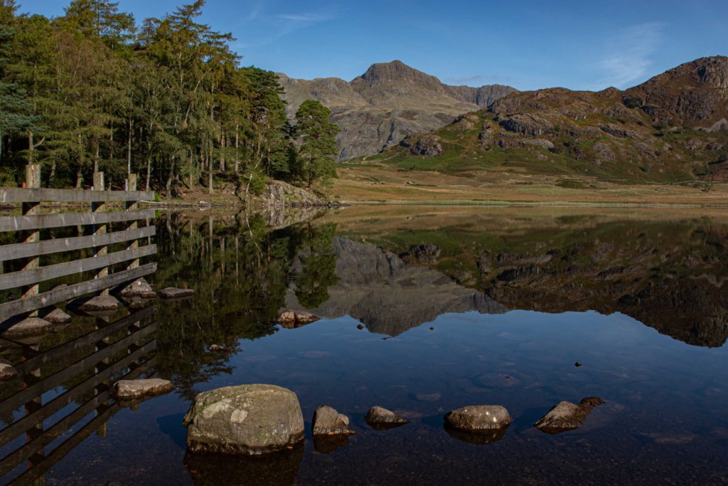
Also study how the light changes during the day and throughout the year, it can have a dramatic effect to the picture.
sk66
Advertiser
- Messages
- 9,731
- Name
- Steven
- Edit My Images
- Yes
It seems to me that the image includes a lot of things that often help, but are applied w/o specific intention. It feels like you're trying to do/accomplish too much.
You will often hear/read that a good landscape image should have fore/middle/back layers of interest. And you will see a lot of images that have some rocks or whatever in the FG like you did here. But in this case the rocks are just rocks... they're not particularly interesting, they're too small in the frame if there are details of interest there, they don't lead into the image (in fact they kind of block the flow), and they're too far to the periphery.
Then you have a lot of leading lines that lead the eye straight to the centered grey mountain, which is actually the area of least interest. All of the lines/details on the left side make it feel busy/heavy/unbalanced, and they contribute to the FG rocks feeling isolated/lost.
IMO, the best part of the scene is the right half and a different composition focused on that area could have worked much better, might have been able to use the rocks better, etc. Dave's edit helps IMO, but it's a bit of "a save" effort.
One of the biggest things I think one can do when you find an attractive scene is to stop and break it down... what exactly is it that attracts you to the scene? What's the most important element/aspect? And then focus on/compose around that aspect and leave out anything that doesn't contribute.
Attachments
Last edited:
- Messages
- 6
- Edit My Images
- Yes
I personally love this photo and would love to get quality like itI like photography, and do as much as I can but need direction on how to improve, this is one of my latest images
- Messages
- 1,883
- Name
- Stephen
- Edit My Images
- Yes
Photography is a journey, you'll improve from whatever is/was your starting point. Enjoy it. Your images are for you.
- Messages
- 1,386
- Edit My Images
- No
From the example shown shoot in better light such as golden hour (or when the sun is lower in the sky, golden hour isn't always possible in the Lake District due to hills blocking the light) or when you have spotlighting effects from the sun breaking through cloud, look for more atmospheric conditions such as low lying mist or interesting cloud and work on your compositional skills. There's tons of foreground rocks available there so work to find the most interesting shapes. Good luck!
- Messages
- 21
- Name
- Thomas
- Edit My Images
- Yes
You've identified some nice features in the landscape. Lots of compositional opportunities in this scene - the leading line of the fence, reflection, rocks..but shooting this wide and far away from your foreground means they sort of blend into one.
Get closer with the wide angle or go longer and tighter. Decide what your focal point and choose which aspects to leave out.
The rocks anchor the eye to the bottom so don't really let you explore the rest of the image. I'd crop these out (a pano might help).
Get closer with the wide angle or go longer and tighter. Decide what your focal point and choose which aspects to leave out.
The rocks anchor the eye to the bottom so don't really let you explore the rest of the image. I'd crop these out (a pano might help).