You are using an out of date browser. It may not display this or other websites correctly.
You should upgrade or use an alternative browser.
You should upgrade or use an alternative browser.
weekly LC2's 52 for 2015 Thread - Week 52 : Christmas
- Thread starter LC2
- Start date
- Messages
- 4,344
- Name
- Martin
- Edit My Images
- Yes
Well, it certainly implies a lot of water. Nicely exposed.
LC2
Negan
- Messages
- 10,457
- Name
- Tim
- Edit My Images
- Yes
- Messages
- 2,908
- Name
- Summer
- Edit My Images
- Yes
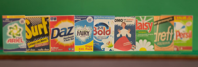
I'm not sure about the crop you've chosen, but the idea works well the way the outer ones go oof. I would have maybe tried putting the boxes in a triangular formation so the boxes go further back from the central one. Just might have made things a lil bit more interesting 
- Messages
- 4,344
- Name
- Martin
- Edit My Images
- Yes
That old Bold soap powder is getting around a bit. Sturisoma is right, the Bold doesn't stick out as boldly as it could.
LC2
Negan
- Messages
- 10,457
- Name
- Tim
- Edit My Images
- Yes
Yes, I do see what you both mean.
It was supposed to imitate a focus target and hence the bold being in focus in the middle, but bold would have stood out better at the front.
You might be interested (you might not) to know that the total length of the focus target was only just over 300mm.
The crop was overly tight to remove distracting shadows.
LC2
Negan
- Messages
- 10,457
- Name
- Tim
- Edit My Images
- Yes
Week 8 - Better late than never: Relax
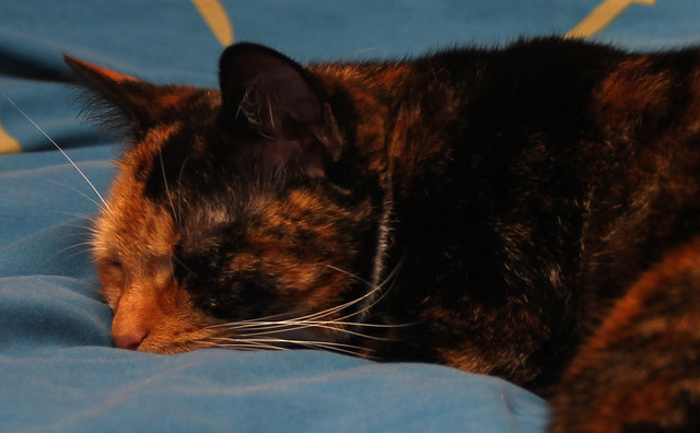
It's taken a week to capture one of the cats asleep somewhere non distracting, so I guess this is more of a 'taken' photo than a 'made' photo.
Cropped to the Rule of Thirds and to remove distractions. Shadows lightened slightly and the yellow channel saturation raised a little.
Taken with an 1100D and a Tamron 18-200 as that's what was to hand - I didn't want to clomp around and wake her.
Flash bounced off of the ceiling to provide lighting.
Relax by timz2011, on Flickr
It's taken a week to capture one of the cats asleep somewhere non distracting, so I guess this is more of a 'taken' photo than a 'made' photo.
Cropped to the Rule of Thirds and to remove distractions. Shadows lightened slightly and the yellow channel saturation raised a little.
Taken with an 1100D and a Tamron 18-200 as that's what was to hand - I didn't want to clomp around and wake her.
Flash bounced off of the ceiling to provide lighting.

Relax by timz2011, on Flickr
- Messages
- 3,724
- Name
- Chris
- Edit My Images
- Yes
Cats certainly do seem to be the order of the week, they do make challenging subjects too. I read somewhere once that "a dog will come when called, a cat will take a message and get back to you later" Having owned a few over the years I would definitely agree.
Anyway back on topic. I quite like the composition and she definitely looks relaxed, so on theme there. As to critique, I know you have raised the shadows, but it stills looks under exposed to me, it would be nice to see more detail especially in her face as you can only really make out the one eye. It may be worth dialling in a spot of exposure compensation. It also looks a little too orange, so possibly dial back the saturation
Anyway back on topic. I quite like the composition and she definitely looks relaxed, so on theme there. As to critique, I know you have raised the shadows, but it stills looks under exposed to me, it would be nice to see more detail especially in her face as you can only really make out the one eye. It may be worth dialling in a spot of exposure compensation. It also looks a little too orange, so possibly dial back the saturation
LC2
Negan
- Messages
- 10,457
- Name
- Tim
- Edit My Images
- Yes
...so on theme there. As to critique, I know you have raised the shadows, but it stills looks under exposed to me, it would be nice to see more detail especially in her face as you can only really make out the one eye. It may be worth dialling in a spot of exposure compensation. It also looks a little too orange, so possibly dial back the saturation
I didn't think to change the capture to raw
I've dialled back the yellow saturation a little, I see what you mean.

Relax 2 by timz2011, on Flickr
LC2
Negan
- Messages
- 10,457
- Name
- Tim
- Edit My Images
- Yes
Vertical...
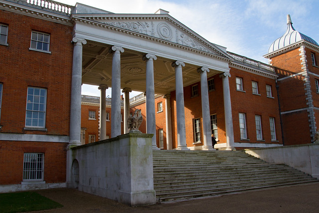
A quick trip to Osterley House today resulted in these two
I was originally thinking of the Vertical Pillars at the entrance to the house.
This was deliberately taken at an angle with only the middle pillars absolutely vertical due to perspective.
Osterley House by timz2011, on Flickr
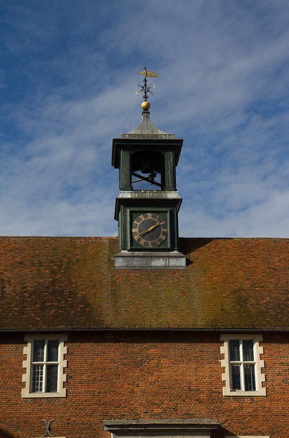
Once there, the Clock Tower on the Stable's (okay, the Tea Room) roof also struck me as particularly vertical and I think the sky came out better as the sun was behind me and not to the side.
Osterley House Stables Clock Tower by timz2011, on Flickr
A quick trip to Osterley House today resulted in these two
I was originally thinking of the Vertical Pillars at the entrance to the house.
This was deliberately taken at an angle with only the middle pillars absolutely vertical due to perspective.

Osterley House by timz2011, on Flickr
Once there, the Clock Tower on the Stable's (okay, the Tea Room) roof also struck me as particularly vertical and I think the sky came out better as the sun was behind me and not to the side.

Osterley House Stables Clock Tower by timz2011, on Flickr
Last edited:
- Messages
- 9,095
- Name
- Mandy
- Edit My Images
- Yes
I am on a bit of a comments catch up........
Bold - I have to agree with others I don't think its a bold as it could be.
Relax - fits the theme, crit wise I feel the cat looks a bit dark in colour.
Vertical - first image for me like the vertical pillars.
Bold - I have to agree with others I don't think its a bold as it could be.
Relax - fits the theme, crit wise I feel the cat looks a bit dark in colour.
Vertical - first image for me like the vertical pillars.
LC2
Negan
- Messages
- 10,457
- Name
- Tim
- Edit My Images
- Yes
Working from a different office this week, not far from Trafalgar Square.
The 4th Plinth was changed on Thursday, so I trotted down there on Friday to take this.
Never look a gift (skeletal) horse in the Mouth !

4thPlinth by timz2011, on Flickr
Taken using an old Lumiz TZ8 that lives in my bag, possibly not the sharpest shot ever but then I've not likely to have a DSLR with me while at work, so "the best camera you have is the one you have with you"
The 4th Plinth was changed on Thursday, so I trotted down there on Friday to take this.
Never look a gift (skeletal) horse in the Mouth !

4thPlinth by timz2011, on Flickr
Taken using an old Lumiz TZ8 that lives in my bag, possibly not the sharpest shot ever but then I've not likely to have a DSLR with me while at work, so "the best camera you have is the one you have with you"
LC2
Negan
- Messages
- 10,457
- Name
- Tim
- Edit My Images
- Yes
She's asleep on my bed again now, and in sunlight she is less dark. I don't think that the shot is too bad a representation of how she looked at the time though as the colours of the walls and ceiling do tend to make the room and everything in it slightly dark.Hi Tim
Relax - cats do seem to be very good at this relaxing don't they. Great fit for the theme, maybe a little too dark as others have said.
Vertical - both on them, but I prefer # 1
Hi, Time, I like the shadows in #1. Wonderful building, for me, though, I'd prefer a front on composition to emphasis the verticals.
Cheers.
I took some straight on, but somehow they just felt bland / dull, perhaps the size of the house removing the emphasis on the pillars. I'm afraid I've deleted them now :/Hi Tim
Out of you 2 vertical shots, number 1 for me.
As pointed out i also think a central PoV could have been better, but that would have depended on the location of the sun..
Thanks. It's one of those buildings you just take for granted as it's been there all my life. Getting the camera out on this challenge makes you look at things anew.Tim I really like the first image, great shadows and what an amazing looking building
I am on a bit of a comments catch up........
Bold - I have to agree with others I don't think its a bold as it could be.
Relax - fits the theme, crit wise I feel the cat looks a bit dark in colour.
Vertical - first image for me like the vertical pillars.
Thanks, it seems the general consensus is that the house is the better image, and I think I have to agree.
With regards to "BOLD", would people be suprised that these were the props?
View attachment 32208
Last edited:
D
Deleted member 59779
Guest
Love the idea of using a proverb as an idea for a photo. Looks fine to me. As you say best camera is the one you have with you. Love the blue of the sky with just a hint of cloud. Actually been a beautiful day today even if a bit windy.
SarahLee
TPer Emerita
- Messages
- 13,060
- Name
- Sarah
- Edit My Images
- No
Wow! You're on the ball this week Tim - and I really like the interpretation.
Nice clean background, lovely contrast and depth to the sculpture.
I'd really have liked to see a closer crop of just the head and neck though.
BTW Is it just me or does that little wisp of cloud look like steam snorting from his nostrils?
Nice clean background, lovely contrast and depth to the sculpture.
I'd really have liked to see a closer crop of just the head and neck though.
BTW Is it just me or does that little wisp of cloud look like steam snorting from his nostrils?
LC2
Negan
- Messages
- 10,457
- Name
- Tim
- Edit My Images
- Yes
Love the idea of using a proverb as an idea for a photo. Looks fine to me. As you say best camera is the one you have with you. Love the blue of the sky with just a hint of cloud. Actually been a beautiful day today even if a bit windy.
Thanks - I think it worked quite wel tooNice interpretation Tim and well spotted
Handy little compacts, aren't they.Yes nice one Tim, would also be nice to see the whole Gift Horse sculpture but I guess you were concentrating on the mouth.
I too have a Lumiz TZ8 ... nifty little things.
Hi, well done for not getting any distraction in the BG, not sure if I want to see the whole thing or maybe a closer view of its head
Wow! You're on the ball this week Tim - and I really like the interpretation.
Nice clean background, lovely contrast and depth to the sculpture.
I'd really have liked to see a closer crop of just the head and neck though.
BTW Is it just me or does that little wisp of cloud look like steam snorting from his nostrils?
a closer crop would make it even more on theme but I am also left wondering i would like to see a wider shot of the whole statue.
@d00d @alsjazzera @sr1867 - Here is the original uncropped image. I don't think the full image has the impact that the cropped version does though.

4thPlinth_uncropped by timz2011, on Flickr
@alsjazzera @SarahLee @sr1867 - I did take a few closer cropped images to at the time, but felt that whilst they did concentrate on the mouth more, they lost impact
@SarahLee - No it's not just you, I thought exactly the sameBTW Is it just me or does that little wisp of cloud look like steam snorting from his nostrils?
- Messages
- 3,724
- Name
- Chris
- Edit My Images
- Yes
Mouth - Nice take on the theme, I quite like it. Cleverly composed against a nice sky. Not sure what the names are all about though, personally a little distracting. Nice shot though 
- Messages
- 9,095
- Name
- Mandy
- Edit My Images
- Yes
Mouth - that's a cracking sculpture, and another different take on this weeks theme.
LC2
Negan
- Messages
- 10,457
- Name
- Tim
- Edit My Images
- Yes
Two this week...
More Crowded than Crowd, but I liked the colours:

37 Rescue by timz2011, on Flickr
This shot is deliberately close cropped to give that Crowded feel.
A Crowd of TOGs (one for the spotted a Tog thread too perhaps) shooting 37 324 at Ropley early Saturday morning
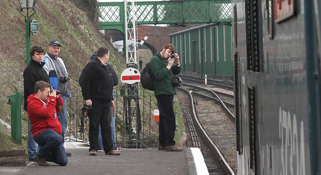
Crowd by timz2011, on Flickr
It seems that @SarahLee did choose a subject allowing me to photograph 37 324
It's a shame that the light was so flat yesterday.
More Crowded than Crowd, but I liked the colours:

37 Rescue by timz2011, on Flickr
This shot is deliberately close cropped to give that Crowded feel.
A Crowd of TOGs (one for the spotted a Tog thread too perhaps) shooting 37 324 at Ropley early Saturday morning

Crowd by timz2011, on Flickr
It seems that @SarahLee did choose a subject allowing me to photograph 37 324
It's a shame that the light was so flat yesterday.
Last edited:
- Messages
- 4,344
- Name
- Martin
- Edit My Images
- Yes
I too prefer the two trains picture it is a bit of a shame about the flats in the background as they detract somewhat from the image.
LC2
Negan
- Messages
- 10,457
- Name
- Tim
- Edit My Images
- Yes
@sr1867  I think you may be right.
@michael23 I was deliberately not making a thing of the loco (whilst including it) - Also cropping in around the 'crowd' trying to make 5 people look like a crowd.
@ShinySideUp Yes, on reflection, it would have been better to blur the background, but that was f4, would f2.8 have created bokeh? I dunno.
@d00d @Cobra Thanks for your comments. I too prefer the two loco shot (I felt I shuld include the other one as it was a more conventional Crowd shot though).


