Lightroom / Colour cast / A Rant.

Messages
529
Edit My Images
Yes
Please excuse the title but wasn't sure what to put that didn't get me banned with immediate effect.
I have a bit of a problem and I need some help pretty dare smart before a certain printing company recieves the full roth my anger this afternoon.
Ok, story so far. Have processed my images in lightroom 2.2 using a couple of presets I started using this year, images are exported in srgb colour profile as jpg's, they are then uploaded to printers system via fujicolour interface. On my screen this one image is black and white with no colour cast or split tone to it.
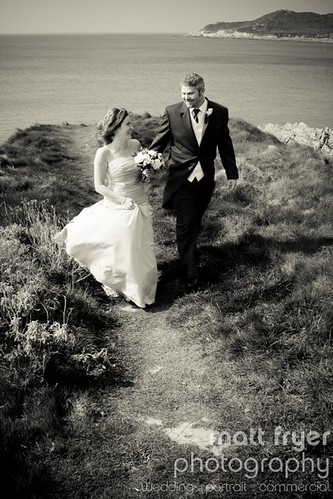
3601030788_97fd268250.jpg


But when I have it returned to me it has a very horrid brown colour cast to it and certain other images from the same order are much darker then on my screen and are slightly dull and lack lustre.
Now I have been on the phone to them this afternoon, with what can only be described as a very rude assistant spouting all manner of facts and figures regarding the number of images they print on a daily basis and that it is not their system that is at fault but something I am doing my end, so I relate my workflow system to him and it turns out I didn't emmbed the colour profile into the image despite it showing as an sRGB image in CS3, so I re-edit the images in CS3 embeding the colour profile into it, once with sRGb and once with their own ICC profile for gloss paper. Thinking that would do the trick i recieved an email a while ago saying that nothing has changed the images are still showing a colour cast.
Once again we go through my workflow and he basically says that the only way to get the best from his printing system is to ditch lightroom and use the desturate feature in CS3! A slightly heated discussion then follows, words like tell that to Adobe etc etc are thrown around, by now I am getting very annoyed and recall another incident with this company where the same image printed 3 times in the same order has three different colour casts on it. I tell him this and he says that that is impossible. Once again another heated disussion follows and I now starting to lose the plot. Most of you don't need to know all this but a little history never helps.
So the point of my post is to find out if anyone else can see a weird browny / yellowee colour cast to the posted image. And also in the vain hope of someone offering a sensible solution to my problem. I now have a massive backorder of images that need to be printed asap but I reluctant to get them done if they are going to come back wrong. Oh I also looked their test image both a printed verison they sent and compared it to thier online version and they match! AGHHHHHHHHHHHHHHHHHHHHHHHHHHHHH :bang:Someone please shed some light on this for me. please.
 
Last year and again this year I have submitted some of my landscape photo's to a publisher who prints various calendars and greetings cards etc, they were very specific with the requirements for submission, they stressed to me that grayscale was the only profile which should be used for black and white images, otherwise there would be colour casts present after press :shrug:

Desaturation could be one way, but it would be just as simple to create an action that converts the images to grayscale and then create a droplet for easy drag and drop functionality for your folders of lightroom exports.
 
Looks pretty toned to me. Opening in PS and looking at the levels also shows the file has quite a heavy sepia style tone applied to it.

EDIT: If you want a black and white print; i'd suggest removing the toning processing and making sure you set up the file as required by the printer, converted to the correct profile if required. I've also heard converting to grayscale can help. But obviously the major factor here is the file is toned, so your prints are toned.

Also, prints are never going to be the same luminosity as on screen images. Transmissive and reflected light and all that jargon. You need to get to know your printer and how to prepare files for print.. which can be very different to how you prepare for web / on-screen.
 
I can see a definite yellow/brown tint to that image. Sorry to say, it sounds like you may need to look at you monitor calibration.

I always have to check my images on my macbook as well as my pc monitor as images edited on the monitor always look really dark on other screens. Even after changing the brightness levels etc. Its one of the main negatives to digital images - you can never be sure that what you put out there looks the same to other people due to hardware differences.
 
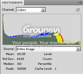
Definitely a yellow and red tint there - its visible on my screen even before I loaded into PS and looked at the graph:

graph.jpg
 
I have re-edited the image again from the original raw file and disected the lightroom preset, turns out the preset has a highlight hue of 60 at 20% saturation in it. So looks like it does have a small degree of toning to it, have edited the preset removing that highlight toning and it now looks much better. Just need to wait till monday to find out what the printers say.
Ok I may have been wrong and the image did have a slight tone to it but not to the degree they have printed it at which is what is bothering me and he didn't have to be so f'in rude about it.

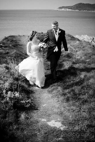
Here's the edited version without the 20% 60 hue added.

3601417622_8591d511ba.jpg


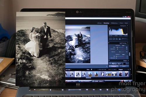
Also just to show how bad i think the printed version is here's a copy of it next to my laptop screen. This image is SOOC, although I must say it isn't as brown on as it is in my hand.

3600604825_a43c905b06.jpg


Without using a proper calibration tool this image - http://tomyeah.com/images/Monitor calibration chart.jpg looks spot on my both screens. I can see all the shade of grey whites are white and nothing has a cast to it.
Interesting.
Does anyone have a calibration thingy they are willing to lend me to get my screens sorted?

Cheers for the help so far guys. Knew i could rely on TP to come to my rescue.
 
Does anyone have a calibration thingy they are willing to lend me to get my screens sorted?

Cheers for the help so far guys. Knew i could rely on TP to come to my rescue.

Unless you are intending for a duo-tone effect then I would strongly recommend including a grayscale profile version with your next print batch.

So far I can confirm that regardless of how accurate your monitor calibration is, an RGB based colour profile on a black and white image will always result in some kind of colour cast in print.

Embedding a Ggrayscale profile will discards all colour information and thus eliminate the possibility of colour casts from your PP.

If you submit a grayscale profile image and that too comes back with any tints, you'll have a more clear idea of where the problem is. :thumbs:
 
Cool, where's best to find a greyscale profile? Tried google but no luck, nothing conclusive.

Also the preset is a greyscale rather than desaturation version. If trhat matters.
 
Cool, where's best to find a greyscale profile? Tried google but no luck, nothing conclusive.

Also the preset is a greyscale rather than desaturation version. If trhat matters.

Y'know I'm not sure if there is one available in lightroom :thinking:
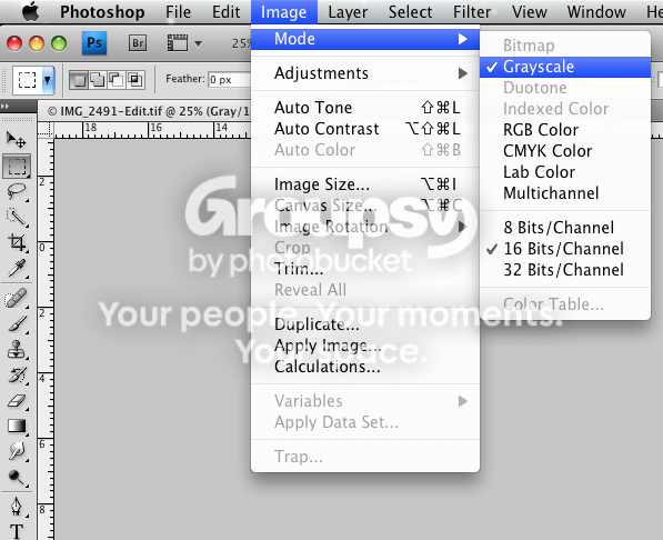
I use photoshop then make actions and droplets, just before I FTP them to publisher.

Picture1-9.png
 
Couldn't find one as yet. Not a problem will just export as normal then use Cs3 to convertto greyscale.
Will do some test images and see what happens fronm their.
 
The first issue is that your screen isn't calibrated, I'm sure any decent print company's printers will be calibrated, which brings me onto point 2, if they offer a specific profile, it is always best to use that (but if your monitor is out the print will be too).

If it is who I think you are talking about they use laser printers, as opposed to giclee, I'm not 100% if it is the same, but with giclee you need to add some colour into the black ink to make it true black, so their profile could also be out.

Or the paper could be slightly yellow, it is amazing how the base colour of the paper can change the tone of a print.

All in, black and white printing is a black art!!!
 
Calibration is being taken care of thinking it will be easier just to get my own tool.

They print on FujiColour Crystal Archive paper if that makes any difference. They do their own ICC profile and will be emmbedding that in future. But what about the whole greyscale issue?
 
... about the whole greyscale issue?

Regardless of what we think, it's not going to hurt to include a grayscale profiled image in the next batch you send to the printers. Just make sure it's easily identifiable from the rest.

You going to get a lot of conflicting opinions as seen above. My best advice to you is to try them yourself. Do a test, a couple of prints isn't going to break the bank.

If the printer has their own ICC profile then you should always use that, submitting images in sRGB is no good and will always result badly.

Personally, I'm not convinced that your monitor calibration is the problem, more often than not it's related to ICC profiles and mis-matched colour spaces.

Just my tuppence.
 
I am sending him a whole heap of different versions tonight to see what happens. Will be easy to spot as they print the file name on the reverse. So some sound advice Tomas there cheers.

Will be using the printers own ICC profile from now on.

Like you I am not 100% convinced it is my monitor being out but will eliminate that anyway. As you say ICC profile and the whole colour space managemnt is normally the root of the issue. I personally now think it os a very underrated issue that shouldn't be overlooked and I am now kicking myself for not addressing it sooner. I have a heap of work that neeeds to be done (Hence I am still here at 9.30 on a saturday night), but am spending decent editing time doing something I should have addressed months ago.
 
Tell me about it mate, I'm really grateful to have the best quality printers around here, if there's a boo boo, it's always mine :nuts:

All the best and let us know how it turns out :thumbs:
 
Lightroom has the greyscale option at the top under the histogram in the develop modual.
 
Lightroom has the greyscale option at the top under the histogram in the develop modual.

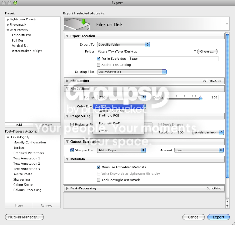
Your referring to the colour treatment Wayne and not a colour profile is applied or converted to upon export only.

It seems these are the only options aside from whatever monitor profiles are in your colour sync library:

Picture1-10.png


It really doesn't matter if the colour treatment is grayscale, if you whack an RGB colur profile on you will get a cast of some kind.
 
Lightroom has the greyscale option at the top under the histogram in the develop modual.

I am fully aware of that thanks, in fact the preset used on the images in question use the greyscale option rather than desaturation. My question about grey was regarding ICC colour profiles. The above images as stated used the greyscale option in Lightroom but when exprted it still had te sRGB icc colour profile embedded into it, I was wondering if there was a specific greyscale icc profile. What I am doing as a test now is sending one version with the rgb colour profile attached and then converting another version of the same image to greyscale in CS3 and sending that to be prinbted.


Chaz Photos said:
two things screen calibration and seting the colour temp have found many are not set to 6500k but much higher and your shots of your screen look like that as well.
what is your back light set to?

Colour temp on main screen is 6500K, until i get the spyder calibration tool I am unable to tell you abouit colour tmep on laptop screen, but comparing images between screens using lightroom I reckon laptop temp is cooler by a fraction. Laptop backlight is set at 85% and main screen is brightness 85% also.

Once again cheers for all your help and advice here guys. Much appreciated.
 
I have re-edited the image again from the original raw file and disected the lightroom preset, turns out the preset has a highlight hue of 60 at 20% saturation in it. So looks like it does have a small degree of toning to it, have edited the preset removing that highlight toning and it now looks much better. Just need to wait till monday to find out what the printers say.
Ok I may have been wrong and the image did have a slight tone to it but not to the degree they have printed it at which is what is bothering me and he didn't have to be so f'in rude about it.

Here's the edited version without the 20% 60 hue added.

3601417622_8591d511ba.jpg


Also just to show how bad i think the printed version is here's a copy of it next to my laptop screen. This image is SOOC, although I must say it isn't as brown on as it is in my hand.

3600604825_a43c905b06.jpg


Without using a proper calibration tool this image - http://tomyeah.com/images/Monitor calibration chart.jpg looks spot on my both screens. I can see all the shade of grey whites are white and nothing has a cast to it.
Interesting.
Does anyone have a calibration thingy they are willing to lend me to get my screens sorted?

Cheers for the help so far guys. Knew i could rely on TP to come to my rescue.

your laptop screen looks VERY blue, which is why when you make things look grey, they come out brown. Start by calibrating your screen. Dont believe yoru eyes, your visual system adjusts for colour all the time. You may want to consider grey wals and daylight bulbs in your work area too!
 
your laptop screen looks VERY blue, which is why when you make things look grey, they come out brown. Start by calibrating your screen. Dont believe yoru eyes, your visual system adjusts for colour all the time. You may want to consider grey wals and daylight bulbs in your work area too!

was going to say that aswell, does looks blue
 
Back
Top