weekly mercurius's 52 in 2014: catch up Weeks 28 - 31

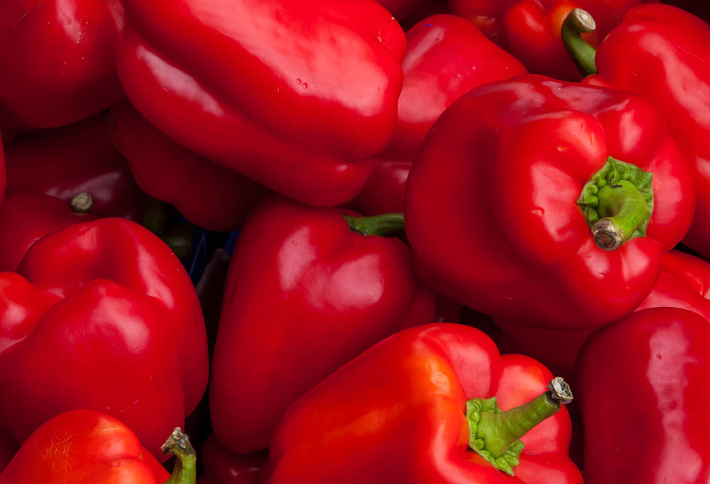
Very yummy looking and I like the way you've arranged them on the diagonal, but I'm not quite sure about the slightly oof foreground.
Thanks Elaine. Agree the OOF foreground is distracting.
:agree: With the above.
Good composition and nicely lit. I do wonder if a wide DOF (per Elaine/Mandy) would have worked better, but I can't say for certain...
The super close shot works well - a nice and different take on the theme. Well done!
Thanks for your comments, Paul.
 
Hiya... Three good photos!

Rich: I love the colours and it's bang on theme because of that. Saturation is absolutely spot on on my monitor (which can occasionally show reds as a touch oversaturated but not here). Depth of field is good - I like the vast majority being in focus but some OOF over on the far left is good contrast. Only minor crit is not completely convinced on placement of all of them - perhaps feels a touch right heavy on the stalks for me? A couple of other minor points are: some wrinkling of the skin in BL corner (pepper getting old?) and the ends of the stalks are a bit manky... cutting the last 1/2cm off might have been worthwhile? Overall a super shot, though.

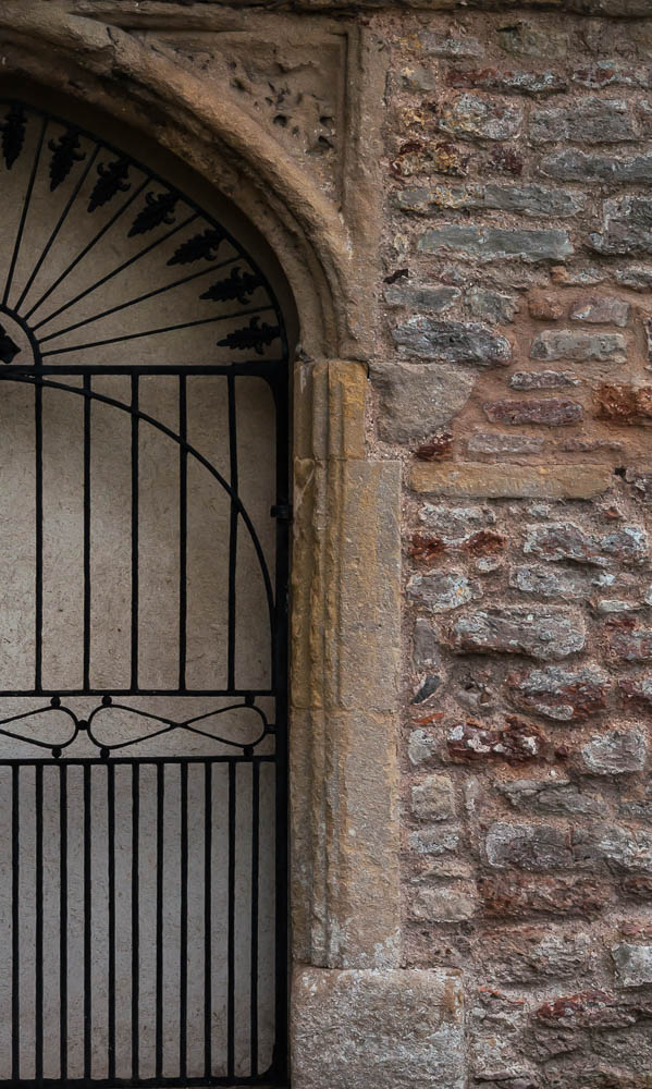
Half: yes it is. Not massively exciting for me, but it's well taken, on theme and technically good.

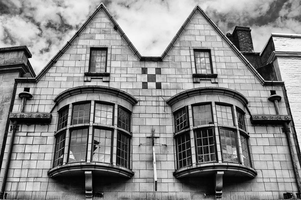
Architectural: lovely shot with great sky and a nice perspective. B&W conversion is absolutely super for me: just enough shadow detail in the blacks. Very good take.
 
Hi
Rich - like the randomness of the peppers, the vivid colour contrasting with the lower ones in shade and the green of the stalks. Agree with Paul @pjm1 re the cutting of the brown bits from the stalks.
Half - on theme, needs slight CCW? Maybe a touch brighter too
Architectural - Good pov and symmetry. Like the processing adn the reflections on the glass. Not sure whether you were spot on in the centre cos that hanging sign looks slightly squiffy ( a technical term)
 
Hiya... Three good photos!

Rich: I love the colours and it's bang on theme because of that. Saturation is absolutely spot on on my monitor (which can occasionally show reds as a touch oversaturated but not here). Depth of field is good - I like the vast majority being in focus but some OOF over on the far left is good contrast. Only minor crit is not completely convinced on placement of all of them - perhaps feels a touch right heavy on the stalks for me? A couple of other minor points are: some wrinkling of the skin in BL corner (pepper getting old?) and the ends of the stalks are a bit manky... cutting the last 1/2cm off might have been worthwhile? Overall a super shot, though.
Half: yes it is. Not massively exciting for me, but it's well taken, on theme and technically good.
Architectural: lovely shot with great sky and a nice perspective. B&W conversion is absolutely super for me: just enough shadow detail in the blacks. Very good take.
Thanks for your thoughtful comments. The peppers were on a market stall, so couldn't really get my knife out to trim off the manky bits!

Hi
Rich - like the randomness of the peppers, the vivid colour contrasting with the lower ones in shade and the green of the stalks. Agree with Paul @pjm1 re the cutting of the brown bits from the stalks.
Half - on theme, needs slight CCW? Maybe a touch brighter too
Architectural - Good pov and symmetry. Like the processing adn the reflections on the glass. Not sure whether you were spot on in the centre cos that hanging sign looks slightly squiffy ( a technical term)
Thanks. In the Architectural shot, the wind was blowing the sign which is why it's at an angle.
:agree: With the above comments.
Thanks Mandy.
 
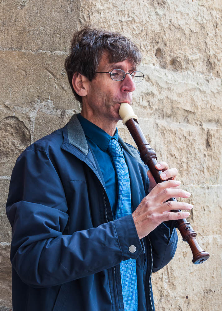
Some good shots Mercurius. I particularly like Half for the texture you've managed to capture in the stonework and Skill is a great composition the way you've cropped it to just show the important part instead of a full length shot.
 
Hi Mercurius... decent shot for Skill although it feels slightly lacking somehow. Had you managed to get eye contact, I think that could really have made it. Maybe it's the wall behind him - makes me wonder what he's doing playing outside a castle?

Decent take though and exposure, lighting, focus etc all good. If he were a bit further from the wall you could have blurred it out more with narrower DOF but that wasn't an option given where he was standing...
 
Back
Top