Monthly Minnnt's ETC project - August - Fisheye

So this shot should be my last for the month, but if i get the chance to do something else then i will as i feel i having 3 motion blur photo's is cheating a little. REALLY wanted to do the star trails, but getting a clear sky is proving difficult to say the least.

Right, here is my entry for something ordinary doing something unexpected... A levitating split 'nana.

Enjoy. :D


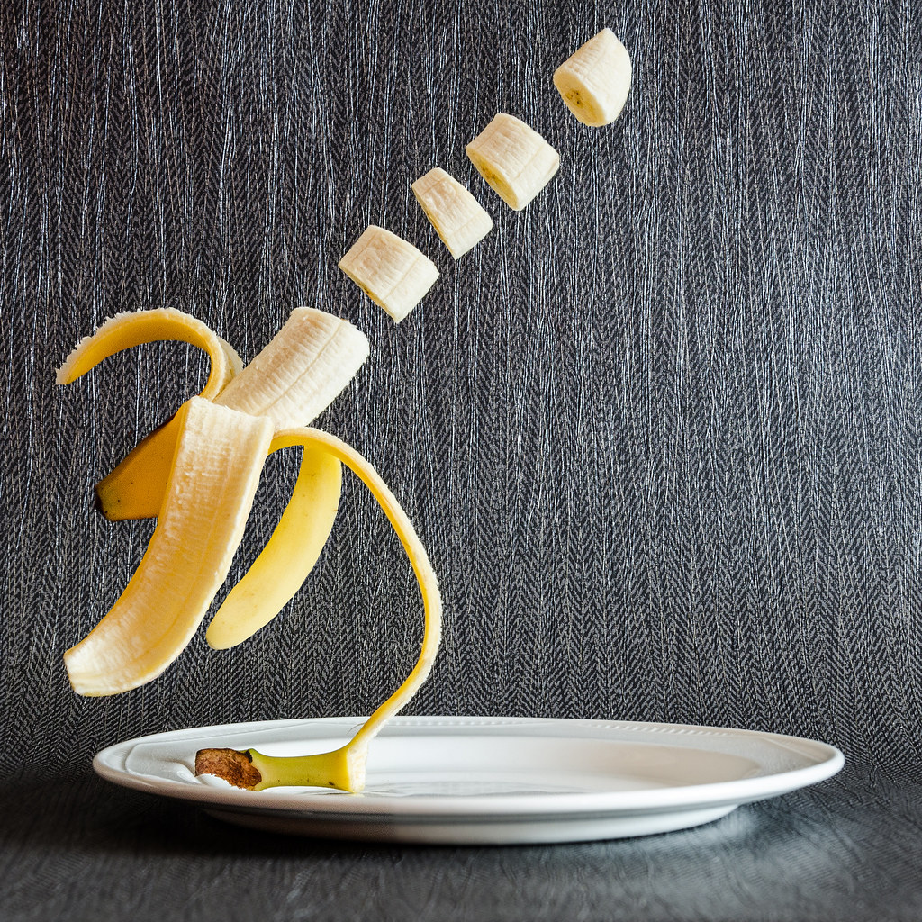
An ordinary banana doing the unexpected!
by David Raynham, on Flickr
 
I like this David, not sure why and have not idea how you did it, may have to google it. I like you wanted to do the star trails, but didnt want to be out on my own for hours doing this, I can see myself getting the chance whilst I am fishing to do this though.
 
Hi David, it's me! I've come to catch up. Sorry it's took so long to get going again after my "crash".

Joiner: well, for me that's not a joiner but it's a nice enough effect. It definitely works much better with the camera than with the counters. I think you put a piece in the wrong place (the strap is in the middle of the lens) but still, it has great potential.

Harris shutter: never tried it myself so hard to comment, I think it's one of those things that "anyone can learn but it's really hard to do a good one"

Duo tone: seems a tad dark, but other than that I like it. :)

Zoom Burst: Great stuff :clap: well done.

Multiplicity: I'm a little bit late to the party, but I agree with the others that although technically excellent, a little bit of interaction between the "characters" would make it even better.

Motion Blur: WOW! love the blue tit (or is it blur tit?) pic! and splash is a real fun shot!

I can see that you are following Evan Sharboneau's course on trick Photography, all well and good and I appreciate that you are learning but I would urge you to put a bit more imagination into the scenes, to make them "yours".

Onward and upward! (y)
 
Last edited:
So, onto March already!! What better way to start it off than with a bit of MARMITE!! :D Selective colour can be very in your face and a bit chavy... Not sure if my images come under that summary or not? :LOL: I've done two, one very much in your face and the other a little more subdued. I think.

Any thoughts? C+C welcome as always! (y)

#1

Marmite for March
by David Raynham, on Flickr
#2

Marmite for March
by David Raynham, on Flickr
 
Last edited:
Looking through these there are a few that jump out at me, the b&w motion blur on the roundabout and the selective colour on the berries are two of these (y)

I did the etc last year and found some of the themes great and couldn't wait to have a go and some I couldn't get no matter how I tried, the Harris shutter effect was one of the I couldn't get no matter what but I think yours is great. :clap:
 
Many thanks for stopping by Cowboy. Really appreciate your comments. Some themes I think I have hit on the head but others I've missed by a country mile. :LOL: it's been great fun so far and much more interesting than my 52 project tbh.

Thanks again.
David.
 
Missed this thread before David, have bookmarked thread to watch it in future

Great work, well executed and clear explanations of how you made the image - keep em coming! :)
 
Hi David, Woah! he's a horrible little fella isn't he? where did you find him? LOL

Great find, but I feel that his image lacks the impact it could have had? There are 3 things that I think would give it more.

1 More contrast - the conversion looks like a de-saturated image rather than one that has been purposely converted to B&W IYSWIW some more contrast would bring out the texture of the stone.

2 "eye" contact with the gargoyle - As he is such a horrible character I think having him look right at me would grab me and keep me there a bit longer.

3 Cropping a huge chunk off the left of the image - for me the composition is out of balance, my eye gets drawn to the lighter empty space behind him.

As you allow edits I have had a quick tinker (I know I've overcooked it, I don't have the time today to do it properly, but it should be enough to demonstrate to you what I mean).

It's all subjective at the end of the day of course, What do you think?

View attachment 7810
 
Morning David. The SC lotus cortina hits the mark for me. Great subject and processing. 2 things from me though. Clone the tree from through the windscreen, and it feels a bit lopsided.... Would it pull out with perspective adjustments or distort tool??
 
Thanks for the comment mate. The bumper is actually pretty much spot on level. I think the lower sill isn't quite straight so makes it look funny. Will give it some attention and see if I can make it look better.

As for the tree, yes, I noticed and thought I'd done it tbh, but I think it was a woman that I cloned out of another shot. Again, will sort it and repost.

Thanks again.
David.
 
Nice pencils David, I have done something similar, just have not uploaded yet :)

I really like the selective colour car as well, is it yours?.
 
Last edited:
Ha, if only mate. I'd be sat on a mint!! It was taken at Donnington Park on Tuesday. There were two in the car park. Found out today that one of them was actually Jim Clarke's that he raced in the series many moons ago. Thanks for the comments :)
 
A little trip out to a local ex colliery site saw me attempt a couple of 'leading lines'. Not the best by any stretch of the imagination but i think they work and fit the theme.
Also another black and white which i have upped the contrast in as advised by Brian above.


Pleasley Pit
by David Raynham, on Flickr


Pleasley Pit
by David Raynham, on Flickr


Pleasley Pit Mono
by David Raynham, on Flickr

Any good? Was hoping to try a time lapse too as there were some fluffy white clouds in the sky but typically, by the time i has got there they had been replaced with horrible grey ones and a few rain showers. :rolleyes:
 
Just had a play with this image from last week. Decided to try a bit of marmite on this shot and thought i'd post it here. Wish there was more interest in the ETC project and i'm suprised it's not more popular. :thinking:

 
Hi David, not sure about the 2 pit monos, the top clouds keep distracting me, not sure if it would help to crop them out? I am no expert though!

I like the car though, nice space for it to drive into.

I know what you mean about the interest in the etc, I'm enjoying it, not done much this month though. I have a weeks holiday in each of the next 2 months so hopefully I will have a lot to add!
 
Hey Lee, thanks for the comments. I think i actually agree about the crop now you mention it. Just a quick tester using the top of the monitor to crop them down and they do look more appealing.

Good luck with your weeks worth of shooting.

Cheers.
 
Hi, missed a few...

Banana, well done here. All looks fine and I like the BG. Just the segments....I'd like them to be a little tidier.

Lightbulb, good lighting :) and well processed. Feel a slight crop would work.

SC #1, good effort. Just a few very small areas that need. Ore work, manly around the edges.

I like sharp, very colourful and the composition is just about on IMO. I'd just like the pencils and shavings a little closer.

I like your final B&W the constellations really stand out.

Good show.
 
Back
Top