Needle & Cotton (1)

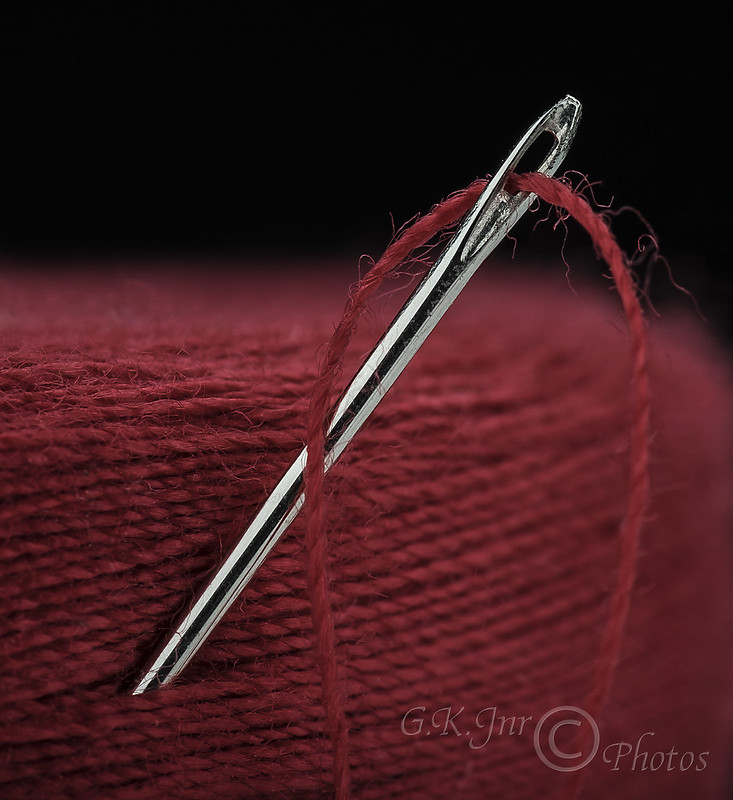
I like that very much George, simple but extremely effective, good composition too with the needle sticking in to the ball of thread. :)
 
I love this - deceptively simple, but very effective. Spot on focus and depth of field.
 
I think you've done really well with this.
I like the stray threads on the cotton, the strong colour against the black background and you've handled the flash well.
Simple but effective.
 
I love this - deceptively simple, but very effective. Spot on focus and depth of field.


+1

Two points George;

• When working a studio shot, the better
practice is to compose prior to SR.

• I think the take could be a tad brighter.

Very nice idea!
 
I really like it George.
Love the fact that you haven't been tempted to play with the sliders and make the colour garish.
 
I like that very much George, simple but extremely effective, good composition too with the needle sticking in to the ball of thread. :)


Many thanks Ma'am, appreciate your comments.(y)

George.
 
I love this - deceptively simple, but very effective. Spot on focus and depth of field.


Thank you Keith, appreciate your comments.(y)

George.
 
I think you've done really well with this.
I like the stray threads on the cotton, the strong colour against the black background and you've handled the flash well.
Simple but effective.


Thanks Dominic, much appreciated.(y)

George.


+1

Two points George;

• When working a studio shot, the better
practice is to compose prior to SR.

• I think the take could be a tad brighter.

Very nice idea!


Thanks for that, appreciated.(y)

George.
 
I really like it George.
Love the fact that you haven't been tempted to play with the sliders and make the colour garish.


Thank you Ruth, I really appreciate your comments.(y)

George.
 
This is great George, lovely composition and great to see something different, top work fella!


Many thanks Neil, really appreciate your comments m8.(y)

George.
 
I like that a lot, George - fantastic detail and lovely composition.


Thank you Emma, much appreciate your comments.(y)

George.
 
Super shot George, excellent choice in the red thread.


Well thank you Ma'am, really appreciate you stoppin' by.(y)

George.
 
A quality image, really nice. The rich red works well with the black and the detail is spot on.

I have 2 very very minor nits though. The first is the black background. I know I just said it works well with the red but as I spend so much efforr trying to avoid black backgrounds I've just developed an aversion to all black backgrounds :p

The second is the transition between subject and background, which is quite central. The image is divided into 2 halves of red and black and I would have preferred slightly more red and less black. It is very minor though as I said.

Great work!


Edit: Ok ignore that last bit... I was looking on my phone and had clicked on the image to fill the screen. Due to the crop, it didn't display the image edge to edge and filled the missing space with black. This merged with your black background and presented me with an alternate presentation where it all appeared very central. When I look at the smaller thumbnail the composition looks spot on and exactly what I was trying to describe!

Another reason to consider avoiding black backgrounds though :p
 
Last edited:
Nice shot here. Would you mind telling us how you lit this please?
Thanks
Dave
 
A quality image, really nice. The rich red works well with the black and the detail is spot on.

I have 2 very very minor nits though. The first is the black background. I know I just said it works well with the red but as I spend so much efforr trying to avoid black backgrounds I've just developed an aversion to all black backgrounds :p

The second is the transition between subject and background, which is quite central. The image is divided into 2 halves of red and black and I would have preferred slightly more red and less black. It is very minor though as I said.

Great work!


Edit: Ok ignore that last bit... I was looking on my phone and had clicked on the image to fill the screen. Due to the crop, it didn't display the image edge to edge and filled the missing space with black. This merged with your black background and presented me with an alternate presentation where it all appeared very central. When I look at the smaller thumbnail the composition looks spot on and exactly what I was trying to describe!

Another reason to consider avoiding black backgrounds though :p

Many thanks Tim, really appreciate your constructive comments.(y)

"I've got similar shots with different coloured backgrounds but didn't like them".:p

George.
 
So well shot and posed. Love the sharp needle and the fading thread.


Many thanks Chris, much appreciated comments.(y)

George.
 
Nice shot here. Would you mind telling us how you lit this please?
Thanks
Dave


Many thanks Dave, appreciate you stoppin' by.(y)

"Lighting was with three studio heads, each with a softbox attached.
One overhead just out of shot slightly behind the subject facing slightly forwards to avoid any light spill on the background and to bring a bit of life to the subjects edges.
One to the right just out of shot with the centre at the same height as the subject and once again facing slightly forwards to bring out a bit of subject edge detail.
One from the left just out of shot with the centre at the same height as the subject but this one at about 45 degrees in front of the subject to act as a fill, this one was set with about 1/2 stop less power than the other two.
The black paper background was about 5 feet behind the subject".

Hope this helps.,

George.

 
Back
Top