weekly Peter 123's 52 for 2022

Messages
5,357
Name
Peter
Edit My Images
Yes
Being new I tried a few different things. I wanted something with the word new in it.
In the end I was spoilt for choice.
I thought the one I used had the most impact.
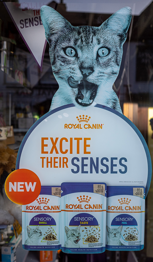
Week 1 5 (1 of 1) by Peter Stephens, on Flickr
 
Last edited:
Hi Peter.
Welcome to the 52 :)
A couple of things to consider with this shot.
(a) Is the white balance correct? It looks a bit blue to me.
(b) The crop. It's quite tight which is possibly hindering composition. As there is a face, I would tend to try to get it on the intersection of thirds. It feels a little high in the image to me, and having more space around the cat would give you the opportunity to play around with the composition.

Of course, this could be exactly as you wanted it :)
 
Thanks Tim.
This was through a shop window and there were many mixed articles in close view. I felt the cropping gave it more impact.
Yes white balance is a little off. I'll check this next week.

Here are two I rejected (although my wife says I chose the wrong one!) (assuming it's OK to post the rejects?)

Week 1 1 (1 of 1) by Peter Stephens, on Flickr

Week 1 9 (1 of 1) by Peter Stephens, on Flickr
 
Edit - question answered now I read the guide!
 
Last edited:
Tim has some good comments. I must admit to looking out for the New Road Layout signs myself, but had I hope a better idea.

Pdte
 
assuming it's OK to post the rejects?
I think you found the answer, but yes, post whatever you like in your personal thread :)

This was through a shop window and there were many mixed articles in close view. I felt the cropping gave it more impact
Ah yes, there are often things that constrain what you can / cannot do.
Potentially consider cropping in even tighter (certainly at the bottom) to give the shot a more balanced feel. There is an art to cropping into images where you purposely crop into some of the subject - the important thing is to make it obvious it was intentional, rather than accidental. :)
 
Ticks the box - I prefer the shoes pic :)
 
Yes that was going to be my contribution before I went out for a walk.
I tried different lighting set ups on a wet day.
Certainly most effort went into this shot.
I just felt the other had more impact.
 
Good start to the challenge!
Personally, I prefer the shoes shot, but they all fit the theme.
 
It meets all the requirements Peter, but I think that I like the shoes the best.
 
Last edited:
(assuming it's OK to post the rejects?

Most weeks, I will post multiple images - sometimes of different subjects, sometimes of different angles, processing of the same subject.

It's your 52, so the way I look at it is that you want to get out of it something that works for you. I like to see comments about the images that I could have chosen, because I certainly don't always get it right with my favourite image.
 
Uep - No1 it is for a well lit and shot image. My only nitpick is the modern hammer and nails. Not needed IMO.
 
Yes wife said that. Hammer is about 15 years old but not used a lot.
 
Great shot Peter, the texture and the light make the first shot pop. I find the other two to be a little dull.
 
Your submission post is certainly the best. Very nicely exposed with the two light sources enhancing the image.
 
I would have gone for your chosen shot. For me the composition and lighting is much more pleasing than the latter two.
 
I think that your composition and light are good Peter. I like the second shot the best. I think that cropping the edges of the canister on the first and third take a little away from it as a the main focus.
 
I'm with Bill. I think the cropping on image 1 is overly tight, so image 2 for me too. Not sure if there was anything restricting getting just a little wider to get all objects completely in t he frame?
 
No nothing. Just that I hadn't noticed it until processing and by then I'd put everything away.
Laziness I suppose.
 
Agreed on the crop comments although I do prefer the inclusion of coffee... goes SO well with the biscotti!
 
I like the one with the coffee in the best but agree about it needing to be slightly wider. Nice use of light.
 
Not a lot of choice this week as my model (our granddaughter who is 5 in a few days) wasn't in the mood to keep still.
Anyway, it's a bottle of "fruit shoot" which she likes but is restricted to one per day.
I thought an "action" shot was a little different.

Week 4 bottle (1 of 1) by Peter Stephens, on Flickr
 
Last edited:
The close crop works well, and the focus spot on given the risk of movement in the shot.
 
Nice slurpage :)
 
Back
Top