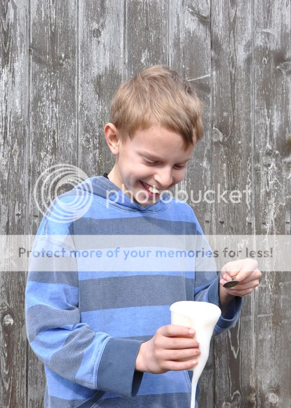
People - well done for going out and getting the shot, and I know exactly how you feel about doing it. Personally I would prefer to see just a crop of the man without the distraction of the lads but can understand why you prefer to keep the whole scene.
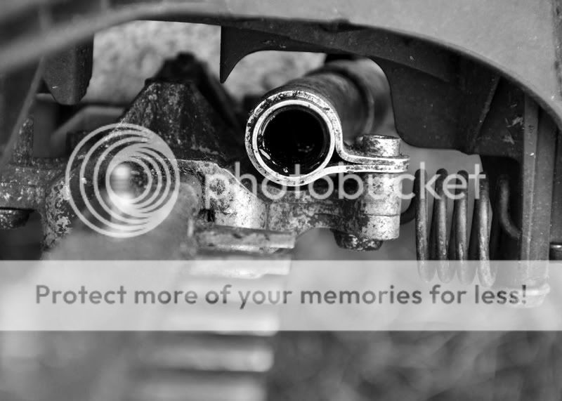
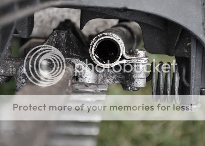
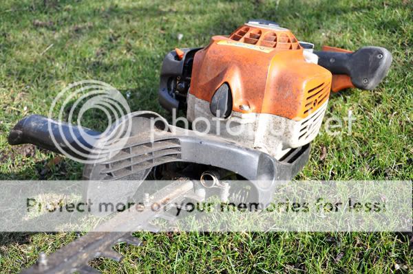
Mechanical - I like your less obvious take on this and use of DOF - makes it looks quite sinister. The grass is a bit too bright for me, though - you might try desaturating the picture a bit, perhaps?
Mechanical - I like your less obvious take on this and use of DOF - makes it looks quite sinister. The grass is a bit too bright for me, though - you might try desaturating the picture a bit, perhaps?
") Your lighting and processing look good, it's just the composition that's not working for me here.
Your lighting and processing look good, it's just the composition that's not working for me here.


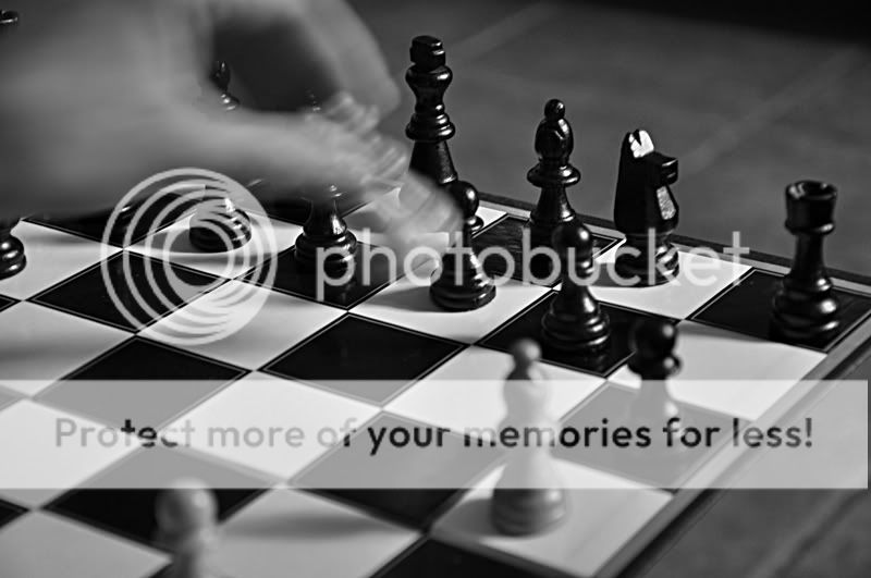
 Nice one Rob! Great composition and the blur looks good.