Grass is 18% grey which is pretty handy outdoors.
This is often stated, yet not necessarily accurate. Different grasses meter at different brightnesses relative to an 18% gray card, unfortunately. For one thing, moisture on the grass can significantly alter its reflectivity, so that depending upon where the light source is located, the surface sheen can mislead the meter. Over a decade ago (when we still had grass in my backyard), I put a gray card out on the grass in both shade and in sun, and measured both with a one-degree spot meter... on average there was around a -1.5 EV difference in brightness, within the
range of -1.2 to -1.7EV difference (grass was less bright than grey card) during that experiment. IOW, the results showed that it will not necessarily match 18% gray card tonality!
Similar urban legend exists about surrogate 18% gray, about the suitability of concrete sidewalks and driveways...there is actually a range of brightness, and the match to 18% tonality is not ensured.
Film vs. digital does not matter...everything (meters and film) is calibrated to the same ISO standards and equations. Period, end of statement.
The only difference is the range of brightness which can be captured from darkest to lightest tone, and the capture characteristic is simply 'different'.. B&W neg vs color neg vs. color transparency vs. which specific camera at what specific ISO. Yes there is some degree of similarity of transparency and digital shooting, in the consideration of highlight detail.
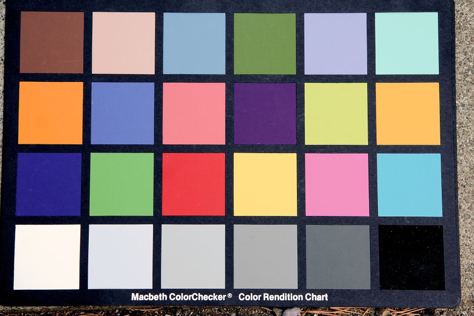
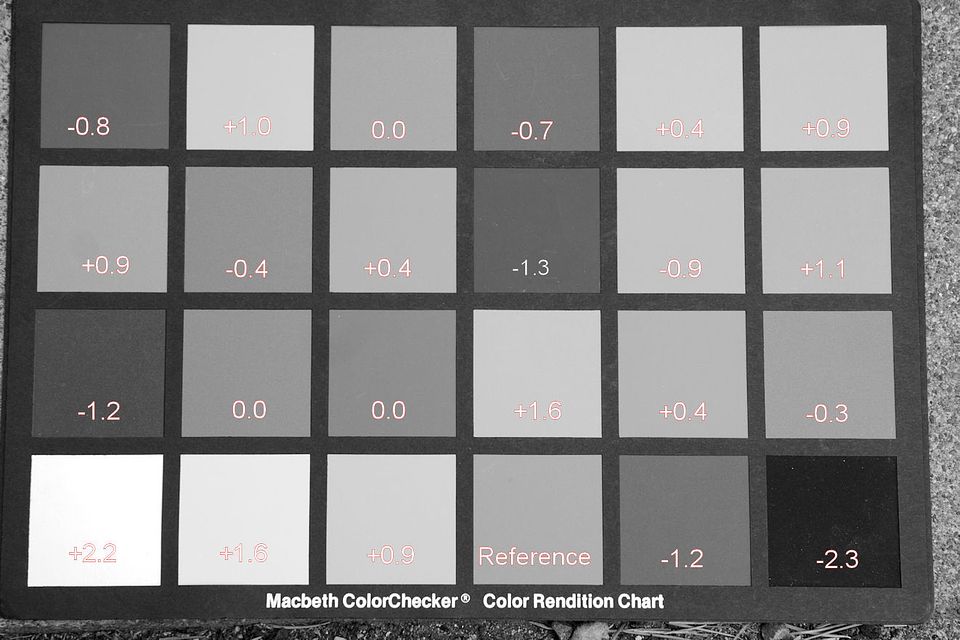
One of the hardest challenges to training your eye about what reflects back as a 'mid-tone' (e.g. 18% tonality) is how COLOR fools the eys. Here is a MacBeth Color Checker card, first, in color then with color removed...look at the color version and identify which ones you think are 'midtone', and then see the B&W version to see how far off your assessment of color happens to be!
This image is the above shot, with Zero setting for Saturation, so I could annotate the photo. The EV values annotated were obtained by taking Minolta spotmeter readings of the actual Colorchecker card using the meter's EV difference capability, with the 18% gray reference patch in the bottom row. (Note there is little correlation simply dialing down Saturation, and the actual brightness value seen by a spotmeter, as seen in desaturated patches labele 0.0! vs the Reference patch)
For me, the use of spotmeter is done as more predicable result than a meter which simply sees an overall scene and is fooled by subject brightness, and when I am in the studio it permits me to adjust lighting so that it all will predictably fit within the narrower range of tones that can be reproduced on the offset printed page, when clients intend for the illustration to be included in printed literature.


")