- Messages
- 18,261
- Edit My Images
- No
That's just the weather this timeThat Betty made a right mess of that grass lol
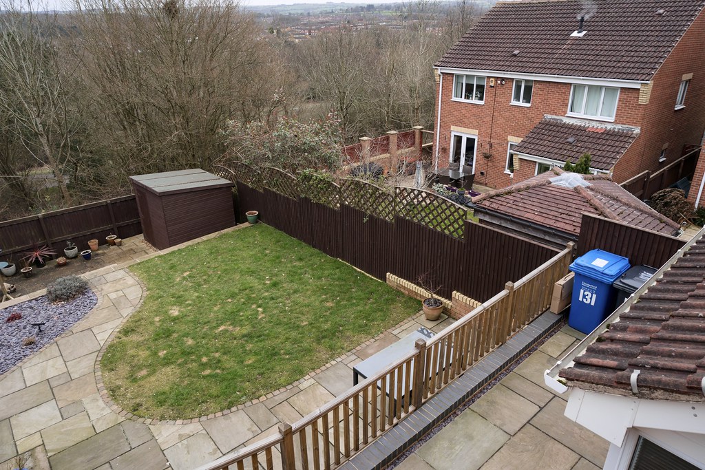
What do these colours look like to everyone? They look spot on on my Mac (colour calibrated) but on my iPad Pro and iPhone Pro there's definitely more of a green cast. I've found this is true in general and I've always gone by the Mac as it's calibrated but I know that the later iPads and iPhones are supposed to have good colour accuracy and so I'm wondering if my images always have a slight green cast?So to give an example of the corners of the 24-70mm f4 here's a shot out of my upstairs window, 24 mm f8 (not the best on here as TP softens massively). Wasn't paying attention so still had it on my wildlife setting so ISO was 1600 "facepalm"
Screenshot 2021-02-21 at 13.29.09 by TDG-77, on Flickr
And 100% crop top left corner
Screenshot 2021-02-21 at 13.29.25 by TDG-77, on Flickr
They are both the sameSo aside from internal lens corrections that we know the camera will make, you've not allowed for different transmission levels (t stop rather than f stop) and colours that lenses produce.
Just ragging on you really, but as presented it's impossible to tell anything other than gross differences.
Colours look fine to meWhat do these colours look like to everyone? They look spot on on my Mac (colour calibrated) but on my iPad Pro and iPhone Pro there's definitely more of a green cast. I've found this is true in general and I've always gone by the Mac as it's calibrated but I know that the later iPads and iPhones are supposed to have good colour accuracy and so I'm wondering if my images always have a slight green cast?
FYI I turn the true tone off on my iPad and iPhone as this makes it look different every time you look at them.
Thanks, this is an example of what I mean. On the top is the image processed to look right on my Macbook (using Color Fidelity as recommended by @dancook), and on the bottom is how I have to process it to look right on my iphone (i.e. to look the same as the top looks on Macbook). On my Macbook the bottom looks far too magenta, but on my iPhone the top looks too greenColours look fine to me
TBH I don't edit images for others and so don't usually worry if what they are seeing isn't quite what I am, however I've spent a lot of time (and money if you factor in the monitor calibrator and colour profile) trying to get colours as accurate as possible and thought that I had, however they look different on different devices so am trying to get a feel of which looks right to most so that I can calibrate accordingly if necessary, therefore I am asking for advice in this situation. I hope that makes sense?With all this colours talk I wonder if people are obsessing too much or looking too much into it to the detriment of their own photography.
I don't think anyone will have looked at a half-decent photograph and gone "if only you shot with brand X the colours would be right" or "did you use Y colour profile because it looks a bit magenta",
Both look acceptable to me, though the upper image does have a hint of green in the paving, while the lower image is warmer with more prominent reds.Thanks, this is an example of what I mean. On the top is the image processed to look right on my Macbook (using Color Fidelity as recommended by @dancook), and on the bottom is how I have to process it to look right on my iphone (i.e. to look the same as the top looks on Macbook). On my Macbook the bottom looks far too magenta, but on my iPhone the top looks too green
FYI the bricks in real life are more of an orangey red.
A9_00387 by TDG-77, on Flickr
A9_00387 iphone by TDG-77, on Flickr
Thanks, and that’s what I’m seeing too. The trouble is, as mentioned above, I don’t know which is closest to real life due to the differences in my screensBoth look acceptable to me, though the upper image does have a hint of green in the paving, while the lower image is warmer with more prominent reds.
If your Mac is properly calibrated it would be best to go with the Mac screen. Tablets, phones and even people computer screens won’t all be perfectly colour calibration. As long as your screen is calibrated it’s best to stick with that and not worry about what others see as it’s not within your control.TBH I don't edit images for others and so don't usually worry if what they are seeing isn't quite what I am, however I've spent a lot of time (and money if you factor in the monitor calibrator and colour profile) trying to get colours as accurate as possible and thought that I had, however they look different on different devices so am trying to get a feel of which looks right to most so that I can calibrate accordingly if necessary, therefore I am asking for advice in this situation. I hope that makes sense?
On the example above if I hold the computer up and look out of my window the top picture looks just like the colours in real life, but if I do the same with my phone the bottom image looks just how they do in real life. I'd like to know which device is accurate and which isn't.
Thanks. That’s what I am doing but it’s just a bit frustrating when I do that but then go to my phone or iPad and go “oh, that’s not as nice as it was”. Clearly a first world problem and not something I’ll lose sleep over, but in the boredom of lockdown I wondered if I could solve itThe top image looks better to me but I'm on my laptop not my main PC. The bottom one looks fine too though so it is probably getting towards the splitting hairs stage. If I had only seen the bottom one I would have thought it looked fine. Keep editing to your tastes
Thanks. As above, it’s all for my own pleasure, I just wish I could get consistency when I go from one platform to the other.If your Mac is properly calibrated it would be best to go with the Mac screen. Tablets, phones and even people computer screens won’t all be perfectly colour calibration. As long as your screen is calibrated it’s best to stick with that and not worry about what others see as it’s not within your control.
Aesthetically the bottom one is more pleasing, but going in between would be pretty much ideal I'd think.Thanks, and that’s what I’m seeing too. The trouble is, as mentioned above, I don’t know which is closest to real life due to the differences in my screens![]()
Maybe I’ll just have to go for somewhere in between![]()
These look pretty good in the corners on my phone, will look at them on the computer tomorrow.OK, I've had to dig a bit to find anything that's going to make a useful comparator. When I shoot at 24mm then very often the foreground running close to the camera goes beyond the plane of focus, and that's of no help at all. These were shot at f11 or f10, basically to deal with that very issue, so f8 might give a touch more sharpness in the right situation.
Original f11
View attachment 309739
Bottom right 100%. NB the shadow recovery has been pushed hard, hence the noise.
View attachment 309740
Example 2, f10 - SOOC whole image
View attachment 309741
Central crop 100%
View attachment 309742
LH bottom edge crop 100%
View attachment 309743
Sorry 24-105 f4. Forgot exif might not make it.These look pretty good in the corners on my phone, will look at them on the computer tomorrow.
Really like the first pic.
You forgot to mention which lens this is?
Just checked on the computer, corners look very good.Sorry 24-105 f4. Forgot exif might not make it.
I wasn't picking on you in particular, I understand what you are trying to get at.TBH I don't edit images for others and so don't usually worry if what they are seeing isn't quite what I am, however I've spent a lot of time (and money if you factor in the monitor calibrator and colour profile) trying to get colours as accurate as possible and thought that I had, however they look different on different devices so am trying to get a feel of which looks right to most so that I can calibrate accordingly if necessary, therefore I am asking for advice in this situation. I hope that makes sense?
On the example above if I hold the computer up and look out of my window the top picture looks just like the colours in real life, but if I do the same with my phone the bottom image looks just how they do in real life. I'd like to know which device is accurate and which isn't.
That’s what I see on my iPadBoth look acceptable to me, though the upper image does have a hint of green in the paving, while the lower image is warmer with more prominent reds.
That’s what I see on my iPad
Doesn't your phone allow for changing the colour gamut.OK so to put my colour 'issues' to bed, I've looked at a selection of the images I've faved on flickr and on the whole prefer how they look on my Mac rather than the phone so am definitely going to use my Mac as the reference![]()
Thanks, that’s definitely the difference. To my eyes the top one is more natural, while the bottom one is arguably more pleasing to the eye (although a tad too magenta for me).That’s what I see on my iPad
You’re really slow these days
I really wish you’d not posted these, I think I’m going to have to swap my 24-70mm for the 24-105mm in the futureOK, I've had to dig a bit to find anything that's going to make a useful comparator. When I shoot at 24mm then very often the foreground running close to the camera goes beyond the plane of focus, and that's of no help at all. These were shot at f11 or f10, basically to deal with that very issue, so f8 might give a touch more sharpness in the right situation.
Original f11
View attachment 309739
Bottom right 100%. NB the shadow recovery has been pushed hard, hence the noise.
View attachment 309740
Example 2, f10 - SOOC whole image
View attachment 309741
Central crop 100%
View attachment 309742
LH bottom edge crop 100%
View attachment 309743
Fixed that for youBut I thought the Northfrumps provedit wasthey are crap?
![]()
did you post that too week ago?You’re really slow these days![]()
bobsyouruncle posted it just over a week agodid you post that too week ago?
yeah not on top of latest and greatest news I'm afraid (been rather busy), may be i should stop posting for now.
Well, there's no Jeremy Kyle these days but Loose Women might be on.did you post that too week ago?
yeah not on top of latest and greatest news I'm afraid (been rather busy), may be i should stop posting for now.
It’s usually just waffle anywaySometimes I miss a day and am 4 or 5 pages behind!
Or birds eyesIt’s usually just waffle anyway![]()
Not sure that beard is the right colour ...
and not enough micro-contrast.Not sure that beard is the right colour ...
I owe you an apology. When you posted your pair of images a second time, they appeared smaller than the first set and it *looked like* you were on a p***-take. I had not realised that they were linked to Flickr with larger images behind them, hence my reaction. The mistake was mine, and I'm sorry I misunderstood what you'd done.You certainly are!
Obviously somethings rattled your cage this today. You either see a difference or you don't.![]()
Reminds me of the time of mates dad played for our football team years ago when we had about 4 games in a week at the end of the season. My mates dad was very fit running ultra marathons etc and had a big white beard. He never took prisoners on the pitch and always surprised a few with an early crunching tackle they weren’t expecting! One game the oppositions 20 year striker wasn’t happy about being taken out by ‘Captain Birdseye’ as he called him.