crusher
Greengrass
- Messages
- 4,495
- Name
- Keith
- Edit My Images
- Yes

yes not bad considering so many photographers don't like sc, great job on these edits")


that's so weird graham, I was thinking of doing something similar, but using the view of a church from the street. It works well

take pic,
duplicate,
turn one b&w
add layer mask to b&w pic,
brush in colour you want,
when happy flatten
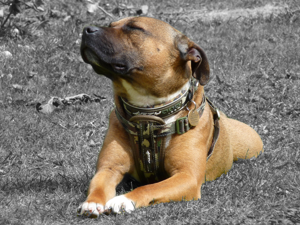
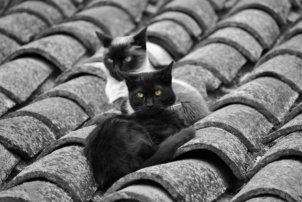
An old one from me.
Matt.
 this was mentioned on another thread, just spent five mins trying to find it, only then saw you had just posted it on here


crusher said:
Have to say I don't dislike a bit of selective colouring here and there when done well, but there are some really poor ones on here with a few superb efforts inbetween IMHO.
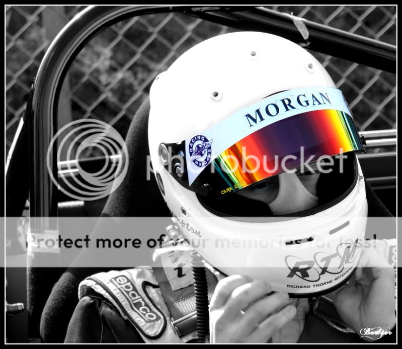
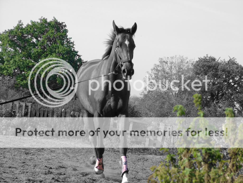
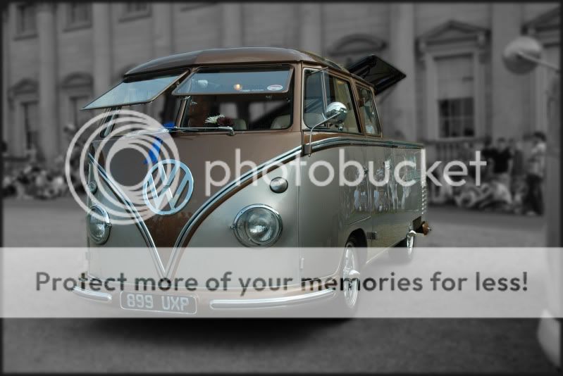
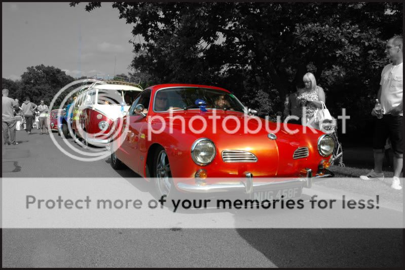
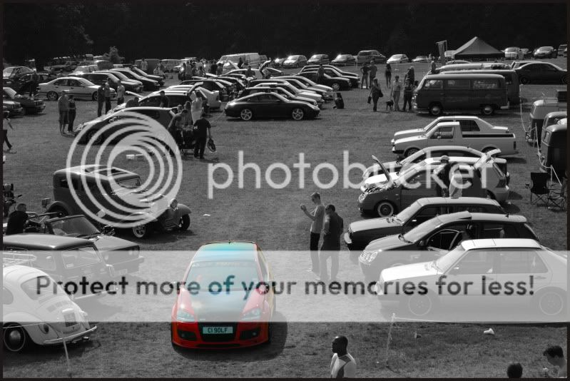
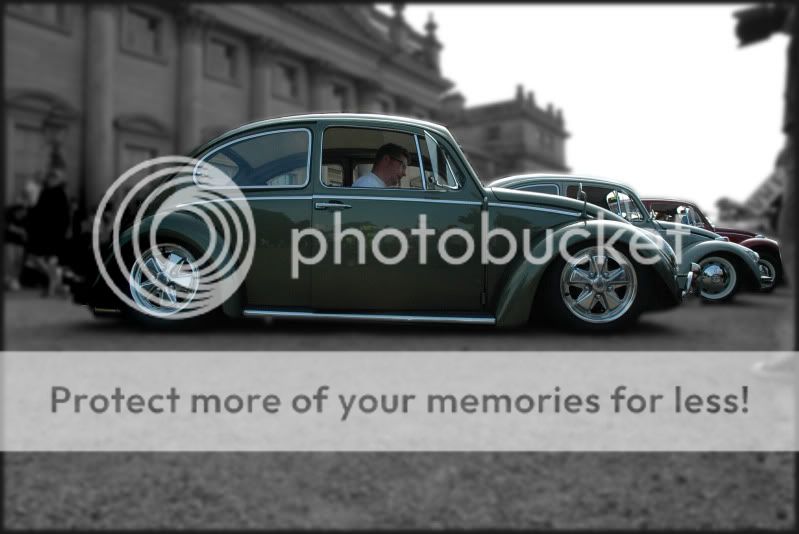
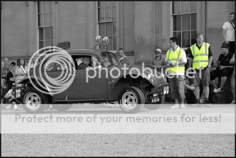
a few of mine from vwfestival last year
Have to say I don't dislike a bit of selective colouring here and there when done well, but there are some really poor ones on here with a few superb efforts inbetween IMHO.
Not everyones great at editing pics, you wont improve if you dont try.