You are using an out of date browser. It may not display this or other websites correctly.
You should upgrade or use an alternative browser.
You should upgrade or use an alternative browser.
weekly Wornish's 52 2023 Week 52 added: Favourite 2023 Image
- Thread starter wornish
- Start date
- Messages
- 3,145
- Name
- bill
- Edit My Images
- Yes
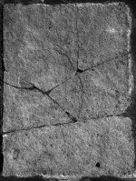
That's nice David, very simple but it capture the texture of the stone really well and makes for an interesting image.
- Messages
- 1,680
- Name
- David
- Edit My Images
- Yes
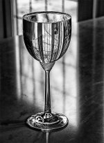
It was taken in the Kitchen with the glass on the worktop I did re-position the glass and the camera a few times to get the light and reflection as I wanted it.Lovely lighting and thought the glass was chrome when first looked at it.
Was the glass placed at just the right spot for the light or lot of editing?
- Messages
- 3,145
- Name
- bill
- Edit My Images
- Yes
Beautiful shot David. Not sure that I believe you about it being just water...
- Messages
- 1,293
- Name
- Stuart
- Edit My Images
- Yes
Getting a catch-up on some comments!
Snappers Choice - Very interesting shadows. It's a bit busy and might benefit from being simplified.
Knob(s) - I had to zoom in to see you. Does it extend past the right or finish, if the latter I would prefer seeing the whole item.
You could "take your eye" out with those strings on the guitar head!
Letters - I prefer the colour version, it has more impact.
Kitchen - Interesting shadows from the fork with good detail on the prongs.
Broken - Nice textures, could see it being used as a background in a composite too.
Full - Great choice of the glass. Did you manage to fill it to the brim first time? Might benefit from a small crop at the right edge to remove the brighter area.
- Messages
- 4,350
- Name
- Martin
- Edit My Images
- Yes
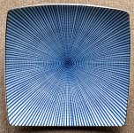
That top one reminds me I'm afraid of heights! Looks like a portal to another dimension.
- Messages
- 4,696
- Name
- Pete
- Edit My Images
- Yes
That is some mind bending pattern. And quick off the mark again.
- Messages
- 3,145
- Name
- bill
- Edit My Images
- Yes
Love your chosen one David. Makes me cross-eyed if I stare at it too long...
- Messages
- 4,696
- Name
- Pete
- Edit My Images
- Yes
Is that a roll of Kitchen paper or a loo roll?
- Messages
- 1,680
- Name
- David
- Edit My Images
- Yes
Loo Roll !Is that a roll of Kitchen paper or a loo roll?
- Messages
- 3,866
- Name
- Simon
- Edit My Images
- Yes
That's certainly helped David, although it was an observation rather than a criticism. I suspect it's tricky to resolve completely. I wouldn't know how to go about it for sure although I suppose there might be some sort of solution tucked away in one of my PP applications. It doesn't detract from the main subject - I just love that colour!!
- Messages
- 1,680
- Name
- David
- Edit My Images
- Yes
The third one is part of a Magnolia bushNice images, a;; would be OK for the theme, shame about the aberration on the tulip though

