weekly Marsha's photo 52 2012 is complete. NSF Dieters!

Almost on time!!!

This wasn't my original idea! But I decided to use this week as a lesson in flash work! This is my daughters birthday present for next month, she is obsessed with telling the time.


F5, 1/20 sec, ISO 400, 100mm macro, hand held and manually focused.

This was taken with a flash on the right set to +1 bounced off the ceiling, one on the left aimed at the watch set at -1 to reduce shadows and the built in pop up flash on!

Apart from a little crop and tweak to levels on the watch face this is as shot. My flash case was used to provide the black background!

C&C welcome.

Now onto week 34 :wacky:
 
Last edited:
Hi, Marsha, missed and few and just returned from holiday so quick comments called for as loads to catch up on:

Letter, love these and they always make me smile. Well executed and well composed, that said, think I'd like the letter at a bit more or an angle.

Contrast #1 for me. Well exposed and sharp. Quite moving that the empty spaces on the wall will likely be filled up at some point.

Mineral, hmmm, not keen on this one. Nice idea but to me it looks like a composite photograph.

Dark, back on form :clap: Reminds me of a scene out of X Files. Dark it is, with nice highlights and star burst.

Time, well composed with nice depth and colours. Like the negative space and the angle used is great.

Cheers and off to see what week 34 is :bonk:
 
Hi Andy:wave:

posiview said:
Letter, love these and they always make me smile. Well executed and well composed, that said, think I'd like the letter at a bit more or an angle.
Cheers Andy. I tried angling it sloping towards the letterbox but it wouldn't sit still, so had to settle on the flat!

Contrast #1 for me. Well exposed and sharp. Quite moving that the empty spaces on the wall will likely be filled up at some point.
Glad you like this one.

Mineral wasn't a great shot, I must locate my lump of Vesuvius ready for a reshoot!

Dark and Time are such extreme ends of the scale, one barely lit and one as much as possible:nuts:

Now on to Body :thinking: Anyone daring to visit a morgue?
 
I like your take on time Marsha, quite literal but it really works.
The vivid colour of the clock makes it for me very pleasing on the eye. Good work on using your flashes, it certainly sounds as if you have the lighting cracked. Iain
 
Hi Marsha - Given the explanation for the amount of lighting used this is incredible. Superb control of DOF and colour, and hand held! Well shot
 
Hi Marsha

Like your idea for mineral , neat use of your earing...but the bit that catch's my eye is the petal edges...they are glistening , almost like minute gem stones:)

Dark.....just a little too Dark for me , do like the star bursts though & the mono suits given the colors you mentioned (y)

Time...yup , agree with others comments so far , nice angle , complicated lighting that gives a good effect , nice POV (y)
 
Sorry it's brief - I'm lagging behind again! :(

Contrast - I think the explanation is needed, but the image is fantastic.
Mineral - Sounds like it was a tricky shot to get! Woeth the effort though, colours are fab and the metal on the earring is very well handled too.
Dark - Very much on theme. Those floodlights look fabulous.
Time - Good colours, excellent lighting. Sounds like it was a successful lesson :)
 
nice control of the lighting there, like the composition too. Very good shot.
Cheers Michael.

I like your take on time Marsha, quite literal but it really works.
The vivid colour of the clock makes it for me very pleasing on the eye. Good work on using your flashes, it certainly sounds as if you have the lighting cracked. Iain
Thanks Iain, I didn't actually say but this is a watch! It amazes me that I've gone from clueless to suddenly understanding flashes and symbols on it, I can't say I've got it cracked but I'm getting there!

Given the explanation for the amount of lighting used this is incredible. Superb control of DOF and colour, and hand held! Well shot
Thanks John

Like your idea for mineral , neat use of your earing...but the bit that catch's my eye is the petal edges...they are glistening , almost like minute gem stones:)

Dark.....just a little too Dark for me , do like the star bursts though & the mono suits given the colors you mentioned (y)

Time...yup , agree with others comments so far , nice angle , complicated lighting that gives a good effect , nice POV (y)
Cheers Lynne. I actually found another shot for mineral I'll add it to the original post shortly as I now don't like the original one:bonk:

Sorry it's brief - I'm lagging behind again! :(

Contrast - I think the explanation is needed, but the image is fantastic.
Mineral - Sounds like it was a tricky shot to get! Woeth the effort though, colours are fab and the metal on the earring is very well handled too.
Dark - Very much on theme. Those floodlights look fabulous.
Time - Good colours, excellent lighting. Sounds like it was a successful lesson :)
Thanks for dropping in Vicky, I'm struggling to keep up with everyone just now!

Ok so I have FINALLY started tackling my mess that is photo filing! I've got stuff in folders everywhere and no organisation, so obviously found photos I forgot to upload:bonk: I'll get them up shortly in the original posts and put links here.
 
Ok, so I'm a bit behind on my photo sorting and filing, I found another shot for mineral that I quite like and the original one I took for letter but wasn't going to use, but I actually like the colours so I've uploaded it!

Both added to the original posts if any of you have time to take a peak.
 
What a great watch for a child learning to tell the time. I've never seen one of these before. I like the shot. Nice and clean with good use of a small DoF.
 
What a great watch for a child learning to tell the time. I've never seen one of these before. I like the shot. Nice and clean with good use of a small DoF.
Cheers Peter, this watch is superb. She's too young to read the words just now but she was gutted when her cheap plastic Peppa Pig watch broke so I hope she loves it!

Marsha - time - super shot - I'm going to persevere more with my flash guns - many thanks for the inspiration
Thanks Mike, get them flash guns out! I learnt a lot from the DSLR module to do with slow sync speed and all about the first and second curtain! That and high speed flash and understanding the symbols has helped a great deal :bonk:

ooo ooo ooo I've got body sorted, with 43 minutes left of this week to spare:D :banana: :woot:
 
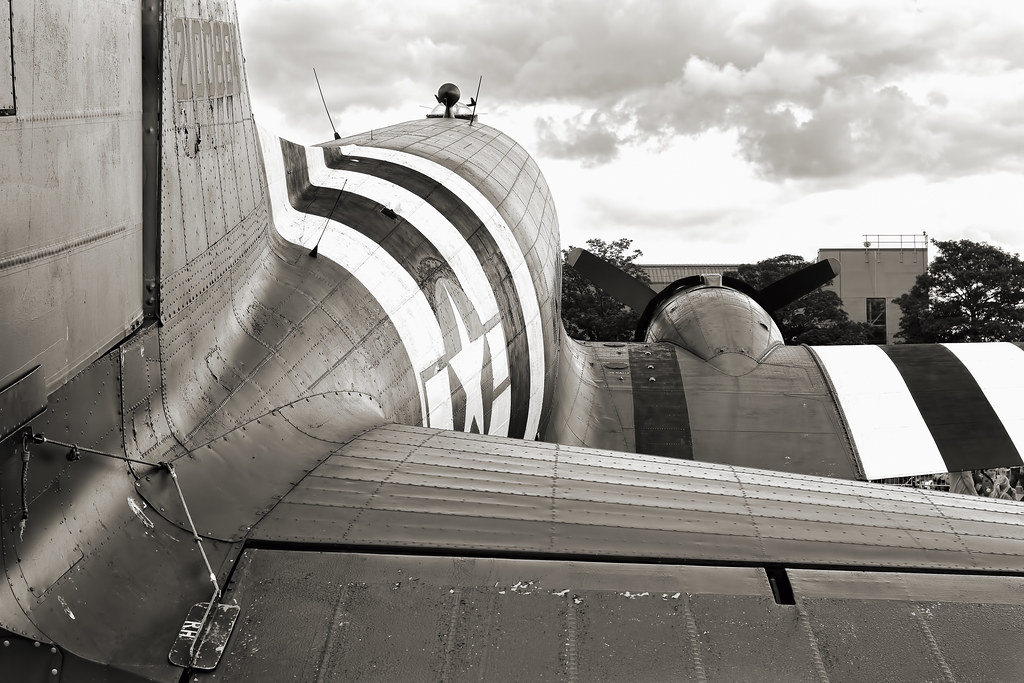
The plan to photograph my hubby's muscular physique didn't come to fruition so I settled for this:

The fuselage, or body of an airplane:

A Dakota aircraft, part of the Battle of Britain Memorial Flight:


F8, 1/125, ISO 100, 40mm pancake lens.

Opened twice in ACR, once to adjust the exposure in the sky and the second to just tweak the main body of the aircraft.
I reduced saturation in the shot then SC'd back in everything except the tree and building on the right and the people under the right wing. To be honest it looks almost mono anyway with the grey drab sky and grey aircraft body, but there is a hint of blue to the paint work.

A B&W conversion:


C&C welcome. I'm in on time (just) for the first week in a month or two :D
 
Last edited:
I do have to say the Dakota is a superb aircraft. I do like the framing and pp you've given this one. It's a pity about the modern hanger in the background but there's nothing you could have done about that - or maybe there was given your job :LOL:
 
I agree with the above comment the building and the trees in the bg sort of get in the way
 
Delta Skies said:
I do have to say the Dakota is a superb aircraft. I do like the framing and pp you've given this one. It's a pity about the modern hanger in the background but there's nothing you could have done about that - or maybe there was given your job :LOL:

Alas I don't work at this unit anymore:bonk: Although these hangars are probably as old as the Dakota, the military don't waste money on things like infrastructure!!!
I could PP the building and trees out, but it would probably look odd!

Cheers for dropping in.

Almost ready for week 35:nuts:
 
I like your take on body Marsha, your edit on it suits it well. I particularly like the contrasty feel to it, brings all the detail out in the aircraft.
As Lynne says, the hangar and the people don't distract my eye at all. I find myself looking around the photograph but never really straying away from the main subject. Good work and on time (just) :LOL: Iain
 
Cracking aeroplane. Like the desaturated feel to it.

I do feel, though, that there's a better perspective in there...personal opinion, I guess, but I'd like to see a photograph from the lower left up the body.

Then, that's just me. Some real detain in the aeroplane.

Cheers.
 
I do feel, though, that there's a better perspective in there...personal opinion, I guess, but I'd like to see a photograph from the lower left up the body.
Dammit, I tried a number of different angles on the right and a variety of apertures, didn't think about the other side of the aircraft:bonk: I guess you mean so you can read the shot left to right:thinking:

Thanks for dropping in Andy.

Nice one Marsha, really like the angle of view and the selective colour works really well. How are you finding the pancake lens?
I'm quite enjoying it, I've not used it much though as I've been a little too busy. But it's so small and great if you want to take a big camera that isn't going to feel like you're back packing!!
Glad you like the shot.
 
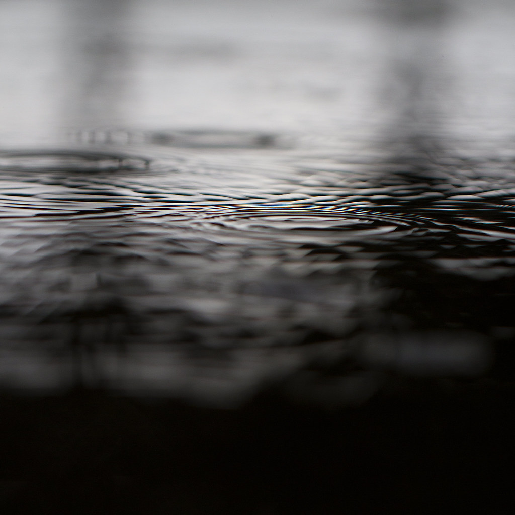
A monstrous storm hit here earlier so what do I do? Grab the camera and open the door! Potentially scare the hell out of my kids as the thunder was MUCH MUCH louder, but they coped thankfully!

That didn't work, so I grabbed the macro lens and ran out to the puddle in the road right outside my house. I only had a minute or two as dinner was cooking and I was worried about the very heavy rain on my non weather proofed camera body!

I've wanted to take shots of rain drops in puddles for a while but never had the chance. For some reason this shot came out almost black at the bottom and I timed it perfectly that I didn't get a single splash, deliberately obviously:whistle: I really like the simplicity of this.


F2.8, 1/1000sec, ISO 400, 100mm macro.

Only a square crop, straighten (and to those with OCD, I had the ruler out and tried various other angles, this is the best option) and slight sharpen give.

I'm hoping to have a go at something else, but we'll see.

C&C welcome as always, thank you.
 
Last edited:
Oooooh get us, posting so early in the week :LOL:
I like your take on the theme Marsha, its a simple yet effective interpretation.
I particularly like the recession from black near the bottom through the greying ripples middle to the almost white at the top. It gives the photograph depth.
I can't offer any critique (cop out I know) but I just think it works. Good work, well spotted and executed. Iain
 
Nice and simple and certainly says liquid and very brave going into the wet with the camera
 
Body - I like this one, the perspective works for me. I'd be tempted to try it in B&W though, I think the contrast and tones might bring out something quite special.

Liquid - Gorgeous! I love the simplicity too. Really well done.
 
it could be any liquid, very nice :clap:
 
Hi....well Liquid passed my 'blink' test...I tend to go with my first reaction and it was good. Nice and simple with good detail where needed.

I wasn't sure about the black band across the bottom, but it gives the feeling that part of the camera is under the liquid.

Cheers.
 
A great shot again Marsha, I like the black at the bottom and how it leads your eve up to the white at the top.The ripples have a lot of interest in them and you did well to not get any actual drops in it!:LOL: I hope youre recovering from your accident!:)
 
Oooooh get us, posting so early in the week :LOL:
I like your take on the theme Marsha, its a simple yet effective interpretation.
I particularly like the recession from black near the bottom through the greying ripples middle to the almost white at the top. It gives the photograph depth.
I can't offer any critique (cop out I know) but I just think it works. Good work, well spotted and executed.
Cheers Iain, it is nice to post early:) I have two other shots with this, I just need to get the others uploaded.

Nice and simple and certainly says liquid and very brave going into the wet with the camera
Thanks, I wasn't out long and tried to keep my head over the camera to keep it dry:nuts:

Body - I like this one, the perspective works for me. I'd be tempted to try it in B&W though, I think the contrast and tones might bring out something quite special.

Liquid - Gorgeous! I love the simplicity too. Really well done.
Thanks Vicky, I'll try the Dakota in B&W and get it uploaded. Glad you like my liquid shot.

it could be any liquid, very nice :clap:
It could, it looks like oil let alone water! Thanks for dropping in, I've looked at your shots just not commented yet:bonk:

Hi....well Liquid passed my 'blink' test...I tend to go with my first reaction and it was good. Nice and simple with good detail where needed.

I wasn't sure about the black band across the bottom, but it gives the feeling that part of the camera is under the liquid.
I never looked at it like that Andy but it does have that under water feel!

A great shot again Marsha, I like the black at the bottom and how it leads your eve up to the white at the top.The ripples have a lot of interest in them and you did well to not get any actual drops in it!:LOL: I hope youre recovering from your accident!:)
I did well with all that rain to avoid a single splash:bonk: I am on the mend thank you, lots of drugs help! It's bad that I'm so used to rib pain! I still managed to drag my camera out for our families day and mini air show last week!!!

Liquid - " I really like the simplicity of this" - Me too!
Cheers Mike.
 
Hi Marsha

Mineral - clever and well executed but the dragonfly does look as if it has been stuck on, rather than part of the shot.

Dark - excellent shot. Lovely rhythm of the hangars, the small lights, the spotlights. Black and White is perfect for the shot and theme.(y)(y)

Time - Well handled lighting and good emphasis with the pov and dof.

Body - well on theme for me . i agree that the desaturation helps the shot a lot. Pity about the b/g building etc at right hand side but that angle was always going to get that intrusion.

Liquid - very very good :clap: Agree with points made about the graduation of colour from black at bottom to white at top and good capture of the ripples. And done on the spur of the moment too (y)
 
Time, Like it, nicely lit, and the DOF works great. That's a colourful watch too
Body, fits the theme and works for me...
Liquid, Simple yet very effective. I like the way that's come out.
 
I was at work when I saw the fire escape door open and some glorious blue sky lurking! So I grabbed my phone and went outside and looked up the fire escape!!

Up 1

Taken on my iPhone, edited in Snapseed then transferred to my pc and had some noise removed with Topaz Denoise!

Then I went upstairs to the glass fish bowl bit where I work. The sun was setting and I had one chance so grabbed quite a poor shot of the ladder leading to the top of ATC where some of the aerials are. This went through the same software but converted to B&W gives a lot more punch I think? You can see where the ladder is reflected against the glass, that's where I work!

Up 2


C&C welcome as always.
 
Time, Like it, nicely lit, and the DOF works great. That's a colourful watch too
Body, fits the theme and works for me...
Liquid, Simple yet very effective. I like the way that's come out.
Thanks John.
I agree with Andy in that the black band makes it look like an underwater shot. I'd probably go for a higher crop. I like the overall feel to it.
Cheers Peter. I think Andy likes the underwater feel:thinking:
Hi Marsha

Mineral - clever and well executed but the dragonfly does look as if it has been stuck on, rather than part of the shot.

Dark - excellent shot. Lovely rhythm of the hangars, the small lights, the spotlights. Black and White is perfect for the shot and theme.(y)(y)

Time - Well handled lighting and good emphasis with the pov and dof.

Body - well on theme for me . i agree that the desaturation helps the shot a lot. Pity about the b/g building etc at right hand side but that angle was always going to get that intrusion.

Liquid - very very good :clap: Agree with points made about the graduation of colour from black at bottom to white at top and good capture of the ripples. And done on the spur of the moment too (y)
Cheers Alan. I'm not happy with Mineral, it was stuck on, literally! That's one that's up for a reshoot:bonk:
 
The colour one is fantastic. I was looking at it and marvelling at the textures you've managed to capture, then read that you took it on your phone. Amazing! The leading lines, the textures, the colour, the concentric shape... totally awesome.
 
Back
Top