- Messages
- 242
- Name
- Vicky
- Edit My Images
- No
I've started at week 25, playing catch-up on the first 24!
Week 1 : Direction
Week 2 : Fear
Week 3 : Sigh
Week 4 : Sweet
Week 5 : Secure
Week 6 : Industry
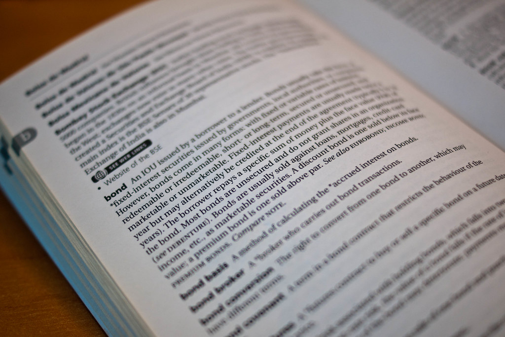
Week 7 : Root
Week 8 : Handmade
Week 9 : Money
Week 10 : Win
Week 11 : Shiny | Reshoot
Week 12 : Magical
Week 13 : Vice
Week 14 : Entrance
Week 15 : Soft
Week 16 : Pride
Week 17 : Short
Week 18 : Flight
Week 19 : Authority
Week 20 : Leave
Week 21 : Random
Week 22 : Temperature
Week 23 : Abstract | Reshoot
Week 24 : Symmetry
Week 25 : Moody
Week 26 : Joy
Week 27 : Small
Week 28 : Straight
Week 29 : Letter
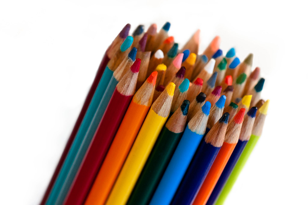
Week 30 : Contrast
Week 31 : Mineral
Week 32 : Dark
Week 33 : Time
Week 34 : Body
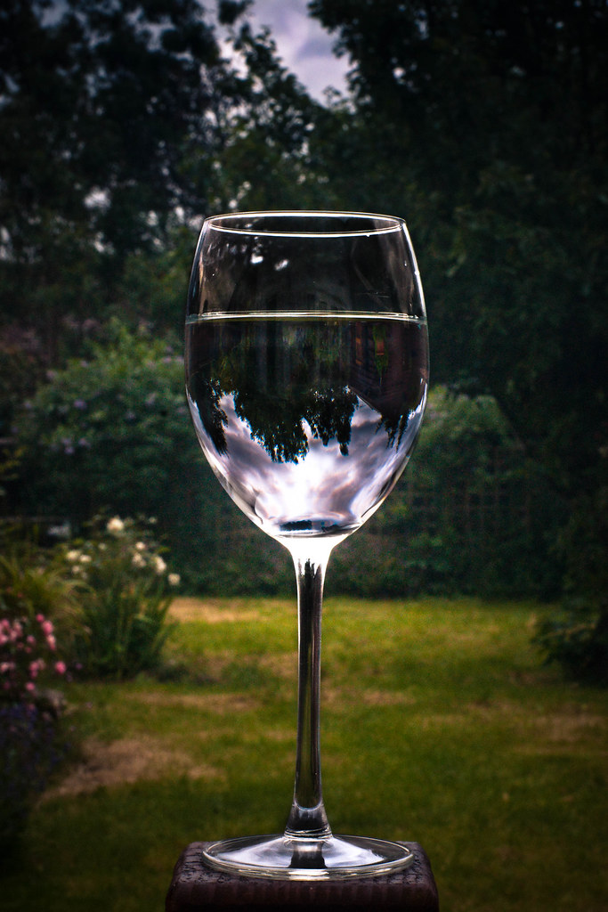
Week 35 : Liquid
Week 36 : Up
Week 37 : Duo
Week 1 : Direction
Week 2 : Fear
Week 3 : Sigh
Week 4 : Sweet
Week 5 : Secure
Week 6 : Industry
Week 7 : Root
Week 8 : Handmade
Week 9 : Money
Week 10 : Win
Week 11 : Shiny | Reshoot
Week 12 : Magical
Week 13 : Vice
Week 14 : Entrance
Week 15 : Soft
Week 16 : Pride
Week 17 : Short
Week 18 : Flight
Week 19 : Authority
Week 20 : Leave
Week 21 : Random
Week 22 : Temperature
Week 23 : Abstract | Reshoot
Week 24 : Symmetry
Week 25 : Moody
Week 26 : Joy
Week 27 : Small
Week 28 : Straight
Week 29 : Letter
Week 30 : Contrast
Week 31 : Mineral
Week 32 : Dark
Week 33 : Time
Week 34 : Body
Week 35 : Liquid
Week 36 : Up
Week 37 : Duo
Last edited:
")