
You are using an out of date browser. It may not display this or other websites correctly.
You should upgrade or use an alternative browser.
You should upgrade or use an alternative browser.
weekly Z1805's 52 for 2013 - 5+6: Space + Work
- Thread starter z1805
- Start date
Great take on the theme and I like it in colour, agree with the other comments about the RH side.
Thank you. Maybe I should have put up a colour cropped image then. Oops.
I like the original thinking for the topic, as usual in this thread its amazing the variation we get
I like the black and white re edit personally
Hopefully this week will be original as well, I think the idea just about works.
I apologise that I'm not always getting around to comment on everyone's photos, it's all I have time for to do this -- I forgot about it completely until yesterday -- and rarely have anything to add to what's already been said.
Anyway, this is hopefully supposed to show that gravity stops people falling off the bottom of the earth. Or something like that.
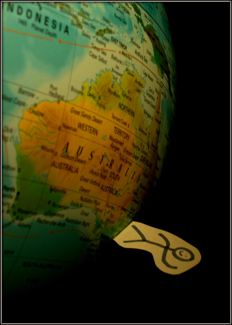
Week 3 - Gravity by z1805, on Flickr
Brian_of_Bozeat
Jeff
- Messages
- 3,235
- Name
- Brian (not Jeff)
- Edit My Images
- No
haha, very creative! - great fun and spot on the theme. ")
exposure is perfect, I like what you have done with the dark bg hinting that the globe look a little like it's out in space.
10 out of 10. Looking forward to next weeks pic.
exposure is perfect, I like what you have done with the dark bg hinting that the globe look a little like it's out in space.
10 out of 10. Looking forward to next weeks pic.
haha, very creative! - great fun and spot on the theme.
exposure is perfect, I like what you have done with the dark bg hinting that the globe look a little like it's out in space.
10 out of 10. Looking forward to next weeks pic.
Technically it was out in space, I hung it from a beam. I was going to try getting the whole thing in it, but it always came out blurred, I'm assuming that the house moves slightly and that's enough to be caught on camera at longer shutter speeds.
Thank you
Interesting take, Z. Very simple and effective.
Thanks.
- Messages
- 125
- Name
- Jamie
- Edit My Images
- Yes
That's great The first photo of the year that has made me actually laugh out loud
Minor niggle is that the man isn't fully in focus at the head, but that's a really good photo
The first photo of the year that has made me actually laugh out loudMinor niggle is that the man isn't fully in focus at the head, but that's a really good photo
like the contrast of the colours against the background, can;t really think of much else you could have done that would improve it.
Maybe raise the ISO a bit - (this was at 100), to speed up your shutter to combat the movement blur?
I was too baffled by the thought of the house moving enough to be caught on camera (I honestly can't think what else it might have been seeing as the door and window as shut and there would be no draughts) to think of such a sensible solution. I'm always paranoid of increasing the ISO too much now after I ruined a whole load of photos by doing that before I properly understood what it did.
That's great
Minor niggle is that the man isn't fully in focus at the head, but that's a really good photo
I wanted to do something different to everyone who was playing with fake wine, and the only thing that I could think of was an old kids program where a family moved to Australia and the son was wearing boots filled with lead to stop him falling off the bottom of the earth.
 I'm really glad you enjoyed it.
I have to admit, I completely forgot about the man, was concentrating on getting the writing on the globe in focus. If I was to reshoot I would get the whole thing in focus, I'm not too keen on the soft focus towards the LHS now, it's not pronounced enough for my liking.
haha, great concept and interpretation.
photo-wise, great composition, evenly lit. not sure if tungsten is the white balance you wanted but it IMO works.
Anything else threw out the colour of the globe and it just looked boring. I'd never be satisfied with the colours on the stick-figure because my black pen decided that it wanted to be a gray pen instead and I didn't have another.
- Messages
- 13,760
- Edit My Images
- Yes
Hahaaaaa another fun shot - Great composition and a great idea !!!!
Hahaaaaa another fun shot - Great composition and a great idea !!!!
I like it, nice idea and well executed.
Thank you both.
Really like this idea. I had a similar idea of spinning a globe but it just didn't look right!
I couldn't even get a photo of a stationary globe, let alone it spinning right! (Really want to try that now...)
- Messages
- 8,398
- Name
- Lynne
- Edit My Images
- Yes
Hi Z
novel take & made me giggle like the bg as it does appear to be floating...& good focus on the writing
novel take & made me giggle
like the bg as it does appear to be floating...& good focus on the writing
M
Mad Hatter
Guest
Interesting take, Z. Very simple and effective.
Agree, made me laugh, Good blend of colours and BG, Fine job
Hi Z
novel take & made me giggle
Agree, made me laugh, Good blend of colours and BG, Fine job
Thanks, glad you found it amusing
I really don't like either of the photographs I got for 'Wild', but can't think of any other ideas so I'm stuck with them unfortunately.

Week 4 - Wild by z1805, on Flickr
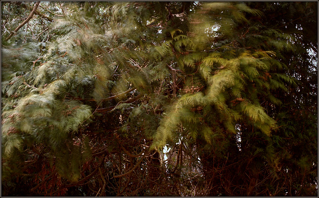
Week 4 - Wild (2) by z1805, on Flickr
- Messages
- 1,353
- Name
- Chris
- Edit My Images
- Yes
Like the rainy window although would have been better with the whole handle in.
Not sure about the other one...
Not sure about the other one...
ChrisR
I'm a well known grump...
- Messages
- 11,034
- Name
- Chris
- Edit My Images
- Yes
I definitely preferred the second, although perhaps a bit more of a focal point would have helped? In the first the handle really distracts me! I know it's difficult getting a rainy window to have a compositional element, but I don't think this one quite works.
Like the rainy window although would have been better with the whole handle in.
Not sure about the other one...
I agree with the whole handle, I just saw the window while trying to get a different angle on the trees and shot off a few quickly so didn't pay too much attention because I didn't think they'd be good for anything at all.
Prefer the first one as I don't think the second has much of a focal point? Echo the comment about the handle too. Nice shots!
I agree with the focal point, but I couldn't think of anything to put there as the focal point, and I wasn't keen on getting the camera wet on a hunt for a nice blustery tree with a focal point (I was lazy and shot that out the window).
Personally I like the 2nd. Really like the motion and the colors.
Thanks.
Limited time, I'm afraid, so quick comments...
Neither scream Wild but it's there. Sometime the themes just don't inspire us.
Cheers.
I definitely noticed that with 'wild', and also struggled with the most recent two, but that was more with time, rather than the themes.
I definitely preferred the second, although perhaps a bit more of a focal point would have helped? In the first the handle really distracts me! I know it's difficult getting a rainy window to have a compositional element, but I don't think this one quite works.
Thanks for the honest crit, I agree with you really.
I almost gave up with just not having the motivation or time the last few weeks but pulled my finger out just now and did the past two weeks. I fully understand if people don't want to bother giving me crit because I'll probably not have the time to go through and comment on everyone's photographs -- not that I know enough to give useful input in the first place. I'm going to try and continue posting because I don't like giving up on things if I can help it though and this is a good place to keep a record. Obviously I welcome crit if anyone wants to give any, just don't feel like you have to!

Week 5 - Space by z1805, on Flickr
Needed slightly more DOF but I didn't realise until I'd loaded it onto my laptop, doh.

Week 6 - Work by z1805, on Flickr
I apologise if anyone spots anything with the actual work! 3-phase systems are not my strong point at all.


M
Mad Hatter
Guest
I like SPACE, lovely colour and good focus, has impact. I like the angle of the ILY inside the ring it adds dimension and interpretation.
WORK, very interesting. Thought I could make out Ohms Law (?) but the one above I don't get. However, the depth of field and colour is very good.
WORK, very interesting. Thought I could make out Ohms Law (?) but the one above I don't get. However, the depth of field and colour is very good.
- Messages
- 532
- Name
- Ray
- Edit My Images
- Yes
Really liking that entry for space. Clever idea and it works well.
- Messages
- 8,398
- Name
- Lynne
- Edit My Images
- Yes
Hi ya
Space 1 hits the spot for me...plenty of emotion implied , like the angle , don't mind the clipped corners
I like Space 2 as well just not got a clue what it's about
Space 1 hits the spot for me...plenty of emotion implied , like the angle , don't mind the clipped corners
I like Space 2 as well just not got a clue what it's about
ChrisR
I'm a well known grump...
- Messages
- 11,034
- Name
- Chris
- Edit My Images
- Yes
Space: terrific shot, really well thought out, the message in the ring really makes it.
Work yes, that kind of work! But the shot itself is much less interesting, as you say the DoF isn't quite right, and there's something odd about the pen that I can't put my finger on. (Actually I think I expected the pen to have the point towards the work, and it's the other way round...) Still, a good idea to illustrate brain work like that...
Work yes, that kind of work! But the shot itself is much less interesting, as you say the DoF isn't quite right, and there's something odd about the pen that I can't put my finger on. (Actually I think I expected the pen to have the point towards the work, and it's the other way round...) Still, a good idea to illustrate brain work like that...