weekly Blondie606's 52 in 2014 Wk 52 Support-THE END :-)

Really effective there Lynne. Actually looks like the separate leaves on three square cut logs on a stone floor.

The green really pops out.

This from your friend Mr H's tutorial ?

No crit from me... Which is rare but does happen from time to time :)
 
A really nice composition with different textures and a great combination of colours. First class
Andrew
 
Hi, reshoot, your improving very quickly. The pebbles resting on the hands is much better.

Textures, well composed and good detail. I'd actually prefer it without the leaves, and I do like my leaves. I can see the interesting contrast between the leaves and the wood, but I really like the textures in the wood.

Half way, indeed :eek:

Chests.
 
Last edited:
Hi Lynne, nice pic for texture lots of different textures in there good use of PS as well, the middle leaf is a bit thinner than the rest could of been intensional though so ignore that
still not sure on your strong pic though not really liking the BG
 
Action - I prefer #1 given the lead in of the flying dirt gives it more strength and feel of motion.

Mono - Not saying mono to me given it's in colour even though there's one one rose. That said I do really like the image. The stem coming from the corner, the use of negative space and a very clean black makes this a winner.

Twisted - Good use of the diagonal and small DoF

Fresh - Nice lighting on this. The slight sheen on the strawberries definitely says fresh. Very minor crit is the water drops on the left hand side of the glass. It just needs some cream LOL

Shape - Well captured although it might be the background light but trees seem a little light behind the rider. The shells image though is absolutely spot on. I do like that one. The heart shape fits the theme superbly

Reshoot - I have to say I'm not as keen on this one but I'd blame Dean if I were you LOL

Number – The top one works a lot more for me than the two images combined. I like the reflection of the trees in the M3 badge. Just adds a little interest

Strong – Whilst I like the idea I feel all the objects seem too float in the strong blackness so isn't really working for me. Well done for getting to grips with adding layers (great instructions BTW) but even what I've just said I actually prefer the black one. I feel it needs some sort of base surface for the subjects to stand on

Texture - Absolutely love this one.That's one for the wall or a coffee table book. Good pp'ing to bring the whole thing together
 
Plenty of textures in there and I love the contrast between the green leaf and the wood. Nice composition too!
 
Hi Lynne, great image for texture, works really well, lovely detail (y) well done with the pp'ing :clap:
 
Really effective there Lynne. Actually looks like the separate leaves on three square cut logs on a stone floor.

The green really pops out.

This from your friend Mr H's tutorial ?

No crit from me... Which is rare but does happen from time to time :)

Thanks Graham...yup , Mr H to the rescue again (y)

A really nice composition with different textures and a great combination of colours. First class
Andrew

Many thanks Andrew :)

Hi, reshoot, your improving very quickly. The pebbles resting on the hands is much better.

Textures, well composed and good detail. I'd actually prefer it without the leaves, and I do like my leaves. I can see the interesting contrast between the leaves and the wood, but I really like the textures in the wood.

Half way, indeed :eek:

Chests.

Chests to you to Andy :D....I wanted a splash of color which is why the leaves stayed...but now you mention it it may look ok without them :thinking:

Hi Lynne, nice pic for texture lots of different textures in there good use of PS as well, the middle leaf is a bit thinner than the rest could of been intensional though so ignore that
still not sure on your strong pic though not really liking the BG

Thanks Allan...well spotted on the middle leaf...did I mention i had a mare trying to resize them ? Resorted to free transform & best guess.......that'll be a fail then :oops: :$
 
Hi Lynne

Texture - lots of different textures in there, its interesting watching your PS skills improve well done

Thanks Craig :)...slowly but surely getting the hang of this pp stuff...very very slowly :D

Action - I prefer #1 given the lead in of the flying dirt gives it more strength and feel of motion.

Mono - Not saying mono to me given it's in colour even though there's one one rose. That said I do really like the image. The stem coming from the corner, the use of negative space and a very clean black makes this a winner.

Twisted - Good use of the diagonal and small DoF

Fresh - Nice lighting on this. The slight sheen on the strawberries definitely says fresh. Very minor crit is the water drops on the left hand side of the glass. It just needs some cream LOL

Shape - Well captured although it might be the background light but trees seem a little light behind the rider. The shells image though is absolutely spot on. I do like that one. The heart shape fits the theme superbly

Reshoot - I have to say I'm not as keen on this one but I'd blame Dean if I were you LOL

Number – The top one works a lot more for me than the two images combined. I like the reflection of the trees in the M3 badge. Just adds a little interest

Strong – Whilst I like the idea I feel all the objects seem too float in the strong blackness so isn't really working for me. Well done for getting to grips with adding layers (great instructions BTW) but even what I've just said I actually prefer the black one. I feel it needs some sort of base surface for the subjects to stand on

Texture - Absolutely love this one.That's one for the wall or a coffee table book. Good pp'ing to bring the whole thing together


Wow...thanks for the mega catch up Peter....not expected but much appreciated (y)
Nooooo ...cream is not allowed on the strawbs......
You're right about the lighter tree's nehind the rider...1st attempt at selective adjustments in ACR....always a school day :eek:
Strong I'm still not happy with 100% , possible reshoot I think (y)
 
Love the different shapes making up that really strong composition.

Cheers Tony & thanks again for the layers help (y)

Plenty of textures in there and I love the contrast between the green leaf and the wood. Nice composition too!

Cheers Elaine :)
:clap: Very nice

Thanks Mark :)
Hi Lynne, great image for texture, works really well, lovely detail (y) well done with the pp'ing :clap:

Cheers Phil....I will not be beaten by PP :)

Hi Lynne,
Lovely job, lots of pp practice, and fits the theme well, no crit really I like the green of the leaves it lifts the image well(y)

Thanks Judi......I spend hours faffing around trying to learn....slowly slowly is getting there...probably :)
 
OK....best I catch up with my shots now.....

this one's gonna be a real marmite shot.......my only thought was Wild Flowers but wanted a slightly different slant on it . 2 images ,blended to look like one mounted atop the other with a copious amount of pp thrown in for good measure.....Wild Flowers processed in a wild style... maybe :rolleyes:

Wk 23 Wild jpeg by Blondie606 Photography, on Flickr
 
& to complete my catch up here's my Dream submission

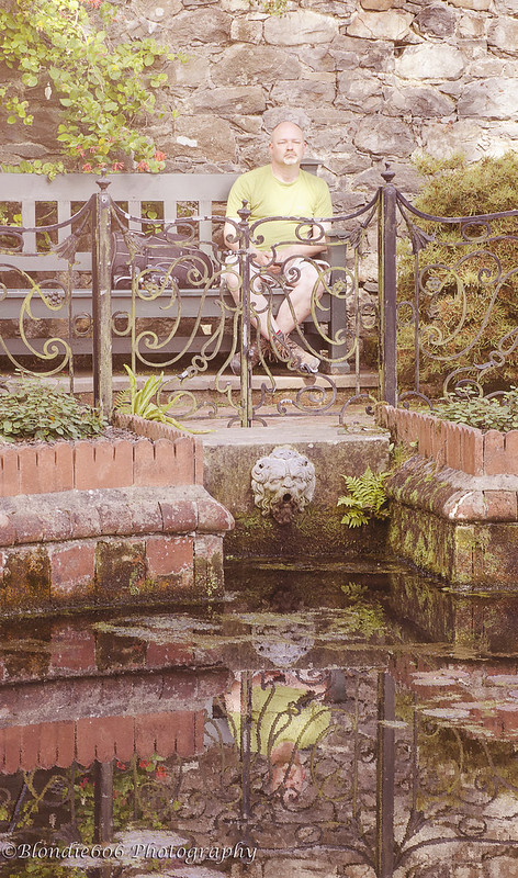
Day Dreaming :) Wasn't keen on the theme but then this shot kinda felt like it worked .Big thanks to top model @Southdowns for allowing me to use it....:clap:

Wk 24 Dream jpeg by Blondie606 Photography, on Flickr

Went a little ott with some florabella type actions , my thinking behind the shot was a chap drinking in the tranquility of his surroundings & dreaming of happy things....or something like that anyway:D


Aarrggghhhhh...it burns...it burns ;)

It's a nice interpretation. Well composed and the reflection does add to the drama. Muted colours work for me.


No crit from me.

Cheers.
 
Wild - I am not so sure on it, I like the colours and can appreciate the pp work gone into the image to get the end result.

Dream - I really like the composition and the reflection on the image, nice take for the theme.
 
Wild flowers - I like it, and not just because its an unusual image. The vibrance of the colours in the top layer really pop from the lower layer.

Day dream I think is a well composed shot, with a lovely reflection of a loverly setting, but do agree the Processing has made it feel a bit washed out, lowering the contrast that much hasn't helped, wonder if selective adjustment to the reflection might work, leaving the "real" view natural, or maybe the other way round... dunno! :)
 
Wild - I'm afraid I'm not a marmite lover so I'm not feeling this one I'm afraid. I see from your explanation where you were going with it though

Dream - I'd normally say that it was too washed out but it fits the theme. I feel the ironwork gets in the way somewhat but I do think the reflection works nicely
 
Hi Lynne, Wild - I wasn't sure about this - like you say a marmite shot, but i kept wanting to com back for a second look. I love the colours and the vibrancy just not sure about the image behind it.
Dream - I struggled with this too and overall I think your shot works well just a little too washed out for my taste.
 
Sorry but not a fan of the flowers, I don't like marmite either :)

I think you've really caught the mood for dreaming, I like the way the face lines up throughout the reflection and the muted tones really give it a dream like quality.
 
Hi Lynne .... Two to catch up on :)

Wild .... Its one of those 'not sure' shots, I do like it but I feel its not quite there, maybe it needs a snippet of the original slotted in somewhere. Super colours and one I'm sure you enjoyed doing.

Dream .... I like it .... There are so many different textures in there but it still works, I like the muted colour and the composition. It has a slightly surreal feel to it .... Good choice for the theme.
 
Well that's odd: I thought I'd commented on yours, Lynne!

Wild - nice effect and always good to try something different. Definitely hits the wild button a few times!

Dream - I really like the effect and think it suits the subject (the guy) and the theme perfectly. My only minor difficulty is with the busy-ness of the frame as a whole. I think the dream idea would be stronger if he were sitting in front of a single object (e.g. a lake without reflections) rather than having so many things between us and him.

But that's just me! I do really like your style and PP (in general and on these) as well as your obvious photography skills...
 
Hi Lynne, wild is definitely a marmite image I like the colour in it and the abstract nature of the image but think the frame is too dominant, for me anyway.

dream works for me nice muted colours not sure he looks like he's dreaming but a very difficult thing to convey in a photograph
 
Hey Lynne :)

You're jigged shot of woodsy with the brick background is a dam good effort, the background looks real goo, feel it does need more shadow but no idea where to start... as said before I'm clueless with this stuff currently, babe I'll follow your example and add it as a challenge on next years 52 :)

Texture - Without your description I would never have guessed that the middle leaf was the same leaf, a good shot for texture ?? yeah why not, as you say loads of different textures there, a very bright fresh looking image, I like the wide crop with the 3 blocks in it, the shadows look good, the detail is excellent and that background works well too...

Crit, I wish I could offer something constructive, taken me ages to spot anything, so I'm going to be picky, very picky :p but the shadows on the blocks not the same aspect as the leaves ???

Right... best get back to work (service station break (Starbucks :D)) full of caffeine now time to get buzzing, will catch up on the rest tonight
All in all a super image, you must be well pleased with it :clap:
 
Last edited:
Right moving on...

Wild - I remember you mentioning this concept, I wasn't quite so sure, but now I see it I think it's a great image, Crit wise, I can't fault it, but it doesn't say wild other than whacky, not sure if it was meant to be wild flowers or a wild image... now I have said that it fits fine :D

Love the colours and the PP on this :)

Dreamy - Liking the composition, thinking the muted washy colours help the dreamy feel of the shot and he certainly looks miles away in a different land (he was up in the slate mine again I think) but unsure if it could be a bit more vivid and still work... a real nice reflection in the water, and I'm also liking the 3 visual elements adding some depth to the shot, the reflections in the nearly still water, The chap in the background, and the railings/bricks separating them - a nice image indeed (y)
 
:wave: Lynne, sorry I'm another that really doesn't get stuff like your wild shot, but seeing as you've blended two images, I couldn't, well done on the pp (y):)

Day dream I like, agree that the washy colours add to the image, reflections good (y) as mentioned, I did think the iron work in the reflection just gets in the way a little but I imagine not a lot could be done to rectify that :)
 
Hi Lynne

Texture - good treatment and the green really pops against the neutral b/g. Excellent PP and like the crop. Personally I would not have had those brown spots at the top
Wild - like that(n) Bit like stained glass effect and as Monet feel.
dreamy - very hard to get that right in a portrait but excellent effort. Desat works for me and like the comp with the walls converging on the subject and the gargoyle below him. Agree with peter re the ironwork, but small point.
 
Love it! I think it works really well and nice vibrant colours.

Thanks Si :)
Hi Lynne
wild...not sure about this one, but you have obviously had to work hard to get there so (y) for the pp :)

Cheers Judi....always gonna be marmite...going through a phase of liking random abstract shots :)
Hi Lynne,
Dream.. this one i do like, the colour of his t-shirt, the reflection in the water and the gentle dreamy colours (y)(y)

Glad someone likes it Judi (y)

Aarrggghhhhh...it burns...it burns ;)

It's a nice interpretation. Well composed and the reflection does add to the drama. Muted colours work for me.


No crit from me.

Cheers.


:jawdrop:Falls over in shock...NO CRIT :thinking: I'll take it anyways...cheers matey (y)
 
Wild - I am not so sure on it, I like the colours and can appreciate the pp work gone into the image to get the end result.

Dream - I really like the composition and the reflection on the image, nice take for the theme.

Thanks Mandy.....you're not alone with your thoughts on Wild......;)

Wild - I am not so sure on it, I like the colours and can appreciate the pp work gone into the image to get the end result.

Dream - I really like the composition and the reflection on the image, nice take for the theme.

And another not so sure....but at least you like Day dreaming :)

Wild flowers - I like it, and not just because its an unusual image. The vibrance of the colours in the top layer really pop from the lower layer.

Day dream I think is a well composed shot, with a lovely reflection of a loverly setting, but do agree the Processing has made it feel a bit washed out, lowering the contrast that much hasn't helped, wonder if selective adjustment to the reflection might work, leaving the "real" view natural, or maybe the other way round... dunno! :)

Wayhayyy.....cheers Graham......the image behind is actually the same shot as the top one...just without the vertical pan .PP was meant to give a washed out kinda look...maybe took it to far :thinking:

Hi Lynne, Dream: I agree with Graham about the washed-out look, but it still works for me. It's a bit like a pastel painting I think.

Cheers Si....never thought about a painting...might give that a try, cheers for the idea (y)
 
Wild - I'm afraid I'm not a marmite lover so I'm not feeling this one I'm afraid. I see from your explanation where you were going with it though

Dream - I'd normally say that it was too washed out but it fits the theme. I feel the ironwork gets in the way somewhat but I do think the reflection works nicely

What....you don't like marmite...how very bizarre :D....I figured the National Trust would get a touch miffed if I started dismantling the iron work :runaway:

Hi Lynne, Wild - I wasn't sure about this - like you say a marmite shot, but i kept wanting to com back for a second look. I love the colours and the vibrancy just not sure about the image behind it.
Dream - I struggled with this too and overall I think your shot works well just a little too washed out for my taste.

Cheers Richard...the image behind Wild is the same image as on top....just minus the vertical pan...got a bug to do more of these...even though most don't seem to like it :crying:

Sorry but not a fan of the flowers, I don't like marmite either :)

I think you've really caught the mood for dreaming, I like the way the face lines up throughout the reflection and the muted tones really give it a dream like quality.

My god...thats' 2 people who don't like marmite...ya all heathens :D Glad you like daydreaming though :)

Hi Lynne .... Two to catch up on :)

Wild .... Its one of those 'not sure' shots, I do like it but I feel its not quite there, maybe it needs a snippet of the original slotted in somewhere. Super colours and one I'm sure you enjoyed doing.

Dream .... I like it .... There are so many different textures in there but it still works, I like the muted colour and the composition. It has a slightly surreal feel to it .... Good choice for the theme.

Cheers Susie.....still got some ODD idea's for differing takes on Wild.....suspect they won't be liked either ;)
 
Hey Lynne :)

You're jigged shot of woodsy with the brick background is a dam good effort, the background looks real goo, feel it does need more shadow but no idea where to start... as said before I'm clueless with this stuff currently, babe I'll follow your example and add it as a challenge on next years 52 :)

Texture - Without your description I would never have guessed that the middle leaf was the same leaf, a good shot for texture ?? yeah why not, as you say loads of different textures there, a very bright fresh looking image, I like the wide crop with the 3 blocks in it, the shadows look good, the detail is excellent and that background works well too...

Crit, I wish I could offer something constructive, taken me ages to spot anything, so I'm going to be picky, very picky :p but the shadows on the blocks not the same aspect as the leaves ???

Right... best get back to work (service station break (Starbucks :D)) full of caffeine now time to get buzzing, will catch up on the rest tonight
All in all a super image, you must be well pleased with it :clap:
Right moving on...

Wild - I remember you mentioning this concept, I wasn't quite so sure, but now I see it I think it's a great image, Crit wise, I can't fault it, but it doesn't say wild other than whacky, not sure if it was meant to be wild flowers or a wild image... now I have said that it fits fine :D

Love the colours and the PP on this :)

Dreamy - Liking the composition, thinking the muted washy colours help the dreamy feel of the shot and he certainly looks miles away in a different land (he was up in the slate mine again I think) but unsure if it could be a bit more vivid and still work... a real nice reflection in the water, and I'm also liking the 3 visual elements adding some depth to the shot, the reflections in the nearly still water, The chap in the background, and the railings/bricks separating them - a nice image indeed (y)

My god...how much Starbucks had you drunk ??? Cheers for the detailed comments , agree with all points made...but I now have it in writing that you are doing the 52 next year :naughty:

:wave: Lynne, sorry I'm another that really doesn't get stuff like your wild shot, but seeing as you've blended two images, I couldn't, well done on the pp (y):)

Day dream I like, agree that the washy colours add to the image, reflections good (y) as mentioned, I did think the iron work in the reflection just gets in the way a little but I imagine not a lot could be done to rectify that :)

Cheers Phil ...I don't really get my wild shot either ...just one of those itch's that has to be scratched ;)

Hi Lynne

Texture - good treatment and the green really pops against the neutral b/g. Excellent PP and like the crop. Personally I would not have had those brown spots at the top
Wild - like that(n) Bit like stained glass effect and as Monet feel.
dreamy - very hard to get that right in a portrait but excellent effort. Desat works for me and like the comp with the walls converging on the subject and the gargoyle below him. Agree with peter re the ironwork, but small point.

Thanks Alan...the brown spots were part of the texture....guess I could clone them out :thinking:

Monet....I knew Wild reminded me of something :) Somehow doubt my image is worth a smidge as much as his are though :rolleyes:
 
Trying to keep up , got my Vertical shot last Sunday but no time to post it ! Getting older finds me doing things I never thought I would do......

Wk 25 Vetical jpeg by Blondie606 Photography, on Flickr

( ffs...will they ever stop messing about with flickr :rage: ) This hasn't turned out quite how I imaged it...I really wanted a close up of the Stumps but wandering on to the pitch mid game would probably have landed me in hot water ....might try again tomorrow though.....:naughty: Shooting at full reach on the 70-200mm is probably not the best way to get a good result but hey....live n learn :D

In the words of Arnie.......I'll be back........laters to catch up on comments

TTFN

x
 
Back
Top