
You are using an out of date browser. It may not display this or other websites correctly.
You should upgrade or use an alternative browser.
You should upgrade or use an alternative browser.
weekly Mr.Si's 52 Week Challenge - Final Photos Added
- Thread starter mr.si
- Start date

 Change
- Messages
- 4,155
- Name
- Paul
- Edit My Images
- Yes
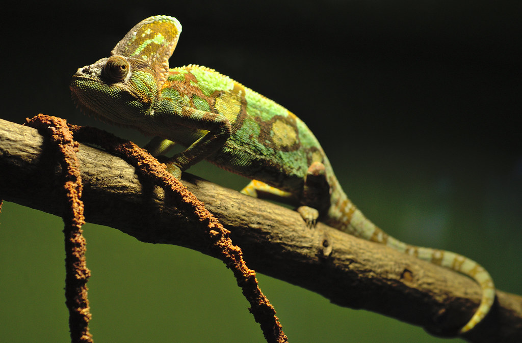
Briliant spot Simon. Perfectly on-theme. I really like the light on the top half of the chameleon but I agree with Allan that it would have benefited from more even / diffuse lighting to fill those shadows. perhaps worth trying to lift them in post? I actually really like the fairly shallow DOF - it draws you into the face and texture of the skin.
Very well done and excellent in the conditions!
Very well done and excellent in the conditions!
OP
- Messages
- 1,164
- Name
- Simon
- Edit My Images
- Yes
Thank you both. I had to reduce the exposure to -1.39 in post anyway as the spine was blown out, but I was happy to have got a decent result from an OK shot.
I must confess that for the last few weeks (I think ) I've been taking photos with -5.0 on my exposure compensation so my exposure triangle has been off...
I only just realised yesterday on the way back from a walk when I randomly decided to check it. I wonder if I'd have found that before, I may have been able to achieve better results. Ahh the problems of trying to use full manual or semi-manual modes...
- Messages
- 9,061
- Name
- Mandy
- Edit My Images
- Yes
Fall - a nice take on the theme and fits nicely into the theme, my only niggle is I find the background a bit to dark.
Cut - spot on for the theme nicely composed, and exposed nicely as well good work.
Balance - works for the theme I agree with the other comments regarding crit.
Change - a wonderful idea for the theme, well exposed good stuff I really like this image.
Cut - spot on for the theme nicely composed, and exposed nicely as well good work.
Balance - works for the theme I agree with the other comments regarding crit.
Change - a wonderful idea for the theme, well exposed good stuff I really like this image.
Last edited:
- Messages
- 4,088
- Name
- Graham
- Edit My Images
- Yes
I think this is pretty much spot on as it is, you've used entirely suitable settings that are all right at the extreme ends of where you could be, but well balanced. DOF is perfect for me.
As you've reduced exposure by a stop, I'd say there could be some shadow detail to be pulled out, (just a touch mind).
White balance looks good, and compositionally if the tail had been clipped it would have been one for the recycle bin.
As you've reduced exposure by a stop, I'd say there could be some shadow detail to be pulled out, (just a touch mind).
White balance looks good, and compositionally if the tail had been clipped it would have been one for the recycle bin.
- Messages
- 8,398
- Name
- Lynne
- Edit My Images
- Yes
Hi Si
Fall....great idea & a good find to capture the stages of the conker/chestnut") The black bg is just about perfect but does give the effect of them floating...no bad thing as the theme is Fall but maybe a touch of motion blur in post would convey that a little more ? If they were intended to be static then I feel a different color bg to allow a slight shadow might have worked better ?
The black bg is just about perfect but does give the effect of them floating...no bad thing as the theme is Fall but maybe a touch of motion blur in post would convey that a little more ? If they were intended to be static then I feel a different color bg to allow a slight shadow might have worked better ?
Balance...works for me , girlie in focus ,the shadows are natural & don't detract maybe a slight crop to the rhs to make it a smidge less central & ,if you have any editing program's , a slight tweak of the highlights to lower the bright sky a touch ?
Cut......another simple idea well executed, perfect black bg ( you're getting good at these ! ), nice angle & good focus Only very small crit is the lefthand & arm look a touch cooler than the right hand but that could be my monitor .
Change...good spot for the theme, you've done well in the environment")
Fall....great idea & a good find to capture the stages of the conker/chestnut
The black bg is just about perfect but does give the effect of them floating...no bad thing as the theme is Fall but maybe a touch of motion blur in post would convey that a little more ? If they were intended to be static then I feel a different color bg to allow a slight shadow might have worked better ?Balance...works for me , girlie in focus ,the shadows are natural & don't detract
maybe a slight crop to the rhs to make it a smidge less central & ,if you have any editing program's , a slight tweak of the highlights to lower the bright sky a touch ?Cut......another simple idea well executed, perfect black bg ( you're getting good at these ! ), nice angle & good focus
Only very small crit is the lefthand & arm look a touch cooler than the right hand but that could be my monitor .Change...good spot for the theme, you've done well in the environment
- Messages
- 1,458
- Name
- Elaine
- Edit My Images
- Yes
Fall - Good progression, good angle and lovely shiny conkers
Cut - Nice simple shot and another good use of the diagonal.
Balance - on theme and well done to your wife for the pose, but I agree that the light could have been a bit kinder to you.
Cut - Nice simple shot and another good use of the diagonal.
Balance - on theme and well done to your wife for the pose, but I agree that the light could have been a bit kinder to you.
- Messages
- 1,458
- Name
- Elaine
- Edit My Images
- Yes
Just noticed that I'd missed Change! What a beautiful fellow and a very opportune spot! Love the way you've caught so much detail in the eye and downturned mouth - especially as I presume it must have been shot through less than pristine glass
OP
- Messages
- 1,164
- Name
- Simon
- Edit My Images
- Yes
Thank you all for your comments on the little Chameleon chap. I am v glad it came out as well as it did as I thought it wouldn't at one point. My main 2 thoughts when taking the shot was to be at eye level and keep the eyes (and head ideally) in focus and the rest could be whatever but still retaining enough detail. That seems to be what you all think, which is great!
- Messages
- 19,304
- Name
- Andy
- Edit My Images
- Yes
Hi, Change, well spotted and I have to say they are one of my favourite reptiles.
I appreciate the constraints you had, and these resulted in the top lighting causing some issues with the top of it's back, and some extra lighting from the right would be nice, but you gotta work with what you've got.
Cheers.
I appreciate the constraints you had, and these resulted in the top lighting causing some issues with the top of it's back, and some extra lighting from the right would be nice, but you gotta work with what you've got.
Cheers.
- Messages
- 13,393
- Edit My Images
- Yes
Hi Si
Sorry... looks like I have not been around for a bit, have my lappy running again so catch up time
Fall - Nice job showing several stages of the conker, good background, the lighting is pretty consistent but the final conker could do with being a tad lighter for me, a great idea for the theme
Cut - again a nice original idea, liking the angles of the arms coming into the frame, and again liking the background, nice lighting too
Balance - Not sure on my lappy if the clouds are slightly blown, but also thinking your speedlight may have given enough light to try selectively lightening the shadows on her clothing ?? - A good effort mate
Change - A good spot indeed, considering you were limited with the light and also presume it was behind glass, a real good shot, nice DoF, nice colours and detail, again liking your background - Nice one
OP
- Messages
- 1,164
- Name
- Simon
- Edit My Images
- Yes
Hi all,
I have been absent for a while but gratefully receive all your comments!
I haven't done "Grow" yet, but here is my "Live" photo for week 44.
It is entitled "Live Young". I hope you like it!
I attempted a white background this time as they are more difficult to achieve, but I had to touch it up in post.
 LiveYoung by Mr_Si, on Flickr
I have been absent for a while but gratefully receive all your comments!
I haven't done "Grow" yet, but here is my "Live" photo for week 44.
It is entitled "Live Young". I hope you like it!
I attempted a white background this time as they are more difficult to achieve, but I had to touch it up in post.
LiveYoung by Mr_Si, on Flickr- Messages
- 4,155
- Name
- Paul
- Edit My Images
- Yes
Hiya Simon... I like the connection with the theme: my wife and I were just talking about how so many people seem to have taken up cycling as if it's the new mid-life crisis thing to do instead of buying a Harley/convertible sportscar. Not suggesting you're reaching that point of course ")

It's a simple and effective composition - it works really well. Lighting is fairly "conventional" and the only negative on that is the patterns on the helmet probably distract slightly from the otherwise very pleasant effects of the lighting. You've done well to light the water bottle (a notoriously hard subject) and although it might possibly benefit from being separately lit, you've done very well with a more straightforward setup. Nice shadows, too.
The only issue you've had to deal with is the touchup in post. The front of the surface (nearest camera) has suffered and is darker than the background and there's a touch of vignette top left corner but not really anywhere else. But it's bloomin' hard and you've managed it very very well.
- Messages
- 7,567
- Edit My Images
- Yes
I like it simon, fits the theme well focus looks good, as does colour, you've done well with the bg, good plain bg's are a PITA to achieve in any colour, well for me anyway .....and I wouldn't have noticed the small bit you missed top left corner if Paul hadn't mentioned it 

focus looks good, as does colour, you've done well with the bg, good plain bg's are a PITA to achieve in any colour, well for me anyway .....and I wouldn't have noticed the small bit you missed top left corner if Paul hadn't mentioned it
OP
- Messages
- 1,164
- Name
- Simon
- Edit My Images
- Yes
Hi Simon, not sure I get it myself, but the helmet and the bottle are well lit, white BGs are a real pain but you have not done too bad with the touch up
Evian water has the slogan "live young" and I wanted to depict a healthy lifestyle to go along with that, so I thought of cycling is a good way to keep fit, which in turn helps someone feel like they are staying younger longer.
- Messages
- 13,393
- Edit My Images
- Yes
Hi Si
Live - A nice clean bright image that, I think you have done really well with the background, still some real good shadows and good colours - I got the link no problem so from me
Live - A nice clean bright image that, I think you have done really well with the background, still some real good shadows and good colours - I got the link no problem so
from me- Messages
- 11,987
- Name
- Allan
- Edit My Images
- No
Evian water has the slogan "live young" and I wanted to depict a healthy lifestyle to go along with that, so I thought of cycling is a good way to keep fit, which in turn helps someone feel like they are staying younger longer.
Ah ok, I don't think i have ever read or seen their slogan, thanks for the explanation
- Messages
- 863
- Name
- Jason
- Edit My Images
- Yes
Hi Simon
Change: A wonderful image. Really. Has a pleasing warmth and natural feel to the colours & tones. You've put a strong diaganol through the frame which works well and I like the rough symmetry between the brown vines and tale of the little critter. DOF is nice too and as Paul said, it really shows off the face, eyes and mottled textures. Good work
Live: Another good image. You've done well with your white background which works well with this fresh young contempary subject. My fav bit is the bottle reflection which grounds this all nicely thus avoiding the dreaded floating subject.
I've not commented on you work lately, but I have been looking at your pictures, and can honestly say that you have really improved noticeably since your project start. Well done on that mate
- Messages
- 8,398
- Name
- Lynne
- Edit My Images
- Yes
Hi Simon
I like that , simple composition , bold colors that stand out well from the white bg , shadow to ground the objects all works well for me The bottom of the bottle is slightly soft I suspect due to the angle of aperture used, white bg's are a pain but you've done well with this one
I like that , simple composition , bold colors that stand out well from the white bg , shadow to ground the objects all works well for me
The bottom of the bottle is slightly soft I suspect due to the angle of aperture used, white bg's are a pain but you've done well with this one - Messages
- 1,458
- Name
- Elaine
- Edit My Images
- Yes
You've made a really good job of the background and I like the way the shadows fall so it doesn't look like it's floating in mid air.
- Messages
- 9,061
- Name
- Mandy
- Edit My Images
- Yes
Hi I hope all is well with you, I am having a bit of a catch up at the moment I had a look back at the images I missed. Love the image for cut and for fall very nicely done. And for the live theme outstanding work nothing at all to crit on, keep up the good work.
 Smooth
 Attached
 Energy
- Messages
- 14,759
- Name
- Laura
- Edit My Images
- No
Hi Simon,
smooth, good position in the frame for the chocolate, bg looks nice and clean, i can see why why you have concentrated on just one piece crackerd open.
attached, dof is just right, good composition, but the bg looks grey on this one, would prefer it with a wholly white bg.
energy, a bit more dof for me needed on this one, to bring all of the batteries in focus, I would also prefer them to be on the rhs.
OP
- Messages
- 1,164
- Name
- Simon
- Edit My Images
- Yes
Here's one I have been deliberating over for some time.
My entry for Week 45 - First.
I was looking at finding the RAW file to maybe uplift it a little but to be honest, I love it as it is as it is a photo of my first born.
 First (born) by Mr_Si, on Flickr
My entry for Week 45 - First.
I was looking at finding the RAW file to maybe uplift it a little but to be honest, I love it as it is as it is a photo of my first born.
First (born) by Mr_Si, on Flickr- Messages
- 4,088
- Name
- Graham
- Edit My Images
- Yes
chocolate - stand out image, pretty much perfect. Absolutely ooozing out of the screen... did you get the hairdryer on this, or just leave it to naturally melt and soften??
Keys, a bit disinteresting, looks a tad staged / arranged, and the BG does look decidedly grey between the two others. On its own it might be ok, but stands out between the others
batteries, superbly arranged, well enough lit, but lacking a bit of wow.
And first. I can see exactly what you mean about not needing to edit this one at all.... I can honestly say that I could imagine pulling a few sliders up and down, but settling on having them all exactly where they are now. Perfect. Love the use of DOF to have the face and near hand sharp, but the fall off of focus to the rear hand. Soft light falling on the face is lovely. If this is no crop, then again you've done superbly well to not cut off either hand.
- Messages
- 19,304
- Name
- Andy
- Edit My Images
- Yes
Quick catch up, I'm afraid.
Smooth is wonderful. Nice soft light and clean, white BG.
Attached, keys attached and attached to Fiona. Just the grey BG of crit.
Energy, another clean submission, with good blacks. Uber crit, would be the slightly OOF 'High' on the FG battery.
First, I'm not keen on the orientations, just feel uncomfortable. Hard to crit someone's kid so I won't. Good eye contact, though.
Cheers.
- Messages
- 7,567
- Edit My Images
- Yes
Hi Si,
Smooth- great idea, good detail, colour and dof if anything, I might have been tempted to clone out the very slight shadow down the left but leave the one the left bottom
Attached- Super dof, compositions good, good colours in the Fiona key fob but I do think focus would have been better on that, it does look like its more on the ring and clip
Energy- looks a little noisy? like the composition of the batteries for me, could have done with a tad more dof on the front battery so all the lettering is in focus
First- Lovely image, focus and dof looks spot on I can see where Andy's coming from though about the orientation, would prefer to see it rotated 90 degs clockwise.
Si, I've just read back through what I've wrote before posting, please don't think I'm being negative, it looks like I've tried to pick fault with every image. All the images are good and on theme, the crit is more my ideas and personal choice/ opinion
Smooth- great idea, good detail, colour and dof
if anything, I might have been tempted to clone out the very slight shadow down the left but leave the one the left bottom Attached- Super dof, compositions good, good colours in the Fiona key fob
but I do think focus would have been better on that, it does look like its more on the ring and clip Energy- looks a little noisy? like the composition of the batteries
for me, could have done with a tad more dof on the front battery so all the lettering is in focusFirst- Lovely image, focus and dof looks spot on
I can see where Andy's coming from though about the orientation, would prefer to see it rotated 90 degs clockwise.Si, I've just read back through what I've wrote before posting, please don't think I'm being negative, it looks like I've tried to pick fault with every image. All the images are good and on theme, the crit is more my ideas and personal choice/ opinion
OP
- Messages
- 1,164
- Name
- Simon
- Edit My Images
- Yes
Hi all, thank you for your comments. They are gratefully received as (mostly ) always.
I have re-oriented the photo of my Son for those who are uncomfortable... Hope you like it.
 First (born) by Mr_Si, on Flickr
) always.I have re-oriented the photo of my Son for those who are uncomfortable... Hope you like it.
First (born) by Mr_Si, on Flickr- Messages
- 7,412
- Name
- susie
- Edit My Images
- Yes
Hi Simon .... love the choice of the soft melting caramel for smooth.
Attached ...great focus on the chrome attached parts of the keyring.
Energy ...bang on for the theme, but not too visually exciting.
First .... a super natural shot ...I think the b&w works really well .... one you obviously treasure and rightly so.
Attached ...great focus on the chrome attached parts of the keyring.
Energy ...bang on for the theme, but not too visually exciting.
First .... a super natural shot ...I think the b&w works really well .... one you obviously treasure and rightly so.
- Messages
- 4,155
- Name
- Paul
- Edit My Images
- Yes
Hiya Simon...
Smooth: great shot, nice lighting (bounce off ceiling?) and I like the positioning of it. And it looks very melty and delicious! My only tiny tiny comment would be the glare off the tiny side of the chocolate on its left side (as we look at it): more or less in the middle of the frame. It's very slightly distracting but so marginal, it's hard to get too het up about it! Really good shot, so a big well done
Attached: nicely on theme, good DOF choice and well controlled lighting off the shiny stuff. I might have tried to get more light on the background/table top so it's whiter without blowing out the highlights more on the key rings, but it's a difficult one.
Energy: Good idea but I would like to see more drama. Maybe a closer crop, maybe back-lit, maybe more direct reflection off the tops of the batteries?? I don't know what, but it feels a good composition but needing more "oomph"?
First: I saw the first one and really liked it. Great soft lighting, lovely choice of DOF - basically what @overbez said! Then I saw your re-oriented version and thought that was even better. Lovely shot and well done