
You are using an out of date browser. It may not display this or other websites correctly.
You should upgrade or use an alternative browser.
You should upgrade or use an alternative browser.
weekly Mr.Si's 52 Week Challenge - Final Photos Added
- Thread starter mr.si
- Start date
- Messages
- 9,061
- Name
- Mandy
- Edit My Images
- Yes
Skill - I agree it would of taken a massive amount of skill to build one of them engines, great find for the theme just a shame you couldn't get a better background.
- Messages
- 7,565
- Edit My Images
- Yes
Skill- yep, fits the theme for me too simon, detail, colour look good") I know the building in the bg's been mentioned........
I know the building in the bg's been mentioned........ .......wondered if it would have been possible for a different pov, lower from the left instead of right with a bit of the lovely blue sky as bg?
 ")
I know the building in the bg's been mentioned...............wondered if it would have been possible for a different pov, lower from the left instead of right with a bit of the lovely blue sky as bg? - Messages
- 1,458
- Name
- Elaine
- Edit My Images
- Yes
Skill - definitely a lot of skill gone into building and designing that, so good fit for the theme. Agree about the composition, maybe cropping some of the building from the right and adding a bit more space on the left would help?
- Messages
- 1,417
- Name
- Judi
- Edit My Images
- Yes
Hi Simon,
Like your new crop on yum
loud... altho' I don't know anything about your subject it fits the theme, the composition is great I like the tight crop and the orange of the ear protectors complement the image
reshoot... really good panning, good composition, well done
Rich.. the Camel image is very clever pp and great take on the theme well done
Skill....fits the theme well, a great deal of skill needed there, nice sharp image I agree a tighter crop might be an improvement
OP
- Messages
- 1,164
- Name
- Simon
- Edit My Images
- Yes
 Half
Half
- Messages
- 9,061
- Name
- Mandy
- Edit My Images
- Yes
I have to agree with every one else's comments regarding the oval, good fun take for the theme.
OP
- Messages
- 1,164
- Name
- Simon
- Edit My Images
- Yes
Hi all, fair enough about the oval. Shame really - I thought it looked quite cool and different.
Anyway, I haven't done Week 31 yet, but am skipping ahead to week 32 - Promise, as opportunity arose.
Here goes:
 Promise by Mr_Si, on Flickr
Now, I'm not sure if the focus is quite at the right point, but I can always have another go!
Anyway, I haven't done Week 31 yet, but am skipping ahead to week 32 - Promise, as opportunity arose.
Here goes:
Promise by Mr_Si, on FlickrNow, I'm not sure if the focus is quite at the right point, but I can always have another go!
- Messages
- 4,088
- Name
- Graham
- Edit My Images
- Yes
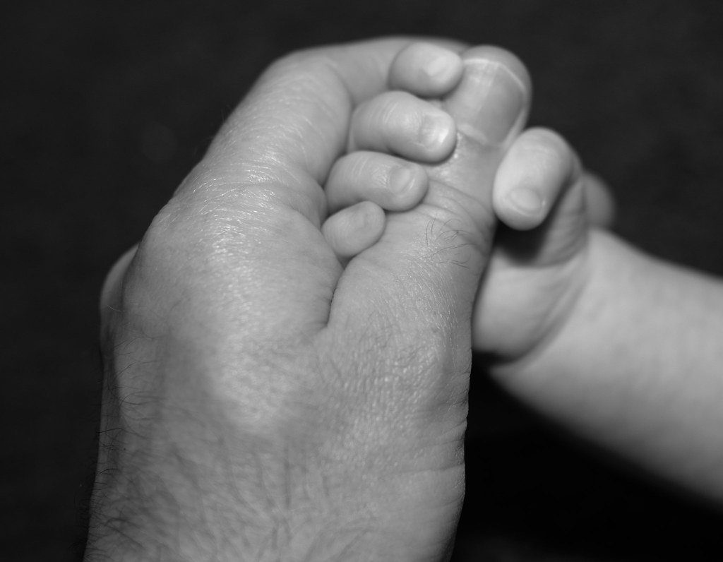
Half. Everyone else has spotted the obvious problem here. Apart from that, I like.
Promise. I really like this. Can't see exif from my phone but suspect too wide aperture as hair on thumb knuckle is sharp but nail is not. Don't think it's too far out to be a problem as long as not printed too big.
Good job and nice memory shot.
Promise. I really like this. Can't see exif from my phone but suspect too wide aperture as hair on thumb knuckle is sharp but nail is not. Don't think it's too far out to be a problem as long as not printed too big.
Good job and nice memory shot.
- Messages
- 4,155
- Name
- Paul
- Edit My Images
- Yes
Simon, half is good - it's fun and it's sufficiently on theme for me. I really like your thinking on this. Don't worry about the oval - it's always worth experimenting and seeing what does and doesn't work so well. Your photo and the technicals are very good, which is the most important thing.
Promise is a beautiful composition and I really like your B&W conversion which is subtle and perfect for the image. The black background is good and makes the image pop. Sadly, focus is off and it's a shame - what could have been such a strong image is let down a bit and a deeper DOF would definitely have worked better. A very nice idea which could be reshot and become a fantastic keeper!
Promise is a beautiful composition and I really like your B&W conversion which is subtle and perfect for the image. The black background is good and makes the image pop. Sadly, focus is off and it's a shame - what could have been such a strong image is let down a bit and a deeper DOF would definitely have worked better. A very nice idea which could be reshot and become a fantastic keeper!
- Messages
- 863
- Name
- Jason
- Edit My Images
- Yes
Half: A Cool idea. The focus on the far figures works well. Their is quite alot going on in this frame though it does'nt feel cluttered of fussy which is testimony to the good arrangement and composition. The vignette also works well to focus the eyes onto the lego scene. A really good job on this one - Well done
Promise: Another nice idea for this weeks theme, though sadly let down by the focus as already mentioned. That said, I do like the placement of the hands and the unclutted background you've achieved. Overall a good effort, and worthy of a reshoot if time allows
Last edited by a moderator:
- Messages
- 1,458
- Name
- Elaine
- Edit My Images
- Yes
A really lovely idea and composition, but as others have said, a slightly sharper focal point would have made it just perfect!
OP
- Messages
- 1,164
- Name
- Simon
- Edit My Images
- Yes
Finally... Week 31 Architecture!
"Architecture in the Making"
 Architecture In the Making by Mr_Si, on Flickr
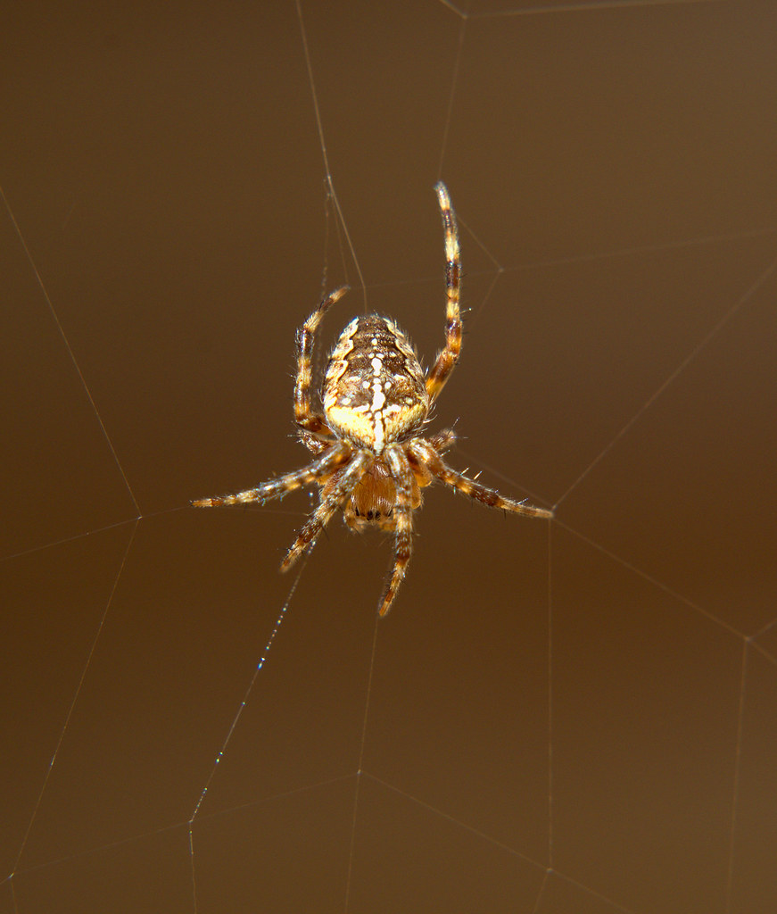 Architecture in the Making 2 by Mr_Si, on Flickr
 Architecture in the Making 4 by Mr_Si, on Flickr
"Architecture in the Making"
Architecture In the Making by Mr_Si, on FlickrArchitecture in the Making 2 by Mr_Si, on FlickrArchitecture in the Making 4 by Mr_Si, on Flickr- Messages
- 4,155
- Name
- Paul
- Edit My Images
- Yes
Hi Simon, what a super idea (I think it was Susie who also decided on a spider's web for this theme) - and I think it works well. Good effort on the captures as well.
I'm a complete newbie to macro so I'm not best-placed to advise, but I'd suggest looking at your lighting set up (or, if it was taken in natural light, thinking about repeating on a cloudier day)... for me, all three images would benefit hugely from more diffuse lighting. Getting enough lighting on the subject can be difficult, so a lot of this sort of photography is done with ultra soft but very strong (the "Andrex" of the lighting world, if you will!) flash. You have a few blown highlights which suggest quite harsh directional light.
If you enjoy this sort of photography I'd definitely recommend heading over to the macro section of the forum as the guys (and girls) there are hugely helpful and so knowledgeable. I just hope you like Pringles!
(by the, well done on the pictures and perfectly on theme!)
- Messages
- 13,393
- Edit My Images
- Yes
Hi Simon
Half - What a fun image, I really like your imagination on this one, not so sure on the heaviness of the black... but great detail, perfect DoF and nice bright colours
Promise - Not so sure on the link, and the focus not quite in the right place for me, like the composition and the PP though
Architecture - A great idea this, liking all three images, nice and bright (maybe a tad too bright on the last), great separation from the background and good detail... I'm going for the first shot due to the web being created
- Messages
- 7,565
- Edit My Images
- Yes
Hi all, fair enough about the oval. Shame really - I thought it looked quite cool and different.
And that's the main thing Simon, it should only be a problem if your unhappy with it yourself, everyone else's thoughts are just an opinion
Promise, I kind of saw a connection between parent and child, nothing wrong with the idea
as mentioned, either slightly missed focus (it could have done with being higher up the thumb) or possibly a little more dof, Suites the b&w and like the oof b/g
Like your spider and web, good detail
if just a tad bright - Messages
- 7,412
- Name
- susie
- Edit My Images
- Yes
Hi Simon as a great fan of macro I love these ....not sure why, but spiders do seem very reflective on the back, and it's hard not to get them shiny....but three great shots there. It fascinates me how they manage to jump about three foot and spin that tiny thread as they go, some of our webs have huge single threads holding them up. You've caught some really intricate detail there...well done
OP
- Messages
- 1,164
- Name
- Simon
- Edit My Images
- Yes
Thank you all for your comments and encouragement. It was early on Sunday morning that I took them and so the sun was bright. I also didn't notice it was on iso 800 at the time of shooting! Should have gone to 100 if I had realised. I definitely reduced the exposure on them considerably when in darktable, which fixed them a fair amount. I love macro and spiders (small non scary ones). I think a smaller aperture may have helped too with the focus of the spider itself.

 Sharp
Sharp- Messages
- 8,398
- Name
- Lynne
- Edit My Images
- Yes
Hi Si
Sharp.....never seen one of those digital read out thingummies on a guitar before.....good focus & a great black bg As with all things reflective you caught some cracking reflections in the twiddly things.....not quite sure how you'd lose them other than by putting up a plain something or other ( like a sheet or piece of card ) maybe ? I can see the tripod base possibly you & what appears to be a shelf or cabinet...or maybe turn the twiddly knobs so the all face the same as the very lowest one....limiting the reflections ?
Architecture in the making...another good take on the theme....superb bokeh Having viewed them all large on flickr #2 gets my vote...looks like you got the little fella all in focus & kept enough detail in the web for the image to work ....very hard to do so Agree with comments on the lighting.....I've taken to carrying a mainly white umbrella around with me when I go shooting this type of subject , helps create a much softer light if the natural light is strong ,if it's quite dark a small reflector will help bounce a bit of light on the subject if you don't have a flash set up ( I don't ) & if all that fails then pull the highlights back in pp
Half.....agree with other's comments re the oval plus I'd have liked the focus the other way round.....if it was possible to keep the flag in focus & get the canon & coffin in focus
Promise.....lovely idea,mono suits...ideal for a reshoot to nail the focus
Cheers
Sharp.....never seen one of those digital read out thingummies on a guitar before.....good focus & a great black bg
As with all things reflective you caught some cracking reflections in the twiddly things.....not quite sure how you'd lose them other than by putting up a plain something or other ( like a sheet or piece of card ) maybe ? I can see the tripod base possibly you & what appears to be a shelf or cabinet...or maybe turn the twiddly knobs so the all face the same as the very lowest one....limiting the reflections ?Architecture in the making...another good take on the theme....superb bokeh
Having viewed them all large on flickr #2 gets my vote...looks like you got the little fella all in focus & kept enough detail in the web for the image to work ....very hard to do so Agree with comments on the lighting.....I've taken to carrying a mainly white umbrella around with me when I go shooting this type of subject , helps create a much softer light if the natural light is strong ,if it's quite dark a small reflector will help bounce a bit of light on the subject if you don't have a flash set up ( I don't ) & if all that fails then pull the highlights back in pp Half.....agree with other's comments re the oval plus I'd have liked the focus the other way round.....if it was possible to keep the flag in focus & get the canon & coffin in focus
Promise.....lovely idea,mono suits...ideal for a reshoot to nail the focus
Cheers
- Messages
- 4,155
- Name
- Paul
- Edit My Images
- Yes
Simon... what a smart take on the theme! Very well done and made me smile.
Great black background and interesting placement of the subject - I'm sure you took a few at different angles so this would have been the best. I agree with Lynne about the challenges re: reflections from the pegs... they are a bit distracting but it can be hard to eliminate. Having all the pegs turned the same way might not have looked very natural (and you'd have to retune your guitar!) so other than being in an empty room and/or spending quite a bit of time in photoshop, it's a toughie...
One small crit is I'd probably prefer to see the specular reflections off the guitar neck either eliminated or more consistent - seeing them just at the edge of the frame makes them look a bit as if they weren't noticed, rather than deliberate.
However, despite all of that, it's a good image and well taken! Perfectly on theme (and cleverly so) so very well done
- Messages
- 4,088
- Name
- Graham
- Edit My Images
- Yes
Original idea for the theme, well executed too.
Good composition and black BG. Highlights and reflections mentioned but in the real world shiny things reflect light. I see them as natural.
Nice detail in the worm gears too, with the colour of the wood there could be another photo just on one of those bits.
Good composition and black BG. Highlights and reflections mentioned but in the real world shiny things reflect light. I see them as natural.
Nice detail in the worm gears too, with the colour of the wood there could be another photo just on one of those bits.
- Messages
- 7,412
- Name
- susie
- Edit My Images
- Yes
Hi Simon ...I've never seen one of those digital thingies either...really handy in this case and perfect for the theme. I like the composition and the dark background, it suits it perfectly. I did look at the shiny bits....but as Graham says above...in the normal world that is just how they look, maybe it would look un-natural if you had changed them.
OP
- Messages
- 1,164
- Name
- Simon
- Edit My Images
- Yes
Hi all,
Well, thank you all for your amazing comments and encouragement! I will return the favour and comment on your photos soon. Possibly next week though as our little man is being Christened this weekend, so we're busy at home with sorting things out for that at the moment.
Now, for Week 34 - Pure:
Photo 1: "Pure Nutritional Goodness"
 PureNutritionalGoodness by Mr_Si, on Flickr
Photos 2 & 3: "Purity of a flower"
 PurityofaFlower2 by Mr_Si, on Flickr
 PurityofaFlower1 by Mr_Si, on Flickr
Well, thank you all for your amazing comments and encouragement! I will return the favour and comment on your photos soon. Possibly next week though as our little man is being Christened this weekend, so we're busy at home with sorting things out for that at the moment.
Now, for Week 34 - Pure:
Photo 1: "Pure Nutritional Goodness"
PureNutritionalGoodness by Mr_Si, on FlickrPhotos 2 & 3: "Purity of a flower"
PurityofaFlower2 by Mr_Si, on FlickrPurityofaFlower1 by Mr_Si, on Flickr- Messages
- 4,088
- Name
- Graham
- Edit My Images
- Yes
love the veggies, frame filling goodness abound there, rather underexposed though to me. (Right hand 1/4 of the histogram completely flat).
Cracking detail on the flowers though, first of those really hits home. The yellow surrounded by the purpley lilac works great.
Super focus and DOF here too.
Cracking detail on the flowers though, first of those really hits home. The yellow surrounded by the purpley lilac works great.
Super focus and DOF here too.
- Messages
- 7,412
- Name
- susie
- Edit My Images
- Yes
Great choice for Pure with those veggies Simon...an excellent assortment of colour and texture...I really like the composition, the way they're spilling out of the frame.
Both the flower shots are spot on.....I don't think I could choose a favourite.
Both the flower shots are spot on.....I don't think I could choose a favourite.
- Messages
- 8,398
- Name
- Lynne
- Edit My Images
- Yes
Hi Simon
hope the christening goes well
Pure veg....like the composition , the variety & the colors Needs slight increase in exposure from the onion back I think ?
Yellow flower for me....like the differing tones of one color create a calming image , works as a central composition Think a slighter deeper DOF would help a smidge to get the rear of the centre of the flower in focus.......wonder if this would work as a contrasty b&w
hope the christening goes well
Pure veg....like the composition , the variety & the colors
Needs slight increase in exposure from the onion back I think ?Yellow flower for me....like the differing tones of one color create a calming image , works as a central composition
Think a slighter deeper DOF would help a smidge to get the rear of the centre of the flower in focus.......wonder if this would work as a contrasty b&w - Messages
- 9,096
- Name
- David
- Edit My Images
- Yes
Hi, veggies as graham says need a lift the dullness is spoiling a very good picture ....

- Messages
- 4,155
- Name
- Paul
- Edit My Images
- Yes
Hi Si, as others have said, the veggies is an interesting shot (so much there) but needs a good 1.5 stop or so exposure lift, I reckon... if it's any consolation, it's how all of my photos (and I mean pretty much every one!) used to come out before I started to "see" exposure a bit better.
Both flower shots are great. I probably prefer the first, but I think the second works very slightly better for the theme, Pure. Cracking!
Both flower shots are great. I probably prefer the first, but I think the second works very slightly better for the theme, Pure. Cracking!