You are using an out of date browser. It may not display this or other websites correctly.
You should upgrade or use an alternative browser.
You should upgrade or use an alternative browser.
weekly Mr.Si's 52 Week Challenge - Final Photos Added
- Thread starter mr.si
- Start date
- Messages
- 1,159
- Name
- Simon
- Edit My Images
- Yes
I'm afraid I don't know who Kelly LeBrock is...
Anyway, by popular demand I shall change the title to "Freshly Mown".
But just so you all know, my original reasoning for the title was that I was enjoying the fresh air. But I realise that the lady in the distance makes it appear otherwise. I might try a crop as well to see what it looks like.
Anyway, by popular demand I shall change the title to "Freshly Mown".
But just so you all know, my original reasoning for the title was that I was enjoying the fresh air. But I realise that the lady in the distance makes it appear otherwise. I might try a crop as well to see what it looks like.
- Messages
- 9,095
- Name
- Mandy
- Edit My Images
- Yes
Fresh - lovely image and fits the theme.
- Messages
- 1,159
- Name
- Simon
- Edit My Images
- Yes
- Messages
- 9,095
- Name
- Mandy
- Edit My Images
- Yes
Shape - fits the theme, and the simplicity works.
- Messages
- 8,398
- Name
- Lynne
- Edit My Images
- Yes
HI Simon
Fresh....didn't notice the woman in red until someone mentioned it so it can't detract too much from the image for me....nicely captured landscape mister
shape...strong bold color , good shape might have gone for either : placing to left or right of frame & used negative space or placed it central & cropped square & close.....
Fresh....didn't notice the woman in red until someone mentioned it so it can't detract too much from the image for me....nicely captured landscape mister
shape...strong bold color , good shape
- Messages
- 1,159
- Name
- Simon
- Edit My Images
- Yes
Thank you all for your comments.
Two submissions this week! No re-shoot though.
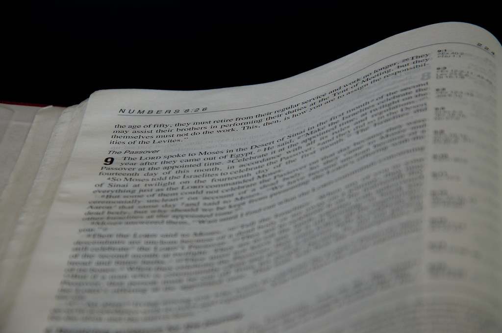
Week 20 - Numbers
To me, there was only one obvious thing to photograph...
 Numbers by Mr_Si, on Flickr
Week 21 - Strong
Had a fantastic time at the Wiston Estate along with 20,000 others over the weekend and so thought this would work from the "Worship Central" band's set...
 Week 21 - Strong by Mr_Si, on Flickr
Two submissions this week! No re-shoot though.
Week 20 - Numbers
To me, there was only one obvious thing to photograph...
 Numbers by Mr_Si, on Flickr
Week 21 - Strong
Had a fantastic time at the Wiston Estate along with 20,000 others over the weekend and so thought this would work from the "Worship Central" band's set...
 Week 21 - Strong by Mr_Si, on Flickr
Last edited:
- Messages
- 11,087
- Name
- Allan
- Edit My Images
- No
HI, numbers very hard to make a book look interesting in a photo, no idea as to how you could but certainly on theme
Strong certainly contains the word "strong" I am sure as an event it means something to you, just not sure of the focal point in the pic
Strong certainly contains the word "strong" I am sure as an event it means something to you, just not sure of the focal point in the pic
- Messages
- 13,760
- Edit My Images
- Yes
Hey Simon 
Shape - Shame about the moon... but you have chosen something else and tried to get the best out of it, nice angle, good background too, feel it could do with a tighter crop, still very nicely lit
Numbers - The figure 9 stands out nicely, but wonder if the word 'numbers' should have been more prominent, liking the angle and DoF all the same, nicely on theme
Strong - Must be honest, took me a while to see the word, now I see it I can get what you are aiming at, just feel it needs to be more prominent.... glad to hear you had a great time, looks like you had the weather too
- Messages
- 6,502
- Name
- Peter
- Edit My Images
- Yes
Nature - I like the framing of these shots together in one image. A find them a little soft though
Action - Good attempt on this one. I like the starburst effect from the street lights. I think the image is much strong by cropping off the bottom to lose the empty road.
Mono - Great play on the word for the theme. I would suggest lighting the image a tad to bring a little more impact
Twisted - Nice idea. You've done well not to get lots of blown out areas given the metallic surface on the drill bits
Fresh - The flat lighting hasn't helped with this one I'm afraid
Shape - I like the subject but would be tempted to put it on a third and go for a negative space style
Numbers - Nice use of a shallow DoF
Strong - Covers the theme but I think I'd have liked to have seen more of the crowd/congregation to give it more of a sense of where it is
- Messages
- 7,548
- Name
- susie
- Edit My Images
- Yes
Hi Simon ... The concept is a very original idea for the theme but I'm not sure about the composition, at first I couldn't make out what the sign on the left hand side said because it's rather dark. Once I read your description of the day it all fell into place. Maybe a simpler composition with just the top of The Big Church Day Out sign combined with the one of the band and the crowd and your text.
It certainly looks as if you had a good time
It certainly looks as if you had a good time
- Messages
- 9,095
- Name
- Mandy
- Edit My Images
- Yes
- Messages
- 8,398
- Name
- Lynne
- Edit My Images
- Yes
HI Simon
I'm quite liking the Numbers shot for the simplicity of it , good black , just the right color on the page to give a sense of slight ageing to the book
Strong......I'd 2nd Peter's comments for this
I'm quite liking the Numbers shot for the simplicity of it , good black , just the right color on the page to give a sense of slight ageing to the book
Strong......I'd 2nd Peter's comments for this
- Messages
- 1,417
- Name
- Judi
- Edit My Images
- Yes
HI Simon
I'm quite liking the Numbers shot for the simplicity of it , good black , just the right color on the page to give a sense of slight ageing to the book
Strong......I'd 2nd Peter's comments for this

- Messages
- 1,159
- Name
- Simon
- Edit My Images
- Yes
Hi all, yeah strong, whilst it fit the theme, was a weak photo. Thanks for the comments though.
Now, on to Week 22.
I set my self a challenge when seeing it to try and capture and bring out the detail of fluffy clouds.
I don't know if it's any good. It's had a bit of PP in that I adjusted the highlights and shadows to try and bring out some depth and to show the fluffiness of the cloud, rather than it being just a bit of white.
Here goes:
 Texture by Mr_Si, on Flickr
Feedback always welcome.
Now, on to Week 22.
I set my self a challenge when seeing it to try and capture and bring out the detail of fluffy clouds.
I don't know if it's any good. It's had a bit of PP in that I adjusted the highlights and shadows to try and bring out some depth and to show the fluffiness of the cloud, rather than it being just a bit of white.
Here goes:
 Texture by Mr_Si, on Flickr
Feedback always welcome.
Last edited:
- Messages
- 1,159
- Name
- Simon
- Edit My Images
- Yes
Hi, pic no longer visible
Hi Allan, it seems to be working for me. I hope it was just a glitch as I haven't done anything to fix it. Does it work for you now?
- Messages
- 1,409
- Name
- Elaine
- Edit My Images
- Yes
Yup, plenty of fluff in there 
- Messages
- 1,159
- Name
- Simon
- Edit My Images
- Yes
Hi all, thank you for all your kind comments.
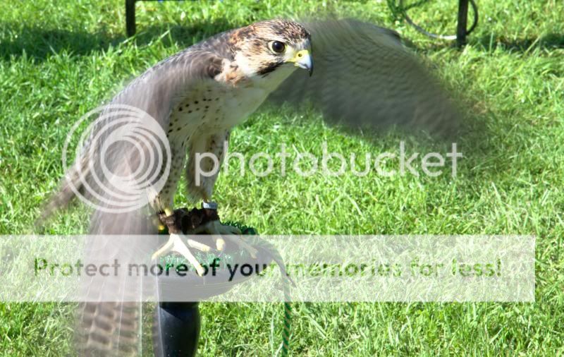
My first entry for Wild:
Falcon: it's a wild bird but it's obviously captive too. You can just never tame them, hence it's wild!
It's not perfect, framing-wise but I was happy the head is perfectly in focus (to me) but the wings are showing lots of motion, which I like.

My first entry for Wild:
Falcon: it's a wild bird but it's obviously captive too. You can just never tame them, hence it's wild!
It's not perfect, framing-wise but I was happy the head is perfectly in focus (to me) but the wings are showing lots of motion, which I like.

- Messages
- 1,159
- Name
- Simon
- Edit My Images
- Yes
Hi Simon,
Lovely image I like the motion in the wings too, good one
Thank you Judi.

 Shape
Shape