weekly overbez's 52 in 2014... Week 52 - SUPPORT added... *** FINISHED ***

Big - yes it is! The colours of the photo and frame stand out well against the white wall and you've made a good job of composition given the constraints of limited space :clap:

Live - gorgeous colours, nice oof background and good use of bokeh (y)

First - #2 for me. Prefer the composition without all that grey sky and it just seems to have more of a sense of movement, plus I like the flare off the headlights :)
 
Hi Graham, out of the two I like the second one better, not a great fan of cars, which is a bit of an understatement

so from a picture point of view the second one the vignette works well and i prefer the angle its on and the composition both nice and sharp considering the speed.

Thanks Allan , I remember your disinterest in cars from last year... And t'other Alan as well I think. :)

Re-Shoot - Well handled PP having peeped at the SOOC for a change, that print stands out beautifully with them great colours, well straightened verticals too :)

Live - Super macro shot, love the bokeh and such a well lit fungi, the colours make it look magical (y)

First - A good angle for the shot, the low PoV adds to the sporty feel, good freezing of the car and keeping the dust kicking up at the back, the sky is rather grey but that for me helps the red car become the centre of attention - Nice one (y)

Hi dean, yep the print is big... But that's what the wife wanted.. :)

Love the colours in the mushroom too,, and the sky for the rally was grey... When it wasn't actually raining. :(

Yes.....but why! :banghead: :D

Still dunno really, think it's supposed to make the shot more dynamic or interesting or something.

Big - yes it is! The colours of the photo and frame stand out well against the white wall and you've made a good job of composition given the constraints of limited space :clap:

Live - gorgeous colours, nice oof background and good use of bokeh (y)

First - #2 for me. Prefer the composition without all that grey sky and it just seems to have more of a sense of movement, plus I like the flare off the headlights :)

Thanks Elaine, I liked the headlight flare too.... Unfortunately though it only came out on one of them. So I had to create the one in the right headlight (as we look at it) myself :)
 
Hi Graham, cracking couple of shots for First there... really good. I think the vignette (not normally a fan!) really works in #2... well cloned out lens flare and the jaunty "motorsport" angle works for me (perhaps just because that seems to be the way these things are done?)

Tiniest crit would be to pull a touch more shadow detail from the side of the car in #2, perhaps?

Shot #1 - I think the subject is even more interesting (not a scooby fan, TBH) and the only thing which weakens the shot at all is the sky... obviously increased because of the low POV (which is great, btw). Not much to be done there - and better lighting generally than if you'd had clear blue skies so I guess damned either way! I think the trick seems to be to get a hill or some other background behind to reduce the amount of sky that's visible?

Great jobs and your processing is very "additive" in a good way... (y)
 
Thanks Paul, the weather really was rubbish, I had a lot more missed focus shots from the afternoons stage, (dark and raining) than I think I've ever had :( but it's a free rally stage, on my doorstep, once a year so have to make the best of it.

Hence my attempts at positions off the tracks lower down and a bit more processing than normal, (angle and vignette).

Removing the flares from the lights in #2 was the easy part. Adding in the starburst to the near side light took more time. Drawing in straight lines emanating from the light, matching the other side, with colour sampled from other side, blur, fade opacity and feather with radial gradient. Done twice with different settings each time and then blend mode screen. :geek:
 
Last edited:
Nice one Graham - funnily enough I did think to myself, "I wonder if he added those starbursts himself" and checked the SOOC very quickly. But, I only looked at the far side light and decided you're cleverness was in camera rather than in post ;)

(But no matter, it's still clever... just of a different sort!)
 
I am glad I've included the links to the unedited shots each week... And glad to hear that they are being clicked on as well, :)

On weeks where I do very little, I'm pleased to be able to show this, but others where I've done more in PS, it's useful to show what I started with. (y)
 
Yes, I think it's a very good idea - one that I reckon I'll be adopting next year.

I'll be totally honest and admit that the reason I didn't at the beginning was because I was using quite a bit of post processing to "rescue" shots. The old adage is true: you can't make a poor photo good... but you can make an average photo marginally more interesting (although never good). I was definitely guilty of a fair bit of that!

I still am, but now I think my SOOC are technically better shots (whilst still not perfect) and my post is usually to apply a particular look or effect, rather than just correct in camera mistakes. There are always some exceptions though... especially with that exposure slider being handy for fixing my metering issues! :oops: :$
 
Cut - Looks a nice clean image with good lighting. A like the shadow underneath. I also like the fact you've varied the cuts across the apple

Balance - Again well lit although I'd have been tempted to clone out the square of light on the bottle. I'm amazed how this is balanced.

Change - I like how you've shown the various stages of the lighted match and the fact you've ordered them left to right Nice use of the smoke against the black background

Reshoot - Good to see an image up on the wall. This one definitely deserves pride of place in your lounge.

Live - Lovely bokah and super focus on the gills. A shame the full cap which needed a smaller aperture.

First - There's just enough motion blur to help this not look static. The low POV really helps give some drama to the shot as well.
 
Thanks peter, on the balancing wine bottle, there were three squares reflected from the velux windows, I removed the smallest one and also removed some of the reflected take to in the lower area of the bottle, as well as a number of small highlights round the shoulders but didn't want to take everything away for fear of losing some of the the-dimensionality of the bottle.

Mushroom I was guilty of shooting wide open here.. As I often do. I must remember this. :)
 
Love that car #2 ... below ground level POV, wacky rotation, sparkly lights. (y)
 
Last edited:
Hi YA

Rally cars...yum yum......, both showing good action with a bit of gravel thrown up from the rear wheels , great focus & DOF (y) Sky is what it is bit not keen on the titlted angles ( not just here but with motorsport images in general) as it kill's my OCD !
 
Hi Graham :wave:

Big -
neutral, slightly warm walls; panelled doors expertly painted in contrasting white, giving that clean appearance; modern dark panelled easy-maintenance plank floors; nicely softened leather sofa, perhaps requiring more colourful cushions to give a bit more wow/impact.

Oh and the photo is good too.:) If a bit high on the wall for my taste:rolleyes:

Live - Like the translucency of the mushroom and the bokeh is super and vibrant - looks like a bonfire in the b/g. Think that you did the right thing in concentrating on the colour/bokeh

First - #1 - actually prefer the SOOC as i think that the colours are more natural
#2 the Subaru (sounds like a bingo call) like the exposure and the vignette and the headlights.
Nuff said:sleep:
 
Thanks guys, I did expect the angle on the really cars to be contentious, the second looks really static in the flat shot.

Hi Alan, made me smile there, cushions are not my department :) and those doors are in desperate need of some gloss, that opening was enlarged from a single door last year, I did more decorating in PS than I've done in there in real life.

Quite pleased with the headlight sparkle I added to the near side light. Makes a big difference I feel.
 
Hi Graham, now thats very nice, very well lit and perfectly positioned in the frame, can't fault it, no crit to offer there :clap::clap:
 
Yep, that's superb Graham, composition, detail and contrast between the lower half of the white ribbon card and off white bg reversed in the top half is excellent (y):clap:

Edit - And a good test for knowing whether your screen is at the correct viewing angle (y)
 
Last edited:
Well I do REALLY like that one Graham. Very well controlled lighting and basically just a wonderful, simple image. Really uses some classic compositional concepts perfectly. The best word I can think of to describe this one is "elegant"... :clap:
 
Cheers gents, was aiming for simple, an almost nothing there image... For anyone with a super bright screen there may well not be much there. :)

And yes dreamy Andy. A bit of negative clarity, and no sharpening, but a bit of noise reduction softened it nicely.

Was wandering around the house trying to find natural light that worked as I wanted, but found double shadows annoying me. Ended up in my favourite room with the roof lights and flash positioned close camera right, diffused with kitchen roll to give the soft shadows to the left. :)

Yes, I nearly posted something to that effect but since it's my screen that's set up that way then it's my fault!!
 
Yes, I nearly posted something to that effect but since it's my screen that's set up that way then it's my fault!!

Wasn't actually thinking of you when I wrote that Paul.... :)
 
Ended up in my favourite room with the roof lights and flash positioned close camera right, diffused with kitchen roll to give the soft shadows to the left. :)

Hi Graham. We have a similar room with 3 roof lights and i do find that as a default position it always does the job.

Smooth - no crit from me. Excellent, creative idea and handled really well. I just wish that i had thought of it. ;) It is so simple yet merits second and third and more viewings.
 
Thanks Alan... There's been plenty of weeks where I've done something overly complicated and someone else has cone in with a simple take and I've thought the same. :)

The room also has our dining table in it and is by the kitchen so is very handy for place mats to flag flashes, bags of rice to weigh down tripod legs, OJ cartons to lean my white card reflectors against; as well as cocktail sticks, sellotape, blutack and all the other photography essentials. :LOL:
 
The room also has our dining table in it and is by the kitchen so is very handy for place mats to flag flashes, bags of rice to weigh down tripod legs, OJ cartons to lean my white card reflectors against; as well as cocktail sticks, sellotape, blutack and all the other photography essentials. :LOL:

Sounds Brilliant. Big boy's play room :banana:
 
Week 47 - Attached.

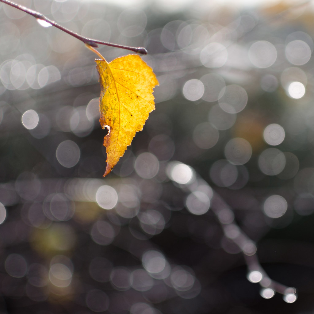
First proper frost of year, and a bit of morning sun to melt it into nice drops which hung on the bare branches. And not many leaves still attached to the trees.


Week 47 - SOOC..
 
Last edited:
Hi Graham :)

Smooth - Oh WOW !!! now that is excellent on my bright monitor, The lighting is wonderful, the curve on this is so well set off against the equally bright background, the tiny hint of a shadow grounding it is spot on - Faultless for me :CLAP:

Attached - Nice photography wise having a bit of frost, none here on the coast so far... I love your background, the bokeh is setting the leaf off perfectly, I'm liking the jagged slightly highlighted edge of the leaf, and the twig coming from the top corner is just right - Super image (y)
 
Thanks Dean. I was worried you'd only see a white rectangle for my smooth shot.... Your screen can't be too far off. :)

Had a nice walk out in the frost this morning, the sun and the water drops combined with the fact I had the 1.8 lens on meant I was on a bit of a bokeh hunt.:)
 
Hi Graham, really nice love the sun on the leaf and the sparkly bokeh with the muted colours that make the leaf really stand out

well spotted :clap:
 
That leaf looks like it's only just hanging on - great spot Graham! Lovely colour contrast and very subtle bokeh that doesn't distract from the main subject (y)
 
.......and the sparkly bokeh with the muted colours.......

Cheers Allan, slight desaturation of the BG there, quite easy as it was mostly monochrome round the leaf.

....., and very subtle bokeh that doesn't distract from the main subject (y)

Thanks Elaine, I did try the full range of aperture's from 1.8 up to about 11, a big difference in the bokeh, but this was the one that worked best for me. :)

... a simple but really effective composition ...

Thanks Susie, didn't have the square crop in mind... I seldom do tbh. But I couldn't get high enough to lose the sky, and that barbed wire cutting across the bottom right had to go, but I obviously had to keep the branch entering top left and the one reaching down into the lower right.. So it kind of wrote itself. :)
 
Last edited:
cheers Andy, who doesn't like a bit of sparkly bokeh. :D was quite interesting how it changed size as the aperture varies. (y)
 
Excellent Graham, simple but effective, lovely well lit leaf, good colour, detail, composition and bokeh (y) ............I've just bought a 35mm 1.8, I would be interested to see one at f11 for comparison :)
 
Smooth ... nice idea, beautiful image.

Attached ... I like a lot. Great Bokeh and light. That would do for a Hope theme ... the old leaf hanging on for dear life in the morning light.
 
That's a great shot, Graham... really like that. The bokeh is lovely (rounded aperture blades - nice lens!)

I also love how the light is coming through the leaf which really brings it to life.

Sometimes the simplest pictures are the best and this ticks both of those boxes :) :clap:
 
Excellent Graham, simple but effective, lovely well lit leaf, good colour, detail, composition and bokeh (y) ............I've just bought a 35mm 1.8, I would be interested to see one at f11 for comparison :)

Cheer Phil... I deleted a lot of them on my walk back... not the best habit but I try and tell myself it saves time later! >>> Here <<< is another one where I kept the f/1.8 and the f/5.0 shots.... here the f/5 would have been my pick.

Smooth ... nice idea, beautiful image.

Attached ... I like a lot. Great Bokeh and light. That would do for a Hope theme ... the old leaf hanging on for dear life in the morning light.

Thanks David... Hope hasn't come up in the past two years... I'd imagine it is the bag though.

That's a great shot, Graham... really like that. The bokeh is lovely (rounded aperture blades - nice lens!)

I also love how the light is coming through the leaf which really brings it to life.

Sometimes the simplest pictures are the best and this ticks both of those boxes :) :clap:

Cheers Paul... 35mm f/1.8. Proabbly gets used about a quarter of the time, with my "long" 55-300 about the same and the 18-55mm kit lens making up the other 50% of my shots.

Yeah the same light backligting the leaf, is also shining through the drops creating the bright OOF highlights.

Hi Graham

Smooth....no crit just a big :clap: , love the curl , the lighting & well, just everything...minimalism at it's best :clap:

Attached....groovy bokeh which compliments the leaf & the yellow really pops (y)

Hi Lynne,
I actually had your curved sheets of paper in the back of my mind as I was mulling this one over, so you can take some credit for providing the inspiration. :)

And there is a bit of desaturation of the BG, which does, as you say help the leaf pop. Not quite SC.... I tried that and it didn't work.
 
Back
Top