weekly overbez's 52 in 2014... Week 52 - SUPPORT added... *** FINISHED ***

Attached: nice idea for the image, it has a story of sorts...

Autumn colours help with the story. Perfect selective focus and good Bokeh, off balanced composition with room for the "drop". what's not to like? 10/10 :)
 
Last edited:
Cheers Brian. (y)

Week 48 - ENERGY

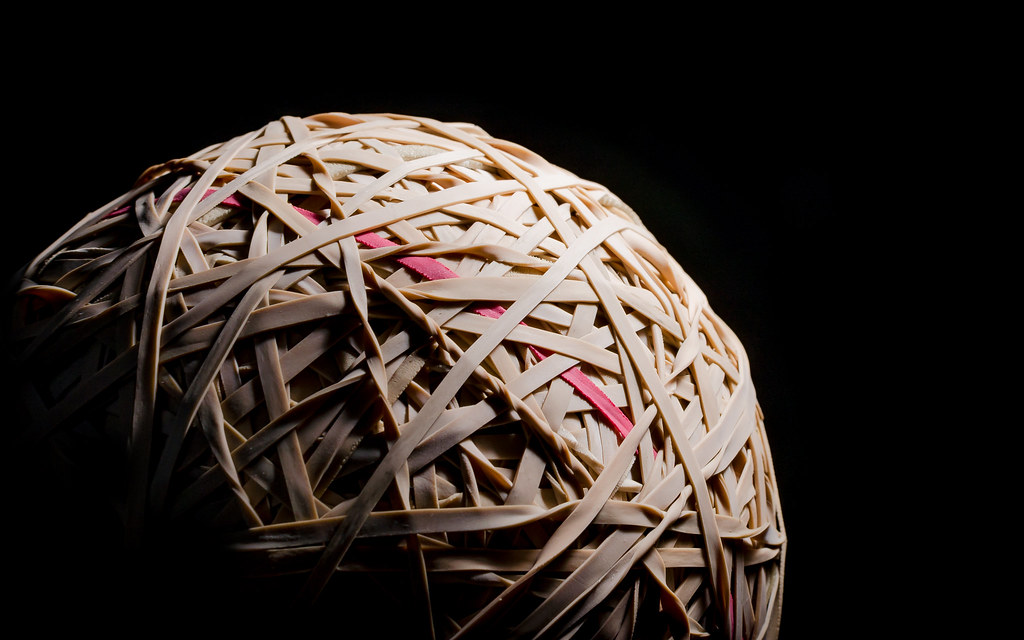
Tricky one this... was thinking stored energy, coiled springs etc.... when my elastic band ball caught my eye, weighing 1.1kg, there must be a couple of thousand stretched rubber bands in there... Quite a bit of stored energy. :thinking:

Not sure I'm completely over the moon with this, but I wanted a close crop, black BG, and fairly harsh lighting to bring out the depth and give a planet-esque look to it.


Week 48 - SOOC

Don;t normally say this, but full screen it looks much better, and F11 to remove the address bar etc (F11 again to get them back :))
 
Last edited:
Don;t normally say this, but full screen it looks much better, and F11 to remove the address bar etc (F11 again to get them back :))

Cough...Mac....Cough ;)

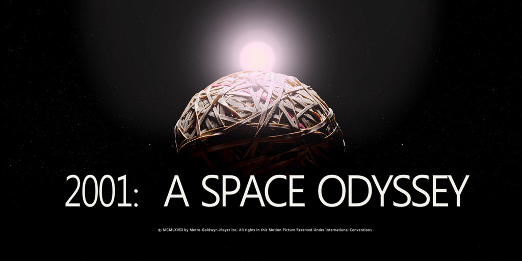
That really works for me. 2001 A Space Odyssey did spring to mind.

The red band is superb, I'm partial to a bit of Red and I'm a fan of Saul Leiter who liked to introduce a splash of red.

Being über critical, I'd have to say the twisted band 8 o'clock from the red band.

Cheers.
 
That's really good and I love the lighting and the framing. Great idea for the theme, Graham.

Thanks Si. :)

Cough...Mac....Cough ;)

That really works for me. 2001 A Space Odyssey did spring to mind.

The red band is superb, I'm partial to a bit of Red and I'm a fan of Saul Leiter who liked to introduce a splash of red.

Being über critical, I'd have to say the twisted band 8 o'clock from the red band.

Cheers.

Thanks very much Andy, it has a red inner core as the PO used to use red ones before they changed to the rubber coloured ones, found a single red one the other day. :)

2001: A space Odyssey would fit better with one of the other shots. :)


Space Odyssey - SOOC

And the shot I worked from..
 
Last edited:
Very clever idea Graham :clap:, straight away I thought of the moon (even before I read your pun........:tumbleweed:...:D) I do actually like the sooc as far as lighting goes, PP one above looks a little bright around the top right side and looks to loose detail :)

A Space Odyssey.........excellent!:LOL:
 
Cheers Phil, a touch bright at the top right maybe, mostly the flat areas which have no detail anyway... and its starting to fall out of focus back there anyway which won;t help.

I find the SOOC one a bit flat and dull. ALthough it could be processing a bit more to try and pull interest into a shot that doesn;t have much of it. :whistle:
 
Hi Graham

Attached - good comp with the position of the leaf and the angle of the branch.(y) Beautiful colour and the way that the light shines thro. I am going away from the crowd by agreeing that the bokeh is well handled and would normally be welcomed , but for me there is a bit too much of it, battling with the main image for attention.

energy - excellent idea ( altho I don't understand why you feel the need for a 1.1kg ball of bands :confused::D). analogy to a planet is spot on and the proportion in the frame and the feeling that the sun is to the right so that part of planet is in day and part in night carries that further. Nice touches with the red and twisted bands. (y)
 
Great one Graham! I think that's really fun and different for Energy. On theme for me too. The original one is really nicely lit in terms of "macro", i.e. the light fall-off bottom left... I really like that. The only tiny tweak I'd like (and I'll confess I wouldn't have thought of this until looking at the photo afterwards) is a bit of reflected light back to fill in under some of the bands. In particular, the shadow under the area near the red band and the tightly twisted band sort of in the middle could do with some filling in. The tricky bit would have been to get fill light just where you want it, without losing that lovely light fall-off at the bottom left. A very carefully angled reflector might do it, but it might just be easier with a snooted (and very low power) second flash.

It might be a tiny bit bright at the top, but it's hard to balance the light fall off (needing a light closer) with not over-illuminating the nearest part to the flash (suggesting moving it further away)... again, a touch of fill might have helped lift the illumination level further away from the main flash? Tricky though.

Anyway, it's really well done and any critique is very minor and just to fine-tune what is otherwise a super shot.

Moving onto the Space Odyssey - I love it. Great thinking, taking a super base shot and compositing in such a way it's greater than the sum of its parts. My only thought is perhaps it's more of a Space Oddity than a Space Odyssey! (y) big thumbs up though...
 
Hi Alan, not sure you can ever have too much bokeh?? :D, The Elastic band planet... well ever since we got our dog, (nearly 8 years ago) I started picking up the bands the posties drop, it got to a point where I simply couldn;t walk past one, and just put them all onto a stretchy ball. The criss crossing is fascinating. I did have in mind a montage of the "planet" being lit from different angles as the "sun" passed overhead, but settled on a single shot in the end.


Hi Paul, Glad you think its on theme, :whistle: :), not so sure on lighting the shadows myself, I kind of like the depth created here, as 3 or four bands cross over creating a void below. I like the deep shadow implying depth.

I'll confess to not having seen Space Odyssey, :), but I googled it on Andy's suggestion, and had a top / back lit shot from one of my sun-passes that I thought fitted. The PS work was fun and again taught me to triple check all is Ok before flattening and saving as jpg. (I misspelt 2 bits in the lower line of text and had to go back in and faff about rather than just retyping). :facepalm:
 
Last edited:
Hi Paul, Glad you think its on theme, :whistle: :), not so sure on lighting the shadows myself, I kind of like the depth created here, as 3 or four bands cross over creating a void below. I like the deep shadow implying depth.

My thoughts could well be very badly wrong: it's one of those things that pops into my head but until I've seen it I can rarely be sure these ideas are any good!! :) Your shot is great as is.
 
Thanks Susie, I did try and use it previously.. Can't remember what week for but the idea was for it to be rolling down a tunnel (Indiana Jones style) after a fleeing Lego man. Unsurprisingly, I couldn't match the image I had in my head for that one. :LOL:

No problems Paul, just because I don't agree, doesn't make you wrong... It has grown on me, but does need to be viewed larger than life to work I think.
 
Hi Graham, i really like that, having just taken some pics of the moon myself the lighting on your elastic band moon is perfect, also fits the theme perfectly.

The one red band is a nice touch too

at least I know where to come if I am ever short of elastic bands :banana:
 
Smooth: Elegant is also the first word that came to my mind. Really like the white on white and super soft hint of a shadow. A really subtle picture which shows off perfectly your skill and flair

Attached: a nature subject with a nice natural 'unforced' composition. The yellow leaf against the grey / white background gives this a selective colouring feel, which sits a little uneasy.....but thats just me being ultra picky. Of course the bokeh is superb and all round its sharp and well executed as all your pics always are.

Energy: I liked this the instant I saw it a week or so ago. Really like the bold lighting and contrasting dark background. Also really like the deep shadow (bottom left) - Not sure if this is added in PP? Of course the the composition suits the bold subject aptly. Do you let the kids play with the rubber ball ?? :)

oohh....and really liked the composited version of energy. The stars are perfect! (y)
 
Last edited:
@alsjazzera Thanks Allan, I agree without the red band it would be quite a bit less of an image.

@Pinkbikerbabe , thanks Mandy, also tried a few with shallower DOF, focussed on both the front edge of the ball, and also on just the rear edge, but they didn;t work as well. This was focussed about 1/4 to a 1/3 of the way round, with aperture set to just have the rear edge falling OOF.

@JasonGlyn cheers Jason, I did go compeltely SC on attached, but it wasn;t right, it was pretty muted anyway, but I just puled it down a touch. ALways like to hear opinions, nothing works for everyone and I prefer when people say if it doesn't work for them.

The shadow on the rubber band ball wasnlt altered to darker, if anything I lifted it slightly, but the far side of the ball from the light is dark, I had the flash literally just out of shot, with some card "barn doors" I think would be the technical term to stop light getting to the camera or the black paper behind the ball.

Also thought you;d appreciate Space Odyssey, again credit to Andy @posiview as I never would have had the idea myself. :)

Oh, and the kids used to play with the ball when it was smaller, but its just tooo big and dense now. Might be fun to take it out to an empty car park and throw it around a bit..... hmmmmm :thinking: :D
 
Last edited:
Thanks Dean. I was worried you'd only see a white rectangle for my smooth shot.... Your screen can't be too far off. :)

Had a nice walk out in the frost this morning, the sun and the water drops combined with the fact I had the 1.8 lens on meant I was on a bit of a bokeh hunt.:)
Sounds like a good trip out... I must try to do that over Christmas when I get the chance :)
 
How did I miss the band ball :D

Really pleased to see a postman red band in there... a band ball is not a band ball without a few of them !!!

Very nice lighting, showing some real depth and super detail too... your edit with the text sure made me smile also (y)
 
Week 49 - Round

Still in a planetary mood, I thought I'd try a moon shot. Not quite a full moon, that was the night before but weather wasn't good. Longer lens would have been nice here! :(


Week 49 - SOOC
 
Not quite a full moon!..........well its not round then :p

I can't see the exif Graham, but I'm guessing this was last Sunday night (edit) now I can :confused:

Some good detail when viewed large, especially in the top right section, (y) .......its certainly well lit :whistle: :D

.....and a lot better than any attempt I've made at shooting the moon. I've normally gone for around 1/250, f/11 or there abouts and iso100, but I like your settings, will give them ago next time:)
 
Cheers Phil. Was indeed Sunday night. Feel a bit of a fraud this week as I had no control of the lighting, plenty of scope to crop in anyway I wanted and literally just stepped onto the doorstep to take it.

This was hand held, leaning against a post for stability, and the moon actually moves quite fast so need a fairly high shutter, dof not really an issue so went f8 for sharpness, the ISO then sets itself.

"They" say a full moon is not the best for detail due to the straight on lighting, so I had to boost clarity and contrast and sharpening to get to this.
 
HI Graham


Not seen an elastic band ball for a long while....good thinking for the theme , like the harshish lighting & the crop....very planetary as has already been mentioned (y) Love the Space Odyssey advert....brilliant :clap:

Round....Moon , yup , super detail , cropped nicely :clap:
 
Thanks, I think I might have liked a bigger moon, I cropped in as much as I could without loosing quality, but do agree that the space around gives more of a feeling of looking up at it in the night sky.

Ooh, cheers Andy. No chance of me getting another lens. When we were at the air show and the hawk conservancy earlier in the year there were guys with 5 / 600mm primes and associated tripods and flight cases and trollies... Not really for me though, apart from the prices, I like something I can carry about
 
Last edited:
Hi Graham, nice detailed shot of the moon, I have always had to play about with the contrast and clarity to when I have attempted it,
it's amazing how much light it reflects, nice choice for the theme too (y)
 
Energy .... Nice idea, nicely lit and cropped ... great detail. 2001: A space Odyssey ... ha that's fun.

Round .... looks like a good moon shot to me and nicely framed.
 
Smooth - Wow. I'm absolutely loving this. It's simplistic and minimal and yet my eye is drawn in around the curve time after time. The lighting is superb with subtle shades of grey. This is one of my favourites from you. A big thumbs up from me. Well done Graham

Attached - This was one of my ideas and I found you'd beaten me to it. The bokeh is superb as is the lighting on the leaf. Simply just a lovely image

Energy - Brilliant. You images are really strong and this is no exception. Again great lighting. I keep thinking of a planet or moon with this image. The sharpness of the elastic is spot on as well.

Round - Another great shot. That moon looks pin sharp and is especially where the craters meet the top right edge. Great positioning in the frame as well.
 
Thanks guys, not much you can do with a moon shot, glad you all approve of what I did do though. :)

@Delta Skies I agree that there is something about smooth that just invites you to keep looking.

And Week 50 - Nonsense

I'd love to know who suggested this theme... although I think I can hazard a pretty good guess!


[URL='https://flic.kr/p/qpjWBq']

Nonsense - SOOC[/url]
 
Last edited:
Hiya Graham, how well does that work (y) good detail in the boat and pasta around it, colour's superb, blue bg acting as sky and excellent cloning to give the pasta width and depth (y)

The only thing that might have worked better for me, would have been the boat on the left corner, heading diagonally away........:thinking:....... but I suppose that would have meant we were looking at the back of the boat and sails :)
 
Cheers Phil, I did think about having it on the left, but still sailing towards us, but I liked the view of the sails from this angle, tried a horizontal flip but still didn;t like it.

Cloning?? :thinking: (Oh yeah, you've obv looked at the SOOC!) Need more pasta. Foolishly thought I could get away with not having any behind the ship, and spread it out a bit more.... Till I got it on the computer and noticed you can see the cardboard base through the holes under the sails and through the rigging.. :banghead:
 
Hi Graham, really like that pasta sea, you have done a great job on the cloning to (y)

As to who suggested the theme :bat:I have no idea, some people shouldn't be allowed to think
 
Cheers Allan. :) with more pasta in the cupboard there would have been no need for cloning.

thanks andy, my first thoughts were either beans or custard... Hardcore :) but we had none of either, might not have thought it through though... as I had about 2 litres of pasta there. o_O
 
Hi Graham... another couple of super shots.

Round - it does what it says! I like the definition you have on the craters at the top... as you say, important that it's not a properly full moon. But it's full enough that it still looks very round. Nice to have one with space around it too. Don't get me wrong, I don't think it's your best ever shot, but it's a very accomplished image of the subject and spot on theme.

Nonsense - well, now. This really is one of my favourites. Smashing idea (I think we're all slightly disturbed, really) and just fantastic execution.

The DOF choice is simply perfect - really makes the pasta look sea-like. And it's a lovely model boat... with the whole thing being very well lit. But the lighting confuses me a bit - the principal shadow suggests lighting frame left, higher up and maybe slightly behind the boat (or at least level with it) - but the highlight on the wooden hull makes it look more like front-on / on axis?? Did you add some on camera flash fill perhaps?

Whatever my confusion, it's a great shot, really well composed and very very well executed. A great #50 for this year!
 
Back
Top