You are using an out of date browser. It may not display this or other websites correctly.
You should upgrade or use an alternative browser.
You should upgrade or use an alternative browser.
weekly Robs 52 - 29 Skill
- Thread starter robj20
- Start date
- Messages
- 3,133
- Edit My Images
- No
Like the daisy, composition, dof, colourif anything, it looks like you've just lost a bit of detail in the petals, on my lappy they look to blend together a little
Great shot of the old tripod, composition, dof, focus, the setting, all work really well
The loss of any detail is probably because its very heavily cropped, the original is a photo of a field of flowers.
Just need to decide what to do for Mono now, dont want to do the obvious black and white photo.
- Messages
- 4,088
- Name
- Graham
- Edit My Images
- Yes
Like the daisy - simple, classic image, well coomposed (or cropped 
Tripod is good too, great detail and texture in the rust... just enough DOF, I thought maybe slightly more to keep in the end of the handle... but that helps tie it into the OOF background nicely
Tripod is good too, great detail and texture in the rust... just enough DOF, I thought maybe slightly more to keep in the end of the handle... but that helps tie it into the OOF background nicely
- Messages
- 8,398
- Name
- Lynne
- Edit My Images
- Yes
Hi Rob
Nature......well placed in the frame , good use of DOF & the whites look white if a tad bright ,nice yellow centre as well - I always struggle with yellows !
Action....good find ! More good use of DOF ,plenty of detail in the rusty bits
Nature......well placed in the frame , good use of DOF & the whites look white if a tad bright ,nice yellow centre as well - I always struggle with yellows !
Action....good find ! More good use of DOF ,plenty of detail in the rusty bits
- Messages
- 3,133
- Edit My Images
- No
Here are the last two weeks, so i'm all caught up now.

Mono 16-52-2014 by treboraj20, on Flickr

Twisted 17-52-2014 by treboraj20, on Flickr

Mono 16-52-2014 by treboraj20, on Flickr

Twisted 17-52-2014 by treboraj20, on Flickr
- Messages
- 19,461
- Name
- Andy
- Edit My Images
- Yes
Well spotted with #1, but is it mono  I'd like a tighter crop, mainly because the blows sky draws my eye. The maybe a little more contrast.
Twisted, on theme but a slightly wider DOF to get more of the wire in focus, I'd like the wire running from top to bottom removed and the photograph looks slightly green. I know it's from the grass but I'd like it removed
Cheers.
Twisted, on theme but a slightly wider DOF to get more of the wire in focus, I'd like the wire running from top to bottom removed and the photograph looks slightly green. I know it's from the grass but I'd like it removed
Cheers.
- Messages
- 4,088
- Name
- Graham
- Edit My Images
- Yes
I really like your SC arrow for MONO, and i don;t mind the blown sky here... the one thing I would like is to have you position to have been slightly round to your left, placing the arrow slightly over in the frame, and giving the path / steps going up the hill more prominence.
on the barbed wire, I also feel the vertical curved one not really contributing much. but like the OOF mottled BG
on the barbed wire, I also feel the vertical curved one not really contributing much. but like the OOF mottled BG
- Messages
- 8,398
- Name
- Lynne
- Edit My Images
- Yes
Hi Rob
Mono....one sign one color picked out so works for me...& I agree with Graham's comments re placement in the frame.....
Twisted...like the great use of DOF , gives a lovely mottled BG , don't mind the curved bit coming in to frame as seems to add to the twisted theme struggling a little to find the focus point though ?
Mono....one sign one color picked out so works for me...& I agree with Graham's comments re placement in the frame.....
Twisted...like the great use of DOF , gives a lovely mottled BG , don't mind the curved bit coming in to frame as seems to add to the twisted theme
- Messages
- 9,095
- Name
- Mandy
- Edit My Images
- Yes
Sorry I haven't popped in for a few days, excellent work from you keep up the good work.
- Messages
- 3,133
- Edit My Images
- No
Big update this time, did most of these while away on holiday. I had all the themes going through my head all the time.
18-Fresh by treboraj20, on Flickr

19-Shape by treboraj20, on Flickr

20-numbers by treboraj20, on Flickr

21-Strong by treboraj20, on Flickr

22-Texture by treboraj20, on Flickr

23-Wild by treboraj20, on Flickr

24-Dream by treboraj20, on Flickr

25-Verticle by treboraj20, on Flickr
Some i am very happy with considering the themes took a backseat but i took each one with the theme in mind. Some like Wild and Verticle im not very happy with the final image, it was sure fun trying to fit the themes into a holiday though and not drive the girlfriend bonkers.

18-Fresh by treboraj20, on Flickr

19-Shape by treboraj20, on Flickr

20-numbers by treboraj20, on Flickr

21-Strong by treboraj20, on Flickr

22-Texture by treboraj20, on Flickr

23-Wild by treboraj20, on Flickr

24-Dream by treboraj20, on Flickr

25-Verticle by treboraj20, on Flickr
Some i am very happy with considering the themes took a backseat but i took each one with the theme in mind. Some like Wild and Verticle im not very happy with the final image, it was sure fun trying to fit the themes into a holiday though and not drive the girlfriend bonkers.
Last edited:
- Messages
- 4,182
- Name
- Paul
- Edit My Images
- Yes
Hi Rob... wow that's a load of photos!
Mono 16 - really nice shot but... erm... it's three colours, not the two of mono! Lovely shot though and great detail with just the right DOF. A bit of SC never killed anyone, did it?! I'd be really very happy with that shot.
Twisted 17 - another well executed shot and smack on theme. Very clean and simple, which is a good thing in this case!
Fresh 18 - Nice shot, well taken and good colours. Just feel like it lacks something in the far background (sunset would be great)... but a good picture - and again I'd be happy with that.
Shape 19 - Well taken and good DOF choice but I feel it's a bit cluttered behind the railing. I think it could be even better from a slightly lower angle?
Numbers 20 - nice spot and a good photo... I'd like the 3 to be in focus as much as a the 1 and for it to then tail off on both screws. So same DOF, but focusing just a tiny bit further in, perhaps? Nice interesting lighting going on inside the numbers...
Strong 21 - good shot but quite a bit going on around the "strong" elements... maybe a tighter crop would focus the mind on the strength of the wall, the castle and hills behind?
Texture 22 - very simple again, but maybe to its detriment. I feel as if it needs something else to help contrast the texture - maybe even tighter DOF so the texture disappears into even more of a blur at the frame edge?
Wild 23 - nice take of a donkey/ass - would prefer it to be looking in-frame and obviously there's a fair bit going on around it which makes it look far less wild!
Dream 24 - love this. I know it breaks rules by being so simple, but it's well taken, is perfectly on theme and the PP/style really works for me. Over saturated colours just make me think of holiday brochures and that's certainly dreamy!
Vertical 25 - On theme, but I'm guessing the shot was taken in the height of the sun? May that's why it looks a bit flat. We always complain about the weather, don't we?!
For me, my favourite is probably dream - so simply but effective. Lovely photos all the way through though. Well done for combining with your holiday!
Mono 16 - really nice shot but... erm... it's three colours, not the two of mono!
Twisted 17 - another well executed shot and smack on theme. Very clean and simple, which is a good thing in this case!
Fresh 18 - Nice shot, well taken and good colours. Just feel like it lacks something in the far background (sunset would be great)... but a good picture - and again I'd be happy with that.
Shape 19 - Well taken and good DOF choice but I feel it's a bit cluttered behind the railing. I think it could be even better from a slightly lower angle?
Numbers 20 - nice spot and a good photo... I'd like the 3 to be in focus as much as a the 1 and for it to then tail off on both screws. So same DOF, but focusing just a tiny bit further in, perhaps? Nice interesting lighting going on inside the numbers...
Strong 21 - good shot but quite a bit going on around the "strong" elements... maybe a tighter crop would focus the mind on the strength of the wall, the castle and hills behind?
Texture 22 - very simple again, but maybe to its detriment. I feel as if it needs something else to help contrast the texture - maybe even tighter DOF so the texture disappears into even more of a blur at the frame edge?
Wild 23 - nice take of a donkey/ass - would prefer it to be looking in-frame and obviously there's a fair bit going on around it which makes it look far less wild!
Dream 24 - love this. I know it breaks rules by being so simple, but it's well taken, is perfectly on theme and the PP/style really works for me. Over saturated colours just make me think of holiday brochures and that's certainly dreamy!
Vertical 25 - On theme, but I'm guessing the shot was taken in the height of the sun? May that's why it looks a bit flat. We always complain about the weather, don't we?!
For me, my favourite is probably dream - so simply but effective. Lovely photos all the way through though. Well done for combining with your holiday!
- Messages
- 8,398
- Name
- Lynne
- Edit My Images
- Yes
Hi Rob.........lord above...how many ????
Without wishing to sound hard I'm gonna skip over all your shots barring one........
Dream......that is a blinder......needs putting on a big canvas & putting on a big wall...I could stare at it for hours just dreaming of the white sandy beach that the beautiful warm blue water will be lapping against...really really excellent


- Messages
- 9,095
- Name
- Mandy
- Edit My Images
- Yes
Blimey how many images.............. Well done for the mega catch up.
Fresh - nice composition and fits the theme.
Shape - fits the theme plenty of shapes to be seen, I am not keen on the composition on this image. Can't put my finger on why at the moment.
Numbers - again fits the theme, the simplicity of the image works for me.
Strong - beautiful image nothing for me to crit on.
Texture - fits the theme but looks a little bland to me could do with something to hold my attention.
Wild - nice looking donkey fits the theme, my crit would be I feel the image would work better with the donkey looking at the camera.
Dream - a fantastic image very fitting for the theme nothing at all to crit.
Vertical - plenty of verticals to be seen nice panoramic image, good composition I like it a lot.
Last edited:
- Messages
- 3,133
- Edit My Images
- No

26-Yummy by treboraj20, on Flickr
- Messages
- 4,182
- Name
- Paul
- Edit My Images
- Yes
Well, if one of the rules of composition is "fill the frame" then I think you've succeeded  I like the icing highlight on the left but I'd prefer another fill light source from the right (or even above) to help lift out some of the shadow areas on the right of the bun. I also find the writing on the board a little distracting (also the knife mark BL of frame).
It certainly looks yummy, focus on the cherry is good, DOF choice is quite shallow which is perhaps a little unusual but I quite like that.
Good shot - just needs a lighting tweak, perhaps?
It certainly looks yummy, focus on the cherry is good, DOF choice is quite shallow which is perhaps a little unusual but I quite like that.
Good shot - just needs a lighting tweak, perhaps?
- Messages
- 1,409
- Name
- Elaine
- Edit My Images
- Yes
Mmm, very yummy-looking - definitely not one of Mr Kipling's! As Paul said, the only thing that I find a little distracting is the lettering bottom left. I found myself tilting my head to try and work out what it said!
- Messages
- 4,834
- Name
- Alan
- Edit My Images
- Yes
Hi Rob.
Yum - spot on theme. A bit tight in the frame perhaps and agree with points made re lighting- food is very hard to get right I find
Yum - spot on theme. A bit tight in the frame perhaps and agree with points made re lighting- food is very hard to get right I find
- Messages
- 3,133
- Edit My Images
- No
Soon as i heard it approaching i finally knew what my Loud photo would be.

27-Loud by treboraj20, on Flickr
This really stood out for me so i just had to use the reshoot option for week 28. I love the contrast between the decaying tree and the green fields, and the angry storm filled sky.
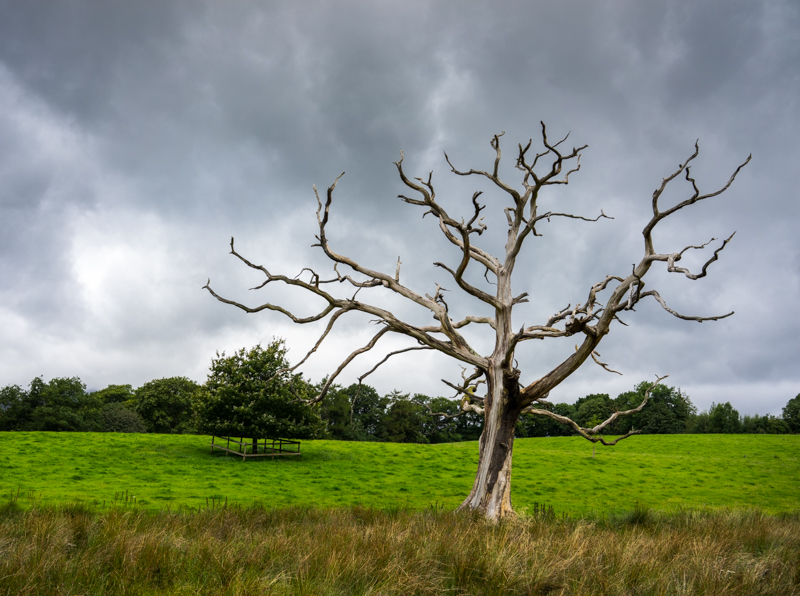
28-Reshoot-Nature by treboraj20, on Flickr

30-Half by treboraj20, on Flickr
This was a great find, in the middle of no where.

31-Architectural by treboraj20, on Flickr

27-Loud by treboraj20, on Flickr
This really stood out for me so i just had to use the reshoot option for week 28. I love the contrast between the decaying tree and the green fields, and the angry storm filled sky.

28-Reshoot-Nature by treboraj20, on Flickr

30-Half by treboraj20, on Flickr
This was a great find, in the middle of no where.

31-Architectural by treboraj20, on Flickr
Last edited:
- Messages
- 4,182
- Name
- Paul
- Edit My Images
- Yes
Hey Rob, a good few catchups there.
Loud - nice take, certainly frame-filling (I'm spotting a theme here!) and also interesting to have the engine in the middle of coaches. The only thing I don't like are the chimneys poking up from the building behind, but otherwise it's a decent take. Nice angle and exposure well handled given the sun must have been pretty high... probably would have been easier in the early morning or late evening?
Nature - that'll be a tree shot then! Well spotted and I think the ominous sky works well here, with the stark, almost haunting, tree. Only thing I'm not a fan of is the branches crossing the line of the trees behind - I'd have much preferred a lower POV and all the branches being viewed against the sky behind. Maybe a tiny bit underexposed and slightly oversaturated, although that might have been your intention with a bit of HDR-impact going on?
Half - I really like the frame filling here and it works very well, along with the angle of the fruit. In fact, cropping the edges of the fruit is 10x more effective and punchy than being able to see it all. Well done on the composition. Only thing distracting for me is the yellow splodge to the left, which I'd much prefer to be cloned out (and would be fairly quick to do with content-aware fill in PS). Lighting is good with just the merest hint of specular reflection... perhaps the tiniest bit more could work, too?
Architecture - great find and well spotted photo opp. I like this and the exposure works well - tough with the underexposure necessary on the tunnel yet almost overexposed on the trees behind. Green saturation is a bit toppy for me on the foliage/weeds at the front (top), although fine behind owing to the lighter colour (higher luminance helps bring down the effect of saturation). Good take and well-judged, compositionally. Only other shot I could see there would be to have the tunnel at a slight angle going left or right and de-centralising the composition a bit. But it's good as is!
Well done and keep it up
- Messages
- 4,088
- Name
- Graham
- Edit My Images
- Yes
Nice shot of the engine - really hard to get a nice uncluttered view of such a thing. Green works well with the nice blue sky, and the engine driver hanging out the door is a nice touch. This isn;t Porthmadog is it? (Similar block paving there.  )
)
Really liking the tree - my sort of image there. Interesting shapes, nicely lit but with a cracker of a sky behind. Only thing i'd like to see a bit more separation between it and the leafy one to the left. 2 steps left would have done it. Love the processing here though.
Kiwi lovely too. Apart from the yellow smudge.
through the tunnel works well, like the lifted shadows under the arch, wonder if they may have been lifted a tad too much maybe. And the greens are a bit green as Paul said, maybe reducing the saturation of the yellows would bring them back quickly.
Good catch up. Love the tree though
 )
)Really liking the tree - my sort of image there. Interesting shapes, nicely lit but with a cracker of a sky behind. Only thing i'd like to see a bit more separation between it and the leafy one to the left. 2 steps left would have done it. Love the processing here though.
Kiwi lovely too. Apart from the yellow smudge.
through the tunnel works well, like the lifted shadows under the arch, wonder if they may have been lifted a tad too much maybe. And the greens are a bit green as Paul said, maybe reducing the saturation of the yellows would bring them back quickly.
Good catch up. Love the tree though
- Messages
- 13,760
- Edit My Images
- Yes
Hi Rob 
That sure is unusual to get a steam train shot without other toggers in, I like the angle, the carriages all in and a nice blue sky/fluffy clouds... Nice
Re-shoot - Oooo now that I really like, I love the layers of green through the bottom of the shot, with a tiny bit of cloning (end of branches from the tree line and clone out that fence) it would be perfect for me, still a great image, super stormy sky and stark tree
Half - Bright, fruity, not sure on the clipping but really well lit and super detail
Architecture - very well framed arch, not sure on the processing, looks just a tad too much, still you have caught some great detail and nice even light throughout, - great catch up
That sure is unusual to get a steam train shot without other toggers in, I like the angle, the carriages all in and a nice blue sky/fluffy clouds... Nice
Re-shoot - Oooo now that I really like, I love the layers of green through the bottom of the shot, with a tiny bit of cloning (end of branches from the tree line and clone out that fence) it would be perfect for me, still a great image, super stormy sky and stark tree

Half - Bright, fruity, not sure on the clipping but really well lit and super detail
Architecture - very well framed arch, not sure on the processing, looks just a tad too much, still you have caught some great detail and nice even light throughout, - great catch up
- Messages
- 4,834
- Name
- Alan
- Edit My Images
- Yes
Hi Rob
Loud - spot on. Good colours, comp and like how the steam of train mixes with clouds.
Nature - good spot - there is abetter picture to be had i feel by moving left and trying to remove the dominance of the rear tree and a lower pov to get all branches against the sky
Half - really like the angle the popping colour and the deliberate crop of the top and bottom. Just that yellow splodge to the left
Architecture - good framing and exposure . A bit less saturation of green for me.
- Messages
- 8,398
- Name
- Lynne
- Edit My Images
- Yes
Hi Rob
Nature reshoot.....has potential as you've got the most important elements right....great sky , well exposed & a fab contrast between the green grass & the dead tree Crop a smidge from the rhs , a smidge off the bottom . If you can reshoot again I'd agree with Alan about a lower POV to get all the dead tree branches clear of the rear hedge so they pop more against the sky
Architecture....fills the frame well & looks nicely sharp & well focused Desat the greens a smidge & lift the shadows a smidge to really bring out the tones & textures in the brickwork possibly
Nature reshoot.....has potential as you've got the most important elements right....great sky , well exposed & a fab contrast between the green grass & the dead tree
Architecture....fills the frame well & looks nicely sharp & well focused

- Messages
- 3,133
- Edit My Images
- No
- Messages
- 4,088
- Name
- Graham
- Edit My Images
- Yes
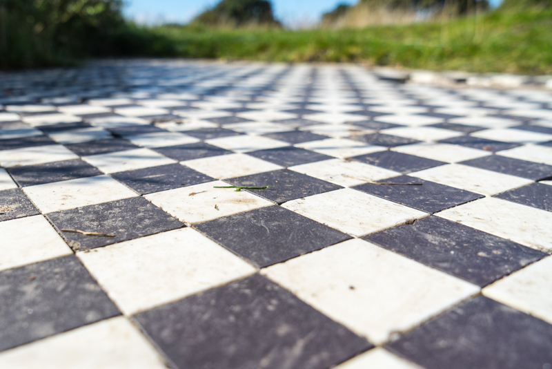
really like this one rob, love the low POV and the shallow DOF and receding lines. As well as the strong diagonals and the slightly off centre angle. Think you;re right to keep some of the BG in to give the sense of scale... (Have you cropped any off the top, I'd like to have the top of that rock(?) in if possible.
- Messages
- 4,182
- Name
- Paul
- Edit My Images
- Yes
I like that Rob. Very different and interesting. It all makes me eyes go a bit funny because of the diagonals and the green bank (which at first looks wonky but the horizon is clearly straight)... Good spot, well shot and nice to see something different again. 
- Messages
- 9,095
- Name
- Mandy
- Edit My Images
- Yes
Some more good work in here sorry not popped in for a while, had issues with my broadband.

