catclick's 52 week challenge 2021 - Done & Dusted

I wonder if there has been an update (Windows or PS)causing the colour shift.
I've not noticed it from flickr, but I found that an image I had moved from LR to PS (to add instagram borders, and pretty much nothing else), and saved back was darker when viewed in Picasa (it was fine in LR).
I selected "Use Colour Management" in Picasa and it returned to the way I expected.

My Save uses:
View attachment 324522
But I'm pretty sure that's standard...
Thanks. I will look at that over the next couple of days and hopefully get it sorted for next submission
 
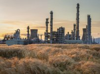
Nice composition using the soft barley to offset the harsh lines of the petrochemical site. Sunlight works really well in the first one
 
I like the first one it looks quite imposing on the landscape, works well with the colour of the sky too. I also love the red squirrel lovely and sharp.
 
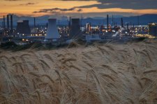
Much prefer the second one. All those little dots of light like mini-suns. The first is really nice too with the way the sun is catching the fields. However the HDR has removed any atmosphere from the background buildings for me. I'm wondering what the 1st one looked like before the treatment?

Glad you got your colours sorted. That was a weird issue!
 
Last edited:
I like both for different reasons but the first one is best IMO as it looks post-apocalyptic.

I also love a red squirrel :)
 
Beautiful images Catherine, I think I prefer the first one. Plants in front of the plant, both with equal time in the frame.
 
Both good Cat, I wouldn't like to choose TBH (y)
 
Oooooh nice - No2 for me for sure!
 
Plant
Definitely #1 for me, I prefer the composition. The tall towers give a nice triangle composition. The sky and crop (wheat?) Match colour and tone wise and the greys of the facility divide the image up nicely.
 
#1 for me too... I like the justaposition between the natural and the industrial.
 
It's amazing how good light can create such a lovely image from an industrial site. #1 for me. The soft light on the barley and in the setting (?) sun really complement the grey subject.
 
Nice composition using the soft barley to offset the harsh lines of the petrochemical site. Sunlight works really well in the first one
I like the first one it looks quite imposing on the landscape, works well with the colour of the sky too. I also love the red squirrel lovely and sharp.
Much prefer the second one. All those little dots of light like mini-suns. The first is really nice too with the way the sun is catching the fields. However the HDR has removed any atmosphere from the background buildings for me. I'm wondering what the 1st one looked like before the treatment?

Glad you got your colours sorted. That was a weird issue!
I like both for different reasons but the first one is best IMO as it looks post-apocalyptic.

I also love a red squirrel :)
Beautiful images Catherine, I think I prefer the first one. Plants in front of the plant, both with equal time in the frame.
Both good Cat, I wouldn't like to choose TBH (y)
Oooooh nice - No2 for me for sure!
Plant
Definitely #1 for me, I prefer the composition. The tall towers give a nice triangle composition. The sky and crop (wheat?) Match colour and tone wise and the greys of the facility divide the image up nicely.
#1 for me too... I like the justaposition between the natural and the industrial.
It's amazing how good light can create such a lovely image from an industrial site. #1 for me. The soft light on the barley and in the setting (?) sun really complement the grey subject.
Thanks for your comments. It always amazes me how different people like different things and for different reasons.
 
Difficult to call to be honest. I prefer that #1 focuses on the industrial plant, but the HDR in the foreground is a bit too overdone for my liking.
I guess you wouldn't have got the bokeh in #2 if the plant were in focus though.
 
Really nice couple of images, I really like them both but have a preference for number two although I couldn’t tell you why :)
 
We've had a few of these the last few days! Better to be looking at a pic of it than be under it!
 
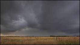
Good work Catherine, just to echo others above, definitely a dominating sky.
 
We've had a few of these the last few days! Better to be looking at a pic of it than be under it!
it does dominate the shot, and it's nicely threatening (y)
Fabulous sky, well captured. Can't say much more.
Great shot I like how the clouds draw my eye to the middle. Very atmospheric!
That is a heavy dominating sky!
Great sky shot
Good work Catherine, just to echo others above, definitely a dominating sky.
Thank you all. Got soaked getting it! ⛈
 
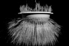
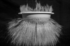
That’s really cool! You’ve caught the water really well there. The only thing I would say in the nicest possible way, is that it would have been nice to see more the bottom of the water. Great shot!

How many attempts did it take?
 
Fantastic!
 
That’s really cool! You’ve caught the water really well there. The only thing I would say in the nicest possible way, is that it would have been nice to see more the bottom of the water. Great shot!

How many attempts did it take?
I would agree with you, unfortunately getting it lined up was tricky, This was the best of the bunch. Previous attempts showed it needed to go higher, then this one should have been lower. I had about 10 balloons. Many shots from the continuous drive and kept about 5. Lots of images of a wet colander and nothing coming through it. :ROFLMAO:
 
I like that - makes for a striking image.

If it was me processing it, I'd have pulled the blacks down more to give it a little more punch however.
Yes, the black is better but I think I prefer the water in the original. Perhaps a radial filter might be the answer? Will give that a try thanks.
 
I would agree with you, unfortunately getting it lined up was tricky, This was the best of the bunch. Previous attempts showed it needed to go higher, then this one should have been lower. I had about 10 balloons. Many shots from the continuous drive and kept about 5. Lots of images of a wet colander and nothing coming through it. :ROFLMAO:

I know that feeling. A few years ago I went to my first F1. When I wasn't panning and instead was trying to get cars passing through frame, I was staggered by how many shots I ended up with just empty track.
 
A lovely take on the theme :)
 
Your Snappers Choice is an excellent shot because of the imagination to think of taking it.

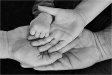
Hands: Clever take. Not sure if I would have preferred a DoF that would focus all the hands.
 
Hands
I've wanted to try something like that for a while, but find it hard to find that many different hand in one place.
A good black and white, nice and sharp.
 
Hands
I've wanted to try something like that for a while, but find it hard to find that many different hand in one place.
A good black and white, nice and sharp.
Right place, right time. My neighbour's daughter and husband visited with their 5 year old and 3 week old baby. Spoke nice to them and the daughter likes the image too, so all happy.
 
Back
Top