Nikon_Nick
Shirley
- Messages
- 6,371
- Name
- Nick
- Edit My Images
- Yes
Mornin',
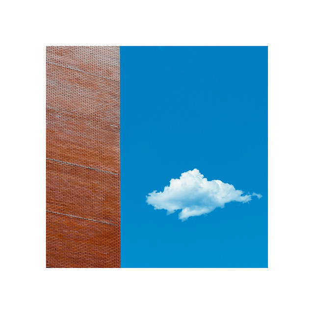
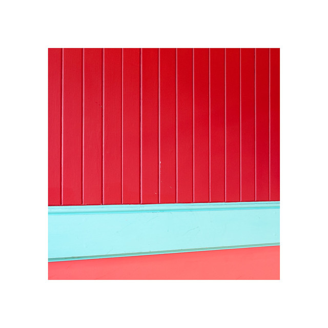
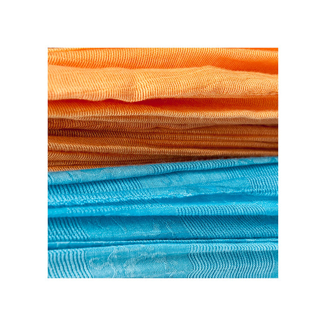
I wanted to do something a little different (for me anyway), as I usually stick to urban landscapes or pictures of my daughter") So, I decided I wanted to make some contemporary, colourful/striking images, and present them in a way that I havent really explored before (square format). Im looking for opposite colours that compliment each other, and I want to find them in the everyday normal things that surround us all.
So, I decided I wanted to make some contemporary, colourful/striking images, and present them in a way that I havent really explored before (square format). Im looking for opposite colours that compliment each other, and I want to find them in the everyday normal things that surround us all.
This is still very much a work in progress, as im at the extremely early stages of this project, but I would appreciate any initial thoughts you may have. These are all presented with thick white borders (like I said, work in progess), so depending on how you view the forum, you may not see them anyway
So, here are the first 5.
Cheers
Nick
1.
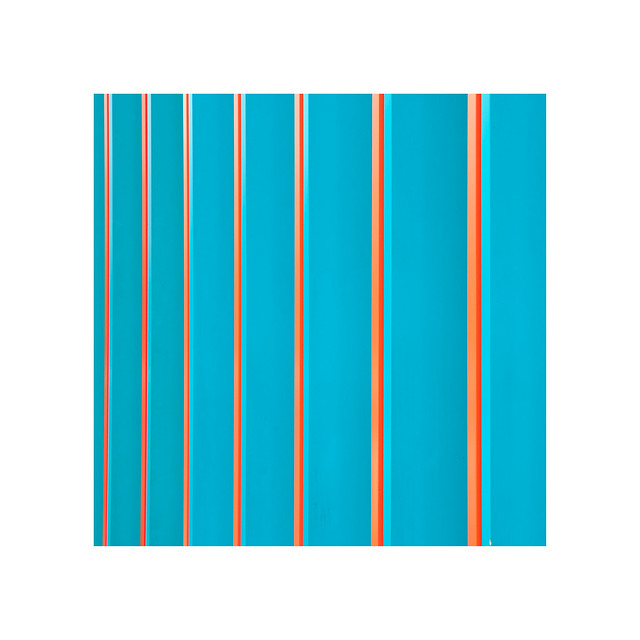
2.
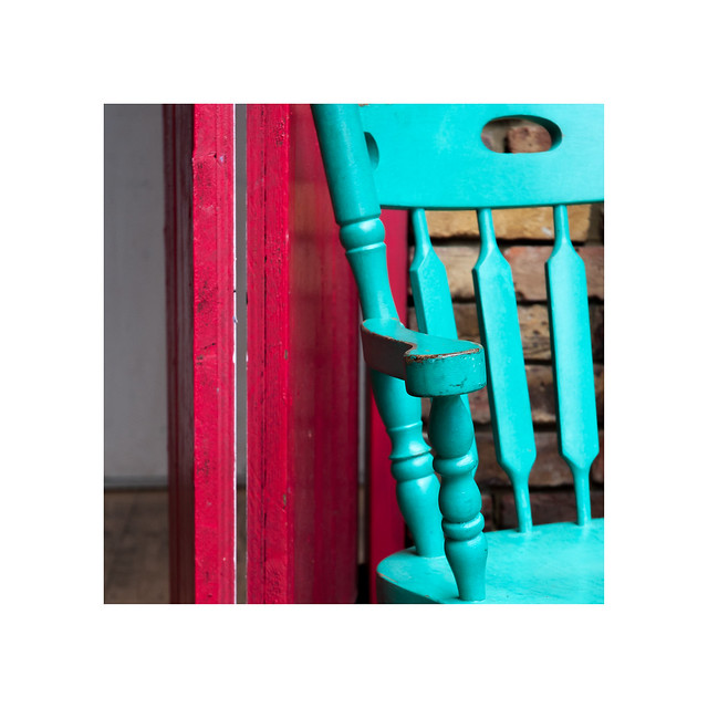
3.
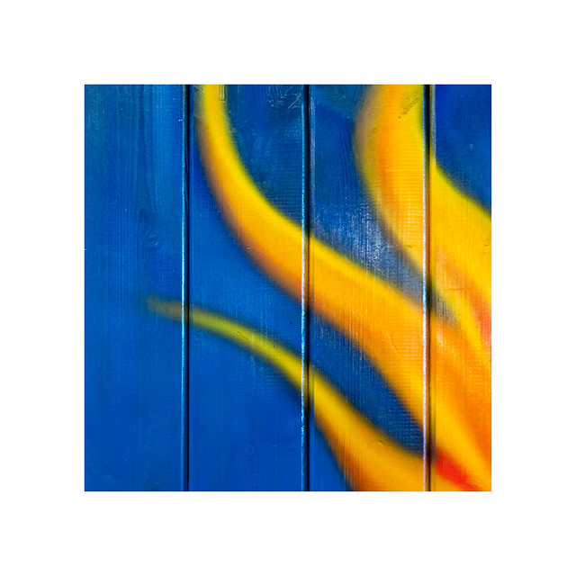
4.
5.
I wanted to do something a little different (for me anyway), as I usually stick to urban landscapes or pictures of my daughter
So, I decided I wanted to make some contemporary, colourful/striking images, and present them in a way that I havent really explored before (square format). Im looking for opposite colours that compliment each other, and I want to find them in the everyday normal things that surround us all.This is still very much a work in progress, as im at the extremely early stages of this project, but I would appreciate any initial thoughts you may have. These are all presented with thick white borders (like I said, work in progess), so depending on how you view the forum, you may not see them anyway
So, here are the first 5.
Cheers
Nick
1.
2.
3.
4.
5.
Last edited: