You are using an out of date browser. It may not display this or other websites correctly.
You should upgrade or use an alternative browser.
You should upgrade or use an alternative browser.
weekly David Tennant's TP52 2015 Week 11 Crowd Reshoot and Week 13 Machine Added
- Thread starter David Tennant
- Start date
- Messages
- 8,398
- Name
- Lynne
- Edit My Images
- Yes
HI David
Scenic...lovely scene there , I have a soft spot for milky water & for me, this is just right though I might pull the brightness back just a smidge
The surrounding area could do with a little lift of shadows I feel to bring out the green's & reds lurking there ....
Fragile.....great take on the theme , mono works well , good focus on the main subject , like how the man kind of frames the woman, the hand on the shoulder gives more connection between them
- Messages
- 517
- Edit My Images
- Yes
Nice waterfall scenic. You got the timing just right, smooth water but enough texture to suggest moving. Just a shame about the stray branch near the bottom left and the small flare by the water edge.
I definitely agree the timing is just right, not too soft on the water, so you can retain the texture of the water
- Messages
- 170
- Edit My Images
- No
Nice waterfall scenic. You got the timing just right, smooth water but enough texture to suggest moving. Just a shame about the stray branch near the bottom left and the small flare by the water edge.
Thanks for your comments.Hi David, good shot and it fits the theme, though I have to agree with Stan about the rogue branch in the bottom left
Yeah the rogue branch is a little annoying, will maybe try editing it out the next time I have the computer fired up.
I actually took similar shots here last summer and was going to use one for the submission but decided I would just go back and do some more. Had my three year old son with me as well so maybe not as much time to concentrate as I would have liked, but he was very good and taking some shots on his own camera.
- Messages
- 170
- Edit My Images
- No
Thank you so much for the suggestions, I really want to improve and this is the best way to achieve this.HI David
Scenic...lovely scene there , I have a soft spot for milky water & for me, this is just right though I might pull the brightness back just a smidge
The surrounding area could do with a little lift of shadows I feel to bring out the green's & reds lurking there ....
Fragile.....great take on the theme , mono works well , good focus on the main subject , like how the man kind of frames the woman, the hand on the shoulder gives more connection between them
To tell you the truth I was totally stumped with Fragile, so decided to get in on the action. I really don't think it would have worked very well in colour. The room was almost dark when I shot it and was always shooting with mono in mind.
- Messages
- 9,078
- Name
- David
- Edit My Images
- Yes
I definitely agree the timing is just right, not too soft on the water, so you can retain the texture of the water

- Messages
- 9,095
- Name
- Mandy
- Edit My Images
- Yes
Scenic - a lovely shot, great motion capture on the waterfall, my only crit would be to clone out the branch in the bottom left of the image.
D
Deleted member 59779
Guest
Beautiful milky waterfall, just as I like. Agree with others about the branch.
- Messages
- 6,502
- Name
- Peter
- Edit My Images
- Yes
I do like long exposure water shots and I think the exposure of the water is spot on. However the exposure on the rest of the image really needs lifting and I think because of that I'm struggling to see where the lens has focussed on. If this has come from the RAW file you may be able to get this back via PP
- Messages
- 170
- Edit My Images
- No
I do like long exposure water shots and I think the exposure of the water is spot on. However the exposure on the rest of the image really needs lifting and I think because of that I'm struggling to see where the lens has focussed on. If this has come from the RAW file you may be able to get this back via PP
Thanks for your comments Peter.
I see what you mean. This particular one wasn't shot in RAW although I did take a few other shots in RAW after this.
- Messages
- 170
- Edit My Images
- No
Week 4 - Companions
My companions shot is of my Sons betime toys, Daisy Cow and Morris Monkey.
He is so attached to them and they really are companions that he cannot do without.
 Week 4 Companions by dtennant9, on Flickr
My companions shot is of my Sons betime toys, Daisy Cow and Morris Monkey.
He is so attached to them and they really are companions that he cannot do without.
 Week 4 Companions by dtennant9, on Flickr
- Messages
- 9,095
- Name
- Mandy
- Edit My Images
- Yes
- Messages
- 4,345
- Name
- Martin
- Edit My Images
- Yes
Like it but again, needs a little more oomph in the exposure. Also, a tad more depth of field to bring the nose of the smaller toy into focus. Good effort though and quite charming.
- Messages
- 170
- Edit My Images
- No
Thanks for your comments guys.
Think my report card at the end of month one would definately be must try harder, lol.
Think my report card at the end of month one would definately be must try harder, lol.
Bruja
Los Cojones del Perro
- Messages
- 3,883
- Name
- Just call me Mad Madam Mim
- Edit My Images
- Yes
Can't add anything to what's been said already other than great idea but a cleaner background would have helped too. But that's why we are here, to pick up all these little tweaks that turn a good pic into a great one. Well done for keeping at it 

- Messages
- 170
- Edit My Images
- No
- Messages
- 170
- Edit My Images
- No
- Messages
- 9,095
- Name
- Mandy
- Edit My Images
- Yes
Elegant - I am so sorry I am going to have to agree with the above comments.
- Messages
- 170
- Edit My Images
- No
Thanks for looking and commenting.Elegant - I am so sorry I am going to have to agree with the above comments.
- Messages
- 4,182
- Name
- Paul
- Edit My Images
- Yes
Hi David
As an image, I really like this. I think cropping 10% of left and right (to lose that edge/corner of the box) brings it out a lot more... but... it doesn't work as well for the theme, at least not for me. I'd also clone out a bit of the marking etc.
So, I think it's a cracking photo (with those tweaks) but not sure it shouts elegant to me. I'm not normally a stickler for being "on theme", either!
- Messages
- 170
- Edit My Images
- No
A bit late this week but here is my watery photo.
Looking at it now I definately should have had more droplets of water in the frame.
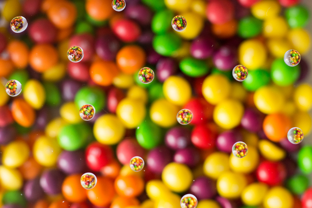 Week 6 Watery by dtennant9, on Flickr
Looking at it now I definately should have had more droplets of water in the frame.
 Week 6 Watery by dtennant9, on Flickr
- Messages
- 170
- Edit My Images
- No
Yeah I possibly should have had the droplets higher up.Hi David
I think the numbers of droplets is OK, but I feel the background should be a little more OOF so that your eyes are drawn less to it, and more to the droplets (and the reflections in them).
- Messages
- 7,548
- Name
- susie
- Edit My Images
- Yes
Hi David I agree with Andy on a elegant I'm sure there is a smashing photo in there ....looking forward to your reshoot on that one.
Love the idea for watery ....I've had lots of tries at this and it is difficult, I agree with Ruth on the background but it still makes an eye catching image.
Love the idea for watery ....I've had lots of tries at this and it is difficult, I agree with Ruth on the background but it still makes an eye catching image.
- Messages
- 170
- Edit My Images
- No
Thank you for your comments Susie.Hi David I agree with Andy on a elegant I'm sure there is a smashing photo in there ....looking forward to your reshoot on that one.
Love the idea for watery ....I've had lots of tries at this and it is difficult, I agree with Ruth on the background but it still makes an eye catching image.
- Messages
- 4,345
- Name
- Martin
- Edit My Images
- Yes
All has been said, I have nothing to add.
Bruja
Los Cojones del Perro
- Messages
- 3,883
- Name
- Just call me Mad Madam Mim
- Edit My Images
- Yes
Nice interpretation for watery but some of the drops are in focus and some not - did you shoot it at an angle? Also, lots of dust on the glass too which you could easily clone/heal. I know it sounds like nitpicking but it's the little things that are easy to correct (or not to have happen in the first place  ) that can spoil a great idea.
- Messages
- 170
- Edit My Images
- No
A bit late with my Bold entry and quite early with my Relax entry.
Two entries for Bold. My wife loves Irregular Choice shoes and they are very "Bold". Not the best background but was struggling to find good backgrounds in the house.
 Week 7 Bold by dtennant9, on Flickr
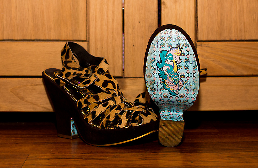 Week 7 Bold by dtennant9, on Flickr
My Relax entry is a nice relaxing candle lit bath.
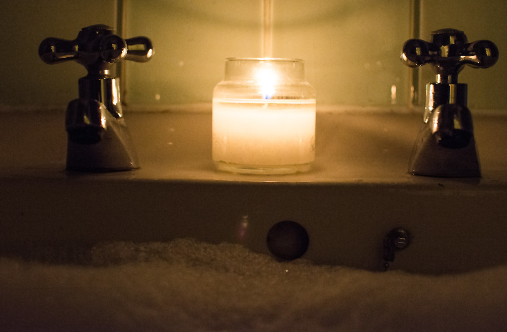 Week 8 Relax by dtennant9, on Flickr
May yet have another go at Relax but don't wan't to be behind again
Two entries for Bold. My wife loves Irregular Choice shoes and they are very "Bold". Not the best background but was struggling to find good backgrounds in the house.
 Week 7 Bold by dtennant9, on Flickr
 Week 7 Bold by dtennant9, on Flickr
My Relax entry is a nice relaxing candle lit bath.
 Week 8 Relax by dtennant9, on Flickr
May yet have another go at Relax but don't wan't to be behind again
Last edited:
Bruja
Los Cojones del Perro
- Messages
- 3,883
- Name
- Just call me Mad Madam Mim
- Edit My Images
- Yes
BOLD - I know what you mean about backgrounds but a cheap sheet or plain throw draped over cupboards can work really well. I've got 3 or 4 that I keep just for that/ It can really improve your shots. I prefer #2 as the reflection of the light on the soles is also a distraction. #2 with a nice crisp background would be perfect for the theme 
Relax - I can see what you were aiming for but it looks a little soft and flat to me and the bg (again) is a distraction. A piece of card fixed behind the taps could have taken care of that. I know it seems like nit picking but it's the tiny little touches that make the difference when planning out the shot. The more time spent beforehand the easier the shot is afterwards.
Onwards and upwards
- Messages
- 170
- Edit My Images
- No
As always, thanks for your comments.BOLD - I know what you mean about backgrounds but a cheap sheet or plain throw draped over cupboards can work really well. I've got 3 or 4 that I keep just for that/ It can really improve your shots. I prefer #2 as the reflection of the light on the soles is also a distraction. #2 with a nice crisp background would be perfect for the theme
Relax - I can see what you were aiming for but it looks a little soft and flat to me and the bg (again) is a distraction. A piece of card fixed behind the taps could have taken care of that. I know it seems like nit picking but it's the tiny little touches that make the difference when planning out the shot. The more time spent beforehand the easier the shot is afterwards.
Onwards and upwards
- Messages
- 3,724
- Name
- Chris
- Edit My Images
- Yes
Bold - I like the idea of no. 1 , but possibly with less DOF (may not be possible though, depends on what lenses you have), also would have liked the bottom of the heels to have not been cropped.
Relax - To follow on from Jill's comments, I agree on the background (its amazing what you can do with a piece of foamcore though )You also need a touch more light in the areas away from the tap, possibly from pop a flash on low power. I would also block off the overflow with gaffer tape, so that you can raise the level of the bubbles
Relax - To follow on from Jill's comments, I agree on the background (its amazing what you can do with a piece of foamcore though
- Messages
- 170
- Edit My Images
- No
Thank you very much for your comments Chris.Bold - I like the idea of no. 1 , but possibly with less DOF (may not be possible though, depends on what lenses you have), also would have liked the bottom of the heels to have not been cropped.
Relax - To follow on from Jill's comments, I agree on the background (its amazing what you can do with a piece of foamcore though)You also need a touch more light in the areas away from the tap, possibly from pop a flash on low power. I would also block off the overflow with gaffer tape, so that you can raise the level of the bubbles
- Messages
- 2,812
- Name
- Mike
- Edit My Images
- Yes
Bold
Good idea. Nice soles, I saw something like it on Dragon's Den the other day.
#1 - I like the composition ecept that youv've chopped the bottom odf the heels off. A shalower dof would've been better too and the light is too strong across the center of the pictures.
#2 - I prefer this one out of the two. I like the way the shoes are displayed and the floor and background. Better light than #1 as well. My only crit would be to black out the pink between the doors as I find it distracting.
Relax
Another good idea. I like the low light but do agree with Chris that a tad more on the outer ages of the taps would've improved it. I think the crop would be better if it was more central, there's more space on the left than the right. What would've finished it of imho is some toes sticking out the bubbles against the bath. And well done for not dropping the camera.
- Messages
- 2,908
- Name
- Summer
- Edit My Images
- Yes
Bold - I love the first one just as it is, doesn't look posed, looks like you spotted some cool soles and pounced with the camera  lovely shot and it looks like it could tell a story which is what it's all about (for me anyway). "nd one is still a good shot but more of a product shot and I prefer stories
relax - mmmm a bit too dark I think. You could probably have used a flash and still got the ambient effect from the candle.
relax - mmmm a bit too dark I think. You could probably have used a flash and still got the ambient effect from the candle.

 Elegant