weekly David Tennant's TP52 2015 Week 11 Crowd Reshoot and Week 13 Machine Added

Nothing to add that hasn't already been said -- background, soft right-hand tap, background, background et al.

Fear not, last year I was castigated more than once about my poor backgrounds so this year that's the first thing I look at and I've got it right so far.
 
Bold
Good idea. Nice soles, I saw something like it on Dragon's Den the other day.
#1 - I like the composition ecept that youv've chopped the bottom odf the heels off. A shalower dof would've been better too and the light is too strong across the center of the pictures.
#2 - I prefer this one out of the two. I like the way the shoes are displayed and the floor and background. Better light than #1 as well. My only crit would be to black out the pink between the doors as I find it distracting.

Relax
Another good idea. I like the low light but do agree with Chris that a tad more on the outer ages of the taps would've improved it. I think the crop would be better if it was more central, there's more space on the left than the right. What would've finished it of imho is some toes sticking out the bubbles against the bath. And well done for not dropping the camera. ;)

Bold - I love the first one just as it is, doesn't look posed, looks like you spotted some cool soles and pounced with the camera :) lovely shot and it looks like it could tell a story which is what it's all about (for me anyway). "nd one is still a good shot but more of a product shot and I prefer stories :)

relax - mmmm a bit too dark I think. You could probably have used a flash and still got the ambient effect from the candle.

Thank you both for your comments.
 
Hi David,

Bold - great idea and really fits the theme. I can't add anything crit wise to what the others have said

Relax - another good idea, it does look a little soft to me though

:)
 
Watery - a nice shot with nice colours in the background.

Bold - they do indeed look like bold shoes, crit wise I think a better background would of helped. Much prefer the second image composition wise to the first.

Relax - works for the theme, but feel the image could be better presented. I feel it looks a bit dark and soft for my tastes.
Thanks for your comments Mandy.
 
As already said nice and colourful and tell a story too.
2nd one for me :)
 
Prefer pic one but needs a slight crop to take a couple of little thing out of the shot.
both are great ideas the colours of #2 with the angle of shot #1 would have been perfect.
 
I'm torn on vertical here.
I love the composition of the first one, but the colours and pop of the second are fabulous.
 
Nice idea DT, perfect for the theme. #1 is more creative but there seems to be a kink in the paper.
 
Just to pick a few whilst I catch up with some comments...

Scenic: Absolutely smashing scene. Just the right length of exposure for me. I have to agree with what's been said - it does look a touch dark but I think the scene benefits from a slightly low key look (y)

Watery: I like doing these sort of shots. They can take a surprising long time to set up but I find them so rewarding. Again, as has been said, if the BG was a bit more out of focus, my eye would be drawn to the drops more. Like it :)

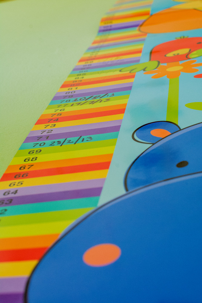
Vertical: First one for me. I like the composition more. Maybe a tighter crop at the top to remove the tiny bit of dark are in the top left and the part of the chart that isn't quite flat to the wall. Maybe push the saturation / contrast a touch too?
 
Hi David

Vertical.....#1 for me but with a boost of saturation...I like the way my eye is drawn up the height ladder (just a small patch top right to clone out ) :)

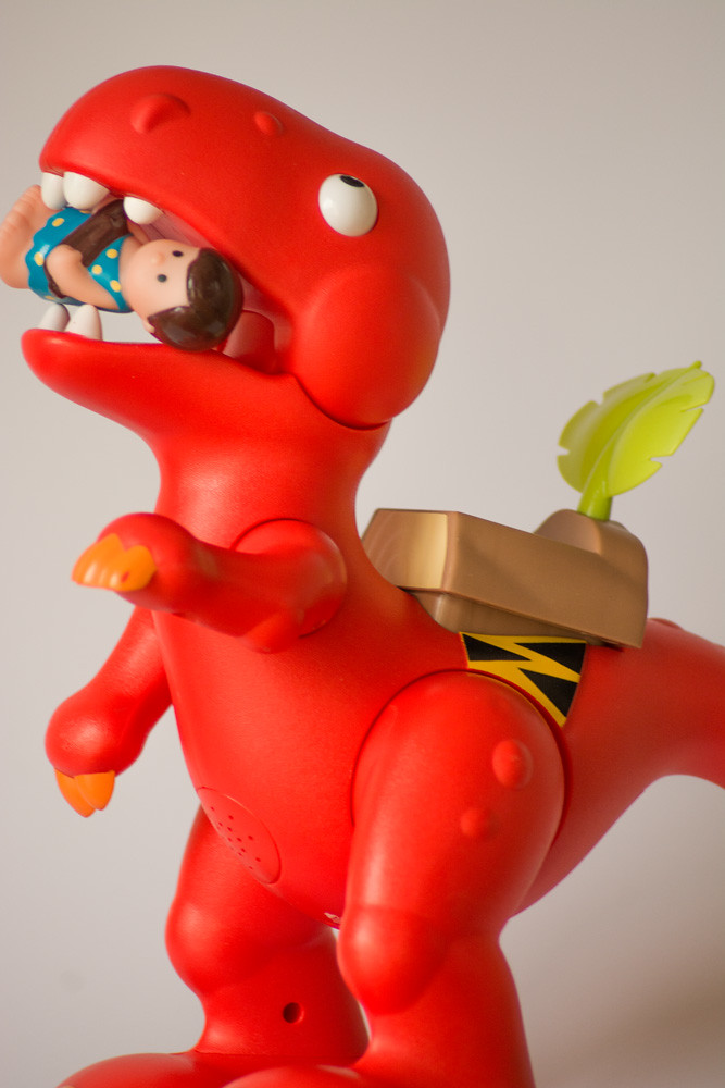
Mouth...not the easiest of subjects without doing the obvious ( which I did :rolleyes: ) so I quite like this fun take & your plain background is a great start :)

.....you mention it looking a bit soft in places ? I don't fully understand focus points myself but from what I can see you may have focused on the rear arm, leg & the little doll's foot & as you shot at f4.5 depth of field is really slim meaning the front of the image is out of focus . If I remember correctly ( for landscapes anyway) you focus ideally about 1/3 of the way in to the image ,this then gives the rear 2/3rd's in focus & the front 1/3rd in focus.................at least I think that's the theory !
If you feel like trying again , I'd suggest something like f8-f11 , stick it on a tripod , focus maybe somewhere like the middle of the foremost arm, camera self timer on & see what result that gives you. Turn the VR/IS off when using the tripod.
& if all the above is teaching my granny to suck egg's please feel free to ignore me & I apologise (y)
 
The background works really well to focus the attention on the subject here David - what do you think? For me, the crop is a little tight. I was once told "give the subject some room to 'look in' to." and I like my pictures better when I give my subjects space to breathe. It's not so much the tail cropped off, it's the space to the left of the image. Maybe a square crop?

As to your sharpness, Lynne's words above are spot on. I know I would get motion blur at 1/200sec at 185mm focal length. It's a terrible rule of thumb but it works for me in that if I start to get to 1/focal length then I'm into blur territory. A tripod or steadying solution would have probably really helped. At a long focal length, and small aperture, your area of front-back sharpness is tiny (1cm at about 6 feet with your camera/lens/aperture and worse if closer) so paying attention to what's in focus is really important. Does your camera zoom in in the viewfinder so you can check the focus?

In terms of hitting the theme, I think it's great. Bold colours, nice shapes and a humorous thought behind the photo. Just a few tweaks and you're there. Have another practise with Crowd.
 
Hi David

Vertical.....#1 for me but with a boost of saturation...I like the way my eye is drawn up the height ladder (just a small patch top right to clone out ) :)

Mouth...not the easiest of subjects without doing the obvious ( which I did :rolleyes: ) so I quite like this fun take & your plain background is a great start :)

.....you mention it looking a bit soft in places ? I don't fully understand focus points myself but from what I can see you may have focused on the rear arm, leg & the little doll's foot & as you shot at f4.5 depth of field is really slim meaning the front of the image is out of focus . If I remember correctly ( for landscapes anyway) you focus ideally about 1/3 of the way in to the image ,this then gives the rear 2/3rd's in focus & the front 1/3rd in focus.................at least I think that's the theory !
If you feel like trying again , I'd suggest something like f8-f11 , stick it on a tripod , focus maybe somewhere like the middle of the foremost arm, camera self timer on & see what result that gives you. Turn the VR/IS off when using the tripod.
& if all the above is teaching my granny to suck egg's please feel free to ignore me & I apologise (y)

The background works really well to focus the attention on the subject here David - what do you think? For me, the crop is a little tight. I was once told "give the subject some room to 'look in' to." and I like my pictures better when I give my subjects space to breathe. It's not so much the tail cropped off, it's the space to the left of the image. Maybe a square crop?

As to your sharpness, Lynne's words above are spot on. I know I would get motion blur at 1/200sec at 185mm focal length. It's a terrible rule of thumb but it works for me in that if I start to get to 1/focal length then I'm into blur territory. A tripod or steadying solution would have probably really helped. At a long focal length, and small aperture, your area of front-back sharpness is tiny (1cm at about 6 feet with your camera/lens/aperture and worse if closer) so paying attention to what's in focus is really important. Does your camera zoom in in the viewfinder so you can check the focus?

In terms of hitting the theme, I think it's great. Bold colours, nice shapes and a humorous thought behind the photo. Just a few tweaks and you're there. Have another practise with Crowd.

Thank you both for your comments, I will take them onboard.

For some reason I decided to use my 70-300m lens in Macro mode for this week. Should maybe have used a different lens.

Like I said, don't be surprised to see toys in on the action again this week as I will need to get it done by Friday at the latest.
 
Hi David,

Mouth - nice idea for what was a difficult theme. I can't comment on the focus issue, but I do agree with Ian (Harlequin) about the crop being a bit too tight - I'd have liked to have seen all of the little doll's feet in the frame. :)
 
I didn't notice the little doll's feet ... it's the monster's feet I'd like to see.

Good fun/different take on the theme DT.
 
Hey David..... It seems to have taken me ages to reach your thread - sorry! Really liking your fragile and scenic weeks particularly.

Mouth: I see what you mean about it being soft on places but it doesn't detract overall for me as its bold and colourful enough to get away with it..... The only thing for me is the dinosaur's feet are a bit too cropped I think, otherwise I like him!
 
At risk of falling way behind I have been going through my photos to try and get ones for the last two themes, both taken in the last week.

Crowd: This was taken at The World of Beatrix Potter and I felt it looked like it was getting a little crowded at Peter Rabbit's window.

Week 11 Crowd by dtennant9, on Flickr

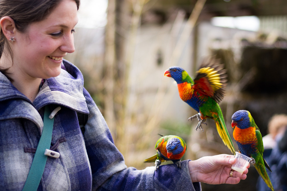
Up Close: This is my Wife getting 'Up Close' with some Lorikeets at Longleat Safari Park last week. Just realised that this was shot at f/1.8 which I didn't mean at the time so a very shallow depth of field.

Week 12 Up Close by dtennant9, on Flickr
 
Last edited:
Hi David

Crowded......I quite like that , they almost look real :)

Close up......think you've given your own crit re the DOF , think you might have managed a slightly faster shutter speed to help freeze the motion a little more of the BIF ?

Yeah I totally agree with the close up shot. It was taken very quickly and I didn't really get the chance to think about it but thought the shot fitted the theme despite its failings.
 
Crowed agree with Lynne they look so real (but i guess thats kind of the idea :) ) but its a little creepy looking but i do like it
Nice capture for up close another good shot (y)
 
Another go at crowd:
Crowd by dtennant9, on Flickr

Two shots for machine this week.
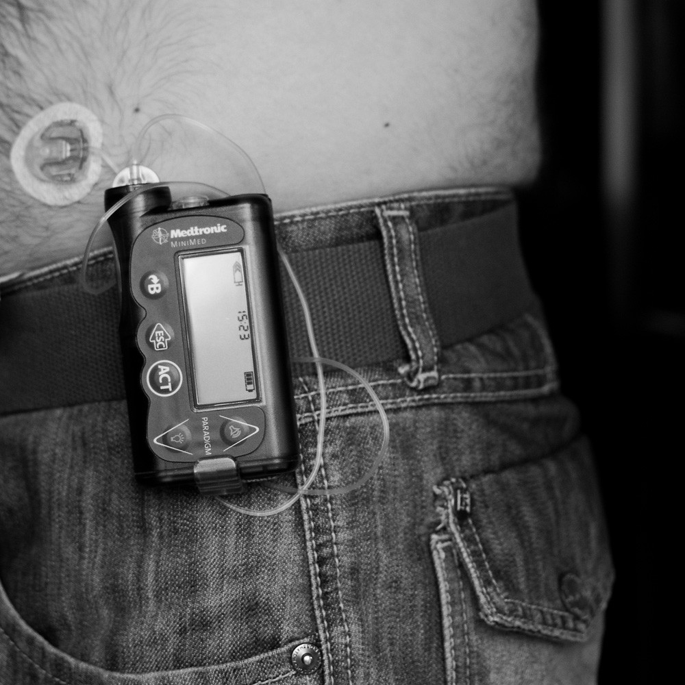
The first one is a shot of my insulin pump. When I saw this weeks theme there was no way I couldn't take a shot of the machine that keeps me alive. I chose the square crop and black and white conversion as I felt it worked better and got rid of my belly.
Week 13 Machine by dtennant9, on Flickr

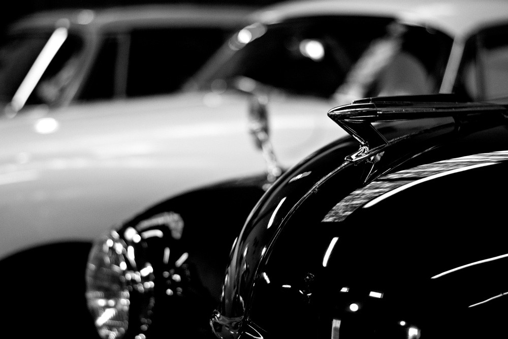
The second shot was taken last year at Dundee Museum of Transport. Although it is an old shot I just thought I would include it as well.
Week 13 Machine by dtennant9, on Flickr
 
although your first crowd is a lovely shot (bunnies yay) it doesn't really say crowd to me, but the jelly babies are much more to my taste (yum) :naughty:

only thing I'd say is that the horizon seems a lil bit wonky.
 
Stands out in the Crowd, yup, looks quite flat to me and my eye was drawn straight the the dust bunnies.

#1 for me, I like the narrative and connection you have with the machine. I think it would have worked better if I could see more of you, specifically our face. Perhaps sat down looking at the machine, just thinking out loud I guess :)

Cheers.
 
although your first crowd is a lovely shot (bunnies yay) it doesn't really say crowd to me, but the jelly babies are much more to my taste (yum) :naughty:

only thing I'd say is that the horizon seems a lil bit wonky.

Thanks for your comments. I only reshot that weeks theme as I was doing it for another 52 and the theme was Orange.

Stands out in the Crowd, yup, looks quite flat to me and my eye was drawn straight the the dust bunnies.

#1 for me, I like the narrative and connection you have with the machine. I think it would have worked better if I could see more of you, specifically our face. Perhaps sat down looking at the machine, just thinking out loud I guess :)

Cheers.

Thanks for looking. I think the crowd one maybe looks a little flat due to the background but I kept getting pulled up for not putting a piece of card behind the subject. I did also think about the dust bunnies but as they are my hypo treatment I didn't want to wash it off.
 
Back
Top