You are using an out of date browser. It may not display this or other websites correctly.
You should upgrade or use an alternative browser.
You should upgrade or use an alternative browser.
weekly imagine's 52 week challenge in 2013
- Thread starter imagine
- Start date
- Messages
- 1,221
- Name
- Carl
- Edit My Images
- Yes
I seem to very much in minority here but i just dont like the DOF here.
Its hard to even notice its a watch let alone a G shock in a shower.
I guess im less arty than most here and like to see the image rather than having 60% of images blurred out.
sorry bud
Its hard to even notice its a watch let alone a G shock in a shower.
I guess im less arty than most here and like to see the image rather than having 60% of images blurred out.
sorry bud
- Messages
- 4,088
- Name
- Graham
- Edit My Images
- Yes
Interesting point carl - there are a few in the 52's so far who have (I feel) used too narrow a DOF for the subject they're taking. But it is useful to draw attention to a specific part of the image.
Here it has been used well, to draw attention to the G (spot-on focus and beautifully sharp here BTW), otherwise this would have been just a picture of a watch in the shower . Not to mention the fact that a smaller aperture (to give more in focus) would have resulted in either slower shutter meaning more water drop streaks, and / or higher ISO resulting in more noise.
I think you've done well here Jim, and good placement low down to allow the water to rain down on it
Here it has been used well, to draw attention to the G (spot-on focus and beautifully sharp here BTW), otherwise this would have been just a picture of a watch in the shower
 . Not to mention the fact that a smaller aperture (to give more in focus) would have resulted in either slower shutter meaning more water drop streaks, and / or higher ISO resulting in more noise.
I think you've done well here Jim, and good placement low down to allow the water to rain down on it
- Messages
- 19,461
- Name
- Andy
- Edit My Images
- Yes
I seem to very much in minority here but i just dont like the DOF here.
Its hard to even notice its a watch let alone a G shock in a shower.
I guess im less arty than most here and like to see the image rather than having 60% of images blurred out.
sorry bud
H, Carl, all opinions are appreciated, and not being ar*y but isn't your gravity 60% OOF

Cheers.
Thanks for commenting everyone, I appreciate it. It's good that there is a difference of opinion, and the challenges do make you have to think about the theme. Most of my initial ideas get shot by others before I get a chance. A lot of people refer to G-Forces or shocks without thinking what the G stands for, hence my focus on the G and a title to explain my thoughts.
- Messages
- 7,245
- Name
- Christine
- Edit My Images
- Yes
Gravity - did not have a clue what this was about until I saw Greenoak referring to it as a watch in a shower, sometimes I can see things, others I can't.
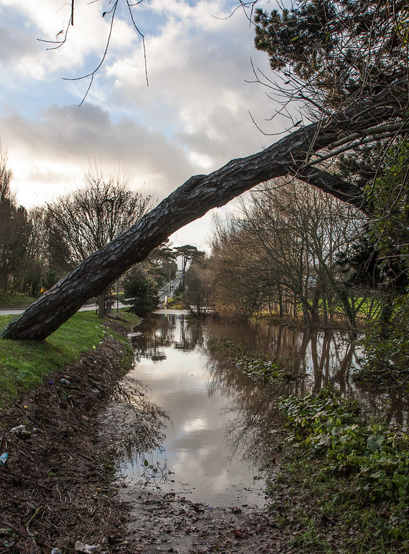
Wild - Looks like some heavy sharpening on this one. I like the way the tree frames the scene and think the top of the sky could easily be lost - I might be inclined to drop the sharpening on the road so the eye does not go straight up the hill but remains in the water and tree reflection
Wild - Looks like some heavy sharpening on this one. I like the way the tree frames the scene and think the top of the sky could easily be lost - I might be inclined to drop the sharpening on the road so the eye does not go straight up the hill but remains in the water and tree reflection
- Messages
- 1,353
- Name
- Chris
- Edit My Images
- Yes
re. the Wild shot I like the idea, but it makes my eyes water.
I think its the shapening and my eyes/brain get confused with the large DoF between tree trunk and house in the background
I think I would have removed branches top left and made the house in the bg more central.
I think its the shapening and my eyes/brain get confused with the large DoF between tree trunk and house in the background
I think I would have removed branches top left and made the house in the bg more central.
I took this at the weekend but wasn't sure whether to use it or not, but realistically I won't have much time to take another this week.
My thoughts are that the rocks on the left look a bit like a head and with good imagination you may even see a cigar sticking out the mouth. The head is "looking into space".
The shot was taken on Dartmoor at Hound Tor in horrible weather with mist, rain and strong icy winds; that is why the background fades away.

Looking into space, on Flickr
My thoughts are that the rocks on the left look a bit like a head and with good imagination you may even see a cigar sticking out the mouth. The head is "looking into space".
The shot was taken on Dartmoor at Hound Tor in horrible weather with mist, rain and strong icy winds; that is why the background fades away.

Looking into space, on Flickr
- Messages
- 8,398
- Name
- Lynne
- Edit My Images
- Yes
Hi Jim
that poor tree's taken a beating for sure...well spotted for the theme though & I like the detail in the sky I'd be tempted to crop the top so the tree goes out of frame top rh corner ?
Space...I like this ( would have worked for wild as well ) , good detail in the rock & given the fog it does feel like you're looking in to empty space
that poor tree's taken a beating for sure...well spotted for the theme though & I like the detail in the sky
Space...I like this ( would have worked for wild as well ) , good detail in the rock & given the fog it does feel like you're looking in to empty space
- Messages
- 5,787
- Name
- Storm Trooper
- Edit My Images
- Yes
Gravity.....as already said just the right amount of movement in the droplets and the watch provides an interesting focal point.
Wild.........I'll go against the grain and suggest cropping some off the bottom as I like the details in the sky and it moves the tree below the centre.
Space.......Mad weather to be out with the camera, I can't help leaning my head to the right slightly when looking at it :shrug: I would suggest a little less rocks in the fore ground to show more space in the distance.
SarahLee
TPer Emerita
- Messages
- 13,060
- Name
- Sarah
- Edit My Images
- No
 Took me a while to spot the face in the rocks for space, but now I've seen it - absolutely perfect for the theme and really made me smile.
Framing's not quite right for me though.
Could you have maybe have rotated to the left a little to bring the head further into frame and made it the main focal point? Not sure what the view would have been like from that angle or what's on his left.
Failing that, I'd go along with the suggestions for less foreground rock and more space to really get the message across.
p.s. While I'm in here, I can't let your snow picture go without comment.
The edited version . . . Wow!!!
- Messages
- 14,766
- Name
- Michael
- Edit My Images
- No
Hi Jim, a good set of pics since I last managed to pop by, the snow scene is lovely, very dreamy. I like the picture of the watch, nice colour to it and a great dof.
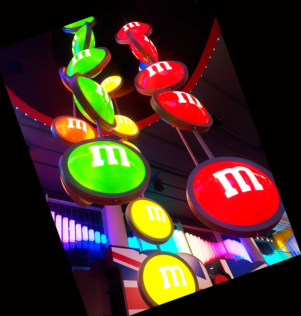
The m+m shop looks an awkward one to photograph, shame the right of the red m and the bottom of the yellow m are cut off, but the exposure is well done and I like the angle.
The m+m shop looks an awkward one to photograph, shame the right of the red m and the bottom of the yellow m are cut off, but the exposure is well done and I like the angle.
- Messages
- 19,461
- Name
- Andy
- Edit My Images
- Yes
Work, on theme and nice one for getting some drama, I do like the guy's face behind the performer 
Crit, just the guy on the far left, does distract a tad.
Gluttony, eeekk, imagine if they were really this size. Like the composition, vibrant colours and the funky tilt.
Cheers.
Crit, just the guy on the far left, does distract a tad.
Gluttony, eeekk, imagine if they were really this size. Like the composition, vibrant colours and the funky tilt.
Cheers.
Last edited:
- Messages
- 8,398
- Name
- Lynne
- Edit My Images
- Yes
Hi Jim
Gluttony....cracking vibrant colors , love the angle as my eye is drawn up the sign , sharper than a sharp thing & well exposed Shame about the slight cropping on the yellow bottom one & red rh one though
Work...these people fascinate me , always good to watch...downside is there's invariably a crowd...but given that you've got a good shot , clear , sharp & good colors
Gluttony....cracking vibrant colors , love the angle as my eye is drawn up the sign , sharper than a sharp thing & well exposed
Work...these people fascinate me , always good to watch...downside is there's invariably a crowd...but given that you've got a good shot , clear , sharp & good colors
I was trying to avoid just posting a picture of a watch, but I'll justify it by saying that the Bulova Precisionist is claimed to be the worlds most accurate quartz watch with a sweeping seconds hand:

IMG_0088.jpg, on Flickr

IMG_0088.jpg, on Flickr
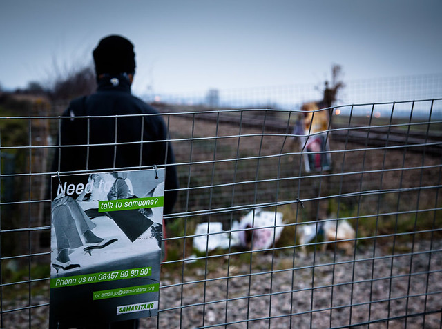
This juxtaposition of Samaritans sign, flowers and a railway track tells a sad story.

IMG_0060-2.jpg, on Flickr

IMG_0060-2.jpg, on Flickr
- Messages
- 1,353
- Name
- Chris
- Edit My Images
- Yes
Time i like, although possibly the lower res is not looking so great on my ipad. i like the lighting.
Juxtaposition...I must be a bit slow today...sorry, you'll have to explain this one to me!
Juxtaposition...I must be a bit slow today...sorry, you'll have to explain this one to me!
Last edited:
Time i like, although possibly the lower res is not looking so great on my ipad. i like the lighting.
Juxtaposition...I must be a bit slow today...sorry, you'll have to explain this one to me!
I would, but:
"In composition, the placing of verbal elements side by side, leaving it up to the reader to establish connections and impose a meaning."
This is a common suicide spot at a railway crossing, the flowers indicate a recent death and the Samaritans sign offers an alternative destination.
- Messages
- 5,787
- Name
- Storm Trooper
- Edit My Images
- Yes
Work.......I think a slightly tighter crop might work better as the guy on the right is a little distracting.
Gluttony...This looks great, nice low angle and the colours a very vivid.
Time......... I like the lighting on this one, I just think the position or angle of the watch need a little work.
Gluttony...This looks great, nice low angle and the colours a very vivid.
Time......... I like the lighting on this one, I just think the position or angle of the watch need a little work.
- Messages
- 532
- Name
- Ray
- Edit My Images
- Yes
I think it needed the text because otherwise I'm not quite sure what it was supposed to be. Fantastic idea for the subject, just think it needed a lot more DoF to make it click.
- Messages
- 8,398
- Name
- Lynne
- Edit My Images
- Yes
Hi Jim
thats a beautiful watch , great colors , well lit Wonder if you could have shown some movement in the 2nd hand ?
Juxtaposition...I also struggled with the connection but it makes sense now you've added some words .With slightly more DOF this would indeed be a very powerful image
thats a beautiful watch , great colors , well lit
Juxtaposition...I also struggled with the connection but it makes sense now you've added some words .With slightly more DOF this would indeed be a very powerful image
- Messages
- 448
- Name
- Lisa
- Edit My Images
- No
Time: Beautiful light and colours!
Juxtaposition: After looking into the theme, i could sort of see where you was going but didnt know it was flowers and a railway track. So again a tad more dof would have helped the shot stand out more and self explain.
Excellent idea.
Juxtaposition: After looking into the theme, i could sort of see where you was going but didnt know it was flowers and a railway track. So again a tad more dof would have helped the shot stand out more and self explain.
Excellent idea.
I took a few shots showing movement of the seconds hand, but couldn't get one I liked. The watch has a very curved face which makes it difficult to photograph.
For the juxtaposition photograph I deliberately used a shallow dof (although maybe it is too shallow) to draw attention to the Samaritans sign and hoped that the viewer would slowly realise what the rest of the image was. Maybe I should have waited for a train to pass by.
For the juxtaposition photograph I deliberately used a shallow dof (although maybe it is too shallow) to draw attention to the Samaritans sign and hoped that the viewer would slowly realise what the rest of the image was. Maybe I should have waited for a train to pass by.


