OP
- Messages
- 5,812
- Name
- Matt
- Edit My Images
- Yes
Hi all,
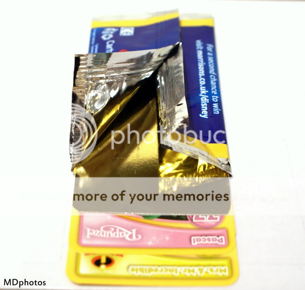
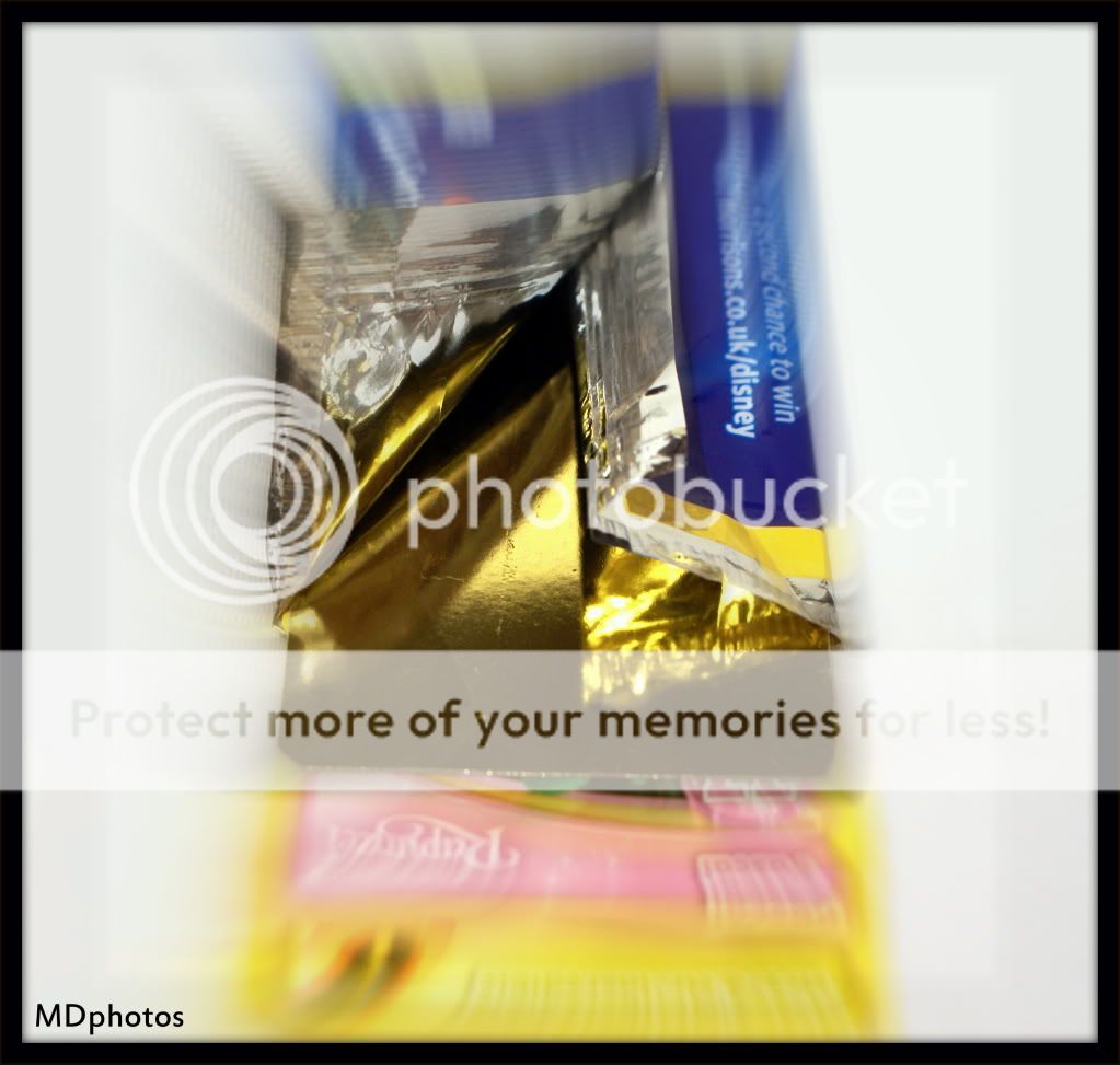
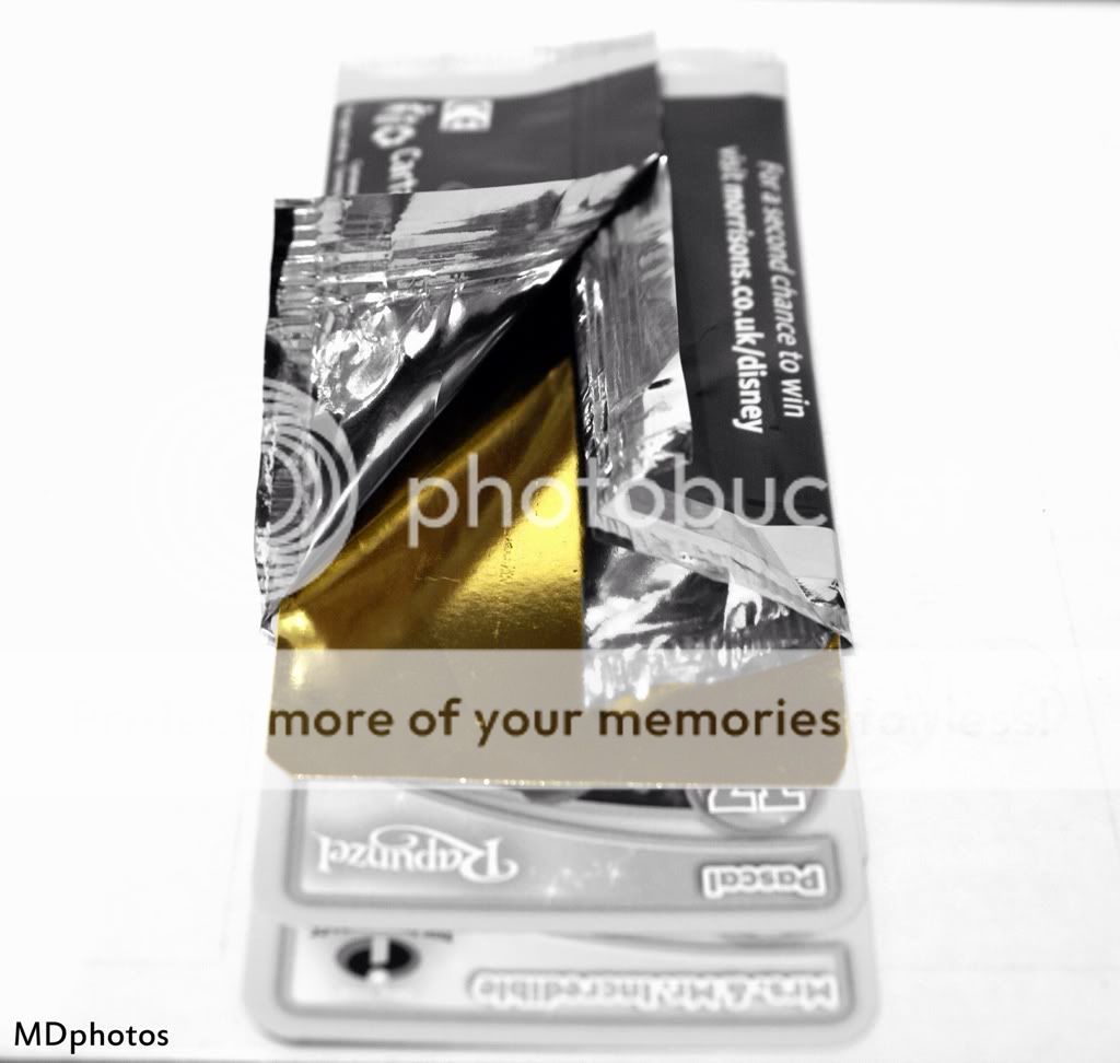
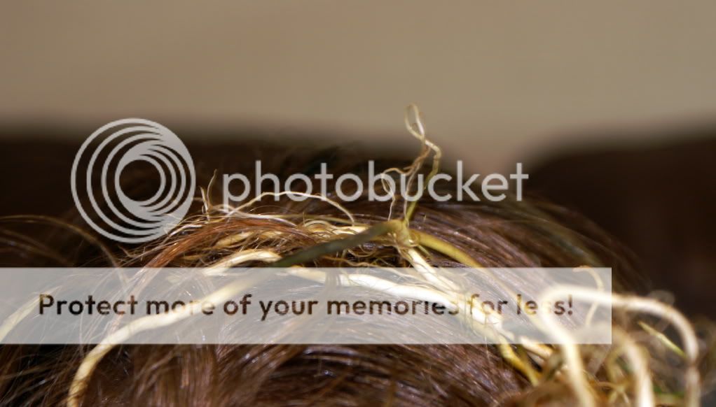
Well heres my root shots, not really happy with them. I did want to try and get to a location where i knew there were some tree roots ripping up a whole pavement, but they fixed it .
.
So i come up with this idea.
I think my mrs needs her roots doing.


Matt
Well heres my root shots, not really happy with them. I did want to try and get to a location where i knew there were some tree roots ripping up a whole pavement, but they fixed it
. So i come up with this idea.
I think my mrs needs her roots doing.
Matt


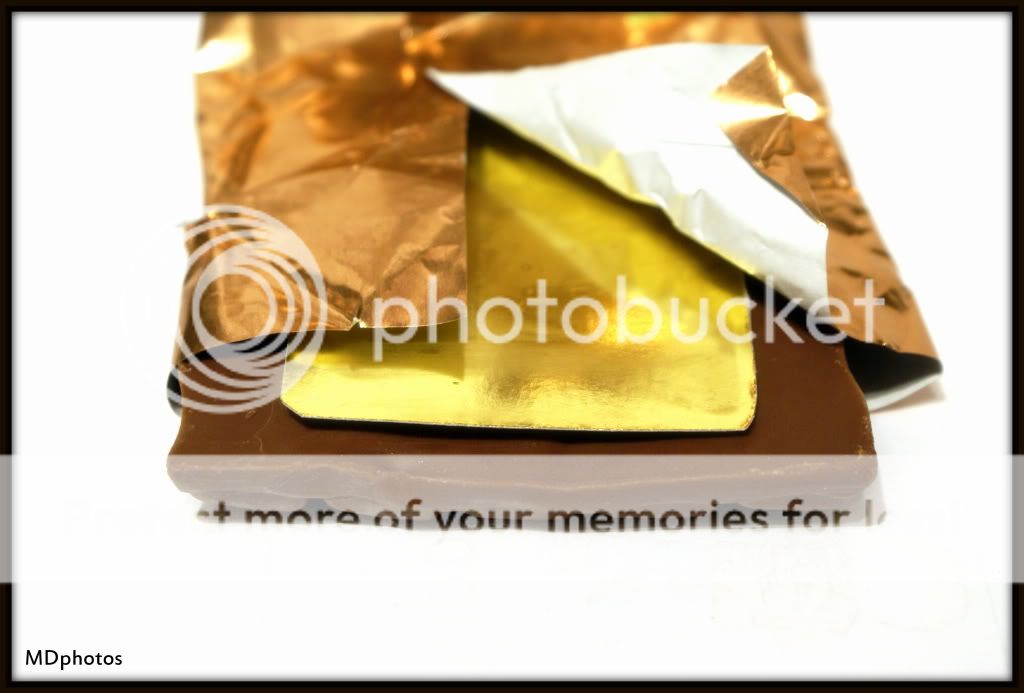
 think I'm going with #3 simply because it's different