weekly Marsha's photo 52 2012 is complete. NSF Dieters!

I decided straight away with this theme that I would do something rank orientated. The military is all about rank! The higher up you go, the more authority you have!

I tried taking a photo of a Warrant Officers rank slides, that didn't work! The WO wasn't too willing to pose either!

Plan B! This is the letter I got when I was promoted! I focused on the Officers name heading it (not made up) as he is waaaay higher up the rank structure than me!


Issues I encountered:

White balance! OMG, every photo was wrong! Either blue or yellow:bonk: So I tried again tonight! I took this outside in the garden with natural light, a much better job done! Note to self 'learn how to use the custom WB function!!!

Composition: envelope in or out, face up or down. All the letter header, or just the part you see here? Side of the paper or face on! The list goes on, let's just say the camera nearly went out the window:bonk: I settled on this composition so as to not include too much of my personal details. Apart from a levels and WB tweak the hardest part was editing out my service number and adding a fake one!

To all you white freaks, the envelope is a dirty blue/ grey colour, the letter paper is also off white!

C&C welcome.

Oh Leave is done too, they're on Flickr, I'll upload them here later today!!!
 
Last edited:
I thought of this straight away. My daughter doesn't like smiling for the camera, but ask her to pull a funny face and she's only too willing to oblige! Well at the dinner table anyway!, She's ill just now and wouldn't do it again, so this was converted to B&W with Topaz to hide the bright pink bib and reflection on her chin!

1. She regularly takes leave of her senses


In case you think she's got a huge filling, it's a half chewed Blueberry!

My little boy LOVES his Blankie, he's developed quite an attachment in this last week! He was actually off to get some soil out of the plant pot, but I thought this fitted the theme too with him leaving. Converted to B&W, grain and vignette added in ACR, (as per one of the lessons in Practical Photpgraphy a few months back) Then opened again in ACR and opened in Photoshop in colour and B&W to copy and paste his Blankie in in colour!

2. Leaving.


C&C welcome.
 
Last edited:
Hi Marsha, Authority is good, dof is just right to emphasize the name. Nice lighting. Only minor niggle is the y on agency is clipped.

Leave, I like these 2 pictures, number 1 for the look and funny face! Like the b+w. But it is number 2 that takes top spot for me. Loving the tones in the image and the b+w looks really good, I especially like the splash of colour on the blankie too.
 
michael23 said:
Hi Marsha, Authority is good, dof is just right to emphasize the name. Nice lighting. Only minor niggle is the y on agency is clipped.
Yeh I know, I noticed it after I'd put everything away and spent hours editing it:bonk:. I did consider adding it from another shot, but the thought of matching the WB and everything else was too much for me last night!

michael23 said:
Leave, I like these 2 pictures, number 1 for the look and funny face! Like the b+w. But it is number 2 that takes top spot for me. Loving the tones in the image and the b+w looks really good, I especially like the splash of colour on the blankie too.

Cheers. I love a little bit of SC, but not too much to be in your face if you get my drift. But I know others that dislike it.
 
Quick off the mark with this weeks theme Marsha. Both images for Leave are good. Prefer #2 and the subtle blue hue. A case of SC working as well. Only thing that niggles is the pots which draw the eye.
Reviewing Flight - all great shots. The kites look better when viewed full size. You have already commented on the sky. Its the typical british weather.
Authority - on theme and well shot
 
Hi Marsha -

Authority - Whatever you struggels with WB, I think that you have done well. Envelope looks like creamy vellum, whilst the letter has good white for writing paper. Ilike the point of focusbut, as already pointe out, pity about the 'y'

Leave - #1 is a smashing shot of you daughter - good capture of eyes and hair and i like the slight sepia treatment. But without you title i wold not have got the connection to the theme.

#2 evokes the theme straight away. Good composition and I like the imaginative PP.. Background a little distracting.
 
number 2 is excellent I really like it love the blue tint to it works really well :clap:
 
Thanks John and Alan. You should have seen the background in colour! The base of the trampoline is dayglo orange:nuts: Believe me this is much better now! In a perfect world I would reshoot this, but kids never perform when needed! Although both my kids leave when the camera comes out so I will see what I can do for a less cluttered shot. Mind you, I got a good shot of him going backwards down the slide this morning on his tummy, with Blankie obviously!

Michael I reckon this is the start of Blankie's adventures!!!!

I'm on lates now (working hard, can you tell), then nights and away up north for the weekend or I would attempt a reshoot of authority.

Thanks Allan, I've never tried this style of editing before, but I do like it. It could fit a lot of my shots as my kids are always looking away or moody:bonk:
 
Great work all round Marsha, you've certainly been busy (working :cautious:)

Your night time shots are especially good, the one on the runway is obviously sharper but the take off one is equally good I think, its still clearly distinguishable with the heat from the engines giving a great sense of how fast its going.

The photographs of your little'uns are both great.
Your daughter looks like she is full of character, I love that in kids. Just the right amount of cheekiness and spirit that its endearing.
I like the processing on the photograph of your son. He really stands out against the background. My eye was drawn immediately to your little model, the busy background doesn't even register. Great work all round. iain
 
blakester said:
Your night time shots are especially good, the one on the runway is obviously sharper but the take off one is equally good I think, its still clearly distinguishable with the heat from the engines giving a great sense of how fast its going.

Cheers, I was pleased to get some in focus! You should see the blurry blob I've got roaring past in between those shots!

blakester said:
Your daughter looks like she is full of character, I love that in kids. Just the right amount of cheekiness and spirit that its endearing.

Mmm, endearing and my daughter:thinking: 
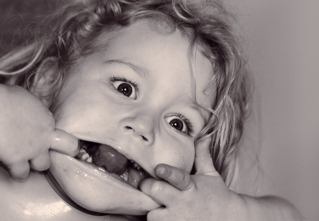
two qualities not often associated in the same sentence! She's very cheeky and extremely spirited! It's a good job she's cute though!

blakester said:
I like the processing on the photograph of your son. He really stands out against the background. My eye was drawn immediately to your little model, the busy background doesn't even register.

I thought so too, thank you.

blakester said:
Great work all round Marsha, you've certainly been busy (working :cautious:)

I'm working hard don't you know:naughty:

Cheers for the kind comments Iain:)
 
'Authority' - Congratulations on your promotion and PP skills ! nobody want's their service number on here ! Whites and off whites works so well done with the lighting and WB !

'Leave' - nice image of your children. Think your little lad pips it for me - he's off on a mission ! In both cases good focus and depth of field are good as is the PP

Nick
 
Hi Marsha,

Nice pics of your children, have to agree with Nick, your lad pips it.

My second eldest, who is now 8 still has her blanket, and she would never leave home with out it. Its been to Euro Disney and Spain, It's a very well traveled blanket!!
 
Some excellent flight shots Marsha.. no clue how to get more detail in the Kites without losing the skies... I guess you could try a pseudo hdr from a single raw, it's something I struggle with to. Love the typhoon shots, in particular that night takeoff.

Authority, works really well, I like the composition and the white balance :D...

Leave, gotta be the second one, spot on for the theme, although the first is fun.
 
no. 2 for leave, love the colour and the blankie :LOL:
 
Hi Marsha

I'm loving your Typhon shots...the main image in the last post is fab ,great heat haze :clap:

Leave.....great 1st image of your little'un with his blanket...looks to be on a mission ! Great use of DOF , focus just right & like the processing on this shot ... :clap:


ps.....whats ACR ?
 
Blank_Canvas said:
'Authority' - Congratulations on your promotion and PP skills !
Cheers Nick. It was my promotion letter from 2006! Me thinks I'll not be getting another one!

kirkers1978 said:
My second eldest, who is now 8 still has her blanket, and she would never leave home with out it. Its been to Euro Disney and Spain, It's a very well traveled blanket!
:LOL: Neil when they get attached they do it in style! I've prepared and have four Blankie's;) He'll never be lost!

Thanks John and Summer.

Cheers Lynne, I do like that shot of the typhoon with the heat haze.

blondie606 said:
ps.....whats ACR ?
I knew I should have said what that was:bonk: It's Adobe Camera Raw. Raw files are opened here first where a lot of editing can be done before going into photoshop. It's VERY clever!
 
Hi Marsha

Flight - other photo's... loving the Kite images, damn I wish I had some of them rather than Pigeon's

The typhoon shots are great too, the heat haze on the first is splendid, and the night shots are also very nice...

Authority - Great explanation, nicely set up and shot, spot on for the theme... like it :)

Leave - Of the 2 shots I prefer the second one too, the first shot is great, a face full of mischief I'm sure, I really like the PP on both, I didn't actually notice the colour on the second though... but probably just my lappy, a great shot though indeed !!!
 
Dark Knight said:
Flight - other photo's... loving the Kite images, damn I wish I had some of them rather than Pigeon's
:LOL: Not to rub it in but we had about 8 Red kites circling my house last week!

Dark Knight said:
Leave - Of the 2 shots I prefer the second one too, the first shot is great, a face full of mischief I'm sure, I really like the PP on both, I didn't actually notice the colour on the second though... but probably just my lappy, a great shot though indeed !!!

Cheers DK. I think mischief is her middle name!

Delta Skies said:
Authority - The use of the angled and cropped letter works well here.

Leave - #2 wins here by a mile. Those tones really suit this image.

Thanks Peter. Looking forward to meeting you guys this evening:)
 
Hi Marsha. Authority is a great shot, very nicely composed and on theme.

Leave 1 is a wonderful photo, but doesn't really say leave to me (I get it, but you used a rather large shoehorn I reckon!).

Leave 2 is just perfect! I can't think of one thing I'd change!
 
Hi Marsha...well my sincere appologies for dropping behind by so many weeks on keeping up with your 52.........Catch up time:

Entrance: Very difficult lighting to deal with.......nice to see the sun does occasionally shine in the UK!! :D
A little over processed for my personal tastes, however I do like the composure.

Soft: How cute and very much an original idea for the theme(y) Very much like the b&w version. Sadly the tracks do spoil the first shot a little but sometimes controling the BG is out of our control!!

Pride: Oh the RNLI....how I used to love watching the launchings of these boats.......I like the border.....it gives the pic an "old" feel ....a cool way to loose what would otherwise be distractions to the main subject(y) Don't have a preference as to the original or wider version tbh!

Short: prefering the 2nd version simply for the sense of scale....short arms or not, I suspect Rex would beat me at any vid game as I am hopeless with them ...it's an age thing!!:D

Flight: Loving your retake on this theme by capturing the typhoons. 2nd one with the smoke for me too although I like the view of the pilot in the cockpit in the last one...kind of reminds me of "Biggles" :D
If I had the opportunity to get jet shots like that I would be out with a long lens to zoom in tight.....pilots, engines, undercarriage etc.

Btw, I do like the additional kite pics...particularly the 2nd one...caught the feather details quite well....(y)

Authority: Well you don't get much more authoritive than the forces do you?....bang on theme!! If it's any consolation, I can't get on with artificial light very well ( including flash) ...always prefeing natural light for my shots!

Leave.....I :LOL: when I saw your daughters expression .....takes leave of her senses....like me then but I'm about 40 years older than her!! lol
Tbh the shot of your little boy is the shot for me both in capturing the theme and the fact that his body language speaks ...."I'm outa here" :D....superb!

Keep up the good work Marsha ......20 weeks in and you're still going strong and prooducing some excellent work.....credit to you(y)
 
Love the pictures of the children, blueberry and all. I found it interesting to read about your challenges with the white paper, as well as having a snap shot into tour career, Mandy x
 
Hi Marsha,

You've had a great few weeks! I love your flight shots, the second one with the starburst effect is great!

Authority, I did try something similar as I was called for jury service that week, then discovered these shots are so much harder than I thought! Your composition is good, I like the way the blue lettering draws the eye into the shot. Well done :)

Leave, I love no2, it's just gorgeous!

Carol
 
Leave 1 is a wonderful photo, but doesn't really say leave to me (I get it, but you used a rather large shoehorn I reckon!)

It made me chuckle, so I thought I would hopefully cheer people up with a little stupidty!

Leave 2 is just perfect! I can't think of one thing I'd change!
Cheers Mark, I have tried shooting this again but I just couldn't get my little boy at the same angle with him walking with such intent! If anything Blankie just got beaten up in the attempt!

Hi Marsha...well my sincere appologies for dropping behind by so many weeks on keeping up with your 52.........

No need to apologise Asha I know how difficult it is to keep up with these threads!!!

If I had the opportunity to get jet shots like that I would be out with a long lens to zoom in tight.....pilots, engines, undercarriage etc.

I did actually get a close up shot of the engines in the hangar, it's on my Flickr (sorry I can't post a link to it just now) If I get a chance later in the year I'll try for a close up action shot!

Tbh the shot of your little boy is the shot for me both in capturing the theme and the fact that his body language speaks ...."I'm outa here" :D....superb!

Keep up the good work Marsha ......20 weeks in and you're still going strong and prooducing some excellent work.....credit to you(y)

Thanks for the very kind words Asha, it's very much appreciated.
 
Last edited:
Love the pictures of the children, blueberry and all. I found it interesting to read about your challenges with the white paper, as well as having a snap shot into tour career, Mandy x

Cheers Mandy, this project does reveal a lot about people!

You've had a great few weeks! I love your flight shots, the second one with the starburst effect is great!

Thanks Carol, this is becoming my favourite of the flight shots.

Authority, I did try something similar as I was called for jury service that week, then discovered these shots are so much harder than I thought! Your composition is good, I like the way the blue lettering draws the eye into the shot. Well done :)

It's a nightmare! Paper is not my favourite thing right now!!!

Leave, I love no2, it's just gorgeous!

Cheers:D
 
I shot these yesterday but I couldn't waste some time in the garden soaking up the sun so here they are.

I was out in my car looking for something random when I saw this field of buttercups, I stopped and had a look to see if there was anything else in the field when a Pheasant randomly poked it's head up, so I quickly ran and grabbed my camera from the car!

1. Random pheasant in the buttercups:

F2.8, 1/2000 sec, ISO 100, 200mm.

2.

F2.8, 1/1000 sec, ISO 100, 200mm +1 step EV.

I did try cropping them but liked them as they are. There were two birds alternating popping up so I experimented with exposure a little. I like number one for the way the bird is peeking out and number two for the depth. The more I look the more I feel number two is my favourite, what do you all think? C&C welcome as ever.

Well done to all that are still here at week 22. I'm rudely having to work right now and settling into a new shift system, I am slowly catching up with eveyone, apologies if I've not got to you yet.

Here's another version: The original was slightly blurry so I cut and paste the head of number one on and tweaked until it fit!!!

 
Last edited:
No 1 for the POV being lower down but No 2 for th pheasant.....just love the yellow which of course makes the red head stand out so much more.......What a chance to have a pheasant randomnly pose for you this week.....he must have been tipped off that it was this weeks theme....:D
 
No 1 for the POV being lower down but No 2 for th pheasant.....just love the yellow which of course makes the red head stand out so much more.......What a chance to have a pheasant randomnly pose for you this week.....he must have been tipped off that it was this weeks theme....:D

Cheers Asha, he did pose quite nicely:D And tipped off that I would be passing for them to wait patiently by the field gate!!!

I prefer the field and flowers in #1 (depth of colour and DOF) but I prefer the pheasant in #2. Overall I can't decide. Both nice shots anyway. Mike

Thanks Mike. I find it funny that I prefer the pheasant crouching in number one and the field and flowers in number two :bonk: The second one has a Florabella feel to it (Mandy will understand that) but apart from a slight tweak in saturation no actions were used!

Mmmm, taken a SP of me sunbathing (sort of) in the hot temperatures dare I post it:thinking: :naughty:
 
Mmmm, taken a SP of me sunbathing (sort of) in the hot temperatures dare I post it:thinking: :naughty:

I think we need to open a vote on this one! lol.............what with the present heat wave in the UK.....your shot might just be tooooo hot for guys to handle! :D :D :D
 
Don't get too excited, it's nothing that would offend any of the ladies on here!

It's not for "nude & glamour" then??!!! :D :D

Well fwiw i reckon you should post it ...you've got my curiosity going now!!:D
 
Random - Both nice images. I prefer number two, to look from left to right and then you see the subject.

'Florabella' whats that all about ? :LOL:

Nick (y)
 
Both have merit and I like them for what they are - I would have preferred to see the pheasant further to the right in #1 but he's almost like a red flower amongst the yellow - very nice opportunistic shots :)
 
Asha your funny! There is flesh bared, but it's not nude and with me in certainly not glamourous!!! I've cropped it now so there is less of me in it, just working the mice in my crappy broadband to attempt an upload!

Cheers Nick, this is what I'm talking about linky

Thanks Gramps, I was aiming for the rule of thirds, maybe a bit more rule of quarters in number one:bonk:
 
Well this challenge is all about doing something new, so here is my first attempt at a self portrait! As the temperature is so nice and hot just now I thought I would try and get a shot of me sunning myself! As I'm on night shift this weekend my family have gone away until tomorrow so I've actually had time to enjoy some sun and try and do this shot!

First problem was the background, this is the only angle that doesn't have kids toys or other rubbish to ruin it, the fence and the house beyond I can't do much about! Next issue was focusing, my helper (Buzz Lightyear) was placed so I had something to aim at, I had to manually focus and found it difficult to get it right. I liked this shot as the glass is in focus.

I added the glass for interest and used a reflector on my right to highlight the glass and detail on my arm.

I cropped it square as I felt there was just too much of me on show :confused:


F2.8, 1/4000 sec, ISO 100, 125mm

Shot in full manual, cropped, sharpened slightly and a warm filter added in PP.

C&C welcome.
 
Back
Top