weekly mtjhome's 52 Photos for 2012 - BUSY added. Hooray! - Made it to the end!!

together is great - this is one I wanted to do for duo :LOL:

pack - hmm, I like the pose but you have cropped the pack - which should be the focus? I would like to see all of the pack :) The bg is spot on though, I love the bokeh :banana:

whoops - I didn't read the next page - this has already been pointed out and a 2nd edit added :LOL:

ok, I been on holiday all week and my brain is sleeping
 
Last edited:
Hi Mike

all crit n comments have been made on your shot but wanted to say I love the idea. maybe you could borrow the pots from work should a reshoot be drawn ?

Pack......more of the pack showing in your edit is better, can see she's looking at the pack but not quite sure it works...looks a little odd ? maybe looking in to the distance at some hills she's going to climb? Must admit....very curious as to the Shoot you were on ? Pro shoot or just friends ? Theme for Halloween or horror movie ? any images to show ?
 
number 2 is a really nice image I like the pp on it too not really getting 1 tho
 
I like both but no.1 says art more than no.2 Now all you need for no.1 is a plain wooden frame and it would look almost exactly like a picture my gran had on her wall :)
 
aw I liked the gilt frame, put it back :banana:
 
Hi Mike, catching up I hope!

Age; yes, pretty aged! Nice one.

Spread, several to choose from, but I'd go with the dresses; very colourful, and well composed.

Together is a great idea. Maybe needs a bit of a clean up, but the B&W works very well.

Pack, yes, on theme, and I like the composition and inclusion of the girl. Has she been in a fight though?!

Art; not keen on the first one - I think it's a fairly ordinary shot only made arty by the texture.

But, the second one is wonderful - can't fault it. I'd gladly have that on my wall!
 
Your B&W shot is stunning though :clap: Not sure on the lady with the camera in it :thinking: was that deliberate?
Thanks Marsha. It is Sarah, my wife. On the walk together. Yes it was deliberate she was in shot, but if only she were on the track a bit further back then the photo would have been much better IMHO - the track leading ones eye to her...

Hi Mike, your tongue in cheek art did make me chuckle.
- unfortunately I think some people missed the tongue in cheek bit!
 
I really like you No 2 image for Art. lovely tone and the monochrome with a little sepia added to the mix works very well. Really is a very pleasing image.
 
Hi Mike

love that canvas effect for Art.......tis amazing what you can do in pp ain't it...the chosen image suits the pp well (y)

B&W shot....lovely , lovely lovely....light from the right works well , great shadows & the path leads you in to the woods (y)
 
Hi Mike

Art - #1 is fine for the theme but not a winner IMO.

#2 - now there is a photo. (y) definitely a wall hanging. Great use of b&w and the slope, shadows and track are perfectly caught. I agree with your comments about the model. Possibly are little further back and without the tree behind splitting her body :thinking:
 
That's a lovely shot Mike. I find these kinds of shot very difficult; they never match what I saw, so you've done extremely well :)
 
I'm just back from 2 weeks in India. You would have thought COLOUR would have been a godsend. Unfortunately Too much work last week meant I had no joy taking any photos at all. However this one, taken the week before is an interesting pic and is certainly full of colour!


IMG_1859a by mtjhome, on Flickr

This is a photo of the Hindu Goddess Kali. Last week was the celebration of Kali Puja which is celebrated in Bengal (Calcutta area) at the same time that the rest of the country's Hindu population celebrate Devali.
 
Last edited:
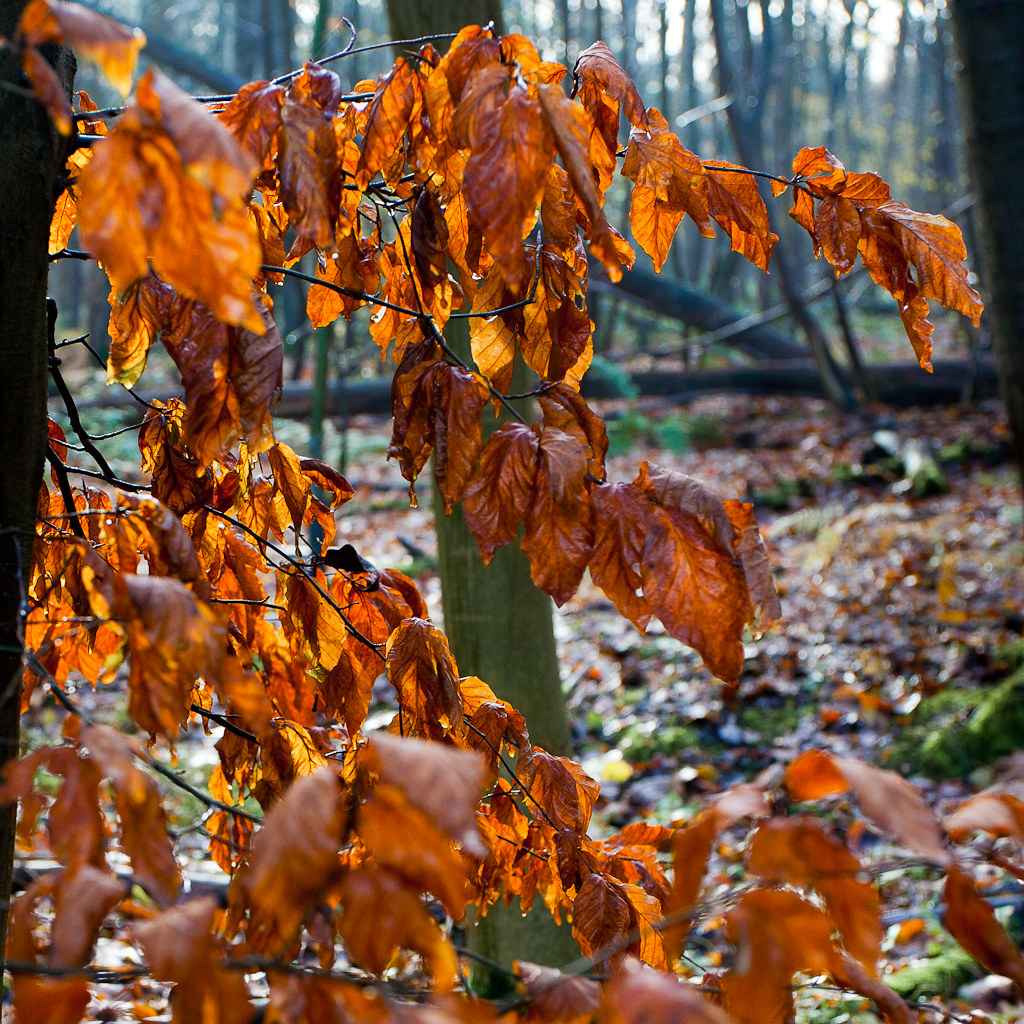
Hi Mike, you have handled the leaves very well. Lighting is really nice and the colours come through very well. Some off the oof leaves pull my eye a little though. But of course very awkward to avoid at times.

Your 2nd shot is really nice, something totally different. It's a shame you didn't have more time. But works well as it is. The middle statue is very striking.
 
Hi Mike....meant to ask...are you coming to the Malverns meet in January ?

Colro....like it , great colors & a lovely autumnal feel (y)

Color....interesting image , lots going on , ...work is a real pain at times , don't they know you're a photographer :LOL:
 
Hi Mike, you have handled the leaves very well. Lighting is really nice and the colours come through very well. Some off the oof leaves pull my eye a little though. But of course very awkward to avoid at times.
Thanks Michael, The DOF was my choice and I tried a few different settings. Not perfect I know, but this was the one that seemed to work best for me.
 
Hi Mike....meant to ask...are you coming to the Malverns meet in January ?

Colro....like it , great colors & a lovely autumnal feel (y)

Color....interesting image , lots going on , ...work is a real pain at times , don't they know you're a photographer :LOL:
Hi Lynne,
Yes I'm still planning on coming to the Malverns meet for the Saturday. Looking forward to it.
Colro - thanks!
Color - I can't really complain too much - plenty of free time during my first week away - but that was before 'colour' was announced.
 
Hi Mike

Colour - #1 -. The colours of the leaves is excellent - lots of depth and variety

#2 - I think that I agree with Steven because the figures get lost in the busy-ness of the shot and there are some awkward shadows. Possible more focus on the central figure - which would have also brought out the man- heads dangling round the centre.
 
Like the colour shot from India but i do think you could have got a bit closer or maybe crop it more
 
Great shot for colour Mike. I think I'd have liked either a slightly wider crop to get all of the three arches in, or a narrower portrait one to show just the centre one, but that may not have been possible.
 
Colour - I prefer the natural colours in #1 out of the two. The overall image certainly has a sense of natural as well

Shadow - The composition works well but I'm assuming it's a composite image as the handle is in the shade. The tones across the image are nice though.
 
Hi Mike

Colour, lovely bright oranges in the leaves contrast nicely against the background.
The Indian shrines to their gods always freak me out a bit, holding a severed head :eek:

Shadow, I was wondering about the handle being in the shade too? Also the coffee stain on the cup is that deliberate? Or is it meant to be causing the shadow of the handle? Sorry I think I asked a similar question last time! But I like the composition and lighting.
 
Back
Top