weekly Marsha's 2013 52 - Finally finished!

Gluttony, wow, he's enjoying the bun :D Interesting framing and nice quirky 3rd photograph. Crit, just the cropped head. I'd like to see all the head or less.

Time, really great photograph. Well composed and liking the muted colours. I see where you're coming from, but it doesn't jump out...not that it has to.

Cheers.
 
nice gluttony tryp and a really nice pic for time a lovely red colour and nice BG (y)
 
Hi ya Hun :wave:

Gluttony....right on theme , lovely way to display the shots , nice n sharp on the eye's..(y)

Time....now this has me curious....love it though , really beautiful image of an ageing rose :clap:
The background...is that one of those textures ? works a treat with the rose if it is . I can see just a hint of blue on some of the petals ( I get it as well with red roses)
Hope you're making great use of the new camera :clap:
 
Nice little bit of a catch up Marsha :D

Gluttony seems such an ugly word for your little un' enjoying his cake but you've certainly caught the moment of Jack scoffing it :LOL:

The triptych works well, it helps tell a little story. I like the quirkyness of the last image position.

Time, I like too. It seems a classic shot of the rose, technically very good, sharp focus, well lit, good work Missus (y)

You are putting your new toy to very good use.

Oh and on that note, how are you enjoying your 40's? Life beginning and all that ;)
 
Hi Marsha

Good to see you keeping going - but how could you not with a spanking new toy?

Gluttony - really good set. Good idea using a tryptych and 3 well balanced shots showing the pleasure of minor gluttony. Only small point would be the highlights on the chair back in #1 and#3.

Time - beautiful. Excellent colour, lighting, b/g and definition from b/g. :clap:
 
Gluttony, wow, he's enjoying the bun :D Interesting framing and nice quirky 3rd photograph. Crit, just the cropped head. I'd like to see all the head or less.

Time, really great photograph. Well composed and liking the muted colours. I see where you're coming from, but it doesn't jump out...not that it has to.

Cheers.
Thanks Andy. I know what you mean about the chopped head, but there is a very annoying speaker behind him that I was cropping out!

Time, I like a shoe horn into the theme :D

nice gluttony tryp and a really nice pic for time a lovely red colour and nice BG (y)
Thank you.

Hi ya Hun :wave:

Gluttony....right on theme , lovely way to display the shots , nice n sharp on the eye's..(y)

Time....now this has me curious....love it though , really beautiful image of an ageing rose :clap:
The background...is that one of those textures ? works a treat with the rose if it is . I can see just a hint of blue on some of the petals ( I get it as well with red roses)
Hope you're making great use of the new camera :clap:
Hi Lynne, yes, it's getting some abuse thank you :)

Yes it is a texture overlay on the rose, using the Sarah Gardner freebies (think I told you about those before). so VERY easy to use, click file, place, drag the corners to fit, reduce opacity, mask and use a soft brush to brush in where you want it :)

Oh and the blue tint on red roses, really bothers me! There are a few on Flickr that I managed to get without it I think!
 
Nice little bit of a catch up Marsha :D

Gluttony seems such an ugly word for your little un' enjoying his cake but you've certainly caught the moment of Jack scoffing it :LOL:

The triptych works well, it helps tell a little story. I like the quirkyness of the last image position.

Time, I like too. It seems a classic shot of the rose, technically very good, sharp focus, well lit, good work Missus (y)

You are putting your new toy to very good use.

Oh and on that note, how are you enjoying your 40's? Life beginning and all that ;)
Thanks Iain, yes I am liking the quirky angles more and more, trying to get them right is a challenge though so you're not having to lean to look at it! Oh and the little beggar has been demonic this week so actually gluttony seems a tame way to describe his!

I'm putting my 'life beginning bit' off until about November, when I can really relax! I am back to work tomorrow and hoping after this week my life will be a tad easier!

I am loving my camera, I have had to get used to a few things that full frame bring but the quality of photos and low light capability is AWESOME! Those photos of Sophie on FB tonight were shot at ISO 1250 and and it's barely noticeable, amazing!


Hi Marsha

Good to see you keeping going - but how could you not with a spanking new toy?

Gluttony - really good set. Good idea using a tryptych and 3 well balanced shots showing the pleasure of minor gluttony. Only small point would be the highlights on the chair back in #1 and#3.

Time - beautiful. Excellent colour, lighting, b/g and definition from b/g. :clap:

Cheer Alan. I hadn't noticed the highlights on the back of the chair. Maybe I'll edit those out at some point

The new toy has caused me more time issues, too many photos too sort through now! Although I am hoping to catch up with my 52 shots this week and then stay caught up!
 
I'm putting my 'life beginning bit' off until about November, when I can really relax! I am back to work tomorrow and hoping after this week my life will be a tad easier!

I am loving my camera, I have had to get used to a few things that full frame bring but the quality of photos and low light capability is AWESOME! Those photos of Sophie on FB tonight were shot at ISO 1250 and and it's barely noticeable, amazing!

Those photographs of both Sophie and Jack are lovely Marsha, I 'liked' them on FB but will comment here. The ones of Sophie in particular are real wall hangers, fantastic eye contact and composition. Your little models are very photogenic I have to say. I look forward to more of the same Marsha, great work.
 
Those photographs of both Sophie and Jack are lovely Marsha, I 'liked' them on FB but will comment here. The ones of Sophie in particular are real wall hangers, fantastic eye contact and composition. Your little models are very photogenic I have to say. I look forward to more of the same Marsha, great work.

Thanks Iain:D I have ordered the one of Sophie on a canvas, had to do it really as I love it! I thought I finally better start uploading images to my gallery as I've never used it before now :bonk:
 
HATED this and it has really made me drag my heels!

So here is a rush job after discovering the multiple exposure function on my new camera:


Given some levels tweaks to darken the BG, cloned out some dirt and attempted to straighten it.

I'll pick out the faults now!

The square block is still a bit wonky, I know my hands were getting tired as I was shooting directly over head, and trying to get them dead straight was proving a problem!

It's not pin sharp, but it was handheld at 1/15 sec give me a break :p

If I find who picked this theme I will have a stern word with them!

Thank you for looking.

C&C welcome as always.
 
Wonky or not Marsha, I love this one :love:

The bright vivid colours and bold shapes really work well together.
Just a suggestion but I found it to be even stronger when rotated 90 deg CCW. It makes it more symmetrical and doesn't play havoc with my ocd :LOL:
 
Pretty good for a rush job if you ask me.... the slight unsquare of the square can be rectified in 2 mins in PS, (edit > transform > distort would be your friend).

Love the colours and the reducing sizes, really drawing the eye in.
 
It wasn't Michael :)

On theme. I'd like to see them the same size.
Thanks Andy. It was hard enough getting them both in shot without any overlap let alone worry about their sizes :bonk:

Wonky or not Marsha, I love this one :love:

The bright vivid colours and bold shapes really work well together.
Just a suggestion but I found it to be even stronger when rotated 90 deg CCW. It makes it more symmetrical and doesn't play havoc with my ocd :LOL:
Thanks Iain :D The bright colours and shapes is what I have been thinking about the whole time just never had the time to do it. Then tried yesterday shooting from above and it wasn't right, so I tried the multiple exposure thing. Works rather well I think!

Pretty good for a rush job if you ask me.... the slight unsquare of the square can be rectified in 2 mins in PS, (edit > transform > distort would be your friend).

Love the colours and the reducing sizes, really drawing the eye in.

Many thanks Graham. I didn't really have time to finish tidying it up!

But here is a more symmetrical straightened OCD compliant version:

 
I really like this Marsha, draws the eyes in. Great use of colours and well thought out. A slight edit is ps would correct the 'wonky' bit as Graham has suggested. Really good.
 
The OCD compliant version, perfect Marsha, simply perfect :D
 
I really like this Marsha, draws the eyes in. Great use of colours and well thought out. A slight edit is ps would correct the 'wonky' bit as Graham has suggested. Really good.
Cheers Dave. I've corrected the wonky box and got it almost straight on all sides, I didn't want to push it too much and distort the shape. I know the top rings could probably move left a bit, is that what you're looking at?

The OCD compliant version, perfect Marsha, simply perfect :D

Cheers Iain :love:
 
really nice colourful image, great colours. OCD one for me really good considering you hated the topic :clap:
 
Many thanks Allan and Lynne :)

I completely forgot to say what they were :bonk:The squares are these wooden stacking blocks from John lewis, here are the rings. I have a collcetion of very colourful kids toys that I was going to sell, but going to keep them for photographic purposes!
 
Damn... I'm miles behind on yours too :(

Space - that sheep sure has lots of space and seems to have spotted you, I like the positioning of the sheep in the frame, a nice muted colour wintery back drop too - Like it :)

Work - The colour one in the car for me, like the DoF used, and the colour co-ordinated shirt that matches the car :D

Gluttony - :LOL: that's excellent, like how you have set that out too with the 3 smaller frames, works very well (y)

Time - Lovely colour against the background, I'd prefer to see either a full leaf or none at all though :)

Juxtaposition - The OCD compliant version for me too :D - Lovely bright colours, a great black background - Nice One :)

Am I caught up yet... I need a Coffeeeeeeeee :)
 
really like this. Like contrast of shapes, colours with background. Simple idea but well done
 
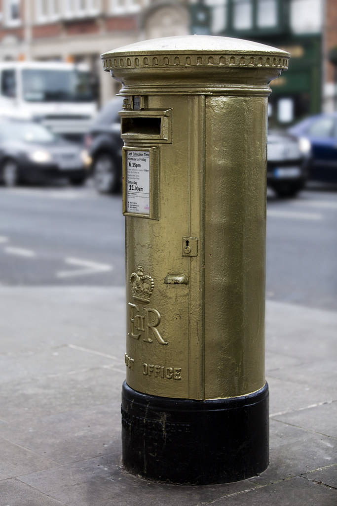
I had different ideas for this theme but then suddenly I thought of the Olympic gold letter boxes. So I did a bit of research and found one in Henley celebrating the success of the rowing teams.

Alas it was impossible to reduce the traffic and BG stuff even using F2.8. I used some added blur on number two, cloned out some distractions and reduced the saturation slightly in the BG. Also cloned out some bird poo!


C&C welcome as always
 
Perfect interpretation of the theme, not seen any gold letterboxes before.. nice change from the selectively coloured red ones (not that there's anything wrong with those :LOL:).

Awesome detail being picked up by your new camera too.

Possibly finding the tops a little bright - not blown just a tad bright.

and not really minding the traffic behind, must be your work in PP muting it well. Think I like the full box best, the framing on the tight one might just be a bit tight.
 
[QUOTE"overbez;5451341"rfect interpretation of the theme, not seen any gold letterboxes before.. nice change from the selectively coloured red ones (not that there's anything wrong with those :LOL:).[/QUOTE]
Thanks Graham. There were a lot of red letter boxes last year, I'm actually surprised I didn't see more gold ones this year!

Awesome detail being picked up by your new camera too.
Doesn't it just :love:

Possibly finding the tops a little bright - not blown just a tad bright.
I hadn't noticed that! Quite mad considering the weather was VERY grey and overcast! I bet they're hellish in bright sunshine!
 
and not really minding the traffic behind, must be your work in PP muting it well. Think I like the full box best, the framing on the tight one might just be a bit tight.
I prefer the full one too. As for pp I didn't like the full sc so went for the slight desaturation and cloned or everything that was too annoying!
 
Prefer the top one, traffic just too distracting on the full version.

Maybe crop to just the letter slot and the collection notice?
 
Hi, #2 for me. Great detail and colour in the box. DOF was an issue as you say but you're PPing has worked well.

Crit, hmm, I think I'd prefer a square on composition with all the lettering in the frame.

Cheers.
 
Thanks Carl. I did think about cropping the first one but ran out of time this afternoon.

Cheers Andy. I couldn't get square on because of a big green box thing on the right side of the post box. You can see it here http://www.flickr.com/photos/oxfordshirechurches/7832419958/ I was using my 70-200 and was as far back as possible to try and reduce the dof to blur the background!

Thanks Lynne.
 
Love #2 I think showing a bit more around it and good use of a shallow DoF makes the shot

Agree about the top being overexposed as others have said, but I don't find it too distracting
Could do with a tiny bit of ccw rotation I think....
 
Last edited:
Work - I think the coloured one in the car works really well - did you use the sponge tool (under dodge and burn) in desaturation mode to tone down the red blob?

Gluttony, lovely expressions, not sure about the tilt but really like the pictures and fit the theme

Time - beautiful deep red colour - looks like you are enjoying using your new camera

Juxtaposition - again love the colours and pleased you showed what they were as I was trying to work it out

Letter - I think someone posted a gold letterbox once before - where are they this colour, all the ones round here (when you can find one) are red
 
Love #2 I think showing a bit more around it and good use of a shallow DoF makes the shot

Agree about the top being overexposed as others have said, but I don't find it too distracting
Could do with a tiny bit of ccw rotation I think....
Thank you. I'm blaming the post box for being wonky, not me ;)

Hi Marsha

2 good shots and diffcult to choose but I do like #1 better I feel because of the increased detail in the shot and the initial impact. Maybe a larger crop to include all of the collection details.
Thanks Alan, do you mean a closer crop?

Work - I think the coloured one in the car works really well - did you use the sponge tool (under dodge and burn) in desaturation mode to tone down the red blob?

Gluttony, lovely expressions, not sure about the tilt but really like the pictures and fit the theme

Time - beautiful deep red colour - looks like you are enjoying using your new camera

Juxtaposition - again love the colours and pleased you showed what they were as I was trying to work it out

Letter - I think someone posted a gold letterbox once before - where are they this colour, all the ones round here (when you can find one) are red

Many thanks Christine, I haven't seen a gold one yet pm here but I'm hardly up to date! I found them here. Hope that helps.
 
Back
Top