weekly Marsha's 2013 52 - Finally finished!

The static kind!

I was thinking of doing some crazy static hair shot with a balloon when my mother in law did a bit of light reading (How to fossilise your hamster) whilst on the loo (as you do). In it there's an experiment about static electricity:

Mix cornflour and oil with a wooden spoon.
Rub a balloon on your clothing.
Allow mixture to dribble a bit and put the spoon near the balloon. Negatively charged gloop attracts to positively charged balloon :D


This took about 100 shots to achieve :bonk:
Firstly to set up the camera and focus point, then to set the lighting.
Then about a gazzillion shots to get the drip right, not in front of my face or OOF.
Then thinking it was a great idea to make it harder by making the balloon stick to my hand as well:help: 
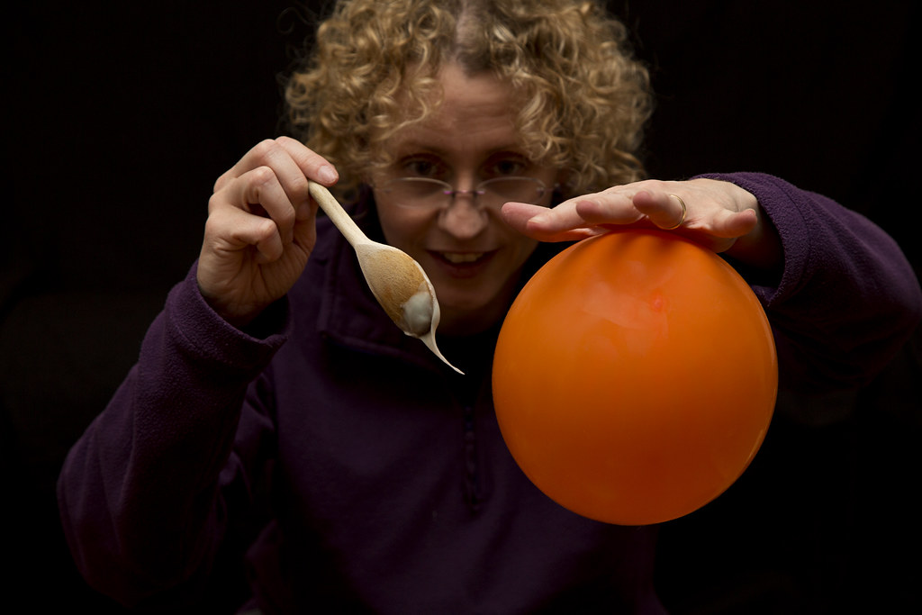
I also wanted me slightly OOF so as to draw attention to the spoon and gloop.
So a few more shots needed to get the balloon to stick and the drip moving in the right direction!

Lessons learnt:
It looks wrong repeatedly rubbing a balloon on oneself!
Cornflour gloop makes a mess of the carpet!
Remote controls shouldn't be dropped in said gloop :puke:
Hair will never be the same again:dummy:
A two second timer is not long enough to pick up a spoon and tease a balloon with it!

This was the last shot I took and has had only the usual basic tweaks in PP, it is as shot.

C & C welcome.
 
Last edited:
FANTASTIC. I am in Awe!

Perfectly executed shot and a great write up too.

Love the low key look and the soft focus is just at the right level so that we can still see your features/expression.

You deserve a standing :clap: :clap: :clap: for this.
 
Many thanks Brian for the praise (y)

The look on my face doesn't show my frustrating at not being able to get the composition quite right! And it was midnight when I took this :bonk:

I posted this last night then thought it could have been my bond shot for the POTY, doh!
 
Hey Marsha :)

Have to agree with Graham... like the second shot best, lovely DoF, a nice shine caught on the box and the collection time nice and clear - Nice One (y)

Really envious of your new toy :bat:

<EDIT>

Electric - Great idea, again nicely executed, glad you said it took you so many shots :D
 
Last edited:
That's works for me. The one thing that really make it, though, is the intense look of concentration on face.

Focus is one as is the colour. Cropped head doesn't both me.

Crit, looks a tad dark, and I cold live without the spoon.

Cheers and :clap: for another SP.
 
Excellent! Love the determination to get the shot and the write up explaining it.
 
:clap: for your persistence and determination to get this one....

Great work with the lighting, really draws attention to the spoon and the balloon.

And a unique take on the theme. And more :clap: for making it doubly difficult with both props in shot.
 
Electric: brilliant, just brilliant. There was me wondering if I could get a few bits of paper to stick to a rod! Definitely not going to try that one now. Great work.
 
Hey Marsha :)

Have to agree with Graham... like the second shot best, lovely DoF, a nice shine caught on the box and the collection time nice and clear - Nice One (y)

Really envious of your new toy :bat:

<EDIT>

Electric - Great idea, again nicely executed, glad you said it took you so many shots :D

Hi DK

The new toy is rather awesome. I'm guessing it would be even more so if I had time to read the manual :bonk: You need one in your life ;)

I think it helps to know how many attempts it took to get my electric shot, I am not the kind of person that gets 'the' shot first time, far from it.

fantstic shot, you have a lot of patience!
....but one thing spolis it for me, the fact that you cropped the top of your head off!
Alas I couldn't aim the camera any higher as my black sheet was just draped over the sofa and any higher meant the wall came into view. I was stooped over as low as possible too. Plus I'm not too fussed on seeing my non groomed hair in all it's fuzzy glory!

That's works for me. The one thing that really make it, though, is the intense look of concentration on face.

Focus is one as is the colour. Cropped head doesn't both me.

Crit, looks a tad dark, and I cold live without the spoon.

Cheers and :clap: for another SP.

I tried many expressions Andy, the maniacal lunatic came a close second to this :puke: It is fairly dark. I had to don a jumper half way through as the stupid balloon kept clinging to my apparently hairy arms! But I like the purple and orange colours. Plus the bits that count, my hands and props, are lit how I wanted them.

And yes, you've got to get an SP in somewhere on this challenge :D

Excellent! Love the determination to get the shot and the write up explaining it.
Thanks Mark

:clap: for your persistence and determination to get this one....

Great work with the lighting, really draws attention to the spoon and the balloon.

And a unique take on the theme. And more :clap: for making it doubly difficult with both props in shot.
Cheers Graham. I love a challenge!

Electric: brilliant, just brilliant. There was me wondering if I could get a few bits of paper to stick to a rod! Definitely not going to try that one now. Great work.
Thanks Chris. Don't let my experiment with gloop and a balloon put you off, it will probably be a very different shot.
Do you think anyone would notice if I used this in the POTY :cautious:
 
Hi Marsha :wave:

A fun and creative take on electric theme :D
Your back story also adds to your post too.

I too like the low key look to it with the focus being on the balloon and gloopy spoon. No real crit from me Marsha, I like it as is, you've brought all the elements together well. Also an SP thrown in for good measure. Iain
 
hi Hun

hope you're fighting off the lergy :hug:

No crit from here at all,not even a smidge cos that shots just far to darn good...excellent excellent excellent :clap::clap:
 
Hi Marsha :wave:

Electricity: A fabulous shot, well executed and worth every bit of effort you put into it. Very clever!
 
I had this idea straight away for direction, but with my kids and then me ill it meant nearly three weeks off work! I was in yesterday and it wasn't raining for once, so I went and stalked the wind sock!

Anyone in the aviation industry will know that aircraft like to land/ take off into a head wind. As an air traffic controller I must give the surface wind to aircraft as they make their approach to land or take off. As a visual aid and a back up to the anemometer (met office wind thingymabob) airfields always have wind socks which tell them what direction the wind is blowing from and approximately how fast, a wind sock fully inflated and straight out means it's about 30knots/ blowing a gale!

I shot these upwards to remove all the surrounding airfield clutter. Used a polariser to get what bits of blue sky were showing very blue! I think number two is my favourite choice. Two and three were taken stood at the base of the wind sock looking straight up it.

Direction 1.

Yes it was windy!

Direction 2


Direction 3


And yes my colleagues think I'm a bit odd for photographing a wind sock!!!!

C&C welcome.
 
#2 for me too Marsha - think it's the combination of the more blue in the sky, and the detail in the post (going up perfectly from the corner), obviously needs the fully inflated sock for this to work, and you picked a great time to take it. (y)

#1 suffers by having less post and less blue in the sky, #3 is great but for the slight kink in the sock and less surface rust on that side of the post. But great composition on them all.
 
I decided to go for the tacky as in slightly sticky or adhesive. And my daughter LOVES 'gluing and sticking' things so was an almost willing voluteer. I say almost as the tv went on and she was very quickly distracted by Tinkerbell!

Two more choices.

Tacky 1


This was my original choice. Shot at F10 to try and get both the sticky bit and Sophie in focus. But this meant more clutter in the background and a crop needed.

Tacky 2


Then I saw this one, and just preferred it. I know the glue brush is OOF but I love her concentration. Edited differently leaving the grain from the high ISO and given a slightly aged feel.

So that now only leaves me one week behind :D
 
'Ello, I can take a hint :D

Direction, now these I'm liking...I almost fell over, though :nuts:

Of the 3, it's #3, great perspective and cracking sky. Nice detail as well. Crit, well, I can't decide what a bit of movement in the sock would look like, personal preference and you'd loose come of the detail in the clouds. Not sure what PP software you use but I'd like to see to shadows on the underside of the sock lifted a tad.

Tacky, now there's a face that screams concentration :D. Nice low angle and ice colours. I'd like to see it a bit closer, the chair, etc distract my eye a bit.

Cheers and nice catch up....almost :naughty:
 
Direction, now these I'm liking...I almost fell over, though :nuts:

Of the 3, it's #3, great perspective and cracking sky. Nice detail as well. Crit, well, I can't decide what a bit of movement in the sock would look like, personal preference and you'd loose come of the detail in the clouds. Not sure what PP software you use but I'd like to see to shadows on the underside of the sock lifted a tad.
Cheers Andy. The sky was really bright and it was a nightmare trying to get colour in the wind sock and the sky:bonk:
I have tried to lift the shadow under the wind sock in pp, didn't push it too far as it looked odd!

Tacky, now there's a face that screams concentration :D. Nice low angle and ice colours. I'd like to see it a bit closer, the chair, etc distract my eye a bit.

Cheers and nice catch up....almost :naughty:
I did try a closer shot but it just made her right arm look mahoosive! So I had to opt for the chair in the background. Shooting in portrait mode meant the bookshelf behind was an issue:bonk:

'Ello, I can take a hint :D

Rude I know but I was feeling unloved :(

I know I've struggled for commenting this year, but I knew it was going to be a difficult!
 
Last edited:
Hello Missus :wave:
I too can take a hint ;)

#2 for direction gets my vote too Marsha, its bang on theme.
Its a simple but effective take on that weeks theme.

A few minor niggles with it for me though :(
I think it could be lightened just a little to bring out the colour in the sock.
Compositionally, I feel it needs to be flipped horizontally so as the pole is rising from the bottom left corner drawing the viewers eye into the scene.

#2 for tacky gets my vote too. The slightly desaturated look to it is what attracts me to that one. The look of concentration on Little Miss Goblin's face is fantastic :LOL:
Not much more I can add, bang on theme, good work (y)
 
Hi ya :wave:

of the 3 direction shots it's #1 for me...like the pole coming out on the diagonal from bottom right... (y) I'm finding the pole in the others too over powering...sorry :crying:

Tacky...ooh , sooo much concentration...like the pp in #2 ,seems to suit it better ( still not sure why though ) (y)
 
Tacky nicely on theme Marsha - there is another level of concentration beyond the one you've captured here... and that's when the tongue gets stuck out too!! :LOL:

I could happily lose the blue bowl and a slice down the LHS too. (y)
 
hi Marsha

Direction - all on theme and an original subject - but only open to those with security passes i suspect. Foe me #2 as the angle of the pole and the straight outtedness of the sock against the good sky combine well.

Tacky - well on theme. both good shots of the concentration involved. For me #1 has the better overall comp and the exposure of the skin tones on the face and arm is better. Also on #1 , the blue bowl is less distracting even tho more is showing.
 
Thank you everyone.

Iain I did try flipping one of them and it just didn't look right! I may try again at some point.

I know what you mean Lynne about the pole!

:LOL: Graham, I think I may have one of her with her tongue out!

Yes Alan this is very much a restricted unit and this area is restricted even further. Not everyone is allowed access on the airfield. I don't get many perks in my job but access to stuff like this is one of them.
 
Hi Alan, I emailed my wedding photographer Jodi Hinds to ask if I could scan and use her photos on Facebook. She very kindly sent me four photos that we didn't have in our wedding album, my avatar was one of them!

I will probably be ordering that one and getting it framed!

I am settling back in the chaos that is home life. I need to sort through my photos and get a few on here.
 
Due to the sudden loss of my Dad last week my involvement in this years 52 had to go on hold.
But life goes on and I have continued to take some photos, maybe not the best but what little artistic flair I had upped sticks and buggered off!

But I'm still here, sort of. I was struggling with commenting beforehand but please forgive me if I become worse for now! My mind is elsewhere.

Whilst in Spain for compassionate leave and my Dads funeral I went shopping, camera went too as I needed to take my mind off things.
I absolutely hate Primark, it's cheap and nasty. Please forgive if you shop there! I picked up some clothes to try on (I was desperate) and discovered they were all falling apart as they were so badly sewn.
Too me this is not value, but clearly some think it is:


These ladies all did there shopping then stood outside this shop to have a smoke, classy!


Were they all walking out in disgust or waiting for other shoppers within? Who knows. Annoyingly the woman bottom left walked into the shot as I took it and I didn't take another one :bonk:

If you leave any C&C at all that would be nice, cheers.
 
I don't like posting out of sync but needs must, I will catch up when I can!

These are the sun shades at the Spanish shopping centre I went too:


Number three was winning me over, but the washed out sky ruined it for me, but shooting straight up hurt my neck and made it difficult to get the sky blue!
I think number two is my favourite.
 
Last edited:
Hi Marsha

Value - Primark certainly has value associated with it and #1 typifies what i always see - that no-one leaves without a bag or two. i like the shot but would try cropping the bottom along the line of the dark/light paving stones. Then I might consider the left hand window - but that does add good colour. You did well with #2 to avoid anyone with a bag!! Like the colours

Angles - #1 is decent but other 2 standout. #3 is well framed and would be better with a more uniform sky. #2 is my choice cos good colours, contrast, sky and comp. Floaty and movement feel to it(y)

PS your avatar reminded me so much of a b&wshot of my wife with her father - looking over the shoulder, hair up, smile. But surely you are too young for b&w :D
 
Hi Marsha, Number 3 is my favourite "Angle" I love the composition and the sky looks ok to me. (y)
 
Hi Marsha :wave:
Your primark shots are bang on theme, if cheap and cheerful is value then this shop ticks the box. Your photos are a good bit of social commentary, I like them and well done you sticking with it (y)

I think all of your angles images are bang on theme too but if I had to choose, I think it would be a toss up between #2 & #3.
I like the composition of #2, the diagonals through the frame are very appealing to the eye.
#3 has an abstract feel to it for me and quite a geometric look too. We as photographers must attract some strange looks from passers-by getting some of these type of shots :LOL:

Good work all round Marsha, keep smiling :)
 
Back
Top