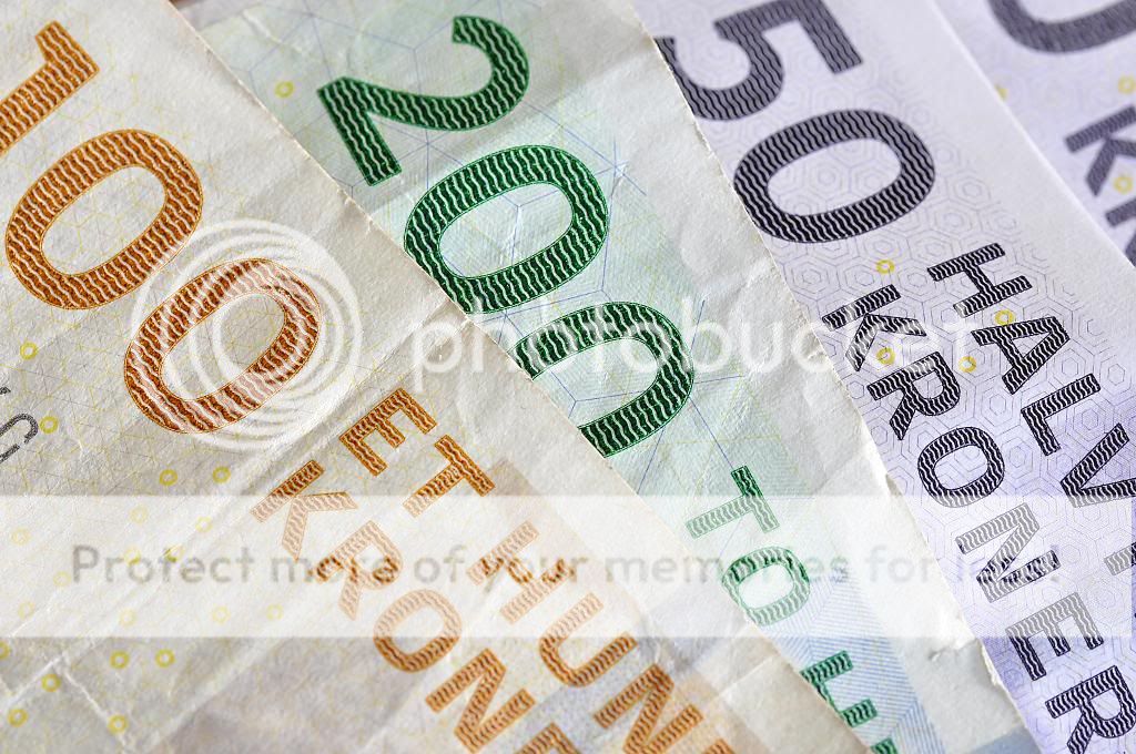
weekly ams99 - 52 Challenge - Week 52 Water

Hi ya Alan,

Lovely details in this shot. I first looked at it on my mobile and couldn't for the life of me work out what it was. Now on the laptop it is more obvious. Like some of the others, not sure the white background helps, but I wouldn't know what to suggest instead?
 
Shape I really like and like others I didn't get it straight away :D. I like the simplicity and sharpness, it suits the subject really well.
 
Hellooooo....:wave:

Shape....cracking shot...great detail , really well positioned in the frame & I quite like the very white bg....top shot mister :clap:

Plenty....loadsa money :D exposure looks spot on ,nicely laid out though I might be tempted to try n lose the last little bit on the rhs of the 4th note (y)
 
Hi
Plenty..... on theme, nice exposure, colour and sharpness maybe you could spread the 3 different notes a bit more to lose the last one :thinking:
 
I really like the detail in the saw blade, didn't register straightaway for me either, which I like!

plenty of money, what's it really worth in ££'s though? Nice and sharp, good colours. nice diaginals there too. (y)
 
Hi Alan,

Shape: Great choice of subject and the crop really works too.
I think something has gone a little off with the processing (the background looks a bit iffy to me) but I'm sure that's easy to fix with a levels adjustment.

Plenty of money eh? - nicely exposed, very "even" if you get my drift. (y)
 
Last edited:
Hi Alan

Quick catch up

Rock - good comp with the sweep of the rock taking the eye around. Perhaps a few less pebbles an a tweak of the horizon as has been mentioned.

Pair - odd comment by you cos I think that is one of your best (y) good idea to 'halve' the pair and the colours really work

process - good shots and super detail in #2 but for me #1 is closer to the theme. Good detail in the bee

Shape - what a good idea (y) Good off centre comp and I will stand out from the crowd and say that the white b/g is a good choice

Plenty - agree with Allan's comments

Keep going - I am sure that the Challenge helps our ideas for all our photos, not just those posted

(y) Thank you for the feedback
 
Hi

Really like the shape pic even if it did take me a while to figure out what it was.
Like the detail (y)
 
There is movement in the wheels and a little blur in the background that convey speed nicely. As you say there isn't enough room for the car to move into but other than that it's good.
 
Hi Alan

i agree with DK on this would love to see some more space in front of the car
but you have caught the car really well (y)
 
You've done your own crit! - That's almost cheating! :LOL:

I just wanted to say Have a nice holiday :wave:

See you next week. :)
 
Pannings hard - especially where the subject is coming in a straight line, as the curve of your arc of pan will not give you the same distance at all points, inside of a hairpin or similar curve is a bit easier (y)

Nice subject though - colours good.
 
Hi, Steps, yeah, a good take. Nice perspective and detail...looks lovely :D

Mono, he looks the business. Well composed and good detail. I quite like how he is looking off into the distance. I'd like to see a tad more contrast.

Cheers.
 
Hi
love the steps pic, you could lose the foot for me would work just as well without :clap:
Nice cowboy pic too good B+W conversion (y)
 
Get off a ya haws and drink ya milk!

Hi Alan, great image! - I think I would have tried pushing the reds up a little to lighten his skin tones (he's a little bit dark under that hat. That said I really like it, nice one. (y)
 
Hi

Steps - works well with or without the foot. Good comp and colour and a very original take on the theme. (y)

Mono - well captured pose. good detail. His right hand looks a bit funny and I cannot make out why.

I never spotted that Alan. Just had a zoom on the original and i think he is holding a gun behind his leg. Bizarre, well spotted eagle eye (y)
 
Get off a ya haws and drink ya milk!

Hi Alan, great image! - I think I would have tried pushing the reds up a little to lighten his skin tones (he's a little bit dark under that hat. That said I really like it, nice one. (y)

Thanks Brian.

I'm using elements 9 and can't seem to apply the correction you recommended. If i use the red channel in levels everything turns pinky. If i try and use colour correction nothing happens with saturation and all im then left with is colour curve adjustment which i cannot master at the moment.

I am obviously doing something wrong. Any pointers / suggestions please.

Thanks,
Alan
 
All,

Ive learned so much over the last 12 months or so. A big thank you to everyone.

Also, ive created a Flickr account. My gosh, there are some awesome images i can learn from on there.

Ive only put what i consider to be my better images on Flickr so, over the last 12 months i have 9 images i am pleased with, none of which i believe have fitted in with the 52 theme.

Please feel free to pay me a visit and offer some crit / advice. It would be most welcome.

The link is in the post above this one........ i think. I cant seem to get it as the signature in my posts.

Thanks all,

Alan
 
Back
Top