weekly Delta Skies 2014 TP52 - Week 51 Extravagant & Week 52 Support (that's 2014 done)

Hi Peter :)

Congrats on the D800 mate... and the 5,000th post, don't you just love new toys especially full frame ones :clap:

Sharp - Awwweeeeeeee that is soooo cute, don't they look great when the are not squashed on the road :D

Excellent detail, love the DoF, really nice background you have achieved there, nice one mate (y)

Pure - Excellent detail, real nice whites and liking your crop :)

Sparkle - Absolutely LOVE them colours... super Bokeh and a great image, even if it is a Christmas shot LOL :thumsnb:

Fall - Another that has made me laugh tonight, great idea and a good angle, liking the DoF with the bread/jam super sharp :)
 
Pure, lovely picture. Dof works really well for me and I like the blur on the edges. Very nice in b+w.
Sparkle, lovely colour through out and the position of the candle looks good.
Fall, A great idea, lighting looks good. Jam has been mentioned.
Thanks Michael

Hi Peter...

Pure is bang on for focus... nice crisp image...
Sparkle works too and the bokeh is easy on the eye which is pleasing...
Fall... the disappointment on the dogs face is excellent...
Thanks Colin

Hi so sorry for not having dropped by to comment for a while, I have had some broadband issues so I am on a marathon catch up session.

Sharp - a very nice image of a cute hedgehog, those spines certainly look sharp to me. Everything about the image works well for me I love it.

Pure - a nice fitting detailed image, I think it is nicely lit and well exposed.

Sparkle - a great image, I love the lens flare the bright colours coming from the lights and the placement of the candle works very well.

Fall - a fun take for the theme, the dog seems to look a bit upset at it having fallen on the floor. I do like the image and works for the theme, keep up the good work.
Many thanks for the catch up Mandy. It's appreciated

Hi Peter sorry for my lack of comments trying to catch up

Half - like the idea but think the clock face looks rather lost with the negative space

Architecture - its different love the red and over sized shadow works for me

Promise - like the angle of the wife and DOF works well nice shot

Sharp - lovely photo face is so cute but should it not be fast asleep in daylight?

Pure - lovely effect you have achieved there with the blurring of the edges, the detail in the centre is excellent

Sparkle - in your face image colours are superb well done

Fall - the dogs eyes make it for me is it thinking yes lunch or what the hell is he doing :)
Another catch up on the thread. Many thanks Craig

Hi Peter :)

Congrats on the D800 mate... and the 5,000th post, don't you just love new toys especially full frame ones :clap:

Sharp - Awwweeeeeeee that is soooo cute, don't they look great when the are not squashed on the road :D

Excellent detail, love the DoF, really nice background you have achieved there, nice one mate (y)

Pure - Excellent detail, real nice whites and liking your crop :)

Sparkle - Absolutely LOVE them colours... super Bokeh and a great image, even if it is a Christmas shot LOL :thumsnb:

Fall - Another that has made me laugh tonight, great idea and a good angle, liking the DoF with the bread/jam super sharp :)
More catching up. Thanks for the comments Dean
 
Hi Peter

Pure.....beautiful image , perfect focus & lighting :clap: only minor & probably personal to me...I'd be inclined to push it to the very edge of the frame so losing the top & bottom darker corners

Sparkle....love that Bokeh , composition just perfect & great christmassy colors :clap:

Please....no more mention of the " C " word till at least december 24th :bat:

Fall......think the crit re the jam has been mentioned but yeah , good take on the theme & the expression on your pooches face is classic...he can't belive he's been so lucky ;)
 
Last edited:
Hi Peter

Pure.....beautiful image , perfect focus & lighting :clap: only minor & probably personal to me...I'd be inclined to push it to the very edge of the frame so losing the top & bottom darker corners

Sparkle....love that Bokeh , composition just perfect & great christmassy colors :clap:

Please....no more mention of the " C " word till at least december 24th :bat:

Fall......think the crit re the jam has been mentioned but yeah , good take on the theme & the expression on your pooches face is classic...he can't belive he's been so lucky ;)
Thanks for the catch up Lynne
 
Week 37 - Communicate

Epiphany by Delta Skies, on Flickr

This one will seem a little out of left field. Epiphany is a company based in Leeds that specialises is Search Engine Optimisation (SEO). In fact I used to work with (ok, work for) their CEO. Companies nowadays communicate through many channels, the internet being one of those. SEO is all about getting your company or brand to the top of searches like Google and hence reaching more people. This was taken hand held with a polariser on and then some PP using Silver Efex.
 
Last edited:
Week 38 - Dark

Tower Nebula by Delta Skies, on Flickr

This one has had plenty of PP'ing especially using Silver Efex and lots of playing around with exposures. The building is a block of flats (apartments for those wanting to sell them for more money) at Clarence Dock in Leeds.
 
Last edited:
Hi Peter :)

Communicate - Loving the sky and the tower shape building... sorry but not not heard of epiphany, presuming it must be the relevance to the theme, really nice PP on this !!!

<EDIT> Just read what you wrote under it now :)

Dark - Again really liking your processing with this one, a beautifully towering building, liking the composition with the emphasis on the dark moody sky - Really Good :thumbs
 
Hey I really like both those Peter.

Silver Efex? I googled it and ... erm .. well .. don't underestimate your delta skies ... :exit:

(y)
 
M O O S E D I T ... N O I G O O G L E D I T

it's not the first time that's happened, is it?
 
2 great ones there Peter, work well posted up together too.

communicate - all just works well togherth, composition, clouds, procesing, all the name included, even the ladder up the side.

and dark, I really like, the dark sky works against the bright building, the nice diagonal of lighter clouds breaking it up nicely, but the super part of it is the bold entrance of the building, with the diagoinal, and the perfectly horizontal and vertical top edges positioned beautifully.

processing is obviously heavy, but not overly so.

Very good. (y) :clap:
 
Hi Peter :)

Communicate - Loving the sky and the tower shape building... sorry but not not heard of epiphany, presuming it must be the relevance to the theme, really nice PP on this !!!

<EDIT> Just read what you wrote under it now :)

Dark - Again really liking your processing with this one, a beautifully towering building, liking the composition with the emphasis on the dark moody sky - Really Good :thumbs
Thanks Dean.

Communicate - great image and great processing I like it.

Dark - this image works really well I love it the composition is bang on, it's fantastic it's all I can say.
Many thanks Mandy

Hey I really like both those Peter.

Silver Efex? I moosed it and ... erm .. well .. don't underestimate your delta skies ... :exit:

(y)

M O O S E D I T ... N O I G O O G L E D I T

it's not the first time that's happened, is it?
Thanks David. Finger trouble or just predictive text? LOL

2 great ones there Peter, work well posted up together too.

communicate - all just works well togherth, composition, clouds, procesing, all the name included, even the ladder up the side.

and dark, I really like, the dark sky works against the bright building, the nice diagonal of lighter clouds breaking it up nicely, but the super part of it is the bold entrance of the building, with the diagoinal, and the perfectly horizontal and vertical top edges positioned beautifully.

processing is obviously heavy, but not overly so.

Very good. (y) :clap:
Many thanks Graham. Processing was deinfitely heavy. Too heavy for my laptop now I'm using full frame. I NEED a new one. Maybe a Macbook Pro but I'm convinced I can't justify the extra that an equivalent laptop would cost.
 
Hi Peter, two really nice architectural images, both superbly processed, I particularly like the second one
the angle you have shot them both is superb :clap: really different but they work really well (y)
 
Hi Peter, two really nice architectural images, both superbly processed, I particularly like the second one
the angle you have shot them both is superb :clap: really different but they work really well (y)
Many thanks Allan

Hi Peter ...two stunning shots there ....very nice indeed :clap: Love the processing especially on the second one ....quite stunning.
Thanks Susie
 
Two excellent shots Peter. I especially like the Dark one - very dark skies contrasting against the sharp bright building :clap:
 
M O O S E D I T ... N O I G O O G L E D I T

it's not the first time that's happened, is it?
That happened to me the other day. Small print at the bottom of the page says Search Engine by Digital Point, so maybe the site's hosts don't like people mentioning googggle :muted: :muted:
 
Hi Peter

cracking pair of images there...both perfect subjects for the pp applied which really makes them pop .Think I prefer#2, more dramatic angle , excellent contrast between the menacing sky & stark white of the building.....worthy of frames on the wall I think :clap:
 
Hi Peter

cracking pair of images there...both perfect subjects for the pp applied which really makes them pop .Think I prefer#2, more dramatic angle , excellent contrast between the menacing sky & stark white of the building.....worthy of frames on the wall I think :clap:
Many thanks Lynne
 
Wow Peter... two cracking shots there. I think you've just about crowbarred the Communicate shot in ;)

I think your photography skills have developed massively over the course of this 52 so far... and they were already might fine at the beginning. It gives the rest of us inspiration! Keep it up and keep serving up such fantastic photos - no crit possible from me :clap:
 
Communicate, much to my liking. The angle works for me as do the high contract clouds. No real crit, a maybe if I were to be uber critical, I'd like the lower left, where it looks like a vignette brightening to match the rest.

Dark, again I like the angle and it is indeed dark. There seems to be some issues on the edges of the buildings where you may have done some masking :thinking:

Cheers.
 
Hi Peter

Me catching up now;

Pure - good placement in the frame and the crop suits it. Good whites in the dandelion and the dof has worked perfectly.
Sparkle - another good shot, joyful and yet calming. Altho it has no actual 'sparkly' bits in it the idea and execution exude the theme (y)
Fall -:LOL: - nothing more - such an intelligent face tho.
Communication - not sure that it fits the theme without your description of the firm but nonetheless a perfectly executed shot - pov , angle, use of b&w, super sky and excellent pp.
Dark - another good architectural image with all the elements of pov, angle, pp coming together.

5 really good shots (y)
 
Week 32 Promise: Lovely and sharp on the padlock and wire just above it. DOF as you say is perfect.... Just enough detail there to still aprreciate the buildings and fluffy clouds. I've just got back from Paris and took some pictures at the Pont des Arts. Compared to 3 years ago when last there, the bridge is in a really bad state now. Plywood Boarding (complete with graffitti) has been put up across many panels to stop more locks being added) Often wonder what the long term management strategy is for this bridge??

Week 33 Sharp:
A really moving picture for me, created by the junxtaposition of nature subject on man made boading I guess, and as Andy says....the tired look on her face adds to this. Beautiful soft bokeh background in vibrant green adds to the feel of nature whilst giving it a comtemporty feel too. Like that you can see the little critters teeeth too.

Week 34 Pure: Simple one to comment on this. SIMPLY PERFECT!....... wish I had a macro lens though fear I would easily get addicted to macro which would definitely incur the wrath of my wife who still insists that my camera is only for taking pictures of the kids...lol

Week 35 Sparkle: these pictures just keep getting better and better! Wonderfully colorful and warm picture. like the candle placed on the line of thirds and as Graham has said already, really like the bokeh reflection and lens flare element. Very very very very nice indeed Peter.

Week 36 Fall: The humour in this is crazy....made me smile so big :) Such a good picture and a nice pet portrait to keep too. The timining and look on Archies face is absolutely spot on which couldnt have been easy. The storyline is so easily reinforced without any need for a caption or blurb. Catchlights in his eyes are a nice touch too.....and I have to ask; "did you comb Archies middle parting for the pic?" I think this is one of my fav pet pics of all time....really really like this. (y) :clap:

Week 37 Communicate: For me, fits the theme really well and thanks for the background info of SEO. THe angled comp works well for me to give it that edgey and dynamic feel which Im sure is inline with the type of cutting edge works this company will be doing. The conversion is really clean and contrasty and suits the moden industrial look well....in short....its faultless! Now get out there and sell that picture to the CEO, quick (y)

Week 38 Dark: Yup, I can see the look you were going for, and you've pulled it off......Love the dark sky with just whisps of white cloud to soften it. Angled comp works welll though I am partial to this approach of photographing things architectural.

Really like your style!
 
Wow Peter... two cracking shots there. I think you've just about crowbarred the Communicate shot in ;)

I think your photography skills have developed massively over the course of this 52 so far... and they were already might fine at the beginning. It gives the rest of us inspiration! Keep it up and keep serving up such fantastic photos - no crit possible from me :clap:
Many thanks for the kind words Paul

Communicate, much to my liking. The angle works for me as do the high contract clouds. No real crit, a maybe if I were to be uber critical, I'd like the lower left, where it looks like a vignette brightening to match the rest.

Dark, again I like the angle and it is indeed dark. There seems to be some issues on the edges of the buildings where you may have done some masking :thinking:

Cheers.
Thanks Andy. There was definitely some masking involved in this some of which I exaggerated and some I felt I was editing at pixel level to sort out.

Hi Peter

Me catching up now;

Pure - good placement in the frame and the crop suits it. Good whites in the dandelion and the dof has worked perfectly.
Sparkle - another good shot, joyful and yet calming. Altho it has no actual 'sparkly' bits in it the idea and execution exude the theme (y)
Fall -:LOL: - nothing more - such an intelligent face tho.
Communication - not sure that it fits the theme without your description of the firm but nonetheless a perfectly executed shot - pov , angle, use of b&w, super sky and excellent pp.
Dark - another good architectural image with all the elements of pov, angle, pp coming together.

5 really good shots (y)
Many thanks for the catchup Alan
 
Week 32 Promise: Lovely and sharp on the padlock and wire just above it. DOF as you say is perfect.... Just enough detail there to still aprreciate the buildings and fluffy clouds. I've just got back from Paris and took some pictures at the Pont des Arts. Compared to 3 years ago when last there, the bridge is in a really bad state now. Plywood Boarding (complete with graffitti) has been put up across many panels to stop more locks being added) Often wonder what the long term management strategy is for this bridge??

Week 33 Sharp:
A really moving picture for me, created by the junxtaposition of nature subject on man made boading I guess, and as Andy says....the tired look on her face adds to this. Beautiful soft bokeh background in vibrant green adds to the feel of nature whilst giving it a comtemporty feel too. Like that you can see the little critters teeeth too.

Week 34 Pure: Simple one to comment on this. SIMPLY PERFECT!....... wish I had a macro lens though fear I would easily get addicted to macro which would definitely incur the wrath of my wife who still insists that my camera is only for taking pictures of the kids...lol

Week 35 Sparkle: these pictures just keep getting better and better! Wonderfully colorful and warm picture. like the candle placed on the line of thirds and as Graham has said already, really like the bokeh reflection and lens flare element. Very very very very nice indeed Peter.

Week 36 Fall: The humour in this is crazy....made me smile so big :) Such a good picture and a nice pet portrait to keep too. The timining and look on Archies face is absolutely spot on which couldnt have been easy. The storyline is so easily reinforced without any need for a caption or blurb. Catchlights in his eyes are a nice touch too.....and I have to ask; "did you comb Archies middle parting for the pic?" I think this is one of my fav pet pics of all time....really really like this. (y) :clap:

Week 37 Communicate: For me, fits the theme really well and thanks for the background info of SEO. THe angled comp works well for me to give it that edgey and dynamic feel which Im sure is inline with the type of cutting edge works this company will be doing. The conversion is really clean and contrasty and suits the moden industrial look well....in short....its faultless! Now get out there and sell that picture to the CEO, quick (y)

Week 38 Dark: Yup, I can see the look you were going for, and you've pulled it off......Love the dark sky with just whisps of white cloud to soften it. Angled comp works welll though I am partial to this approach of photographing things architectural.

Really like your style!
Wow. Many thanks for the mega catch up and kind words Jason
 
Week 39 - Big

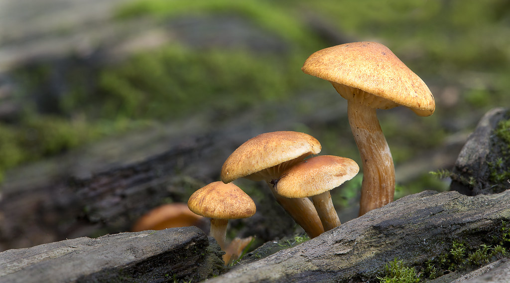
Slender Honey Fungus-3 by Delta Skies, on Flickr

These fungi come in different sizes - one of which was bigger than the others - hence inclusion for this theme. The image was actually a set of 5 images, all taken in natural light, stacked together to improve sharpness through the areas needed.
 
Week 41 - Balance

Audi-12 by Delta Skies, on Flickr

The Wakefield Audi Showroom opens its doors one evening for the visit of the camera club there. Unbelievably this is the workshop in there. Unbelievable because it was absolutely spotless - no oil, no dirt, no nothing other than shiny metal and clean floors. Very impressive. I thought this shot summed up the theme nicely.
 
Week 42 - Change

Last Light Castlerigg by Delta Skies, on Flickr

This shows the change from day to night. We'd spent 5 days up in the Lakes last week and we only had one day when it wasn't windy and rainy. This was from that day. I got to Castlerigg for sunrise and we went back there for sunset. This one was a 30 second exposure (f11) with the addition of some torchlight on the stones.
 
Week 43 - Reshoot (Mono)

Crummock Water by Delta Skies, on Flickr

Guess what? Yet another from the same Lake District day. Whilst there were some nice autumn colours on the hills I tried a mono conversion and felt that the result was much, much stronger. It was certainly my favourite from the day.
 
Hi Peter... There are some astonishing images here! Some proper "wows" for me :)

Big - a lovely take of the mushrooms, super colours, great detail on foreground (inc 'rooms) and perfect DOF choice for me leaving the background with just enough definition. It would have been easy to have a complete blur behind, but your choice and stacking IMO is far better (y) Only crit I could think of would be slightly less flat lighting, perhaps from the side? But that really is nitpicking and more "for the sake of finding something critical to say!!"

Cut - another super take... well spotted. Processing is well handled and a different choice, which is nice. I do find the lettering very slightly hard to read but aside from that it presses my buttons: nice and contrast B&W. The only minor thing I'd have done personally (aside from not having taken such a good picture!) would be to rotate the whole image so the lettering is the right way around :)

Balance - good take on the theme, very interesting POV and image generally. Lighting was presumably outside your control but you've exposed well to avoid too much shininess. For me the image as a concept is lacking something slightly - certainly less "wow" than the previous two, but it's well taken and perfectly on theme.

Change - a good shot, some nice light painting. Had someone else taken this, I'd be even more full of praise but because your bar is set so high nowadays, I'm simply going to say it's very good ;) Looks like a tiny bit of spill from the LP to the right of the rock, but otherwise bang on.

Grow - another super shot and again ideal for the theme. Lovely control of the specular "glistening" which really adds to the shot for me. Bokeh appears very slightly nervous in the background - not sure if this is a consequence of the stacking and blending or simply the way the lens behaves... and anyway, it's such a minor point it's barely worth mentioning. Foreground bokeh is lovely. Exposure and composition absolutely spot on for me - this is genuinely a super shot (y)

Reshoot (mono)... WOW! :clap: This is possible one of my favourite shots full stop. Not in the context of this challenge, not versus your other shots, just simply one of my favourite images. I don't care that the tree has been cropped (it's positioning is lovely) and I don't care that its reflection is barely there - the overall effect of the image and processing is simply stunning. The sky, the very high contrast conversion (I do just love that look) and even the slightly unsettled water works perfectly. I'm actually glad you don't have a high res version on your flickr otherwise I'd have to be rude and download it and print it to a whopping great canvas. Honestly, it is one of the most amazing images I have seen! :notworthy:
 
OMG...what a set of catch up images !

In no particular order.....

Mono reshoot...love it, reflections, detail , sky....get it framed :clap::clap:

Grow... ,lovely shot, good colors,good exposure & well placed in the frame (y) Just needed a tiny tidy up before pressing the shutter ( that's if you don't object to tidying ?) I carry a large soft bristled paint brush for just such occasions :)

Balance...i can't wait till our revamp & we get a workshop like that ! Good angle, well exposed & very few reflections (y)

Cut....so glad you said what it is........well stacked for perfect DOF,super detail & mono conversion is great (y) Like Paul I may have tried to rotate so the letering was nearer the top but it still doesn't detract......

Change.....a great image in it's own right but slightly over shadowed but that Stonking mono reshoot

Big....quite partial to funghi shots & this is no exception, lovely DOF , great detail & another cracking image stack (y)

You're far to good at this malarky :clap::clap:
 
oooo I hate massive catch-ups.... :jawdrop:

All killers, no fillers though.

The first of the mushrooms is great, couldn;t tell it was stacked, lovely colours and light, the diagonals of the rocks works well, and that jaunty tilt of the big one is prioceless!

cracking detail on the shaver, lovely and shiny with no hotspots, again well stacked. (y)

Blanace is the one that stands out for me, can;t believe they didnt stack them black white black white all the way through for you though. the fact there is soo much more car behind the poles than in front does lend a feeling of unease to it all, obv the engines at the front so I'm not that worried, but it looks great. ALl cars washed before they enter the workshop too by the looks of it.

stone for change should work, but doesnt stand out in the company of the other 5, on its own it probably would though.

fly agaric does stand out, super colour and detail. A lower POV is the only thing I might suggest to have improved it, again :clap: for the stacking.

mono reshoot I do like, apart from the sky. I'm just getting a bit of a "scratchy" feeling from it. The compostion and the use of the foreground line of rocks is superb. Also think the processing has been done well.
 
'ello, Peter, cracking catch up.

Big, I once spent about 5 hours in a forest trying to get a decent 'shroom photograph and I got nowt :(

Found it really hard to get a clean BG. I remember @blondie606 getting some nice ones but me, never managed it.

Lovely lighting and the orange of the 'shroom is wonderful. I suspect it's me, nope it is, but always want a clean BG. Well, I have to tell myself if it had a clean BG it would lose it's context and be far too clinical.

Cut....geek alert, but I the noise on the LHS is great :) The detail in the RH bladethingy is cracking. Lighting is bang on.

Balance, how in the hell do you hear about these open events! Whats a belting place. Very clinical and the deep DOF works really well. Was the sepia colour in camera or in post?

Change, been there, what a great place. Lovely detail and the blues on the sky are great. Nice lightpaining as well. I would have had to clone out the moon, or star, OCD alert :)

Grow, again loving the oranges here, and the detail. Wonder what a slight vignette would look like?

Crummock Water, as said on FB, belter.

Cheers.
 
Hi Peter, excellent catch up
Big, focus stacking is superb you have done a great job there lovely composition too with the slanting wood and the opposite slant of the largest mushroom, perfect :clap:

Cut, excellent macro very different from the usual and the processing is spot on

Balance my least favourite, not really into cars, certainly fits the theme and for a workshop remarkably clean

Change, I find standing stone fascinating, the moon is a nice touch and a great blue in the sky

Grow, never seen one in the wild, i like that you haven't taken all the natural defects out of it some people seem to want some kind of perfection which just doesn't happen in the wild

Reshoot, the sky is incredible, the conversion to B+W is spot on, :clap:
 
Hi Peter... There are some astonishing images here! Some proper "wows" for me :)

Big - a lovely take of the mushrooms, super colours, great detail on foreground (inc 'rooms) and perfect DOF choice for me leaving the background with just enough definition. It would have been easy to have a complete blur behind, but your choice and stacking IMO is far better (y) Only crit I could think of would be slightly less flat lighting, perhaps from the side? But that really is nitpicking and more "for the sake of finding something critical to say!!"

Cut - another super take... well spotted. Processing is well handled and a different choice, which is nice. I do find the lettering very slightly hard to read but aside from that it presses my buttons: nice and contrast B&W. The only minor thing I'd have done personally (aside from not having taken such a good picture!) would be to rotate the whole image so the lettering is the right way around :)

Balance - good take on the theme, very interesting POV and image generally. Lighting was presumably outside your control but you've exposed well to avoid too much shininess. For me the image as a concept is lacking something slightly - certainly less "wow" than the previous two, but it's well taken and perfectly on theme.

Change - a good shot, some nice light painting. Had someone else taken this, I'd be even more full of praise but because your bar is set so high nowadays, I'm simply going to say it's very good ;) Looks like a tiny bit of spill from the LP to the right of the rock, but otherwise bang on.

Grow - another super shot and again ideal for the theme. Lovely control of the specular "glistening" which really adds to the shot for me. Bokeh appears very slightly nervous in the background - not sure if this is a consequence of the stacking and blending or simply the way the lens behaves... and anyway, it's such a minor point it's barely worth mentioning. Foreground bokeh is lovely. Exposure and composition absolutely spot on for me - this is genuinely a super shot (y)

Reshoot (mono)... WOW! :clap: This is possible one of my favourite shots full stop. Not in the context of this challenge, not versus your other shots, just simply one of my favourite images. I don't care that the tree has been cropped (it's positioning is lovely) and I don't care that its reflection is barely there - the overall effect of the image and processing is simply stunning. The sky, the very high contrast conversion (I do just love that look) and even the slightly unsettled water works perfectly. I'm actually glad you don't have a high res version on your flickr otherwise I'd have to be rude and download it and print it to a whopping great canvas. Honestly, it is one of the most amazing images I have seen! :notworthy:
Thanks Paul. I am very pleased with the mono reshoot but I have to say I'm pretty amazed by your comments. Many many thanks. I've got a big smile on my face as a result :D

OMG...what a set of catch up images !

In no particular order.....

Mono reshoot...love it, reflections, detail , sky....get it framed :clap::clap:

Grow... ,lovely shot, good colors,good exposure & well placed in the frame (y) Just needed a tiny tidy up before pressing the shutter ( that's if you don't object to tidying ?) I carry a large soft bristled paint brush for just such occasions :)

Balance...i can't wait till our revamp & we get a workshop like that ! Good angle, well exposed & very few reflections (y)

Cut....so glad you said what it is........well stacked for perfect DOF,super detail & mono conversion is great (y) Like Paul I may have tried to rotate so the letering was nearer the top but it still doesn't detract......

Change.....a great image in it's own right but slightly over shadowed but that Stonking mono reshoot

Big....quite partial to funghi shots & this is no exception, lovely DOF , great detail & another cracking image stack (y)

You're far to good at this malarky :clap::clap:
Many thanks Lynne. Regarding the tidying - I certainly don't object to it as I'd already been around with some scissors. Never thought of using a brush though (y)

oooo I hate massive catch-ups.... :jawdrop:

All killers, no fillers though.

The first of the mushrooms is great, couldn;t tell it was stacked, lovely colours and light, the diagonals of the rocks works well, and that jaunty tilt of the big one is prioceless!

cracking detail on the shaver, lovely and shiny with no hotspots, again well stacked. (y)

Blanace is the one that stands out for me, can;t believe they didnt stack them black white black white all the way through for you though. the fact there is soo much more car behind the poles than in front does lend a feeling of unease to it all, obv the engines at the front so I'm not that worried, but it looks great. ALl cars washed before they enter the workshop too by the looks of it.

stone for change should work, but doesnt stand out in the company of the other 5, on its own it probably would though.

fly agaric does stand out, super colour and detail. A lower POV is the only thing I might suggest to have improved it, again :clap: for the stacking.

mono reshoot I do like, apart from the sky. I'm just getting a bit of a "scratchy" feeling from it. The compostion and the use of the foreground line of rocks is superb. Also think the processing has been done well.
Thanks for all the comments Graham

'ello, Peter, cracking catch up.

Big, I once spent about 5 hours in a forest trying to get a decent 'shroom photograph and I got nowt :(

Found it really hard to get a clean BG. I remember @blondie606 getting some nice ones but me, never managed it.

Lovely lighting and the orange of the 'shroom is wonderful. I suspect it's me, nope it is, but always want a clean BG. Well, I have to tell myself if it had a clean BG it would lose it's context and be far too clinical.

Cut....geek alert, but I the noise on the LHS is great :) The detail in the RH bladethingy is cracking. Lighting is bang on.

Balance, how in the hell do you hear about these open events! Whats a belting place. Very clinical and the deep DOF works really well. Was the sepia colour in camera or in post?

Change, been there, what a great place. Lovely detail and the blues on the sky are great. Nice lightpaining as well. I would have had to clone out the moon, or star, OCD alert :)

Grow, again loving the oranges here, and the detail. Wonder what a slight vignette would look like?

Crummock Water, as said on FB, belter.

Cheers.
Thanks Andy. Your comments are appreciated

Hi Peter, excellent catch up
Big, focus stacking is superb you have done a great job there lovely composition too with the slanting wood and the opposite slant of the largest mushroom, perfect :clap:

Cut, excellent macro very different from the usual and the processing is spot on

Balance my least favourite, not really into cars, certainly fits the theme and for a workshop remarkably clean

Change, I find standing stone fascinating, the moon is a nice touch and a great blue in the sky

Grow, never seen one in the wild, i like that you haven't taken all the natural defects out of it some people seem to want some kind of perfection which just doesn't happen in the wild

Reshoot, the sky is incredible, the conversion to B+W is spot on, :clap:
Many thanks for the feedback Allan
 
Back
Top