
You are using an out of date browser. It may not display this or other websites correctly.
You should upgrade or use an alternative browser.
You should upgrade or use an alternative browser.
weekly DK's 2012 '52' - UPDATED 28-12-12
- Thread starter Dark Knight
- Start date
OP
- Messages
- 13,760
- Edit My Images
- Yes
Cheers Simon - good to see you about againHey DK, Mr catch up here.
Authority - like the idea and well captured
Leave - great dof, love it
Random - excellent capturing of the fish
Temperature - absolutely loving the bacon shot, dof just superb
")
OP
- Messages
- 13,760
- Edit My Images
- Yes
Hahaaaa Cheers Allan... I'm stuffed now, but could squeeze in a puddingboth pictures are well taken nicely exposed but the bacon for me
- Messages
- 4,846
- Name
- Alan
- Edit My Images
- Yes
Hi DK
Random - really nice shot, altho I agree with another comment that the veg at the side is a little distracting - it's the stalk rather than the leaves i think.
Well caught, really nice colours ang ripples really add to effect.
Shower - I think that the shower is a good original idea for the shot but it does not seem to have worked out too well. Whereas the bacon shot shows real temperature - almost like a furnace and parts seem almost molten. good capture
OP
- Messages
- 13,760
- Edit My Images
- Yes
Thanks Alan, i'll have another lookHi DK
Random - really nice shot, altho I agree with another comment that the veg at the side is a little distracting - it's the stalk rather than the leaves i think.
Well caught, really nice colours ang ripples really add to effect.
Thanks Again... the bacon sure was sizzlin, unlike the shower that was a very timid shot looking back at itShower - I think that the shower is a good original idea for the shot but it does not seem to have worked out too well. Whereas the bacon shot shows real temperature - almost like a furnace and parts seem almost molten. good capture
OP
- Messages
- 13,760
- Edit My Images
- Yes
Thanks SarahHi Dk, I love your bacon shot - I can almost smell it up here!!
- Messages
- 6,502
- Name
- Peter
- Edit My Images
- Yes
I prefer the bacon shot. The bokeh has been nicely rendered.
OP
- Messages
- 13,760
- Edit My Images
- Yes
Thanks PeterI prefer the bacon shot. The bokeh has been nicely rendered.
Cheers DadeNicely timed shot of the Koi
As for temperature - the shower shot would perhaps be better if it shown the steam coming off the water?
As for the bacon shot, YUMMY! Nice bokeh
I agree steam would have been ideal... thanks again for the Bacon shot Compliment !!!
- Messages
- 1,513
- Name
- Alex
- Edit My Images
- Yes
Bacon all the way DK! Fab shot, lovely that golden bokeh in the background. I can almost taste it....runs out to the shop!
OP
- Messages
- 13,760
- Edit My Images
- Yes
Thanks AlexBacon all the way DK! Fab shot, lovely that golden bokeh in the background. I can almost taste it....runs out to the shop!
- Messages
- 8,398
- Name
- Lynne
- Edit My Images
- Yes
Hi ya 
bacon ....ooooh yummy yummy....looks so good I can almost taste it ...excellent shot mister
& I love your shower....want those tiles & that shower unit , very posh
bacon ....ooooh yummy yummy....looks so good I can almost taste it ...excellent shot mister
& I love your shower....want those tiles & that shower unit , very posh
OP
- Messages
- 13,760
- Edit My Images
- Yes
Hi LynneHi ya
bacon ....ooooh yummy yummy....looks so good I can almost taste it ...excellent shot mister
& I love your shower....want those tiles & that shower unit , very posh
Many Thanks for the compliments
- Messages
- 2,820
- Name
- Mark
- Edit My Images
- Yes
The shower doesn't do a lot for me I'm afraid, bu tI love the bacon shot. Truly wonderful Love the colours and the bokeh.
Love the colours and the bokeh.
OP
- Messages
- 13,760
- Edit My Images
- Yes
Cheers Mark... that just about reflects all our opinions lolThe shower doesn't do a lot for me I'm afraid, bu tI love the bacon shot. Truly wonderful
OP
- Messages
- 13,760
- Edit My Images
- Yes
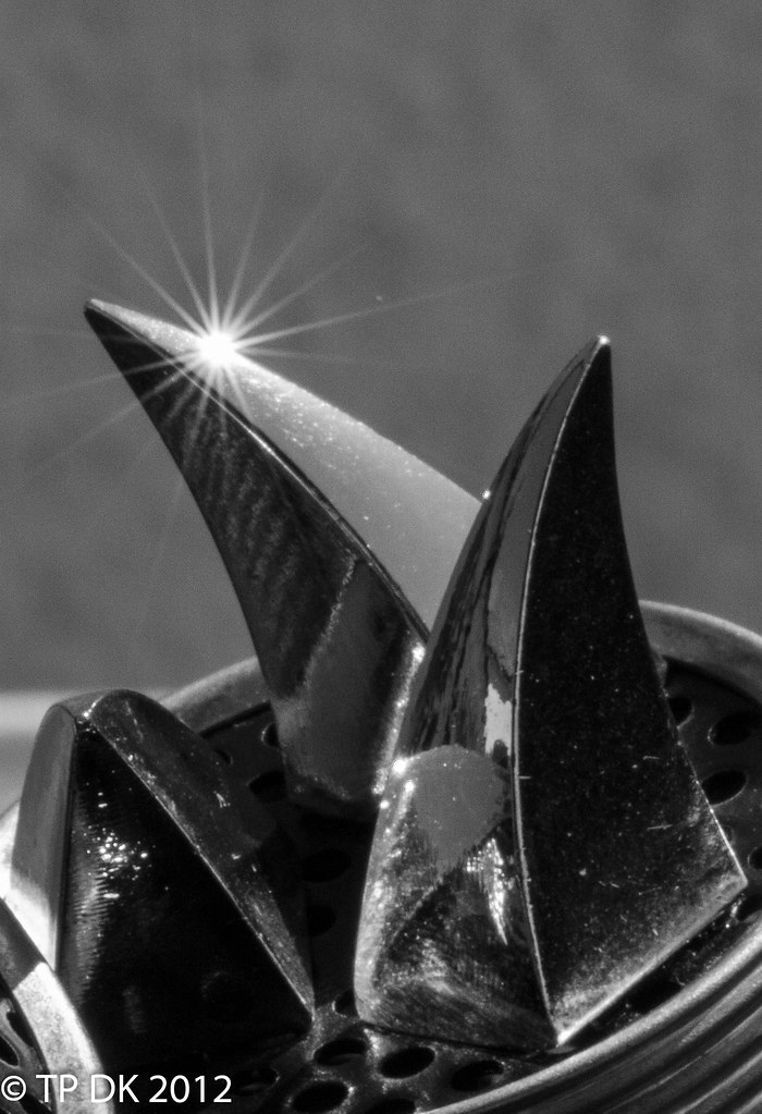
Well... this week, ok last weeks pic, I am not sure whether I have cropped enough to make it abstract, as to me it is still too obvious what it is... I have an alternative on my Flickr that is colour, but as an image I prefer this one.... please let me know what you think
Wk23 - 'Abstract'
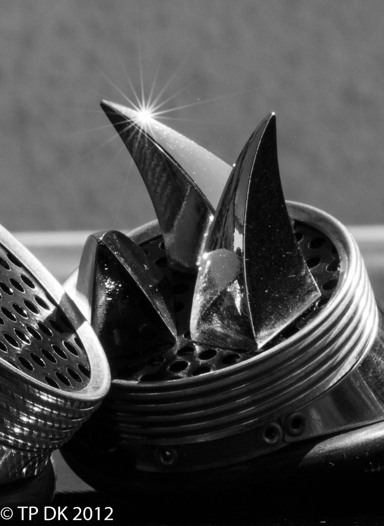
Wk23 - Abstract by TP DK..., on Flickr
Cheers for looking
Wk23 - 'Abstract'
Wk23 - Abstract by TP DK..., on Flickr
Cheers for looking
- Messages
- 6,502
- Name
- Peter
- Edit My Images
- Yes
It's not obvious to me  or maybe I'm a bit slow. I can't decide whether I prefer this one or the colour alternative. I think the B&W has it due to starburst just adding a point of interest which suits the shiny subject matter.
or maybe I'm a bit slow. I can't decide whether I prefer this one or the colour alternative. I think the B&W has it due to starburst just adding a point of interest which suits the shiny subject matter.
OP
- Messages
- 13,760
- Edit My Images
- Yes
Well... I'm not going to give the game away yet thenIt's not obvious to me
Thanks Bob... nope, not a food thingLike it, but I'm stumped as to what it might be. Something to do with food perhaps?
OP
- Messages
- 13,760
- Edit My Images
- Yes
Thanks Mike... maybe I should go with my gut feeling rather than putting two up, I suppose I did a bit more this time by leaving the alternate on flickrAbstract - I had a look on Flickr - prefer the one you have posted. Definitely more abstract! and the B&W and starburst work well. NO IDEA what on earth it is!
Cheers MichaelThe one you posted above is much better, like the b+w conversion and the star burst too.
... do you think it is cropped enough, or a tighter crop would make it more abstract??- Messages
- 2,820
- Name
- Mark
- Edit My Images
- Yes
I think it's abstract. I can't for the life of me see what it is, unless it's an instrument of torture perhaps?
wonderful photo! I love the B&W and the star burst.
wonderful photo! I love the B&W and the star burst.
OP
- Messages
- 13,760
- Edit My Images
- Yes
Hi JohnNot a clue what it is, which is good, interesting, and that star burst looks great... liking the mono
Thanks for popping in, and thanks for the feedback
Hi MarkI think it's abstract. I can't for the life of me see what it is, unless it's an instrument of torture perhaps?
wonderful photo! I love the B&W and the star burst.
Instrument of torture... could be
 it is in fact a pair of 'Steampunk' goggles/glasses of my daughters
I'm glad you like it and agree it's abstract, at times I am doubtful, but guess it is what we want it to be with such a subject
OP
- Messages
- 13,760
- Edit My Images
- Yes
Well... This week I wanted to catch something with general symmetry rather than something straight on symmetrical - that's my excuse anyway
Wk24 'Symmetry' The fence I put in to divide up my garden a bit...
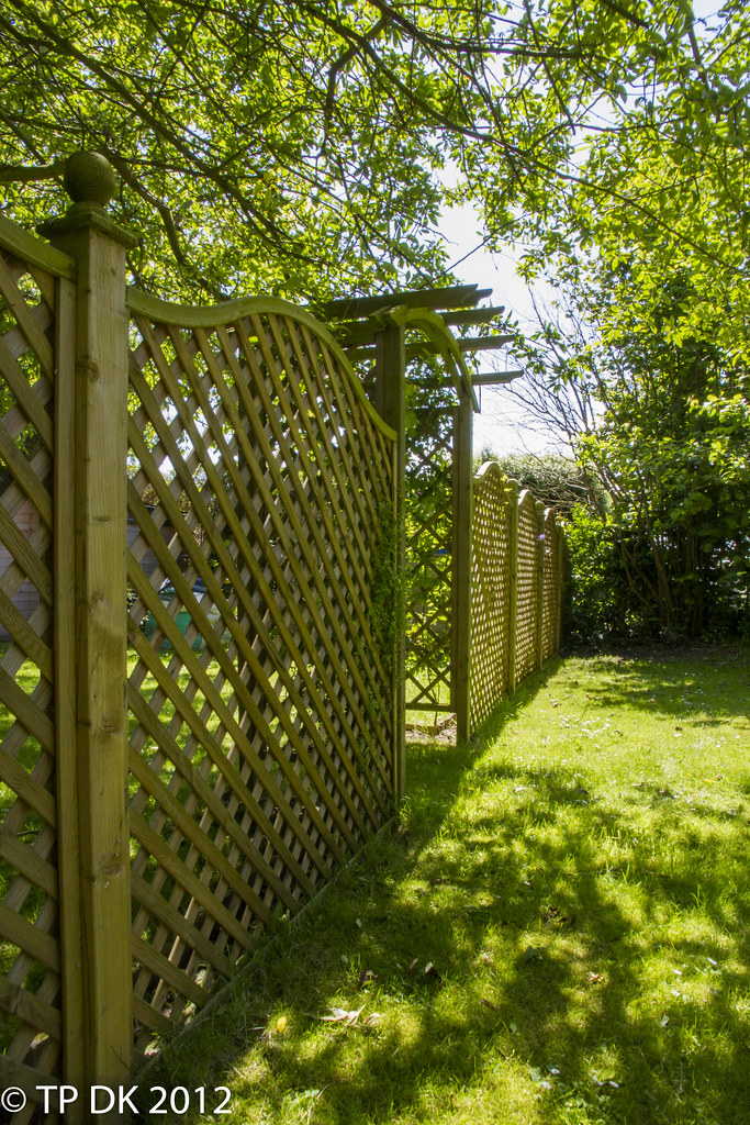
Wk24 - 'Symmetry' by TP DK..., on Flickr
Again thanks for looking
Wk24 'Symmetry' The fence I put in to divide up my garden a bit...
Wk24 - 'Symmetry' by TP DK..., on Flickr
Again thanks for looking
- Messages
- 2,167
- Name
- Liz
- Edit My Images
- Yes
Hi DK, haven't been round for a while so here goes
Temperature - yes i'm loving the bacon the DOF works really well
Abstract, i think you're right i'd have probably cropped a little tighter, i don't know what it is, but its obvious its something
Symmetry - the lead in is nice, i find the trees above a bit distracting, and my eye is drawn to the sky above the hedge, which looks a tad blown, i have to wonder looking at the light whether there may have been a more interesting sky from a different angle?
- Messages
- 4,846
- Name
- Alan
- Edit My Images
- Yes
Hi DK
Abstract - as no one knew what it was until you spilled the beans, I think that it is def abstract and on theme.
I agree that a tighter crop might work but love the starburst and tho I have not looked at the colour on flickr, I think that the mono suits it.
Symmetry - I like the idea of not making it immediately apparently symmetrical. --- Excellent idea.
But it seems to lack impact and my eye is drawn to the green/blue object behind the first piece of fence. Doesn't seem to be a lot of contrast in the pic.
Abstract - as no one knew what it was until you spilled the beans, I think that it is def abstract and on theme.
I agree that a tighter crop might work but love the starburst and tho I have not looked at the colour on flickr, I think that the mono suits it.
Symmetry - I like the idea of not making it immediately apparently symmetrical.
--- Excellent idea.But it seems to lack impact and my eye is drawn to the green/blue object behind the first piece of fence. Doesn't seem to be a lot of contrast in the pic.
OP
- Messages
- 13,760
- Edit My Images
- Yes
Thanks LizHi DK, haven't been round for a while so here goes
Temperature - yes i'm loving the bacon the DOF works really well
ThanksAbstract, i think you're right i'd have probably cropped a little tighter, i don't know what it is, but its obvious its something
I may try a tighter crop tonight as long as a movie doesn't take my fancy Yeah the sky... I did try increasing the blue in the sky, according to LR4 the sky is not blown, just white clouds with no blue skySymmetry - the lead in is nice, i find the trees above a bit distracting, and my eye is drawn to the sky above the hedge, which looks a tad blown, i have to wonder looking at the light whether there may have been a more interesting sky from a different angle?
I did try several different angles but with sheds, a greenhouse and a chicken coup were somewhat distracting
I'll load up one of my others
OP
- Messages
- 13,760
- Edit My Images
- Yes
Here is one from the opposite direction... I know the sky is better, but I think the symmetry with the arch is lost... what do you think ?? of the photo that is... I know the grass needs cutting and the hedge needs a good trim

Wk 24 'Symmetry' alternate shot by TP DK..., on Flickr
Wk 24 'Symmetry' alternate shot by TP DK..., on Flickr
Last edited:
- Messages
- 2,820
- Name
- Mark
- Edit My Images
- Yes
Difficult one. Composition and onthemeiness (?) are better in one, but two does have more punch. I think it might be because the fence nearest the camera is too well exposed. I think it needs to be darker to get more contrast.
OP
- Messages
- 13,760
- Edit My Images
- Yes
Hi Sara... Same here, that's the problemHi DK, I prefer the angle of #1 as it does say symmetry more than #2. Though the sky is better in the second!
Extra Thanks... wow it's like getting homework in on time tooWell done for getting it in on time!!
Onthemeiness - 'Added to Dictionary'Difficult one. Composition and onthemeiness (?) are better in one, but two does have more punch. I think it might be because the fence nearest the camera is too well exposed. I think it needs to be darker to get more contrast.
Any suggestions how to change it in LR ?? I have already reduced highlights, upped contrast, more blacks along with a bit more shadow detail - I KNOW, take the Picture properly in the first place

Cheers Mark
I shall give it a go - cheers MichaelFor abstract, I think a tighter crop would work on it!
As for symmetry, I can't make my mind up, I like number 1, but at the same time I like number 2, when I saw it I thought it was better...
OP
- Messages
- 13,760
- Edit My Images
- Yes
Ok... now, as the nun said to the vicar, is this tight enough now, or are more pelvic floor exercises required
Wk23 - Abstract' Alternate Shot 2 by TP DK..., on Flickr
Wk23 - Abstract' Alternate Shot 2 by TP DK..., on Flickr
- Messages
- 2,820
- Name
- Mark
- Edit My Images
- Yes
Any suggestions how to change it in LR ?? I have already reduced highlights, upped contrast, more blacks along with a bit more shadow detail
I had a play with graduated filters and vignettes on number one in PS Touch, and recon you could get a big improvement using those (especially the vignettes) in LR. They don't enhance symmetry, but do focus your eye better, and give it a bit more punch.
I think I prefer abstract with the wider crop. I think it loses something interesting when cropped too tight.
OP
- Messages
- 13,760
- Edit My Images
- Yes
Nice one thanks MarkI had a play with graduated filters and vignettes on number one in PS Touch, and recon you could get a big improvement using those (especially the vignettes) in LR. They don't enhance symmetry, but do focus your eye better, and give it a bit more punch.
I think I prefer abstract with the wider crop. I think it loses something interesting when cropped too tight.
PP is something I am beginning to do more of, and I really enjoy it, I'll have a go at the grad filters etc
I think your right about the crop too
- Messages
- 2,820
- Name
- Mark
- Edit My Images
- Yes
I think vignettes work best when very subtle. In most cases, I don't think the viewer should notice they're there until they're pointed out. It doesn't take much to make a big improvement (and not a lot more to ruin the picture!)..