weekly DK's 52 in 2013 - Wk 47, 50, 51 & 52 added - FINISHED !!!

Hi Dean :wave:

Reshoot for cut is simply lovely , beautiful colors & lovely layering of same :clap:..might crop a smidge from the top :thinking:
Hey Lynne :)

Hmmmmm I did try that a bit, but I liked the little cloud too :D

I'll post one up that is cropped a bit more :)

#1 for me out of the Cut shots....super low POV,lovely black tarmac & those curves in to the trees just pulls me through the image :clap:
Thanks Lynne :)

Sweet works fine. A good selection of chocolate against the dark reflective tray. Can't comment on the lighting, as I wouldn't know where to start, although it's something I'd like to look in to.
Cheers Nick :)

I like the sunrise shot a lot, I love the splashes of colour across the sky, and the way the mist creates layers, going back through the frame (if that makes sense).
Yes that sure does make sense... Thanks again :)

Cut #2 for me, partly for the focus throughout, and partly for the better sky. Nice composition and a good angle.
Cheers :)

The sky wasn't the best when we got there, During the journey we had a fantastic bright moon, but we could see by the time we would arrive at the location it would have dropped below the clouds... and that it did, it would have been spot on in the roads field of view :(
 
Last edited:
Right... A few quick snaps to try and catch up

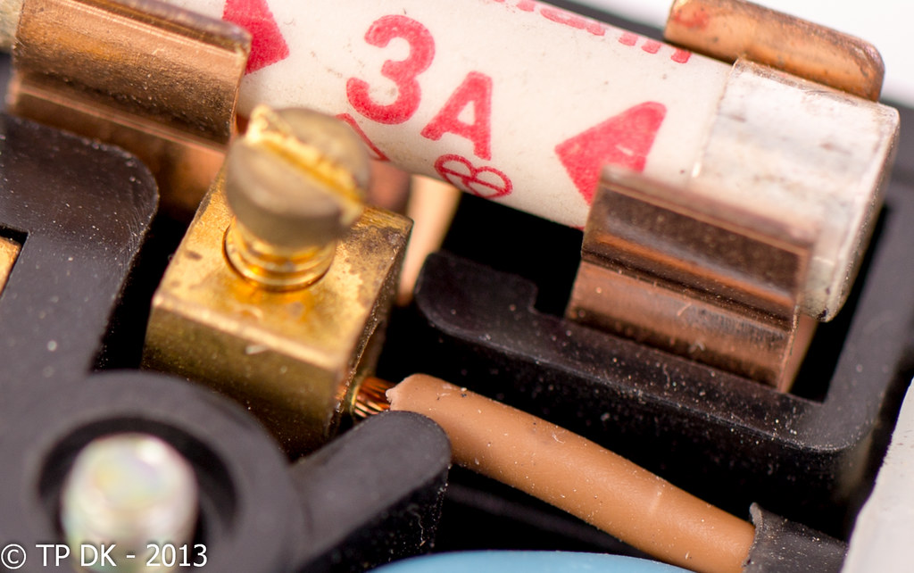
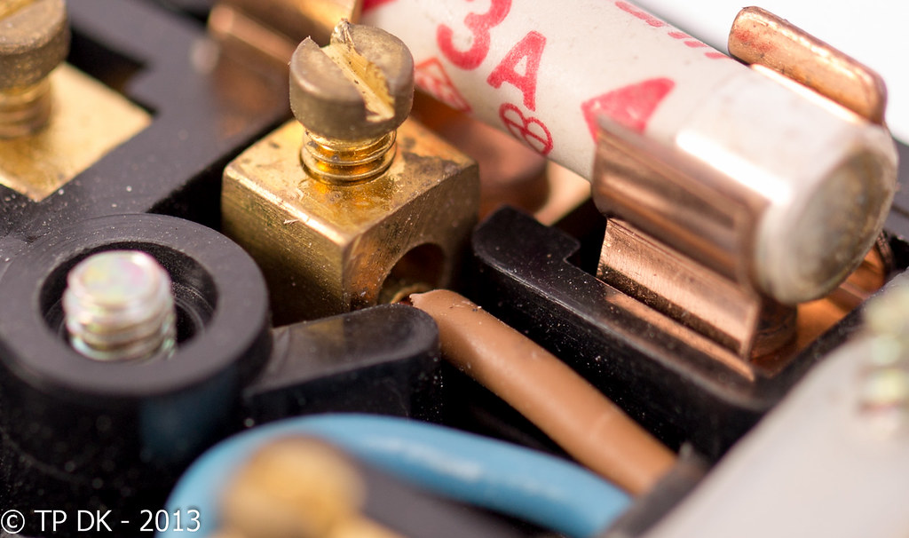
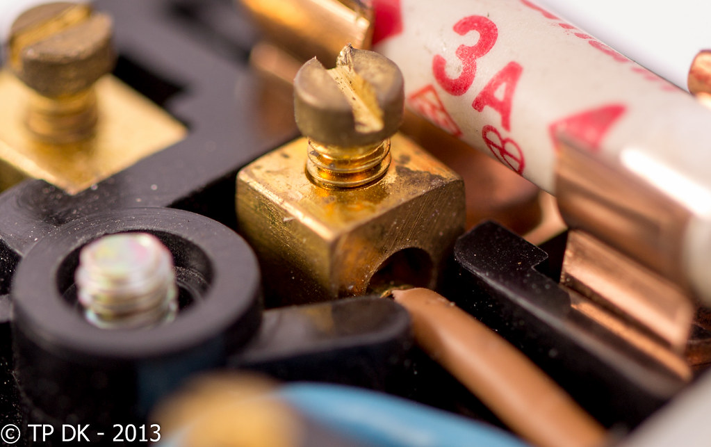
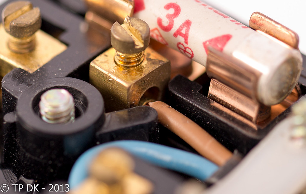
First of all is my live shot, needed something nice and quick and due to the dull weather another go with my lights, so here we go, plain and simple, 3 shots as usual all just taken at slightly different angles to get the light in the right place...

As always best viewed on Flickr with a Black Background...

Wk 41 - 'Live'


Wk 41 - 'Live' 1
by TP DK, on Flickr


Wk 41 - 'Live' 2
by TP DK, on Flickr


Wk 41 - 'Live' 3
by TP DK, on Flickr
 
Hellooooo....

oh the joys of macro work (not checked the exif but guess it's a macro lens ?)

#2 is out cos yo've clipped the number 3

Can't decide between #1 & #2...think it's #3 for me...the oof screw is slightly less oof ?

Lighting looks good on all of them :)
 
Hi Dean, I will go for #2 as the screw/terminal is mostly in focus, the 3 being clipped is unfortunate though.
Obviously on theme but i feel they need a little something more to lift them.
Cheers
 
I was going to complain about the OOF screw head..... came to your thread and spotted #2 - much preferable as the oof screw head is really prominent in your upload to the 52 thread. I love the contrasting colours with the red fuse standing out against the black, browns & brass
 
Hellooooo....

oh the joys of macro work (not checked the exif but guess it's a macro lens ?)
Yup it is my Macro lens :)

#2 is out cos yo've clipped the number 3
oooo bugger.... I'll re-do that one :D

Can't decide between #1 & #2...think it's #3 for me...the oof screw is slightly less oof ?
I did struggle with the DoF... need to play with my settings more, this Manual malarky with studio lights is a bugger :LOL:

Lighting looks good on all of them :)
Thanks :)


Hi Dean, I will go for #2 as the screw/terminal is mostly in focus, the 3 being clipped is unfortunate though.
Thanks Iain... It is a crop so easily sorted that one :D
Obviously on theme but i feel they need a little something more to lift them.
Cheers
I know mate, again not the most inspiring of shots... I really just need to catch up on images as well as comments :(

I was going to complain about the OOF screw head..... came to your thread and spotted #2 - much preferable as the oof screw head is really prominent in your upload to the 52 thread.
Thanks Alan :)

I tried to use a narrower DoF on that first shot to concentrate the eye on the cable, I thought that was the prominent 'Live' element of the plug :)

I love the contrasting colours with the red fuse standing out against the black, browns & brass
Thanks again :)
 
Right and onto the next... These were taken on the correct week I believe, just ran out of editing time on the day and then tried catching up on comments last week, can't seem to get on top of either !!!!

Anyway... moving on

Wk 42 - 'Reflection' again not the most exciting shots but on theme...

I liked this one because of the unusual shape of the pond, this image is obviously flipped on the vertical to have the reflection the right(wrong) way up


Wk 42 - 'Reflection' 1
by TP DK, on Flickr


This second one I just liked the watercolour type look... well oof some may say :D


Wk 42 - 'Reflection' 2
by TP DK, on Flickr


This third was just me p***ing about with the inbuilt HDR... I think I have done this 'Feature' to death now, so don't worry this will be my last for a bit


Wk 42 - 'Reflection' 3 HDR Madness
by TP DK, on Flickr

Thanks for visiting as usual :)
 
I'm struggling to pick a favourite Live shot, but I keep coming back to #1, for the clear focus on the fuse, and the glimpse of the bare wire reinforces the theme for me. It also has a little more breating space than the others, but it's close.

Reflection is easier, #1 all the way. Good colour in the sky, and the sharpness of the grass against the slight softness of the reflection works well. The amount of disturbance on the water spoils #2 a little for me. I like #3 too, but the angle just feels a little high.
 
Live #3 for me - the angle, I mean the height from which the shot is taken, is spot on. I don't think the other two work so well and I prefer it with less dust (y)

for reflection I am going to have to go with #3 also, mainly because I'm just really confused about what I'm looking at in the first two! :thinking:
 
Hi DK
I am going to buck the trend and say number 3 for the live shot, expose and detail spot on (y)
Charlie browns a live wire that how i was taught to remember it when i was young

Reflection number 1 for me, it messes with my head, can't be a bad thing :D
 
Coming in late here! But I've enjoyed your recent photos. I'm really loving the first "reflection" photo though! A bit of a mind bender working that out :D
 
#1 gets my vote Dean, for much the same reason as Allan :LOL: in that it takes a bit of working out which is a good thing.
 
I'm struggling to pick a favourite Live shot, but I keep coming back to #1, for the clear focus on the fuse, and the glimpse of the bare wire reinforces the theme for me. It also has a little more breating space than the others, but it's close.
Thanks Nick :)

Reflection is easier, #1 all the way. Good colour in the sky, and the sharpness of the grass against the slight softness of the reflection works well. The amount of disturbance on the water spoils #2 a little for me. I like #3 too, but the angle just feels a little high.
Again Thanks Nick... I think your right a lower angle would have been better... I think my Garage would have spoilt it though :D

I will try again this weekend weather permitting :)


Live #3 for me - the angle, I mean the height from which the shot is taken, is spot on. I don't think the other two work so well and I prefer it with less dust (y)
Thanks Chris :)

To be honest I didn't notice the dust until the pics were uploaded... I need one of them monitors to check the shots, because as soon as I uploaded them I pondered seriously for a moment whether I was going to clone all the spots out :nuts:

for reflection I am going to have to go with #3 also, mainly because I'm just really confused about what I'm looking at in the first two! :thinking:
Hahaaaaa :LOL:
 
Hi DK
I am going to buck the trend and say number 3 for the live shot, expose and detail spot on (y)
Cheers Allan :)
Charlie browns a live wire that how i was taught to remember it when i was young
Cool way to remember :cool:

Reflection number 1 for me, it messes with my head, can't be a bad thing :D
YAY :clap:

Coming in late here! But I've enjoyed your recent photos. I'm really loving the first "reflection" photo though! A bit of a mind bender working that out :D
Hey Toni, thanks for popping in :) glad you have liked my shots (y)

Some sure get more thought than others, but as you know we all lead busy busy lives in the real world :D

#1 gets my vote Dean, for much the same reason as Allan :LOL: in that it takes a bit of working out which is a good thing.
another YAY !!!! I like messing with peeps heads :nuts:
 
Live #3 for me, just looked at your exif... f/2.8?? for macro?? No wonder the DOF is shallow. I do like a shallow DOF, but here I think sharpness throughout would work better.

The first reflection with the flip is really classy, the trees just look right, and then the rest of the image falls into place, ending up with the realisiation its a reflection. Nice one!

Is that it?? I'm sure we're a bit further on than week 42??
 
Hello Dean, do you remember me? Golly... it's like a trip down memory lane coming to your thread these days, Live? I remember that form ages ago, and the other one, what was it now? oh yes that's right "reflection". I think we shot those themes on film - in the days before digital was available you see - back on the old forum, do you remember when you had that funny spreadsheet and we all laughed about it because someone moaned that it couldn't read peoples minds... wasn't life grand back then eh? :D

#3 Live for me, who buggered up that screw? (did you let Graham loose with a screwdriver?) :naughty::exit:

I like the upside down pond, messed with my head at first. A fishes eye view of the house perhaps?

I looked for Melt and Left... Have you left melt for later or are you stuck? I thought of a really good idea for left btw...:LOL:

Oh, there's the bell - back to work I go... ♪♫ HI Ho!
 
Live #3 for me, just looked at your exif... f/2.8?? for macro?? No wonder the DOF is shallow. I do like a shallow DOF, but here I think sharpness throughout would work better.
Ah Haaaaa yes your right mate, I tried all sort of settings, total experimenting with the lights settings, apertures, shutter speeds - the wonders of Manual settings... I did quite a few with smaller apertures but it just looked like a plug, so I tried f2.8 to try and get focus/separation from the other cables & pins :)

The first reflection with the flip is really classy, the trees just look right, and then the rest of the image falls into place, ending up with the realisiation its a reflection. Nice one!
Thanks again Graham :)

Is that it?? I'm sure we're a bit further on than week 42??
Well... I have taken a shot for both, both have been edited to a fashion, but not happy with either - might be a post and be damned moment soon

The last couple of months I have been swamped with work, so the little time I had was spent taking, editing and posting my pics, BUT my commenting has got way behind so I'm trying to keep up with that and put my pics up as I can :)

Hello Dean, do you remember me? Golly... it's like a trip down memory lane coming to your thread these days, Live? I remember that form ages ago, and the other one, what was it now? oh yes that's right "reflection". I think we shot those themes on film - in the days before digital was available you see - back on the old forum, do you remember when you had that funny spreadsheet and we all laughed about it because someone moaned that it couldn't read peoples minds... wasn't life grand back then eh? :D
:wacky:

:LOL:

#3 Live for me, who buggered up that screw? (did you let Graham loose with a screwdriver?) :naughty::exit:
Hahaaaaa :naughty:

I like the upside down pond, messed with my head at first. A fishes eye view of the house perhaps?
A fishes eye veiw of my sheds more like :D

I looked for Melt and Left... Have you left melt for later or are you stuck? I thought of a really good idea for left btw...:LOL:
As above mate... shots taken and edited... May have to post them even though not happy with them :(

Oh, there's the bell - back to work I go... ♪♫ HI Ho!
I thought 'Lights Out' would be way before 9:00pm at your institution house :geek:

Cheers for visiting... I needed a laugh (y)
 
I need to catch up, and I am not going to be home in daylight for the rest of the week sooooooo... Post and be damned

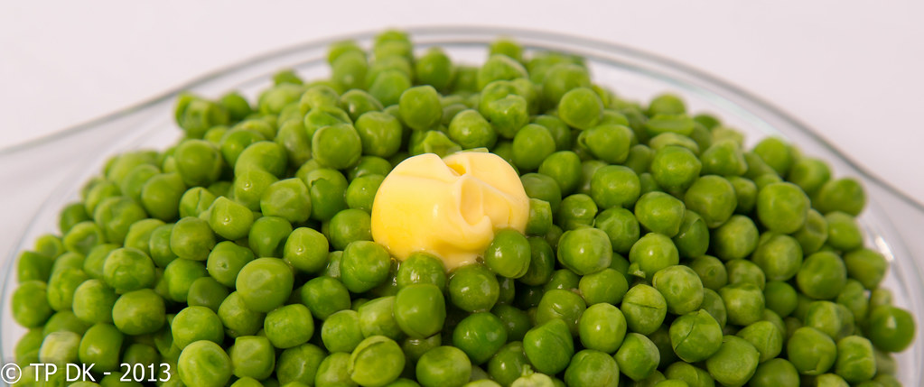
The only peas I could find in the freezer, not enough 'Melt' and over microwaved too :coat:

What Did I learn... more fiddling with my lights so was worth the time :)

Wk 43 - 'Melt'


Wk 43 - 'Melt'
by TP DK, on Flickr
 
Very nice. I read somewhere that food looks best with an odd number of items on the plate, so I hope you counted them peas carefully!

Rich colours & perfect DOF, looks good enough to eat.

Good one mate (y)
 
Very nice. I read somewhere that food looks best with an odd number of items on the plate, so I hope you counted them peas carefully!

Rich colours & perfect DOF, looks good enough to eat.

Good one mate (y)
lol... thanks Brian, I did try and count them but gave up after I ran out of fingers and toes :thinking:
 
And onto the last to get me up to date... ok the last two :D

Another couple done in the fresh air... I didn't get the DoF deep enough on image 2, but again I wont be home in the daylight so this will have to do

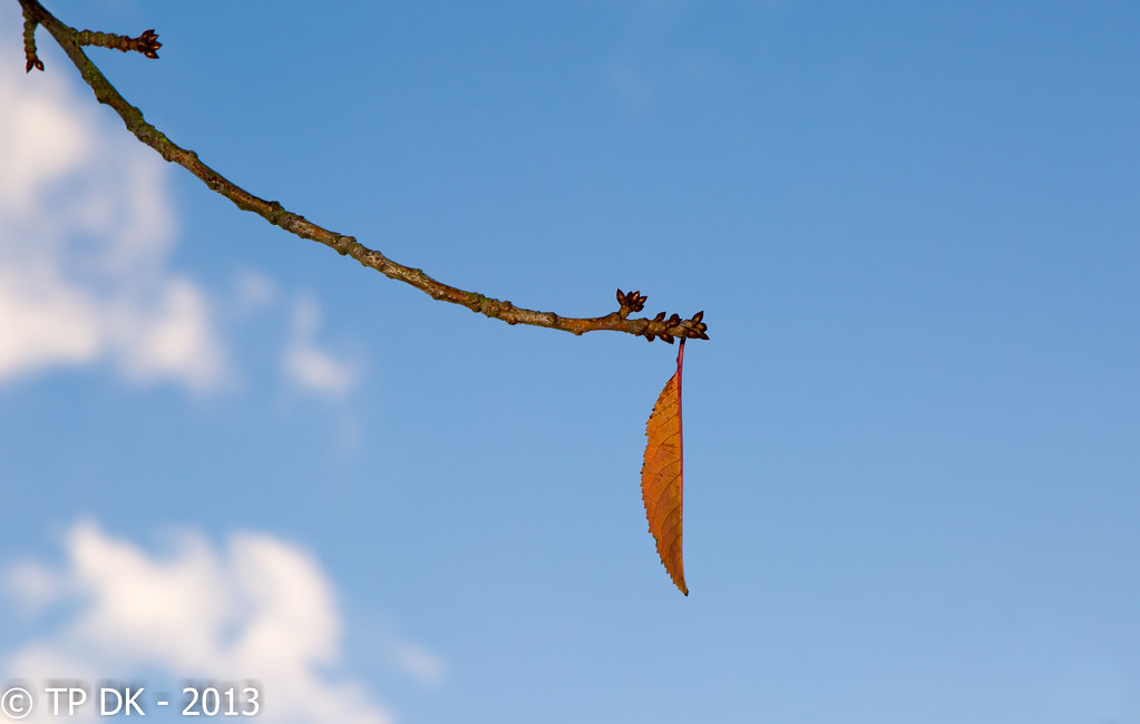
Autumn is finally here... and there are very few leaves 'Left' on the trees already

Wk 44 - 'Left'


Wk 44 - 'Left' 1
by TP DK, on Flickr


Wk 44 - 'Left' 2
by TP DK, on Flickr
 
Post and be damned... not at all..

great idea of the melting butter - love the colours and the DOF is spot on here, the curve of the plate / lid in the BG frames it all nicely

first leaf as well for me, simple and minimal, great with the buds and the vertical line of the leaf itself. and little clouds to boot. (y)

_____edit_____

just gone back to look closer at the single leaf..... big pat on the back for an obviously excellent technique, DOF here must be pretty shallow, compare the buds from the top left, with those above the leaf in the image below. (100% crop). If all the technical bits were not 100% spot on, your kit would definitely leave you nowhere to hide. :clap:

vwz7.jpg
 
Last edited:
Hi DK
Number 1 for me too nice colours the orangey/brown leaf looks nice against the blue sky,
a nice bit of minimalism (y)
 
Peas:

I would be inclined to crop much tighter (square perhaps) around the melting butter creating a contrast between the yellow and green as well as showing off the limited specular highlights.
Would look scrumptious too.
 
Melt is nice, DOF is spot on and the colours are lovely. Taking a food shot that makes you hungry is a skill!

I saw left #1 of Flickr today, and liked it from the moment I saw it. Love the simplicity of the composition, really on theme. Good colours too.
 
Post and be damned... not at all..

great idea of the melting butter - love the colours and the DOF is spot on here, the curve of the plate / lid in the BG frames it all nicely
Oooooo thanks Graham, that's a surprise to be honest :)

first leaf as well for me, simple and minimal, great with the buds and the vertical line of the leaf itself. and little clouds to boot. (y)
thanks again :)

_____edit_____

just gone back to look closer at the single leaf..... big pat on the back for an obviously excellent technique, DOF here must be pretty shallow, compare the buds from the top left, with those above the leaf in the image below. (100% crop). If all the technical bits were not 100% spot on, your kit would definitely leave you nowhere to hide. :clap:
Blimey... Thanks for taking the time to look so closely :) :)
 
Hi DK
Number 1 for me too nice colours the orangey/brown leaf looks nice against the blue sky,
a nice bit of minimalism (y)
Cheers Allan :)

I wasn't sure how the leaf would go down, I really liked it but with it sort of curled so only one half showing, that's why I did the other one as it was fuller :)
 
Peas:

I would be inclined to crop much tighter (square perhaps) around the melting butter creating a contrast between the yellow and green as well as showing off the limited specular highlights.
Would look scrumptious too.
that sure sounds like a plan I can handle I may do that tomorrow night (y)
 
Melt is nice, DOF is spot on and the colours are lovely. Taking a food shot that makes you hungry is a skill!
cheers Nick :)

Thing is I can't stand peas myself :D

I saw left #1 of Flickr today, and liked it from the moment I saw it. Love the simplicity of the composition, really on theme. Good colours too.
Cool....thanks again Nick :)
 
Hi DK

Bit behind on everyone's threads - soz

Cut - to be honest, not a lot of interest there for me - but having to choose, #2

Live - blimey, lots of shots, some deleted, some recropped - aaaargh. The last one seems to fit the bill and take account of all the crit up to then. V good idea for theme and a good shot of a mundane article.

Reflection - whatever the theme #1 is a belter - lots of detail, good colour, lots for the viewer to work out and then go away still not sure of what has been seen. (y)

Melt - excellent idea, simple colours and so effective. I feel warmth coming from the shot. Well done

Left - #1 another top shot :clap: - 3 in a row. Simple, clear, good colour and detail, well executed. #2 pales by comparison.
 
Evening Dean

Reflection for me is #1......beautifully still water so sharp reflections....does mess with my eye a little though....still I do really like it

Recrop of Live is wayyy better...though being a picky madam I'd crop to lose the oof blue bit lower lhs...sorry :rolleyes:


Left...thinks it's #1 for me...like the minnamilist approach with just a few fluffy clouds to give context , good angle as well :clap:

Ooops , nearly missed Melt......garden pea's with butter...yum yum....thikn you've added the only crit re not quite enough melting going on
 
Last edited:
Hi, Dean, missed a few :thinking:

It'll have to be a quick catch up, I'm afraid :nono:

Power #3 for me, it has better symmetry and I like the perspective.

Sweet, good detail in the chocolate and good colours.

Reshoot has great pastel colours and the low mist works well.

Cut, hmmm, cuts through the countryside? Works well, good low angles and detail.

Power, good detail and looks like you couldn't make your mind up where to focus :)

Reflection #1 for me. Really messes with my eyes!!

Melt, on theme and good detail, and colours. Well composed.

Left, best of the recent posts. Really works for me. The side view of the leaf really adds to the sense of being left. :clap:

Cheers and I'll keep up from now on.
 
Hi DK

Bit behind on everyone's threads - soz
No problem mate... I'm just the same :D

Cut - to be honest, not a lot of interest there for me - but having to choose, #2
Again no problem :)

Live - blimey, lots of shots, some deleted, some recropped - aaaargh. The last one seems to fit the bill and take account of all the crit up to then. V good idea for theme and a good shot of a mundane article.
There was a few mate yes ... glad you liked the last one :)

Reflection - whatever the theme #1 is a belter - lots of detail, good colour, lots for the viewer to work out and then go away still not sure of what has been seen. (y)
Hahaaaa cool thanks :cool:

Melt - excellent idea, simple colours and so effective. I feel warmth coming from the shot. Well done
Cheers :)

Left - #1 another top shot :clap: - 3 in a row. Simple, clear, good colour and detail, well executed. #2 pales by comparison.
Thanks Alan... appreciated :)
 
Back
Top