weekly DK's 52 in 2014 - Wk's 52 'Support' Added - AND FINISHED :)

'ello, gotta ask...are they really balanced or was (glue) used?

The lighting works for me. Nice and bright, almost has a circus Big Top feel to them...whatever that means.

I like the detail in #3 but the wide angle and negative space on #1. I'd like a slightly less acute angle. Nice subtle shadows, though.

Cheers.
Thanks Andy :)

Well to be honest, there was a tiny bit of tape to hold the odd two together at their tops, but all were freely standing, none taped down :)
 
And onto the next...

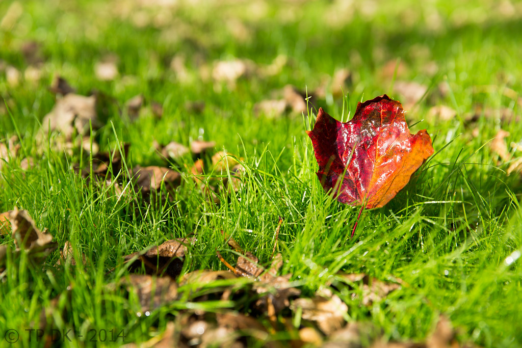
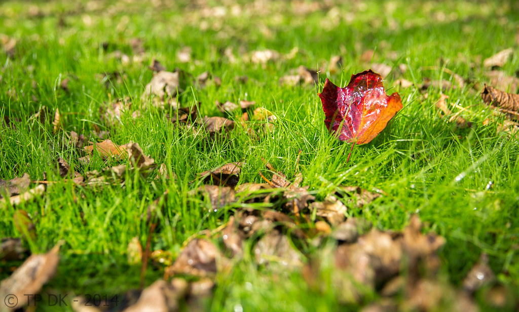
Wanting to catch up, so went with a quick simple shot... All I was going for was a low PoV and picking out a single colourful leaf amongst some dull ones, I found a bit of ground with quite nice light... quite satisfied with it considering it's simplicity

A couple of slightly different shots, one slightly closer in to try and show more detail (not cropped)... but don't think it really adds much ??

Thanks for looking in :)

Wk 42 - Change

Wk 42 - Change by TP DK, on Flickr


Wk 42 - Change 2 by TP DK, on Flickr
 
Hi DK, the first one for me it makes your explanation work better as the leaf is lost a little more so it emphasises the difference in it, not sure that makes any sense :thinking:
you could lose a slither off the top to remove the very thin dark area
 
Hi DK, the first one for me it makes your explanation work better as the leaf is lost a little more so it emphasises the difference in it, not sure that makes any sense :thinking:
you could lose a slither off the top to remove the very thin dark area
Cheers Allan :)

I see what you mean... hows this, took a slither off the bottom too to keep the leaf in a similar position ??

Wk 42 - Change (Edited) by TP DK, on Flickr
 
HI DK

Balance - original idea and alot of hard work to get those. I like #2 cos of the shadows but there is something about the angle of the shot that makes them look like thay are tipping to the right - but no one else has mentioned this so it must be my brain.
#3 really pops and for me is the best photo.
I agree with Paul @pjm1 that I would imagine it to be better with a b/g , poss with a kind of oval light on the b/g showing thro the spaces in the tower. Just an additional approach really.

Change - the slithered on for me. Is is a good comp and the leaf stands out nicely in a subtle autumnal way. Good focus on the middle area without the oof f/g being distracting.
 
HI DK

Balance - original idea and alot of hard work to get those. I like #2 cos of the shadows but there is something about the angle of the shot that makes them look like thay are tipping to the right - but no one else has mentioned this so it must be my brain.
#3 really pops and for me is the best photo.
Cheers mate :)

Not sure about the angle, thats nothing I had spotted either mate :)

I agree with Paul @pjm1 that I would imagine it to be better with a b/g , poss with a kind of oval light on the b/g showing thro the spaces in the tower. Just an additional approach really.
One day hopefully... One Day :)


Change - the slithered on for me. Is is a good comp and the leaf stands out nicely in a subtle autumnal way. Good focus on the middle area without the oof f/g being distracting.
Cool - Thanks again :)

Change, on theme and lovely colours, although the harsh light is, erm, quite harsh :)

I would have had to clean up the FG, though.

Cheers.
Thanks buddy :)

FG... bugger... I wanted it to look natural, but I think you are right DOH :bang:
 
Rught... done a few shot on Sunday, a couple more here, weather was crap so was using affixed, bounced speedlight, was fun playing about :)

Both shots are straight forward...

First, a shot with my macro lens, this cast ornament is only about an inch high, it's an odd one as the gestures are opposite to the usual use...

I wanted it clean, simple and sharp...

So for me - here is Wk 37 - Seeing, Hearing and saying... ways to 'Communicate' :whistle:

Wk 37 - Communicate by TP DK, on Flickr
 
Last edited:
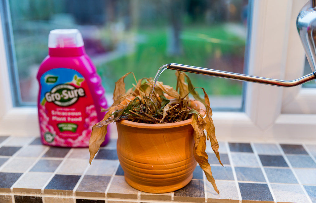
And the next one for me, again a straightforward shot...

Thoughts now it is up, possibly too many angles going on, but nowt I could have done really, I have straightened the uprights in one edit and it looked plain, soooooo lets see what you guys/gals think :)

Wk 43 - Wishful thinking, but come on pleeeease 'GROW' :D

Wk 43 - Grow by TP DK, on Flickr
 
Hi, communicate, who doesn't like monkeys....:) Works for me. Nice detail and I like the central composition. I'd have gone for a good centimetre crop all around to emphasise the detail.

Grow, less is more would improve im my opinion. I don't need the Gro Sure container our the Window, but the idea really works for me.

Cheers.
 
Hi DK with Andy sort of with the crop in the monkey image but i would take a large chunk off the bottom, i like the way the speckled surface fades, so crop from where it is in focus and let it fade :thinking:

Again with Andy don't think it needs the gro bottle, you might be right about to many angles.
 
Hi, communicate, who doesn't like monkeys....:) Works for me. Nice detail and I like the central composition. I'd have gone for a good centimetre crop all around to emphasise the detail.
Cheers Andy :)

I may well do that if it rains tomorrow :)

Grow, less is more would improve im my opinion. I don't need the Gro Sure container our the Window, but the idea really works for me.

Cheers.
Cheers again mate... I see what your saying :)

Hi DK with Andy sort of with the crop in the monkey image but i would take a large chunk off the bottom, i like the way the speckled surface fades, so crop from where it is in focus and let it fade :thinking:
Thanks Allan :)

Hmmmmmm again will give it a go tomorrow if it rains, if it's dry I'll be busy on other stuff :(

Again with Andy don't think it needs the gro bottle, you might be right about to many angles.
Thanks again :)

Looking now, I guess it does all look a tad busy :bang:

:agree:

Yes watering the dead plant .... (y)
Thanks David :)
 
Bloomin 'eck......I really have missed your thread !

Balance...............Awesome bit of stacking there & a fabulous idea:clap::clap: Love the contrast between the stark bg & the splash of color in the cards , bg looks fine to me , hint of a shadow grounds the tower nicely,I was thinking the position of the tower looked slightly un-comfortable & then saw Grahams ( I think) flip....works better I think ? BUT ,I really really love the close up shot :clap::clap:

Change.......nice bit of color on the green grass , think your 2nd version works best for me , always like closer versions & this one has just enough of the dead leaves in frame to give context (y)

Communicate......simple ,effective ,you achieved what you intended (y) Agree with the crop , could stand being a lot closer in I feel

Grow...keep looking but can't make up my mind ,think I'm tending to agree about losing the bottle .....probably :thinking:
 
Bloomin 'eck......I really have missed your thread !
Ooo you busy bee you :D

Balance...............Awesome bit of stacking there & a fabulous idea:clap::clap: Love the contrast between the stark bg & the splash of color in the cards , bg looks fine to me , hint of a shadow grounds the tower nicely,I was thinking the position of the tower looked slightly un-comfortable & then saw Grahams ( I think) flip....works better I think ? BUT ,I really really love the close up shot :clap::clap:
Thanks Lynne :)

And Yes, I agree Alan's edit is much Better :bat:

:LOL:

Change.......nice bit of color on the green grass , think your 2nd version works best for me , always like closer versions & this one has just enough of the dead leaves in frame to give context (y)
Thanking you very much :)

Communicate......simple ,effective ,you achieved what you intended (y) Agree with the crop , could stand being a lot closer in I feel
Cool - and Thanks :)

Grow...keep looking but can't make up my mind ,think I'm tending to agree about losing the bottle .....probably :thinking:
Ha Haaaa love your decisiveness on this :D

Thanks anyway :)
 
Wow, so much for me to catch up on Dean, sorry for being radio silent...

I like both of your change shots but probably prefer the first. The DOF works well and if only you'd have been able to move the leaves at the very bottom of frame out of the way slightly, it would have been perfect for me. I quite like the harsh lighting for a change... golden hour would have made the green grass less green, which would have weakened the "change" theme for me.

Communicate - nice idea, but I'm less convinced by the composition TBH. Lighting is well handled, but I might have been tempted to do something even simpler and just bounce from the ceiling directly above to get a small very soft shadow directly under each one. But that's very minor... the biggest change I'd probably be inclined to make is either a tighter crop (not sure that would work) or far more negative space... It's a toughie but I think you've dealt with your new macro lens and the lighting well.

Grow... I think this is a good idea but again a different composition could strengthen it. Maybe losing the watering can almost completely (or even completely) and just having the water coming in from the top corner of the frame? Close crop on the dead plant and pot without other distractions? I think in that sort of shot it would be all about the lighting so not easy to capture, especially with water but it would be fun to try.

I don't mean to be harsh with my comments - I think especially with change and communicate you have very good shots with some great technicals. I'll be honest and say I'm less excited by grow, but the idea is still a good one. Keep it up! :banana:
 
And Yes, I agree Alan's edit is much Better

:LOL:

I preferred mine if I'm honest... :p


Change I don;t think either of the edits massively improve on the original, I like the space around it, showing a just fallen leaf surrounded by dead ones, the red contrasts nicely with the green of the grass. (y)

the monekys are perfectly on theme and again I like the crop as it is, the fade of the detailed surface inot the beautiful soft OOF behind the monkeys works super well. Sharpness, DOF, lighting all need no crit either.

I see the issues with Grow, but I love the humour and the optimism here, I think the plant food bottle needs to be there, and I reckon it might actually come back to life with enough TLC. :D
 
Last edited:
Hi DK ....I'm miles behind with your thread ...how did that happen o_O

Balance ..is amazing ...I love it ...you must have so much patience ....I would probably get to the last card and knock it over .... all three shots are superb ... the third close up is stunning in it's clarity and colour ....very well done to you on that one :clap:

Change ...a super little autumn shot ...focal point on the lovely shiny leaf looks perfect to me.

Communicate .... well done with the macro, I'm glad you said how big the monkeys actually are, it really helps when viewing it. To crop or not to crop ... personally I really like it as it is ... it's always quite hard to know where to stop .

Love your grow ...that really made me smile ... super focus on the plant ...take all those dead leaves off and nurture it ...if we have a topic 'miracle' it may come in handy :)
 
Hiya DK,

Balance - :clap: for actually balancing the cards, great idea and like all 3 shots (y)....I am drawn to the 3rd, the tight crop works well (y)

As you say, simple idea for change that works well, 2nd, closer shot for me (y)

Communicate- :LOL: love it, good detail and well done with the lighting, works well shot on the worktop? instead of just being set against a plain white bg (y)

Grow- another good idea for the theme :LOL: I agree about the angles, possibly doesn't help with the tiles being small :thinking: :)
 
Wow, so much for me to catch up on Dean, sorry for being radio silent...
No worries mate :)

I like both of your change shots but probably prefer the first. The DOF works well and if only you'd have been able to move the leaves at the very bottom of frame out of the way slightly, it would have been perfect for me. I quite like the harsh lighting for a change... golden hour would have made the green grass less green, which would have weakened the "change" theme for me.
Cheers Paul :)

Yes I wish I had moved them a tad looking back !!

Communicate - nice idea, but I'm less convinced by the composition TBH. Lighting is well handled, but I might have been tempted to do something even simpler and just bounce from the ceiling directly above to get a small very soft shadow directly under each one. But that's very minor... the biggest change I'd probably be inclined to make is either a tighter crop (not sure that would work) or far more negative space... It's a toughie but I think you've dealt with your new macro lens and the lighting well.
Cheers again Paul, Yes I would like to have a play about a bit more with the bounced flash, Needed it stronger somehow, it was on TTL guess I should have switched to manual :thinking:

Grow... I think this is a good idea but again a different composition could strengthen it. Maybe losing the watering can almost completely (or even completely) and just having the water coming in from the top corner of the frame? Close crop on the dead plant and pot without other distractions? I think in that sort of shot it would be all about the lighting so not easy to capture, especially with water but it would be fun to try.
Goooood ideas again Paul - like em (y)

I don't mean to be harsh with my comments - I think especially with change and communicate you have very good shots with some great technicals. I'll be honest and say I'm less excited by grow, but the idea is still a good one. Keep it up! :banana:
Cheers... no offence taken, I like the suggestions, that's what I am here for :)
 
I preferred mine if I'm honest... :p
Me too :LOL:

Change I don;t think either of the edits massively improve on the original, I like the space around it, showing a just fallen leaf surrounded by dead ones, the red contrasts nicely with the green of the grass. (y)
Cheers Graham :)

the monekys are perfectly on theme and again I like the crop as it is, the fade of the detailed surface inot the beautiful soft OOF behind the monkeys works super well. Sharpness, DOF, lighting all need no crit either.
Blimey... cheers again :)

I see the issues with Grow, but I love the humour and the optimism here, I think the plant food bottle needs to be there, and I reckon it might actually come back to life with enough TLC. :D
Fingers crossed hey :D

Hi DK ....I'm miles behind with your thread ...how did that happen o_O
It just does Susie... no problem :)

Balance ..is amazing ...I love it ...you must have so much patience ....I would probably get to the last card and knock it over .... all three shots are superb ... the third close up is stunning in it's clarity and colour ....very well done to you on that one :clap:
Thanks very much :)

Change ...a super little autumn shot ...focal point on the lovely shiny leaf looks perfect to me.
Thanks again Susie :)
Communicate .... well done with the macro, I'm glad you said how big the monkeys actually are, it really helps when viewing it. To crop or not to crop ... personally I really like it as it is ... it's always quite hard to know where to stop .
I think you are right, I like it as it is, but when somebody mentions something I look again and I can see where they are coming from... so always worth consideration for future shots for me, makes me think a bit more :)

Love your grow ...that really made me smile ... super focus on the plant ...take all those dead leaves off and nurture it ...if we have a topic 'miracle' it may come in handy :)
Ha Haaaa very true :)

Hiya DK,

Balance - :clap: for actually balancing the cards, great idea and like all 3 shots (y)....I am drawn to the 3rd, the tight crop works well (y)
Cheers Phil :)

As you say, simple idea for change that works well, 2nd, closer shot for me (y)
Cheers again :)

Communicate- :LOL: love it, good detail and well done with the lighting, works well shot on the worktop? instead of just being set against a plain white bg (y)
Yup... you are correct, shot on my breakfast bar, I was hoping the textures/colour chips would help add some scale and DoF rather than a backdrop :)

[quoteGrow- another good idea for the theme :LOL: I agree about the angles, possibly doesn't help with the tiles being small :thinking: :)[/QUOTE]I think... nothing helps on this one mate :D
 
Well... onto my NEXT catch up

This is a re-shoot from a previous catch up, the first time I did the shot it got mixed comments, so this time I have tried adding something else into the shot to give some scale, and sharpness to the image...

What I liked about this one, the texture of the water that was captured, I have kept the shot as colour rather than B&W, I did try both but feel the B&W was lacking warmth

Wk 43 - Re-shoot 'Sparkle'

Wk 43 Re-Shoot - SPARKLE by TP DK, on Flickr
 
Balance - All good and have been well lit but #1 for me. I'm a sucker for negative space. The only minor crit on #1 is the missing shadow next to the bottom left hand card. It's there on the others. How long did it take you to build this? And how many attempts? LOL

Change - Just the right time of year for this theme. On #1 the brown leaf is positioned right on the thirds with a nice DoF

Communicate - Good thinking for the theme. I like the mottled surface which is made super subtle by another shallow DoF well used

Grow - Not sure the water would help this plant. LOL. I'm not bothered about the inclusion of the Gro-Sure bottle but feel the colour is far too vivid and draws the eye away from the main subject. A different coloured bottle or reducing the saturation may help

Reshoot - Wow. Lots of sparkles. Some super star effects on the highlights as well. Nice one. I can't decide if you've done a mono conversion or whether the subject is very monochrome. Either way I like it.
 
Reshoot... that's brilliant Dean!!

Really like that... definitely one of the best sparkle shots :) Top, top drawer :clap:
Wow - Cheers Paul :)

Reshoot, yeah, works for me. The starbursts really work nicely as does the silhouetted duck.

Cheers.
Thanks too Andy :)

Balance - All good and have been well lit but #1 for me. I'm a sucker for negative space. The only minor crit on #1 is the missing shadow next to the bottom left hand card. It's there on the others. How long did it take you to build this? And how many attempts? LOL
Thanks Peter :)

Well... I did Blue cards first only to find out there were some missing from the pack, so I switched to the red after counting them, and despite using a little tape on some of the tops it took me just over an hour, and if I recall correctly it collapsed at least 3 times :bat:

Change - Just the right time of year for this theme. On #1 the brown leaf is positioned right on the thirds with a nice DoF
Thanks again Peter :)

Communicate - Good thinking for the theme. I like the mottled surface which is made super subtle by another shallow DoF well used
Cheers Peter... that was my aim, glad to hear people like the idea :)

Grow - Not sure the water would help this plant. LOL. I'm not bothered about the inclusion of the Gro-Sure bottle but feel the colour is far too vivid and draws the eye away from the main subject. A different coloured bottle or reducing the saturation may help
I wish I had a different coloured bottle lol :D I see what your saying as I did try SC too but that looked total pants

Reshoot - Wow. Lots of sparkles. Some super star effects on the highlights as well. Nice one. I can't decide if you've done a mono conversion or whether the subject is very monochrome. Either way I like it.
Thanks again Peter :)

Well infact it is as shot, I did try B&W but didn't like it, it was away from many banks so reflecting the grey sky I guess, nearer the bank the colours were more noticeable :)
 
Yep, sun glasses required :cool: I can only echo whats been said, great shot DK (y)
 
Change - Great for the theme with the newly fallen (or strategically placed?) leaf amongst the dried up ones. Third one with the slight cropping gives a better composition, but I like them all.

Communicate - loving the monkeys! The lighting's spot on to capture the texture in their "fur" without adding too much unwanted reflection.

Grow - reminded me of some of my plants and made me smile, but I have to agree that there's a bit too much going on with all the different colours and shapes that distract from the main idea and the lovely terracotta pot.

Reshoot - Big aaw for the cute duck and big thumbs up for the fabulous sparkles (y)
 
Absolutely amazing number of sparkles there. LOVE them all.

Can really imagine that converting to b&w would completely lose the warmth in the sparkles and really kill the scene. I am a fan of a slightly wider crop generally, but you could trim a smidge off the right side for me. But if that's all I have to crit............ :)
 
Change - Great for the theme with the newly fallen (or strategically placed?) leaf amongst the dried up ones. Third one with the slight cropping gives a better composition, but I like them all.
Thanks Elaine :)

Well... there may have been a TINY bit of standing up involved :)

Communicate - loving the monkeys! The lighting's spot on to capture the texture in their "fur" without adding too much unwanted reflection.
Thanks again... with my bright screen, never sure how it will come out :D

Grow - reminded me of some of my plants and made me smile, but I have to agree that there's a bit too much going on with all the different colours and shapes that distract from the main idea and the lovely terracotta pot.
Yup :nod:

Reshoot - Big aaw for the cute duck and big thumbs up for the fabulous sparkles (y)
Cheers Elaine :)

Absolutely amazing number of sparkles there. LOVE them all.

Can really imagine that converting to b&w would completely lose the warmth in the sparkles and really kill the scene. I am a fan of a slightly wider crop generally, but you could trim a smidge off the right side for me. But if that's all I have to crit............ :)
Thanks Graham :)

And yes the slight colour is certainly needed :)
 
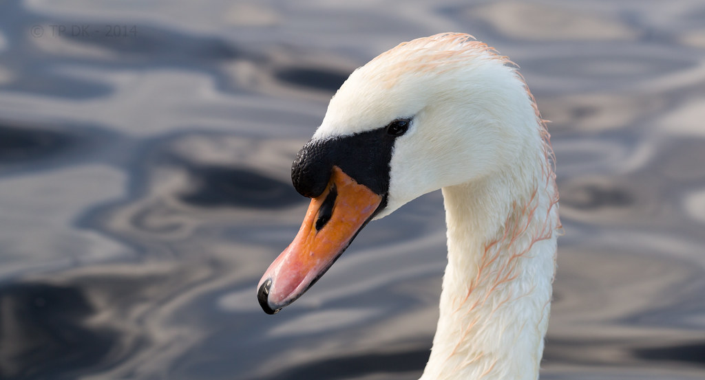
And onto the next catch up... as said in a thread somewhere (think it was Pauls) I was thinking on the line of a socket and test screwdriver, but I had a couple of hours out locally Sunday just me and my camera, I got these shot, of some VERY inquisitive swans... they were sooooo friendly I used my 100mm Macro lens for these, maybe a tiny bit of a shoehorn, but they certainly are not 'Still Life' they were truly 'Live and kicking' under the water :whistle:

What I like, I am really happy with the detail, minimal crop just to level and crop out poor backgrounds... I know they could be a tiny tad sharper and could also be lit better... maybe a reflector ?? but I'm happy with them :)

Wk 44 'Live' swans in and close - a couple to look at here...

Wk 44 - Live by TP DK, on Flickr


Wk 44 - Live 2 by TP DK, on Flickr
 
Hi DK .... I love your Sparkle shot with it's generous sprinkling of sparkles dancing on the water, the duck is perfect adding that essential focal point.

Live ....I'm so glad you chose the swans over a socket and screwdriver !
Your two shots capture the swan so well, I think I slightly like the first one the best as I like the angle of the head and the texture of the water in the background, but they are both lovely.
 
Hi DK .... I love your Sparkle shot with it's generous sprinkling of sparkles dancing on the water, the duck is perfect adding that essential focal point.
Thanks Susie :)

Live ....I'm so glad you chose the swans over a socket and screwdriver !
Ah Haaaa glad you thought that too :)
Your two shots capture the swan so well, I think I slightly like the first one the best as I like the angle of the head and the texture of the water in the background, but they are both lovely.
Thanks again :)

Yeah the head angle of the first is more swan like to me too :)
 
I'd go for the first if you could get the same level of texture detail in the leathery black bit by his beak. White feathers on both are great.

Swan macro though. o_O and considering a hand held reflector too :confused:....... :LOL:
 
Back
Top