weekly DK's 52 in 2014 - Wk's 52 'Support' Added - AND FINISHED :)

Hi Dean, they are cracking shots of the shots - really nicely done and well done on juggling camera, reflector and all that!

There are aspects of both which I really like:

1. Angle of head better "compositionally" for me and focus/DOF is 100% perfect as it covers the entire beak (and eye of course) but background is spot on blurry. Focus is just starting fall away at the bottom of the neck... perfect for me. Great texture and colour on the beak
2. But... direction of lighting works far better for me here: catchlight in the eye, real countours and contrast in the black skin

So, take the lighting from the second and the composition & focus on the first and it's utterly perfect. But even as it is, you have two excellent shots which I'd be very very proud of :)
 
I'd go for the first if you could get the same level of texture detail in the leathery black bit by his beak. White feathers on both are great.
Thanks Graham :)

Yeah there is certain elements I like about both :)

Swan macro though. o_O and considering a hand held reflector too :confused:....... :LOL:
Well... I'm sure you would do the same :LOL:

Hi Dean, they are cracking shots of the shots - really nicely done and well done on juggling camera, reflector and all that!
Cheers Paul :)

The reflector was only a thought... I did have my mini one with me :)

There are aspects of both which I really like:

1. Angle of head better "compositionally" for me and focus/DOF is 100% perfect as it covers the entire beak (and eye of course) but background is spot on blurry. Focus is just starting fall away at the bottom of the neck... perfect for me. Great texture and colour on the beak
2. But... direction of lighting works far better for me here: catchlight in the eye, real countours and contrast in the black skin

So, take the lighting from the second and the composition & focus on the first and it's utterly perfect. But even as it is, you have two excellent shots which I'd be very very proud of :)
Thank you very much indeed, I am happy with them both thats for sure :)
 
Right... and onto the next... and my LAST to get me up to date'ish !!!

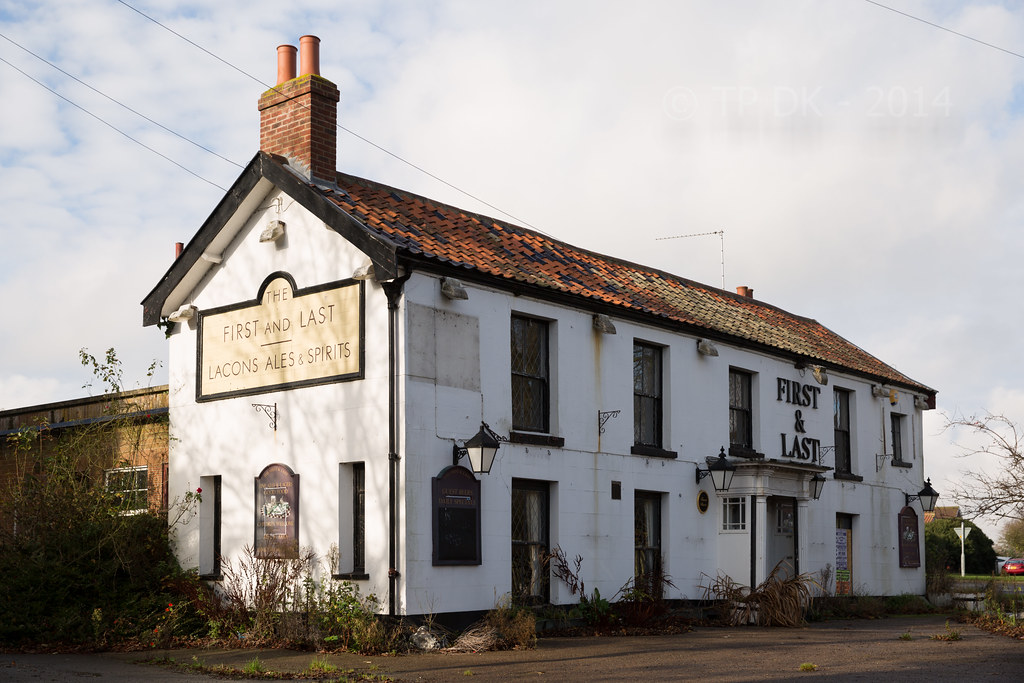
This place sprang to mind pretty much straight away, it's been closed for a few years now, not as run down as I had hoped but suitable for my needs...

I'm a bit unsure on the PP, I have tried a slight vignette, but also added some grain, I then removed the grain as it just made the image look poor quality rather than what I thought I wanted, anyway...

This place has certainly seen it's 'Last' customer... I bet they can not remember their 'First'

Wk 45 - The 'First' and Last

Wk 45 - First by TP DK, on Flickr
 
Up to date, that gives you just less than 3 days off :)

This one's easy to like, nice warm light, cool sky and clouds and a perfect fit for the theme.

Done well to get the verticals vertical and not lose the chimney, would have been so easy to frame it tighter and then find it too tight when the perspective correction does it's thing.

Processing looks good to me, not too sure on the vignette effect in the top right corner, there's a slider where you can lessen the effect of the vignette on the highlights of the image.
 
Last edited:
Up to date, that gives you just less than 3 days off :)

This one's easy to like, nice warm light, cool sky and clouds and a perfect fit for the theme.

Done well to get the verticals vertical and not lose the chimney, would have been so easy to frame it tighter and then find it too tight when the perspective correction does it's thing.

Processing looks good to me, not too sure on the vignette effect in the top right corner, there's a slider where you can lessen the effect of the vignette on the highlights of the image.
Thanks Graham :)

Up to date for three days... I'M GOING TO MAKE IT LAST :D

Didn't notice the top right corner, I'll give the slider a go when I find it, oooo hang on, I added a grad filter in PP that looks more likely, I wanted the sky a bit more moody so pulled as much out of it as I could... I can reduce that possibly :)

Your right with the stack, i'm trying to frame wider on shots like this now I know how to do the uprights and how much it looses space :)
 
Hi!

First: I like the exposure in this and how the FG and BG are balanced with each other. Good find for the theme.
Live: I'm glad you didn't use the "Test Screwdriver", they are a potential death sentence. The only thing I'd use for testing if something is live, is to use an "Approved Voltage Detector". Ok, Electrician rant over. The shots of the swan, however, a brilliant. I don't think I can add anything useful other than to say I like them. The first over the second due to the BG being slightly distracting (oh no, I'm turning in to a photography snob) but the water ripples in the first of the two are lovely.
 
Hiya DK, the pub is a good take on the theme, as Graham said, something makes it easy to like. Its well positioned in frame with the tarmac drive/carpark? leading in from bottom left corner (y). If I'm being honest the vignette is only really visible to me in the top right :thinking:

The small tree down the right is a little annoying, .......:thinking: didn't you once use a chainsaw for one of the themes :whistle:
 
I quite like the processing as it suits the building. I suspect a more acute angle from the LHS wasn't possible.

Vignette on the sky is always an issue, but what a cracking sky.

Did you get any closer to the actual sign?

Cheers.
 
Hi DK, would love to be there when you approach a swan with a reflector please let me know when, it will be worth the journey :wacky:

first one for me it sits better in the frame and has more of the neck, just needs a slight lift its a little dark on the black parts of it's face, great detail in its face on the second (y)

Nice shot of the pub for "first" fits perfect in the frame and for the theme, did you try B+W not sure it would be any better :thinking: either way I like it how it is
 
Last edited:
Love the ripply bg water in the first swan pic.

First ... pub pic ... hmmm .. can't offer any serious comment ... but it's the sort of image that would use some serious pp
 
Last edited:
Hi!

First: I like the exposure in this and how the FG and BG are balanced with each other. Good find for the theme.
Thanks Si :)
Live: I'm glad you didn't use the "Test Screwdriver", they are a potential death sentence. The only thing I'd use for testing if something is live, is to use an "Approved Voltage Detector". Ok, Electrician rant over.
Oh my goodness :exit:

:D

The shots of the swan, however, a brilliant. I don't think I can add anything useful other than to say I like them. The first over the second due to the BG being slightly distracting (oh no, I'm turning in to a photography snob) but the water ripples in the first of the two are lovely.
Ahhh Haaaa that you are mate, you keep at it and it all starts splurting out when least expected... thanks for the compliment :)

Hiya DK, the pub is a good take on the theme, as Graham said, something makes it easy to like. Its well positioned in frame with the tarmac drive/carpark? leading in from bottom left corner (y). If I'm being honest the vignette is only really visible to me in the top right :thinking:
Thanks Phil :)

Yes it isn't very obvious unless you switch it off and on... maybe needed a bit more :D

The small tree down the right is a little annoying, .......:thinking: didn't you once use a chainsaw for one of the themes :whistle:
Now there is a plan :manchoppingdowntreesmilie:
 
I quite like the processing as it suits the building. I suspect a more acute angle from the LHS wasn't possible.
Well... yes there was buckets of room to the left, a big road to the right but a huge carpark too... quite a nice place really !!!

Vignette on the sky is always an issue, but what a cracking sky.
Ahhhhh didn't know that, don't use them much :)

Did you get any closer to the actual sign?
Ooooooh yes, I was a right photography whore... took it from all possible angles :D

SOOC from the left a tad more...

SOOC by TP DK, on Flickr


One of the MANY shots of the signage... scrapped most of them, running out of hard drive !!!

Untitled by TP DK, on Flickr


:beer:

Hi DK, would love to be there when you approach a swan with a reflector please let me know when, it will be worth the journey :wacky:
Well it sounds like fun to me :bonk:

first one for me it sits better in the frame and has more of the neck, just needs a slight lift its a little dark on the black parts of it's face, great detail in its face on the second (y)
Think I may do that now if I get time - Thanks Allan :)

Nice shot of the pub for "first" fits perfect in the frame and for the theme, did you try B+W not sure it would be any better :thinking: either way I like it how it is
Nope... didn't do B&W, may try it... may not :)
 
One of the MANY shots of the signage


yes I like that ... cracks and rust ... fluffy clouds heading leftward.
 
Love the ripply bg water in the first swan pic.

First ... pub pic ... hmmm .. can't offer any serious comment ... but it's the sort of image that would use some serious pp
Cheers David :)

Year did think of a very extreme HDR but ran out of time, will be worth a revisit during a heavy stormy afternoon I feel !!!

One of the MANY shots of the signage


yes I like that ... cracks and rust ... fluffy clouds heading leftward.
Thanks again David :)
 
Hi Dean...


Sparkle...WOW that hits the theme bang on for sure...really really well captured sparkles :clap:


First........#1 for me , prefer the angle , tightness in the frame, good sky , nice lead in lines...got the lot really :clap: A light touch of HDR might just have pulled out more of the colors ?

Pants...forgot your Swan shot.....on balance I think it's 1st for me, better DOF with more of the head/beak in focus but I do prefer the brighter eye in the 2nd :)
 
Last edited:
Live - #1 for me as well, the angle of the head and inclusion of a bit of neck make it a more elegant image.

First - the shot of just the sign does it for me. I think you're right that the building doesn't look quite decrepit enough to make it really photogenic, but the angle looking up at the sign makes a great image on its own.
 
Hiya Dean, that's a great idea for the theme. I think you've taken a lovely photo - light's good, subject's good and composition's good. Technicals look spot on too so all in all a thoroughly accomplished job!! :clap:

Although I agree with Allan that a B&W would be even more striking (B&W buildings always look even more wow in high contrast B&W IMO)...
 
Hi Dean...


Sparkle...WOW that hits the theme bang on for sure...really really well captured sparkles :clap:
Thanks Lynne :)

I tokk a load of shots to get the birds in a good place, but boy did I see sparkles/blotches in my eyes for a while :wideyed:


First........#1 for me , prefer the angle , tightness in the frame, good sky , nice lead in lines...got the lot really :clap: A light touch of HDR might just have pulled out more of the colors ?
Thanks again Lynne, yes I think I should have :)

Pants...forgot your Swan shot.....on balance I think it's 1st for me, better DOF with more of the head/beak in focus but I do prefer the brighter eye in the 2nd :)
Annnnd thanks again, it is always the case, certain shots with prefered bits... I need you PS skills to combine them :D

Hi DK ...I like the last First shot the best o_O super bold and bright :)
Cheers Susie :)

Live - #1 for me as well, the angle of the head and inclusion of a bit of neck make it a more elegant image.
Thanks :)

First - the shot of just the sign does it for me. I think you're right that the building doesn't look quite decrepit enough to make it really photogenic, but the angle looking up at the sign makes a great image on its own.
Ahhhh yes that was my thought when I took the sign shots, wasn't sure how the front would look, but I was happy in the end with the frontage, so went with it :)

Hiya Dean, that's a great idea for the theme. I think you've taken a lovely photo - light's good, subject's good and composition's good. Technicals look spot on too so all in all a thoroughly accomplished job!! :clap:
Thanks a lot Paul :)

Although I agree with Allan that a B&W would be even more striking (B&W buildings always look even more wow in high contrast B&W IMO)...
Well... Here is a quick one done, of head on, not sure if this angle works, I was hoping the lines coming from the road/path would do, but don't think it's enough :thinking:

Wk 45 Edit - B&W head on by TP DK, on Flickr
 
Right... and onto this week

AGAIN the weather is crap, I was wanting to get down to the broads to get a nice smooth water shot :(

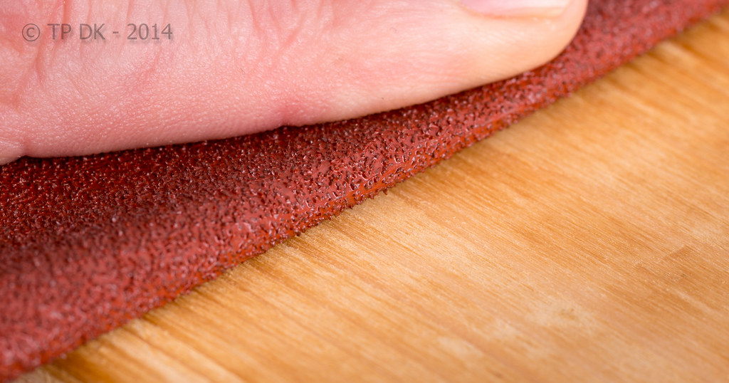
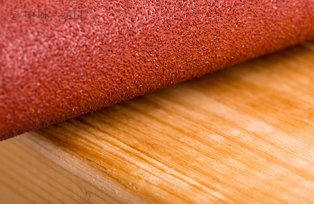
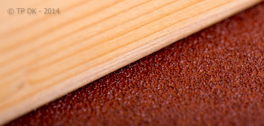
So... had a little play indoors instead, here are 3 different shots, liking all for different reasons, not sure if the one with the finger works as I wanted, I was after 3 textures coming in from the left at angles, not quite got it right :)

Anyway, 3 different takers of Sandpaper (Aluminious Oxide Paper to be accurate), smoothing wood...

Wk 46 - Smooth :)

Wk 46 - Smooth by TP DK, on Flickr


Wk 46 - Smooth 2 by TP DK, on Flickr


Wk 46 - Smooth 3 by TP DK, on Flickr
 
I like that Dean...

Of the three I do think the first (the one you chose for the picture thread) works best for the theme. The super close-up with very shallow DOF (#3) is an interesting shot and compositionally appealing with the perfect diagonal bisection but shallow DOF makes my eyes go funny! I reckon #2 might be the best overall picture, but it is less "on theme" for me as it doesn't really guide the viewer to determine which is the main subject: wood or sandpaper (despite the former being more of the picture).

So, back to #1: I like the shallow DOF which is enough for the story of sanding the wood. I might prefer to have a bit more of the hand as I think the action of sanding is not as strong as it could be with just a sliver of finger. Conversely, I'm going to assume the rest of the hand would have been OOF so that might not have worked. I'll be honest and say that I'd have been tempted to stop way down - don't worry too much about diffraction but instead get as much of the image in focus as possible (you'd still have pretty shallow DOF even at f/22 with such a short focal distance).

I think your lighting on the sandpaper is superb: just enough specular highlights to give it a sense of "bite"... good shot, technically difficult and hard to see how different composition would have worked so I think you've done very well :)
 
HI DK

Grow - hope over experience :) idea spot on but does not need the pink container I feel.

Sparkle - wonderful - mesmerising and the gull just gives it that extra dimension. :clap:

Live - good shots of swans. #1 has better comp as a shot but #2 has lovely detail and really hits the theme as the swan does look so alive, aware and intelligent.

First - Norfolk eh?:) For me your first submission was the right choice - good angle, gets in all the necessary details, that :tumbleweed: feeling. Nice autumnal feel which enhances the theme and the view thro to the rear window empahasising the abandoned state. For me the B&W is not as good.

Smooth - #1 for me as it needs the hand/finger to give the contest. good warm colour. Might have tried it with a bit of wood dust in the sandpaper and on the wood surface ( without of course ruining your furniture:D)
 
Hi DK, 1st one for me too definitely needs the hand in there for the context otherwise it's just a little odd as its not obviously sandpaper,
as comment above a bit of dust might help or are you going to take it back to the shop unused for a refund :D

I quite like the third one too (y)
 
HI DK yes, number one is probably best for the theme ...maybe if the sandpaper was wrapped around a sanding block it would add a bit more 'sanding action' o_O but I'm also really liking number two for the colour and texture of the sandpaper.

Number three is also very nice in an abstract way :)
 
Last edited:
I like that Dean...
Thanks Paul :)

Of the three I do think the first (the one you chose for the picture thread) works best for the theme. The super close-up with very shallow DOF (#3) is an interesting shot and compositionally appealing with the perfect diagonal bisection but shallow DOF makes my eyes go funny! I reckon #2 might be the best overall picture, but it is less "on theme" for me as it doesn't really guide the viewer to determine which is the main subject: wood or sandpaper (despite the former being more of the picture).
My thinking there again mate :)

So, back to #1: I like the shallow DOF which is enough for the story of sanding the wood. I might prefer to have a bit more of the hand as I think the action of sanding is not as strong as it could be with just a sliver of finger. Conversely, I'm going to assume the rest of the hand would have been OOF so that might not have worked. I'll be honest and say that I'd have been tempted to stop way down - don't worry too much about diffraction but instead get as much of the image in focus as possible (you'd still have pretty shallow DOF even at f/22 with such a short focal distance).
Well... me being a tad lazy really, I wanted a close up again so kept my 100 macro on again, took all shots on the closest setting again, Soooo the DoF was too shallow, it looked fine on my camera again, what I should have done was to take a few a bit further away and cropped to get the better DoF....

I'm still not that good with my lights, and struggle to get over F11 with 1/160 at ISO 100 - I think I need to keep practising, and appreciate all suggestions :)

I think your lighting on the sandpaper is superb: just enough specular highlights to give it a sense of "bite"... good shot, technically difficult and hard to see how different composition would have worked so I think you've done very well :)
Thanks again Paul, some great feedback as always (y)

HI DK

Grow - hope over experience :) idea spot on but does not need the pink container I feel.
LOTS of hope mate Lots :D

Sparkle - wonderful - mesmerising and the gull just gives it that extra dimension. :clap:
Blimey... Thanks Alan :)

Live - good shots of swans. #1 has better comp as a shot but #2 has lovely detail and really hits the theme as the swan does look so alive, aware and intelligent.
Thanks again Alan... it's not until you get close in on these birds you realise the size of the buggers and very inquisative they were too :)

First - Norfolk eh?:)
Yup :)

For me your first submission was the right choice - good angle, gets in all the necessary details, that :tumbleweed: feeling. Nice autumnal feel which enhances the theme and the view thro to the rear window empahasising the abandoned state. For me the B&W is not as good.
Thank you, it was a tough choice deciding on the angle for this one, I wanted much lower down, but the signage vanished behind the entrance porch... how inconsiderate :D

Smooth - #1 for me as it needs the hand/finger to give the contest. good warm colour. Might have tried it with a bit of wood dust in the sandpaper and on the wood surface ( without of course ruining your furniture:D)
Ahhhhhhhh of course, I didn't even think about adding dust :bang:
 
Hi DK, 1st one for me too definitely needs the hand in there for the context otherwise it's just a little odd as its not obviously sandpaper,
Very true mate, my thinking too :)
as comment above a bit of dust might help or are you going to take it back to the shop unused for a refund :D
Ahhh okay... everybody thought of it other than me :D

I quite like the third one too (y)
Thanks again mate :)

HI DK yes, number one is probably best for the theme ...maybe if the sandpaper was wrapped around a sanding block it would add a bit more 'sanding action' o_O but I'm also really liking number two for the colour and texture of the sandpaper.

Number three is also very nice in an abstract way :)
Cheers Susie :)

Again a good idea about the sanding block... think I best revisit this one, as there seems some real good suggestions :)
 
First one for me as well, I think it needs the finger to show the act of smoothing. I wonder what it would be like if you changed the position so that the woodgrain is going in the same direction as in the bottom one?
 
Getting worried now.... That's two weeks in a row you've posted on time. ;)

One and three for me.... Although the first seems to be saying to me that the sanding action is going across the grain rather than 'with' it.

I think I prefer the simpleness of the third overall though, the diagonal split works really well, the grain is flowing nicely through the image on that diagonal. :) I think a greater dof would help though, the focus is in a bit of an l shape, across the sand paper and then up the side of the wood, there is plenty of detail to look at, it seems a pity to have some of it OOF.
 
First one for me as well, I think it needs the finger to show the act of smoothing. I wonder what it would be like if you changed the position so that the woodgrain is going in the same direction as in the bottom one?
Thanks Elaine... and again another very valid idea :)

Getting worried now.... That's two weeks in a row you've posted on time. ;)
I'm getting worried too lol :D

One and three for me.... Although the first seems to be saying to me that the sanding action is going across the grain rather than 'with' it.
No... that's just the way I sand things... :LOL: :coat:

I think I prefer the simpleness of the third overall though, the diagonal split works really well, the grain is flowing nicely through the image on that diagonal. :) I think a greater dof would help though, the focus is in a bit of an l shape, across the sand paper and then up the side of the wood, there is plenty of detail to look at, it seems a pity to have some of it OOF.
Cheers Graham, great points, taken in and wanting to re-shoot already :)
 
Hiya DK, I'm going to go against the grain here......:tumbleweed:.......:p..........and say no.3 for me.

I don't think it needs the finger in shot, just the textures alone work. The composition with the smooth wood on top, with the rough sandpaper underneath appeals more. Shallow dof works but possibly focus needed to be more on the smooth wood, leaving most of the sandpaper oof, instead of what looks like a 50/50 split :)
Thanks Phil :)

You have a very good they mate, logically the smooth wood should be more in focus, now WHY didn't I think of that :bang: :D
 
Hiya Dean... well I really like this! I think it's a fab idea, the composition just works perfectly for me, aesthetically. The shadow on the wall behind is also good. I'm not sure whether a harder shadow might work better, but then you'd be left with hard lighting on the spokes, which might not be ideal. I dunno - I think you've nailed it, as it is! (y)
 
Hi DK, at first look I thought it was some kind of bike wheel and have just realised its an umbrella, rella, rella

its a nice abstract image, it draws you in a bit like a web (y)
 
Back
Top