weekly DK's 52 in 2014 - Wk's 52 'Support' Added - AND FINISHED :)

Live - Swans are difficult birds to shoot right because of the whites and then the black part between beak and head plus they are usually on darkish water. You've done really well with both of these. You can still see detail in both so well done. To get these so close up was a bonus for you. Out of the two I prefer the wider #1 shot.

First #1 - Not sure this is one of your strongest which maybe is down to the subject. The vignette top right has been mentioned. I'm wondering whether a really gritty and noisy/grainy B&W conversion may have accentuated the dishevelled old pub.

First #3 - I feel is far stronger in composition but would benefit from cropping the blown cloud. Also you've left a couple of dodgy edits on the A.

Smooth - #2 for me. It has a nice shallow DOF but enough to pick out the coarseness of the sandpaper and the grain of the wood. Exposure looks good as well.

Attached - Looks like one of those pattern pictures. The DoF again works with this one and therefore my eye goes straight to the centre piece of the umbrella which has been positioned nicely just off centre

Energy - I like all three of these but if pushed will say #3. The shine on the tower and blades has been nicely picked out. You can even see the reflection of the blue sky and clouds in it. Super shot.

Round - This wouldn't be your Christmas tree would it?. Nice image but maybe missing something as a main focal point if you know what I mean.

Nonsense. This made me chuckle. You obviously live in a posh area if you get Mrs DK to do the hovering outside LOL. The lack of leaves in the wake of the Dyson makes it look like she;s quite practised at it. Could you send her round please.:exit:
 
Live - Swans are difficult birds to shoot right because of the whites and then the black part between beak and head plus they are usually on darkish water. You've done really well with both of these. You can still see detail in both so well done. To get these so close up was a bonus for you. Out of the two I prefer the wider #1 shot.
Thanks Peter :)

First #1 - Not sure this is one of your strongest which maybe is down to the subject. The vignette top right has been mentioned. I'm wondering whether a really gritty and noisy/grainy B&W conversion may have accentuated the dishevelled old pub.
Thanks again Peter :)

I did try a quick B&W but only a LR pre-set, not played about with sliders much in B&W or added other pre-sets, I'd love to one day to increase my PP options :)

First #3 - I feel is far stronger in composition but would benefit from cropping the blown cloud. Also you've left a couple of dodgy edits on the A.
Really... Oppps :D

Smooth - #2 for me. It has a nice shallow DOF but enough to pick out the coarseness of the sandpaper and the grain of the wood. Exposure looks good as well.
Cheers Peter :)

Attached - Looks like one of those pattern pictures. The DoF again works with this one and therefore my eye goes straight to the centre piece of the umbrella which has been positioned nicely just off centre
It does a bit doesn't it !!

Energy - I like all three of these but if pushed will say #3. The shine on the tower and blades has been nicely picked out. You can even see the reflection of the blue sky and clouds in it. Super shot.
I'm thinking the shine won't be there for lon on these, they sure do get hit with offshore wind witch will soon dull them down - Cheers Peter :)

Round - This wouldn't be your Christmas tree would it?. Nice image but maybe missing something as a main focal point if you know what I mean.
Yep it sure is Peter :)

Nonsense. This made me chuckle. You obviously live in a posh area if you get Mrs DK to do the hovering outside LOL. The lack of leaves in the wake of the Dyson makes it look like she;s quite practised at it. Could you send her round please.:exit:
I'm sure she would be over the moon if I suggested that mate :LOL:

:ROFLMAO: Haha No self respecting dyson owner should be seen outside with there dyson.
Very true Mandy, Very True :D
 
Oustanding job here Dean, and hat off to Mrs DK for indulging you. The heels really add greatly to the nonsensicalness of it all. :)

The smoother strip behind the hoover is a piece of genius and really brings it all to life. Perfect focus, DOF and motion blur(?) too.

You really should empty that a bit more often though. (y)
 
Mrs DK will be getting round to the irony after she finishes with the hoovery.
 
Oustanding job here Dean, and hat off to Mrs DK for indulging you. The heels really add greatly to the nonsensicalness of it all. :)
Cheers Graham :)

The smoother strip behind the hoover is a piece of genius and really brings it all to life. Perfect focus, DOF and motion blur(?) too.
Thanks again... I did run the mower down there first, it didn't show as well as I had hoped but just enough maybe :)

You really should empty that a bit more often though. (y)
Oh... they have to be emptied do they :D

Yeah, I agree with Graham about the heels.
Cheers Andy :)

Nonsense indeed, but I'm sure someone has done it before :) I'm sure I've seen this on an advert recently.
Oooo not sure mate :thinking:

Did it work ;)
Well... I must install a socket down that end of the garden one day to try it out :D

[/quote]Cheers.[/QUOTE]:cheers:

Hiya Dean... another mental image for Nonsense - I do like this theme! There's a lot to like about this shot: the DOF choice, the composition, the pop of the colours... but overall it's the humour and idea which wins for me. Brilliant!
Cool... Thanks paul :)
 
Brilliant idea for the theme DK, super composition with the mown grass effect ...and very well done to Mrs DK for going out in the cold and posing for that one :)
Thanks Susie... Compliment passed on :)

No crit from me

... other to say 8 inch heels would add irony to the irony.
Thanks :)

I did try that but the grass was Soooooooooo boggy down there we decided not to risk her new heels :)

Mrs DK will be getting round to the irony after she finishes with the hoovery.
LMAO :LOL:

OH I do like a good well-maintained lawn.
Who doesn't (y)
 
Hi DK

Smooth: First one for me. Feel the finger helps add some context and also helps create 3 layers of interest (finger, sandpaper, wood). Shapness and DOF across all three is really good.

Attached: Yup good idea for this subject. Like the abstract feel to it though would also like to see what a mono conversion without the warm tones looks like.

Energy: Really hard to choose between the three of these. I like number one because this is the classic kind of picture I would expect to see on a website or magazine article about wind energy. Though the abstract devil in me would choose number too for the simple reason that I like how the column of the turbine makes a symmetrical exit out the bottom of the frame.

to be continued........
 
.......continued

Round: Have to agree with others that it lacks somethings. For me its not the lack of subject but rather lack of sharpness on the bokeh ball edges I think.

Nonsense: Liked this the first time I saw it and smiled so hard too. Just an all round brilliant idea for the week (y) Just the vacume would of been enough but the inclusion of heels is a stroke of genius (or is that madness). I think it works even better because we can cleary see that the act of walking looks a little awkward. :)

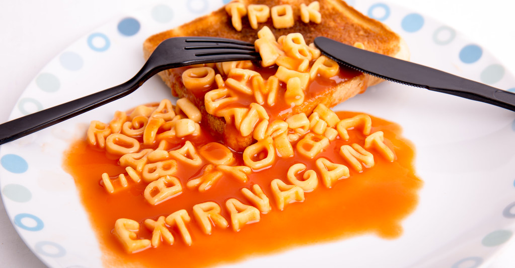
Extravagent: Another cool idea which you set up nicely. The use of plactic utensils is a nice touch to further reinforce your message. Like it a lot!
 
I really like that Dean! Great highlights on the "spaghetti" and I also really like the use of the plastic cutlery - it may also help with the lighting as you're dealing with black semi-gloss rather than shiny nasty metal. Great job: a clever take and look forward to seeing your week 52!
 
Now then matey.....you all ready for the big ho ho ??

nonsense...brilliant idea & well executed ,big thumbs up to Jo for assisting again :clap: Have to admit that high heels would just have added another dimension :D

Extravagant.... simply brilliant idea ,simple but effective ,love the use of plastic cutlery as well ,no crit from me ,just a big :clap::clap:
 
I think thats as far removed from extravagant is is possible to be. :LOL:

Well taken though, just enough shiny highlights to give a bit of shape to the letters, great colour on the sauce and the cropped edges working well here too.

(Did you bring highlights / whites) down in LR much?? I wonder if having the aforementioned highlights brighter on the shapes would give it a bit more pop?

Nice use of letters for the watermark..... shame you cant save that as a brush and use it on all next years images!! :LOL:
 
Hi DK

Smooth: First one for me. Feel the finger helps add some context and also helps create 3 layers of interest (finger, sandpaper, wood). Shapness and DOF across all three is really good.
Thanks Jason :)

Attached: Yup good idea for this subject. Like the abstract feel to it though would also like to see what a mono conversion without the warm tones looks like.
Will add that to my 'To do when I can list'... it is getting a bnit long though :D

Energy: Really hard to choose between the three of these. I like number one because this is the classic kind of picture I would expect to see on a website or magazine article about wind energy. Though the abstract devil in me would choose number too for the simple reason that I like how the column of the turbine makes a symmetrical exit out the bottom of the frame.
Thanks again Jason :)

to be continued........
Cool :D

Hi DK ...love the thinking behind this one ....not an easy theme is it...focus is spot on ...I like the TP OK in the background :)
Thanks Susie :)

Certainly wasn't an easy theme, went with my first thought, and it works okay for me :)

.......continued
YAY !!!

Round: Have to agree with others that it lacks somethings. For me its not the lack of subject but rather lack of sharpness on the bokeh ball edges I think.
Ooooo I see what your saying, maybe because I had to manual focus as I had nothing in the foreground to latch onto ??

Nonsense: Liked this the first time I saw it and smiled so hard too. Just an all round brilliant idea for the week (y) Just the vacume would of been enough but the inclusion of heels is a stroke of genius (or is that madness). I think it works even better because we can cleary see that the act of walking looks a little awkward. :)
Thanks yet again :)

Moment of madness for sure - Mrs DK's double take was one to remember when I asked her :D

Extravagent:
Another cool idea which you set up nicely. The use of plactic utensils is a nice touch to further reinforce your message. Like it a lot!
Cheers :)

I wanted to use a paper plate but had none, hunted around and found plastic picnic set but they were orange :bang:
 
Hi Dk, you are extravagant alphabetti spaghetti, get you :p its a good take on the theme very amusing :ROFLMAO:
Cheers Allan :D

I really like that Dean! Great highlights on the "spaghetti" and I also really like the use of the plastic cutlery - it may also help with the lighting as you're dealing with black semi-gloss rather than shiny nasty metal. Great job: a clever take and look forward to seeing your week 52!
Thanks a lot Paul :)

Now then matey.....you all ready for the big ho ho ??
Well... no not really :LOL:

Are you young lady ??

nonsense...brilliant idea & well executed ,big thumbs up to Jo for assisting again :clap: Have to admit that high heels would just have added another dimension :D
Hopefully I can squeeze them into another theme :D

Extravagant.... simply brilliant idea ,simple but effective ,love the use of plastic cutlery as well ,no crit from me ,just a big :clap::clap:
Cool - Thanks Lynne :)

I think thats as far removed from extravagant is is possible to be. :LOL:
That's what I thought :D

Well taken though, just enough shiny highlights to give a bit of shape to the letters, great colour on the sauce and the cropped edges working well here too.
Thanks :)

(Did you bring highlights / whites) down in LR much?? I wonder if having the aforementioned highlights brighter on the shapes would give it a bit more pop?
Oooooo let me go look... Highlights are on '0' whites are on +34, I see what you mean, I p[ushed the highlights right up and not alot happened to be fair, apaart from loosing plate edge detail :)

Nice use of letters for the watermark..... shame you cant save that as a brush and use it on all next years images!! :LOL:
Was hoping people would spot it... and what a GREAT idea, the letters with a splodge of sauce, now how on earth do I do that :thinking:
 
Oooooo let me go look... Highlights are on '0' whites are on +34, I see what you mean, I p[ushed the highlights right up and not alot happened to be fair, apaart from loosing plate edge detail :)

Ahhh cool. As I said to Alan t'other day, nothing wrong (to me) with throwing the sliders all the way up and down and seeing what happens... Its what I do. :)
 
Ahhh cool. As I said to Alan t'other day, nothing wrong (to me) with throwing the sliders all the way up and down and seeing what happens... Its what I do. :)
Me too mate, I often whack the auto button first, see what that does, play with a few, reset and then play again myself :D
 
Morning DK, I'll have you know when I was a kid, if we got alphabet spaghetti we thought we were posh! :p :D

Great thinking behind the image, as Lynne mentioned, nice touch with the plastic Knife and fork (y)

Well spotted Susie @susiejb , I hadn't noticed the 'TP OK' at the top of the image :)...........mind, spelling never has been my strong point
3f82d.gif
:D
 
Hi DK

Nonsense- certainly is (y) Good comp, moving away and the flat bit at rear, very simple and very effective. Top shot.
Must admit tho that I am a bit perplexed by all the other comments about how good, patient etc is Mrs DK when it is obviously your way of getting a selfie in :exit:

Extravagance - more humour - a nice smiley pic and love the complementary parts of the cheap and cheerful spaghetti and plastic implements.
 
Hi DK

Nonsense- certainly is (y) Good comp, moving away and the flat bit at rear, very simple and very effective. Top shot.
Must admit tho that I am a bit perplexed by all the other comments about how good, patient etc is Mrs DK when it is obviously your way of getting a selfie in :exit:
DAMN... caught me :LOL:

Extravagance - more humour - a nice smiley pic and love the complementary parts of the cheap and cheerful spaghetti and plastic implements.
Cheers buddy :)
 
A fun idea, well composed and I love the addition of the plastic knife and fork to make it look REALLY extravagant :D
 
Well here we go then...

I hope these do not offend anybody, but knowing the current 52 I doubt you will mind at all :)

and while I am here I'd also like to thank my wonderful wife again for her support throughout this year again with my hobby and frequest requests to model for shots :)

I wanted to do something a little different, I thought of this quite quickly, and Mrs DK was all too pleased to get the new 'prop' in the boxing day sales :)

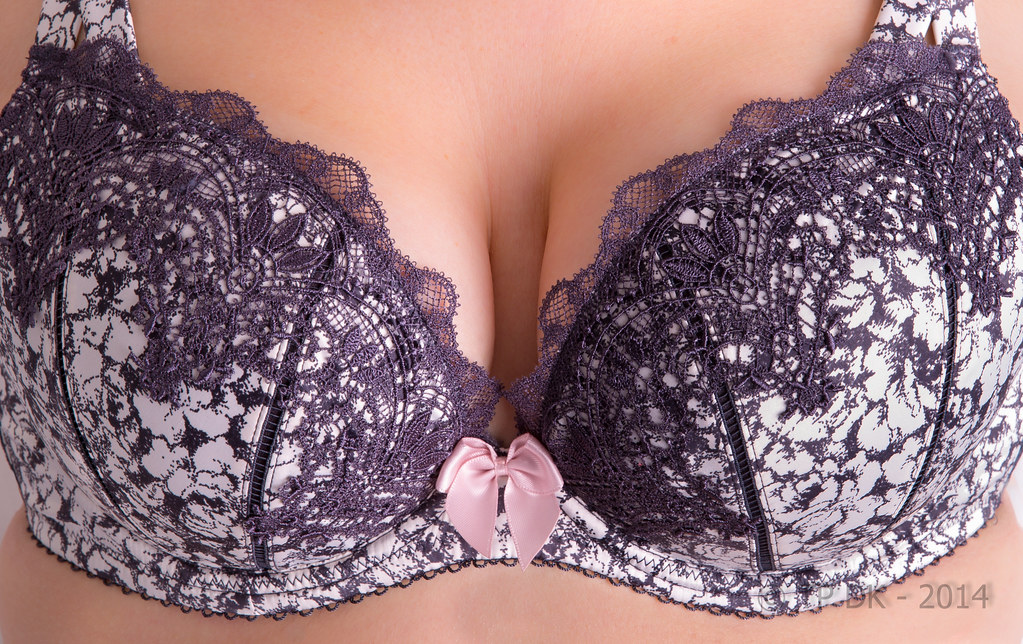
But... Mrs DK has been ill in bed for the last couple of days so has delayed our efforts. This is as you can guess playing with my lights again, I only have a 2 light set up, I set a shoot through brolley high up shooting down on left hand to help fill/lighten shadows and light the background... and the main light which was my way too big soft box, that I put as low as possible and aimed it up to help keep some definition, with the lights straight on and/or too high it removed some shape if you know what I mean :thinking:

Anyway this first shot was one of the first shots I did, it was just a 'Warm Up' shot to get the lighting levels right, but I really liked the inclusion of the red cardigan so I have kept it, yes the top is not evenly spread but seems this was a practice again I'm happy with that, so here we have...

Wk 52 - underwired 'Support'

Wk 52 - Support 2 by TP DK, on Flickr

Here in my second shot is the shot I set out to get, I was aiming for even light (Even though it was coming from one side) and detail, overall I'm pretty happy with the results, BUT would love some suggestions from anybody that is good with very basic studio lighting, Paul, Peter etc. spring to mind who use them also from time to time :)


Wk 52 - Support by TP DK, on Flickr
 
Well DK - I am not an expert on lighting but i can see nothing wrong with #1 - highlights, shadows, detail , colour - it has got it all for me. And IMO much the better pic than #2. It fulfills the theme but has a much softer, relaxed feel to it . The inclusion of the cardigan helps a lot to achieve this relaxed look. Well done both to you and Mrs DK. Happy New Year
 
Well DK - I am not an expert on lighting but i can see nothing wrong with #1 - highlights, shadows, detail , colour - it has got it all for me. And IMO much the better pic than #2. It fulfills the theme but has a much softer, relaxed feel to it . The inclusion of the cardigan helps a lot to achieve this relaxed look. Well done both to you and Mrs DK. Happy New Year
Thanks Alan :)

I too prefer the first shot, it does feel softer to me too and the extra splash of colour :)

All the best to you and your loved ones too mate (y)
 
Back
Top