weekly Jason's 52 in 2014 - SUPPORT Added - We've made it to the end together :-)

Jason... nice take for Promise (glad to see that wasn't any sort of vandalism on your / your model's part!)

Good DOF choice (focus just on the words, not the head of the statue) and pleasing background behind. Arm in from the side looks a bit contrived (you didn't add it in post did you ;) ?!) but not sure what else you could have done. Exposure good. Decent shot!
 
Hi, I like it, the writing has been put on really well, the arm looks a little added on but great idea :clap:
 
A great image Jason. I think the clouds provide a great backdrop for the building and would probably have made it even better if they had gone all the way up - although that wouldn't have made for such a pleasant family day out ;)
 
acttr
acttr
acttr
 
Jason... nice take for Promise (glad to see that wasn't any sort of vandalism on your / your model's part!)

Good DOF choice (focus just on the words, not the head of the statue) and pleasing background behind. Arm in from the side looks a bit contrived (you didn't add it in post did you ;) ?!) but not sure what else you could have done. Exposure good. Decent shot!

Thanks Paul.....All elements captured in camera, only thing added is the writing. Had to wait till no one was around as did'nt want any passerbys actually thinking we were spay painting the statue. THe model is my willing wife and the can actually some screen cleaner. THanks for your comment Paul (y)

Hi, I like it, the writing has been put on really well, the arm looks a little added on but great idea :clap:

Thanks Allan...Glad you like it.

A great image Jason. I think the clouds provide a great backdrop for the building and would probably have made it even better if they had gone all the way up - although that wouldn't have made for such a pleasant family day out ;)

Thanks Elaine for the comments...Was a taxing day out trying to manage the supervision of three kids, dripping ice-creams, fully loaded pushcair.......the list goes on :)
acttr
acttr
acttr
 
Sorry Jason, I'm working my way through the main thread and only just got to your Promise shot - must have confused you as to what I was commenting on I my previous post! Anyway, I think this one requires a teensy bit of a shoehorn to fit the theme, but a great shot nevertheless. Lovely textures to the statue and the oof focus building in the bg gives it good context.
 
Hi Jason....good to see that you're managing to keep up :) That's an interesting take for architecture, it has certainly stood for a very long time and is a testament to it's designer. I like the b&w it suits it really well.

I really love the idea behind promise, but the link of the word to the statue is just a tiny bit tenuous for me ...which is a shame as I really think it's a great idea and image.
 
Hi Jason

Promise - I am not sure of the connection between the statue and the graffiti - must be missing something. Good exposure and detail captured. Arm does look a bit stuck on but obviously not from your comments - weird. The orange line to the rear is a bit distracting. Would have been clever to have included some spray emanating from the canister.

EDIT - just read title and can see the link that you were trying to portray
 
Last edited:
Sorry Jason, I'm working my way through the main thread and only just got to your Promise shot - must have confused you as to what I was commenting on I my previous post! Anyway, I think this one requires a teensy bit of a shoehorn to fit the theme, but a great shot nevertheless. Lovely textures to the statue and the oof focus building in the bg gives it good context.

Thanks Elaine for your comments. they are appreciated

HI Jason - Promise like it nicely done good focus on the word promise captures the textures really nicely on the statue

Thanks Craig mate..the statue did indeed have this magnificant weathered texture

Hi Jason....good to see that you're managing to keep up :) That's an interesting take for architecture, it has certainly stood for a very long time and is a testament to it's designer. I like the b&w it suits it really well.

I really love the idea behind promise, but the link of the word to the statue is just a tiny bit tenuous for me ...which is a shame as I really think it's a great idea and image.

Thanks for stopping in Susie. :)

Hi Jason

Promise - I am not sure of the connection between the statue and the graffiti - must be missing something. Good exposure and detail captured. Arm does look a bit stuck on but obviously not from your comments - weird. The orange line to the rear is a bit distracting. Would have been clever to have included some spray emanating from the canister.
EDIT - just read title and can see the link that you were trying to portray

Thanks Alan for the super critque. I did think to add some spray but stopped short of this for fear of overcooking things - though after your comment Im deteremined to trying adding this to see how it looks. (y)
acttr
acttr
acttr
acttr
acttr
acttr
 
Week 33: "The tongue like a sharp knife....Kills withoug drawing blood"

Well I've gone and done it again by foregoing the oppurtunity to take a regular photo for this weeks theme. Felt like doing a composite and chose to base it on the above budda quote. No crit expected please, as base line pictures obtained from the web, though that said I have added my own additional elements and detailing. Thanks for looking.

“The tongue like a sharp knife... Kills without drawing blood.” by Jason Glyn, on Flickr


acttr
acttr
acttr
acttr
acttr
acttr
 
Hi, saw this yesterday and didn't comment till i had time to think about it, I like it as an image as it is quite intriguing took me a while to figure out the right hand object was a heart
not sure the writing needs to be there, but I can see why you have put it in,
still not sure what to say about it as it contains elements which obviously mean something to you, the forked tongue from the heart seems odd to me, but its interesting
it's nice to see something that makes you think
 
Hi Jason ...I've looked at this a few times too...those are powerful (and true) words and you've managed to create a very powerful image to go with them. Having seen the original images you've created such an excellent piece here, perfect choice of colour with the b&w, not too garish. The only thing that I would have liked was to have the actual quote on the image instead of those random words, it has certainly imprinted that quote in my mind.
 
Last edited:
"The tongue like a sharp knife....Kills without drawing blood"

like the sentiment, but ... not sure about the image [head scratching smiley]

I'm afraid it appears to be trying too hard to tell me something, and we know what that something is after reading the Buddhist quotation.

And Buddhist art is always over-the-top colourful.
 
Last edited:
Wow Jason, you don't want us to sit back and enjoy pretty but lifeless photos do you?!

Massively interesting composition but I'll be honest and say I don't get some parts of it (the tongue on the heart, for example)... but that's what makes it appealing :)

I think there's clearly some good skill that has gone into this - as well as a fascinating thought process and it's better as a result. I'd probably look at fixing the blood at the corner of the mouth but otherwise it's a very well done composite. Disturbing!! (y)
 
Hiya Jason, interesting (y), I've studied it quite a while, Have to be honest and say I wouldn't have got the connection :confused:

I can't add any more than has already been said but again,very good PP'ing skills :clap:
 
Hi, saw this yesterday and didn't comment till i had time to think about it, I like it as an image as it is quite intriguing took me a while to figure out the right hand object was a heart
not sure the writing needs to be there, but I can see why you have put it in,
still not sure what to say about it as it contains elements which obviously mean something to you, the forked tongue from the heart seems odd to me, but its interesting
it's nice to see something that makes you think

Hi Allan. Thanks for the comment. Really appreciate you've taken the time to think about it and return to comment. Thinking behind the tongue was that you have the snake entering the body though the mouth on the left (as thoughts and stimuli would prior to the event of fighting or killing) and then beginning to exit from the heart on the right. The exit 'wound' from the heart was meant to appear more explosive leaving the viewer in no doubt there has been death by piercing wound to the heart, which was ultimately casued by the words inciting hatred and killing. Budda comment probably kind of lost in this interpretation, though I guess like you say.....at the time I felt like it made sense to me

Hi Jason ...I've looked at this a few times too...those are powerful (and true) words and you've managed to create a very powerful image to go with them. Having seen the original images you've created such an excellent piece here, perfect choice of colour with the b&w, not too garish. The only thing that I would have liked was to have the actual quote on the image instead of those random words, it has certainly imprinted that quote in my mind.

Thanks Susie. I have to agree, true words for us all to ponder on. Glad you refer to it as not being to garish, I wanted a powerful image withought being to garish or dark so hopfully Its a success on that front. :)

"The tongue like a sharp knife....Kills without drawing blood"

like the sentiment, but ... not sure about the image [head scratching smiley]

I'm afraid it appears to be trying too hard to tell me something, and we know what that something is after reading the Buddhist quotation.

And Buddhist art is always over-the-top colourful.

Hi David. Thanks for the comments. I included the words in the picture so that it is also able to 'stand alone' without the quote being required to tell a story. You are probably right that in conjunction with the quote, it would appear to be trying to hard.

Wow Jason, you don't want us to sit back and enjoy pretty but lifeless photos do you?!

Massively interesting composition but I'll be honest and say I don't get some parts of it (the tongue on the heart, for example)... but that's what makes it appealing :)

I think there's clearly some good skill that has gone into this - as well as a fascinating thought process and it's better as a result. I'd probably look at fixing the blood at the corner of the mouth but otherwise it's a very well done composite. Disturbing!! (y)

Hi Paul. Thanks for the comments... must say I always enjoy your thoughtful and indepth comments (y) Have a look at the comments above where I've attempted to outline some of the though process thats gone into it.
acttr
acttr
acttr
acttr
acttr
acttr
 
Hiya Jason, interesting (y), I've studied it quite a while, Have to be honest and say I wouldn't have got the connection :confused:

I can't add any more than has already been said but again,very good PP'ing skills :clap:

Cheers Phil. Dont worry if you dont get the connection..... it probably is a bit too cryptic and only makes sense in me own head....

Nevertheless, a good oppurtunity to have a play with PS compositing skills which is where, at the moment, my real interest lies. Cheers (y)
 
Week 34: Pure

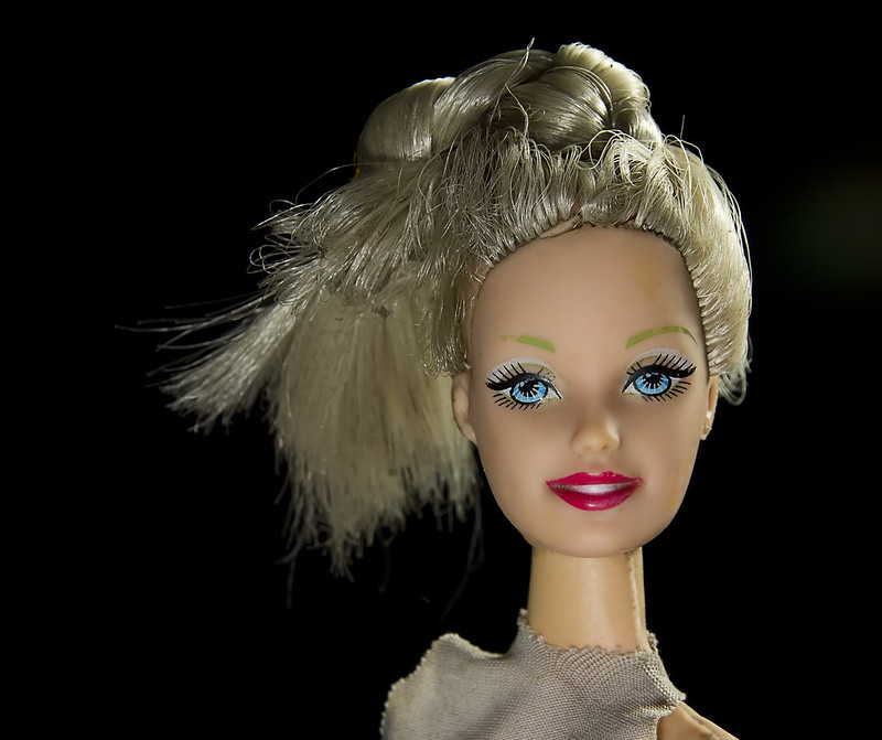
Barbie doll. The face of pure commercialism..... I mean how many variations of the same product could you possibly want?

Ironically I found this dolls head on an old exposed landfill site that I stumbled upon. I Cleaned up the face with healing tool but left everything else as found. Creates a kind of juxtaposition I think.


Pure 34/52 by Jason Glyn, on Flickr
acttr
acttr
acttr
 
Last edited:
Hey Jason :)

Half - I didn't quite get this, and now read the description I get what you were after but the contrast between the two colours isn't enough for me and/or there are way too many yellow compared to the other (Not Half) - Sorry... having said that the actual image is very nice :)

Architecture - Well done with the verticals, all nice and upright, crit wise I think the clouds are close to being over exposed by my monitor, other than that I like you leading line with the fallen stone work (y)

Promise - A good image and good use of the shoehorn, I think I need to borrow it with that theme :D - nice bright image and a great DoF :)

Sharp - Back to your excellent PP work, shame they are not your main images but still doesn't distract from your skills !!!

Pure - LMAO... love that image, great DoF again, wonderful colours and damn your other hobby is out of the closet now, you have done a great job of her hair :LOL:
 
Hi Jason.....you've put some interesting images on here lately.....I like the thought provoking idea behind them .....if it's not there intentionally, I certainly seem to manage to find it !!

I have about three large boxes of Barbie stuff here in my loft left over from the grandaughters ...they loved them, but quite naturally outgrew them. It's amazing that they've actually changed very little in many ways, but as you say the clever people behind them always manage to manipulate a subtle change that makes them a 'must have' .... very clever marketing indeed.

I like the choice of image ... would I like to have seen her looking a bit more dishevelled ...I'm not sure! Another very interesting and unique idea for the theme so well done once again.

( I read the article by the way....a very interesting magazine...echoes a lot of my own thoughts)
 
Hi Jason, quick comments from me this time... Pure made me smile a lot. I saw the image on the main thread and thought, "Pure? Barbie isn't very pure..." but then read your point about commercialism and you're spot on, of course. Perfectly on theme.

Lighting is super - obviously the matte face is a bit kinder to conditions than real skin, but you've still done a great job of keeping it 3D without any harsh shadows. I really like the lighting you've added on the hair - a super job on that front for me.

I wasn't convinced by the OOF hair at the back but after looking properly, I think it really does work to add further depth to the image... superb! (and a big black tick for the background - excellent). (y)
 
Hi, interesting take on the theme, i am not sure you should have cleaned up the face, on saying that its your pic and I respect your judgement
nicely lit and a good black BG
 
Hi Jason


Architecture...like the comp ,mono works well & good detail in the sky (y) Maybe pull some of the highlights in the clouds back in post ? & give it a slight contrast boost as it seems a little grey on my screen ?

Promise......was a little confused till I read your words but yeah , on theme , great DOF , sharp where it needs to be :) I'd be tempted do desat the orange line a smidge

Sharp....my 1st reaction was " wrong on many levels " ! But having read the quotation & other's comments it's growing on me. I certainly admire your PP skills after seeing the 2 original images....awesome . The tones & textures you've applied work perfectly after reading your description but it's an image that could give me nightmares :nailbiting: That heart is wonderful......would make a super image in it;s own right with the texture you applied (y)

Pure.....well lit , super black bg.....never had a Barbie & with somany young girls falling in to the trap of beliving that's what they should like I'm actually quite pleased I didn't have one ( but that's another discussion :) )
 
Hi, Barbie, you has me woried for a bit there ;) Interesting angle on the theme and I'm glad i never bought my daugher one of these. It has a wierdness to it.

Sharp, another interesting take and good composite/skills there.

Promise, that's a cracking sculpture. I like the idea and if you managed to 'shop the Promise on I'm impressed. The hand looks a little fake, was this 'shopped in??

Overall, I do like your thinking.

Cheers.
 
Didnt really "get" promise, but applaud the skill in making the sprayed text there.

Again the only thing that anyone could mark you down for is the use of stock images. But if you're open and honest about that from the start then its a moot point. The combining if these becomes even more impressive once you see the base images you worked from. once again combined seamlessly.

loving Barbie though, even down to the little tilt of the head. great lighting and clean up of the face. cracking detail in the hair, even down to the plugs where it goes into her head. Black BG works here and the OOF ponytail emphasises the sharpness on the face.
 
Hi Jason
Sharp - not the kind of image that draws my interest - sorry . Good photoshop skills tho to produce the image from the 2 that you have referred us to.
Pure - works with your explanation. But even as a shot it is super of the doll. Good colour and detail and comp. Excellent black b/g. Lighting is brilliant. :clap:
 
Hey Jason :)

Half - I didn't quite get this, and now read the description I get what you were after but the contrast between the two colours isn't enough for me and/or there are way too many yellow compared to the other (Not Half) - Sorry... having said that the actual image is very nice :)

Architecture - Well done with the verticals, all nice and upright, crit wise I think the clouds are close to being over exposed by my monitor, other than that I like you leading line with the fallen stone work (y)

Promise - A good image and good use of the shoehorn, I think I need to borrow it with that theme :D - nice bright image and a great DoF :)

Sharp - Back to your excellent PP work, shame they are not your main images but still doesn't distract from your skills !!!

Pure - LMAO... love that image, great DoF again, wonderful colours and damn your other hobby is out of the closet now, you have done a great job of her hair :LOL:

Hi DK, Thanks very much for the "catch up" on comments. Really appreciated it and hope to visit you thread soon to reciprocate. Regarding Pure, glad you like the hair, took me a while :)

Hi Jason.....you've put some interesting images on here lately.....I like the thought provoking idea behind them .....if it's not there intentionally, I certainly seem to manage to find it !!

I have about three large boxes of Barbie stuff here in my loft left over from the grandaughters ...they loved them, but quite naturally outgrew them. It's amazing that they've actually changed very little in many ways, but as you say the clever people behind them always manage to manipulate a subtle change that makes them a 'must have' .... very clever marketing indeed.

I like the choice of image ... would I like to have seen her looking a bit more dishevelled ...I'm not sure! Another very interesting and unique idea for the theme so well done once again.

( I read the article by the way....a very interesting magazine...echoes a lot of my own thoughts)

Hi Susie, thanks for taking the time to comment, and I agree with everything you say regarding the marketing.....makes the world tick now days. Glad too that you read the article....kind of thought provoking hey

Hi Jason, quick comments from me this time... Pure made me smile a lot. I saw the image on the main thread and thought, "Pure? Barbie isn't very pure..." but then read your point about commercialism and you're spot on, of course. Perfectly on theme.

Lighting is super - obviously the matte face is a bit kinder to conditions than real skin, but you've still done a great job of keeping it 3D without any harsh shadows. I really like the lighting you've added on the hair - a super job on that front for me.

I wasn't convinced by the OOF hair at the back but after looking properly, I think it really does work to add further depth to the image... superb! (and a big black tick for the background - excellent). (y)

Wow, For a quick comment, that certainly in in-depth.... lol. Thanks for that Paul, appreciate it. Yeah have to agree, hightlight (off -camera flash worked a treat on the hair) (y)

Hi, interesting take on the theme, i am not sure you should have cleaned up the face, on saying that its your pic and I respect your judgement
nicely lit and a good black BG

Thanks Allan.....Yeah, I have photographed this 'model' before, when I initially found her on the dump, and she looked almost, dare I say it, DEAD - and to be honest I took a lot of flack for that, many people saying it was not an 'appropriate' image. - I have to admit I did think, well its just a doll......Just goes to show how peoples perceptions (or misinterpretation) of things have changed with the times.

Hi, Barbie, you has me woried for a bit there ;) Interesting angle on the theme and I'm glad i never bought my daugher one of these. It has a wierdness to it.

Sharp, another interesting take and good composite/skills there.

Promise, that's a cracking sculpture. I like the idea and if you managed to 'shop the Promise on I'm impressed. The hand looks a little fake, was this 'shopped in??

Overall, I do like your thinking.

Cheers.

Thanks Andy, Appreciate the comments. Ref the promise sculpture. The hand is as shot in camera, only the sprayed text is shopped in. I used a displacement map tutorial for this. click the arrow to see it -------->

Didnt really "get" promise, but applaud the skill in making the sprayed text there.

Again the only thing that anyone could mark you down for is the use of stock images. But if you're open and honest about that from the start then its a moot point. The combining if these becomes even more impressive once you see the base images you worked from. once again combined seamlessly.

loving Barbie though, even down to the little tilt of the head. great lighting and clean up of the face. cracking detail in the hair, even down to the plugs where it goes into her head. Black BG works here and the OOF ponytail emphasises the sharpness on the face.

Thanks Graham for the comments. Im impressed that you noticed the slight tilt to Barbies head, was something I intentionally (though subtly) wanted to incorportate (y)

Hi Jason
Sharp - not the kind of image that draws my interest - sorry . Good photoshop skills tho to produce the image from the 2 that you have referred us to.
Pure - works with your explanation. But even as a shot it is super of the doll. Good colour and detail and comp. Excellent black b/g. Lighting is brilliant. :clap:

Hi Alan. Thanks for the comments as always. Regarding, the black background, I had to shoot this in a pitch black room, with 2 x off-camera flash, one front (head on) and one back right (slight raised) (y)
acttr
acttr
acttr
acttr
 
Last edited:
Week 35: sparkle

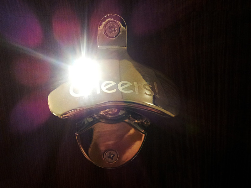
I was staying away in the hotel this week and there was this bottle opener in the room. If I caught the light just right, it made this sparkling burst effect. Captured with my mobile phone. No photoshoppery this week, only some minor post processing such as, lens correction, contrast boost, saturation boost. As always, thanks for looking and no comments expected. (y)

I did toy with removing the the joint line, mostly visible top left, but just ended up leaving it


Sparkle 35/52 by Jason Glyn, on Flickr
 
Last edited:
Hi Jason

Well done for capturing that with a mobile phone - impressive pieces of kit these days, aren't they? Also interesting to know that yours has 6 aperture blades.

I think all things considered, you've done well - I'm not sure how small the apertures on these things can be closed down to really get a strong starburst?

In terms of the image, I feel the highlight is just a bit too big, but under the circumstances I wouldn't be too critical of that. The subject is well captured and exposed in some difficult conditions and obviously focus is spot on. Reflections are very well managed.

I'd say an ok "dslr" shot but an excellent camera phone one - well done!
 
Good enough Jason. (y)

You go above and beyond the required amount of effort a lot of the weeks, this won't affect your average too much. :)
 
I's agree with Paul, it really is amazing what you can do with a mobile phone these days. I watched a Youtube video yesterday when they tested all manner of lenses - macro and wide angle!

The sparkle is just a little over powering, but the detail is nice.

Cheers.
 
Hi Jason

Well done for capturing that with a mobile phone - impressive pieces of kit these days, aren't they? Also interesting to know that yours has 6 aperture blades.

I think all things considered, you've done well - I'm not sure how small the apertures on these things can be closed down to really get a strong starburst?

In terms of the image, I feel the highlight is just a bit too big, but under the circumstances I wouldn't be too critical of that. The subject is well captured and exposed in some difficult conditions and obviously focus is spot on. Reflections are very well managed.

I'd say an ok "dslr" shot but an excellent camera phone one - well done!

Thanks Paul, Really comprehensive and informative crit from you as always Cheers (y)

Good enough Jason. (y)

You go above and beyond the required amount of effort a lot of the weeks, this won't affect your average too much. :)

Lol...Thanks Graham

I's agree with Paul, it really is amazing what you can do with a mobile phone these days. I watched a Youtube video yesterday when they tested all manner of lenses - macro and wide angle!

The sparkle is just a little over powering, but the detail is nice. Cheers.

Thanks Andy. I thought the details such as gold and purple colours gave it a nice 80's night club feel :)

Hi Jason ....now that is very sparkly :) bang on for the theme ...amazing what you can do with the mobile phone isn't it.

Thanks Susie....handy little things aent they.....always makes me think of the time before mobile phones....how the heck did we manage? Quite often I find myself wishing we could go back to those days of having no mobile phones and Sat Navs etc
 
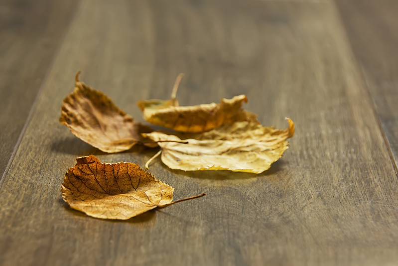
I did consider using the Americanism as well :)

Lovely textures in the table. I did wonder whether the table worked as well as outside, but I feel you made the right decision.

I did a quick all around crop and felt it drew the eye more to the leaves. I'd like the front end on the front leave in focus. Minor points on a pleasing submission.

Cheers.
 
Back
Top