
You are using an out of date browser. It may not display this or other websites correctly.
You should upgrade or use an alternative browser.
You should upgrade or use an alternative browser.
weekly Jason's 52 in 2014 - SUPPORT Added - We've made it to the end together :-)
- Thread starter JasonGlyn
- Start date
- Messages
- 4,182
- Name
- Paul
- Edit My Images
- Yes
Lovely shot Jason. Really nice texture and light coming through those leaves. Would a shallower light source (e.g. setting sun?) give longer shadows under the leaves - that might work well? However, I do really like it and it's a very elegant take on the theme. The wood table / floor is lovely. DOF spot on for me
Great spot.
Great spot.
- Messages
- 4,088
- Name
- Graham
- Edit My Images
- Yes
lovely leaves, absolutely dry and crisp and autumnal.
Nice just fallen look to them too. And the processing (development of the RAW file we should maybe term it), has really given it a big lift.
Guessing this was shot inside (from the SOOC), but the posted version has a real feel of actually being out in nice evening light.
Nice just fallen look to them too. And the processing (development of the RAW file we should maybe term it), has really given it a big lift.
Guessing this was shot inside (from the SOOC), but the posted version has a real feel of actually being out in nice evening light.
- Messages
- 8,398
- Name
- Lynne
- Edit My Images
- Yes
HI Jason
Fall.......love this shot , warm autumn colors , perfect bg for the leaves ,well lit & positioned....cold see this as a series of 3 in frames
Sparkle......agree with other comments & amazed at what a phone can do....unless it's a blackberry of course , in which case the camera is pretty much redundant
- Messages
- 9,095
- Name
- Mandy
- Edit My Images
- Yes
Hi sorry I haven't popped in for a while but been without broadband for a while, but I am back now and frantically trying to catch up on stuff. You have some pretty good takes on the themes in here, sorry I can't comment on them all.
Fall - I love the composition and the image fits the theme perfectly, nice sharp clear image nicely done.
Fall - I love the composition and the image fits the theme perfectly, nice sharp clear image nicely done.
- Messages
- 13,760
- Edit My Images
- Yes
Hi Jason
Sparkle - Now that IS a shine and a half, a cracking sparkly starburst, my OCD want's the screws aligned though lol, joking aside... very to the point this one and some great colours going on
Fall - Excellent DoF on this mate, the colours and lighting work perfectly for me, along with the detail and lines in the timber - really nice
- Messages
- 6,502
- Name
- Peter
- Edit My Images
- Yes
Loud - Nice compilation of images to fit the theme. There's a bit of an edge around the cut out below the arms but other than that I like it
Rich - I feel this is more of a text poster than an image but it gets though the week's submission
Skill - Absolutely love this one. The lighting, DOF and positioning of the cuddly toy are all spot on. Big thumbs up from me
Half - I had to read your write up to see the connection with the theme. A nice picture of some roses but feel it is missing something I'm afraid.
Architecture - There's loads of detail in this shot. Great focus and conversion. I keep looking around the image and seeing more detail.
- Messages
- 6,502
- Name
- Peter
- Edit My Images
- Yes
Catching up part 2.....
Promise - I agree with some others' comments about the arm but like the slight drips on the writing which adds to the realism
Sharp - There's lots in this image. I can imagine you spent a bit of time in front of Photoshop to get the final result. Imaginative thinking.
Pure - Nice idea - Super sharp and well lit. The off centre composition works well.
Sparkle - I know you've added this as a SOOC shot but I feel it would have benefited from reduce the brightness of the reflection. Nice purple and gold colours though
Fall - You've captured some lovely textures in this one - both in the leaves and the wood. The shallow DoF is super.
OP
- Messages
- 868
- Name
- Jason
- Edit My Images
- Yes
I did consider using the Americanism as well
Lovely textures in the table. I did wonder whether the table worked as well as outside, but I feel you made the right decision.
I did a quick all around crop and felt it drew the eye more to the leaves. I'd like the front end on the front leave in focus. Minor points on a pleasing submission. Cheers.
Thanks Andy. I did toy with a crop but left as is for a greater sense of scale I feel. Thanks for your comments as always
Hi, nice simple image which works well, focus is spot on for me and a good composition. slight crit the lines on the table sort of catch my eye a little
Cheers Allan..I see what you mean about the lines....bit of a marmite one I think ?
Lovely shot Jason. Really nice texture and light coming through those leaves. Would a shallower light source (e.g. setting sun?) give longer shadows under the leaves - that might work well? However, I do really like it and it's a very elegant take on the theme. The wood table / floor is lovely. DOF spot on for me. Great spot.
Cheers Paul. "Elegant" works for me
. Good idea about light source being lower - I can see that working well lovely leaves, absolutely dry and crisp and autumnal.
Nice just fallen look to them too. And the processing (development of the RAW file we should maybe term it), has really given it a big lift.
Guessing this was shot inside (from the SOOC), but the posted version has a real feel of actually being out in nice evening light.
Hi Graham...your're spot on. THis was shot inside. Window light from the back and a gold reflector to the front to lift the shadows
HI Jason
Fall.......love this shot , warm autumn colors , perfect bg for the leaves ,well lit & positioned....cold see this as a series of 3 in frames
Sparkle......agree with other comments & amazed at what a phone can do....unless it's a blackberry of course , in which case the camera is pretty much redundant
Thanks Lynn for your comments as always. Proud to say I've never owned a blackberry
This was shot on my wifes hand me down - Samsung Galaxy S2Hi Jason...I'm loving the slowly changing colours for autumn.......you've managed to create a lovely feeling of natural light there in your PP...very nicely done
THanks Susie...I agree that it has a nice warm feel to it. Now that I think about it, I did add some extra warmth (apart from the gold reflector) using color efex.
Hi sorry I haven't popped in for a while but been without broadband for a while, but I am back now and frantically trying to catch up on stuff. You have some pretty good takes on the themes in here, sorry I can't comment on them all.
Fall - I love the composition and the image fits the theme perfectly, nice sharp clear image nicely done.
THanks Mandy. Had too apply a huge amount of sharpening as SOOC was'nt quite right. Hopefully I've not overcooked it ??
Loud - Nice compilation of images to fit the theme. There's a bit of an edge around the cut out below the arms but other than that I like it
Rich - I feel this is more of a text poster than an image but it gets though the week's submission
Skill - Absolutely love this one. The lighting, DOF and positioning of the cuddly toy are all spot on. Big thumbs up from me
Half - I had to read your write up to see the connection with the theme. A nice picture of some roses but feel it is missing something I'm afraid.
Architecture - There's loads of detail in this shot. Great focus and conversion. I keep looking around the image and seeing more detail.
Catching up part 2.....
Promise - I agree with some others' comments about the arm but like the slight drips on the writing which adds to the realism
Sharp - There's lots in this image. I can imagine you spent a bit of time in front of Photoshop to get the final result. Imaginative thinking.
Pure - Nice idea - Super sharp and well lit. The off centre composition works well.
Sparkle - I know you've added this as a SOOC shot but I feel it would have benefited from reduce the brightness of the reflection. Nice purple and gold colours though
Fall - You've captured some lovely textures in this one - both in the leaves and the wood. The shallow DoF is super.
Hi Peter....Thank you very much for your in-depth catchup. Always value your feedback. Will visit your page soon. Thanks again
Loud - Well spotted Peter...no getting past you
Rich - yup...just wanted to get throught the week....sadly another one on the way for communication
Half - I agree, not one of my proudest moments
Sparkle - Colours are my fav part too, and agree the sparkle should have been toned down a little
Last edited:
OP
- Messages
- 868
- Name
- Jason
- Edit My Images
- Yes
Week 37: Communication
Well, I must say I've been thinking again about packing in this years challange. Im struggling to find the time to comment on threads and I dont feel its right or in the proper spirit of the challange to continue, especially when you kind folks continue to comment on my thread.
That said....I'm going to keep trying and aim to catch-up on one thread per night going forwards
THis weeks theme is another text poster, just so that I can stay in the game.....A bit of blurb on composition elements below
Background = Pastel Grey (#CFCFC4)
Communication added as a text layer in PS. Slight change to perspective and added drop shadow using Alien Skin add-in.
'is' shred of paper actually photographed by my fair hand (look at me go). drop shadow added using Alien Skin add-in.
Key is ripped from the internet. drop shadow added using Alien Skin add-in.
Finished with silver efex, overexposed preset and border added using the same.
Job done.....for a quick submission this week
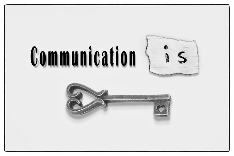 Communication is Key by Jason Glyn, on Flickr
Well, I must say I've been thinking again about packing in this years challange. Im struggling to find the time to comment on threads and I dont feel its right or in the proper spirit of the challange to continue, especially when you kind folks continue to comment on my thread.
That said....I'm going to keep trying and aim to catch-up on one thread per night going forwards
THis weeks theme is another text poster, just so that I can stay in the game.....A bit of blurb on composition elements below
Background = Pastel Grey (#CFCFC4)
Communication added as a text layer in PS. Slight change to perspective and added drop shadow using Alien Skin add-in.
'is' shred of paper actually photographed by my fair hand (look at me go)
. drop shadow added using Alien Skin add-in.Key is ripped from the internet. drop shadow added using Alien Skin add-in.
Finished with silver efex, overexposed preset and border added using the same.
Job done.....for a quick submission this week
Communication is Key by Jason Glyn, on Flickr- Messages
- 4,088
- Name
- Graham
- Edit My Images
- Yes
Hey Jason, you won't be alone in having thought it'll be easier to stop than to carry on this year.. Only 14 weeks to go and between 10 and 20 submissions each week. But obviously you must do what's right for you.
I don't have a problem with this 'type' of submission, is exactly the sort of image i wouilkd want if i were looking for a motivational poster for my locksmith company or prison.
I guess as testament to your skill my first thought wa surely it would have been easier to simply photgraoph a key on white paper with your handwritten note ( as you shot that anyway) and then add the text as it looks exactly like that is what you have done.
- Messages
- 19,461
- Name
- Andy
- Edit My Images
- Yes
Hi, keep at it...
I'm a fan of borders so the subtle one works for me. I like the drop shadows and I can see where Graham is coming from, but I for one have terrible writing so would have opted for PSing.
The only crit I have is minimal and that's on the key, I'd like it a little more contrasty.
Interesting key, though, and I like the heart on the key.
Cheers.
- Messages
- 19,461
- Name
- Andy
- Edit My Images
- Yes
No no no.... Having "communicate" hand written would look pants.
Just the "it" I was referring to.
No....no...no....
I was not referring to communicate, I was referring to the 'is' unless there is an invisible 'it' in there
Cheers.
OP
- Messages
- 868
- Name
- Jason
- Edit My Images
- Yes
Hey Jason, you won't be alone in having thought it'll be easier to stop than to carry on this year.. Only 14 weeks to go and between 10 and 20 submissions each week. But obviously you must do what's right for you.
I don't have a problem with this 'type' of submission, is exactly the sort of image i wouilkd want if i were looking for a motivational poster for my locksmith company or prison.
I guess as testament to your skill my first thought wa surely it would have been easier to simply photgraoph a key on white paper with your handwritten note ( as you shot that anyway) and then add the text as it looks exactly like that is what you have done.
Hi, keep at it...
I'm a fan of borders so the subtle one works for me. I like the drop shadows and I can see where Graham is coming from, but I for one have terrible writing so would have opted for PSing.
The only crit I have is minimal and that's on the key, I'd like it a little more contrasty.
Interesting key, though, and I like the heart on the key.
Cheers.
You both make me smile.......nice to have some dialogue going on the thread.....glad we all agree on the hand written "is" element
OP
- Messages
- 868
- Name
- Jason
- Edit My Images
- Yes
Hi Jason ...I hope you don't give up, I always enjoy seeing your posts including this one. The commenting is time consuming and I appreciate not everyone has that free time available. I hope you hang on in there
Thanks Susie, I'm going to try....just does'nt feel right though when I dont input enough into others threads....but I want to try give a last push to catch up some comments. Thanks for your on-going support
OP
- Messages
- 868
- Name
- Jason
- Edit My Images
- Yes
Week 38: Dark
Some fortuitous timing offered up this weeks theme. We spent 5 days in Paris in the week just gone (dont care what anyone says; I LOVE IT) and whilst there we visited the catacombes de Paris....I have always wanted to visit this 'attraction' and once inside (and after queing 3 hours) I dont know how I felt about being there.....
Heres a link to some general background info on the catacombes if interested ---------->
 Dark by Jason Glyn, on Flickr
Some fortuitous timing offered up this weeks theme. We spent 5 days in Paris in the week just gone (dont care what anyone says; I LOVE IT) and whilst there we visited the catacombes de Paris....I have always wanted to visit this 'attraction' and once inside (and after queing 3 hours) I dont know how I felt about being there.....
Heres a link to some general background info on the catacombes if interested ---------->
Dark by Jason Glyn, on Flickr
Last edited:
- Messages
- 1,409
- Name
- Elaine
- Edit My Images
- Yes
I definitely don't want to go there! But you've captured the atmosphere perfectly and it's a great shot.
- Messages
- 9,095
- Name
- Mandy
- Edit My Images
- Yes
I am a little late to the party of comments again, two fantastic images for the themes.
- Messages
- 13,760
- Edit My Images
- Yes
Hey Jason
Keep at it mate, we all go through busy patches and there is no essential commenting, just get out with your camera and do your shots, pop on the main thread and let us know your still here and comment when you can, I'm sure nobody will be offended unless you never visit them, as you say, One a night and you soon get around everybody, there is few of us left
Communication - Great for the theme, Some of your own photography in it, dong what you do VERY well, and you're still in it... tick
Dark - Oooooo creepy, great light showing plenty of detail, I think a bit of vignette would work with this one to help focus the tomby look, looks like Mr & Mrs too, how eerily sweet
Last edited:
- Messages
- 8,398
- Name
- Lynne
- Edit My Images
- Yes
Hi Jason
keep hanging on in here...I've also felt like jacking in this year , mainly due to lack of time,playing catch up on comments every week & some pretty un-inspiring theme's ! But , we're so close to the end to stop now would be plain daft !!
Communicate.....on theme but not doing much for me I'm afraid , however it does show your great pp skills
Dark....really like this , super sharp with excellent detail on the bones & skull's.......love it When I 1st saw it I thought it was from the Church of Bones in the Czech republic,another fascinating place to visit if you get the chance
keep hanging on in here...I've also felt like jacking in this year , mainly due to lack of time,playing catch up on comments every week & some pretty un-inspiring theme's ! But , we're so close to the end to stop now would be plain daft !!
Communicate.....on theme but not doing much for me I'm afraid , however it does show your great pp skills
Dark....really like this , super sharp with excellent detail on the bones & skull's.......love it
When I 1st saw it I thought it was from the Church of Bones in the Czech republic,another fascinating place to visit if you get the chance
OP
- Messages
- 868
- Name
- Jason
- Edit My Images
- Yes
Wooooo ... very dark, don't think I want to go there.
Saying that, few people had there kids in tow
I definitely don't want to go there! But you've captured the atmosphere perfectly and it's a great shot.
Thanks Elaine. Appreaciate you taking a look
I am a little late to the party of comments again, two fantastic images for the themes.
Thanks Mandy
Hey Jason
Keep at it mate, we all go through busy patches and there is no essential commenting, just get out with your camera and do your shots, pop on the main thread and let us know your still here and comment when you can, I'm sure nobody will be offended unless you never visit them, as you say, One a night and you soon get around everybody, there is few of us left
Communication - Great for the theme, Some of your own photography in it, dong what you do VERY well, and you're still in it... tick
Dark - Oooooo creepy, great light showing plenty of detail, I think a bit of vignette would work with this one to help focus the tomby look, looks like Mr & Mrs too, how eerily sweet
Lol DK......did'nt think of them as a couple before....Now I cant stop
Hi Jason ....I don't know how I missed commenting on this one. Thanks for the link to the article, what a fascinating place. I can't imagine a better subject for the theme, an excellent choice of shot.
Agreed. A subject with a dark past....wish I was a witness to how the bodies were transported
Hi Jason
keep hanging on in here...I've also felt like jacking in this year , mainly due to lack of time,playing catch up on comments every week & some pretty un-inspiring theme's ! But , we're so close to the end to stop now would be plain daft !!
Communicate.....on theme but not doing much for me I'm afraid , however it does show your great pp skills
Dark....really like this , super sharp with excellent detail on the bones & skull's.......love it
yeah, I agree....would be plain daft at this late stage....just that I feel overwelmingly bad for not commenting on others threads. Would love to visit Czech one day...thanks for the tip off
OP
- Messages
- 868
- Name
- Jason
- Edit My Images
- Yes
Week 38:
Bob get a big head from his celebrity status......
Link to SOOC image here -------->
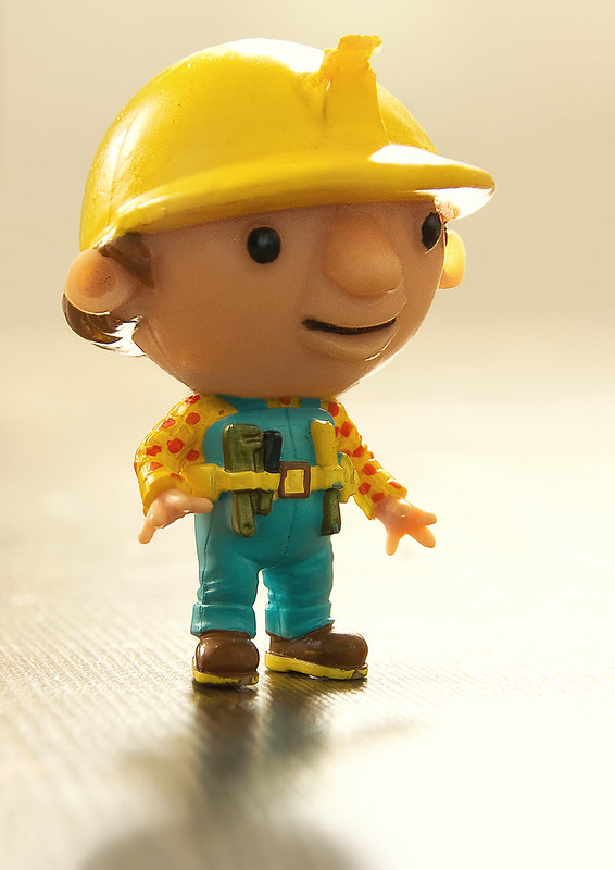 Bob gets a big head by Jason Glyn, on Flickr
Bob get a big head from his celebrity status......
Link to SOOC image here -------->
Bob gets a big head by Jason Glyn, on Flickr- Messages
- 1,409
- Name
- Elaine
- Edit My Images
- Yes
Just love it! Nothing else to say
- Messages
- 9,095
- Name
- Mandy
- Edit My Images
- Yes
Big - I love it very big head indeed lol, good composition nice fun image fir the theme.
- Messages
- 6,502
- Name
- Peter
- Edit My Images
- Yes
Communicate - The inclusion of the key (forgive me) is key to this working. Therefore the use of an interesting one strengthens this entry.
Dark - A gruesome find for the theme. It works well. I feel the exposure on the left hand skull just needs some adjustment as it is the brightest part of the image. Can't help but wonder what the N or Z mark is on the forehead.
Big - The back lighting works particularly well on this one. The shallow DOF works on the surface as well
- Messages
- 4,088
- Name
- Graham
- Edit My Images
- Yes
good spot for the skulls - suitably dark image for the theme,. Also rather intrigued by the mark of zorro on one of the skulls. Wider shot would have worked too I think, adding in all the leg bones inserted end on aroiund them just adds more intrigue to it. Fascinating.
Good fun take on Big with Big ed Bob there. Nicely shot and well transformed. Seamless.
Good fun take on Big with Big ed Bob there. Nicely shot and well transformed. Seamless.
- Messages
- 8,398
- Name
- Lynne
- Edit My Images
- Yes
Hi ya
fun take on the theme Jason , punchy colors & bright...not even adverse to the bright spots
fun take on the theme Jason , punchy colors & bright...not even adverse to the bright spots
OP
- Messages
- 868
- Name
- Jason
- Edit My Images
- Yes
Big, I do like these miniature toys and how they are used in photography.
Cracking idea, lovely punchy colours. Just the bright spots by way of crit.
Cheers.
Thanks Andy.....Yes, toys made a natural subject with 3 little kids in the house....lol
Just love it! Nothing else to say
Thanks Elaine
Big - I love it very big head indeed lol, good composition nice fun image fir the theme.
Thanks Mandy
Communicate - The inclusion of the key (forgive me) is key to this working. Therefore the use of an interesting one strengthens this entry.
Dark - A gruesome find for the theme. It works well. I feel the exposure on the left hand skull just needs some adjustment as it is the brightest part of the image. Can't help but wonder what the N or Z mark is on the forehead.
Big - The back lighting works particularly well on this one. The shallow DOF works on the surface as well
Thanks Peter......I have wondered about the marking on the skull too. none of the others had any markings like this ??
Thanks Susie...appreciate the comments
good spot for the skulls - suitably dark image for the theme,. Also rather intrigued by the mark of zorro on one of the skulls. Wider shot would have worked too I think, adding in all the leg bones inserted end on aroiund them just adds more intrigue to it. Fascinating.
Good fun take on Big with Big ed Bob there. Nicely shot and well transformed. Seamless.
Hi Graham, Agree about wider angle. Problem was the low light conditions as flash was not allowed. 50mm prime was my only chance at getting a half noise free image
Hi ya
fun take on the theme Jason , punchy colors & bright...not even adverse to the bright spots
Thanks Lynne. I like the bright spots too
OP
- Messages
- 868
- Name
- Jason
- Edit My Images
- Yes
Week 39: Cut
Running out of time again so could not try any of the staged pictures I'd planned, so settled for this.....perhaps a crowbar may be required - I'll let you decide
Link to SOOC image here ------->
[url=https://flic.kr/p/pmsq5z]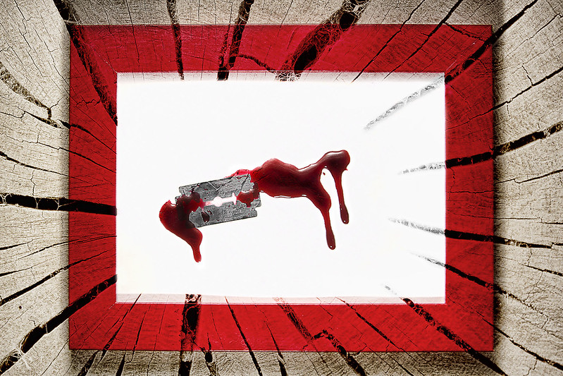 CUT by Jason Glyn, on Flickr[/URL]
Running out of time again so could not try any of the staged pictures I'd planned, so settled for this.....perhaps a crowbar may be required - I'll let you decide
Link to SOOC image here ------->
[url=https://flic.kr/p/pmsq5z]
 CUT by Jason Glyn, on Flickr[/URL]
- Messages
- 8,398
- Name
- Lynne
- Edit My Images
- Yes
Hi Jason
yup ,like that a lot....stark ,bold ,like the texture....thumbs up from me ( can't get smilies to work :-( )
yup ,like that a lot....stark ,bold ,like the texture....thumbs up from me ( can't get smilies to work :-( )
- Messages
- 13,760
- Edit My Images
- Yes
Here we go...
Big - Damn look at that, big head that sure is, great focus on this, the surface he is standing on shows the minimal DoF and that really works, nice little reflection too - Nice One
Cut - Great image, presuming the blade/blood is your work, I would like to see the drips dripping vertically rather than on the wonk, theme wise works well, PP wise excellent as usual, and the red inner frame works really well too
- Messages
- 4,834
- Name
- Alan
- Edit My Images
- Yes
Hi Jason
Communicate - an interesting use of the techniques and works well for the theme even tho the theme word is in there - it is the phrase that takes it out of the ordinary - and the shot of the key. Good work
Dark - good choice - like the lighting, partic how it graduates from left to right, so that there is a visual representation of dark as well as the subject matter. Good detail in the bones
Big - really like that - vivid colours, good pov and dof and the unusual backlight really makes it a bit out of the ordinary
Cut - another punchy, vivid interesting image. I like the contrast between the rectangle of the centre and the roundness of the log(?). My only crit would be that the splits in the log on the right hand side seep into the rectangle and fade away whereas to the left there is a sharp stop at the rectangle boundary