weekly Jason's 52 in 2014 - SUPPORT Added - We've made it to the end together :-)

Loud - I really like the composite because it's been put together so well (in terms of expression, choice of background etc.) and obviously the PP is very well done. All in all, it feels stronger than a "natural" shot would have done, which makes it thoroughly worthwhile.

Great work!
 
Hey Jason :)

Sorry, didn't realise I was so far behind with yours :coat:

A new born certainly takes up your time and energy if you are an active farther, but very rewarding at the same time I thought... good to see you still hanging on in here :)

History - Always been really impressed with your PP skills, and this image is no exception, have no idea how it is done, or how many elements are in there... but I really like the end result, super colours :)

Dreamy - A lovely image that, all the elements go together really well, my only crit would be the shadows but that's being picky... would look great mounted on a nursery wall as it is (y)

Vertical - Although my ocd is messing with the verticals here as to which is dead upright, again I really like this, real nice DoF, the background really brings the gates into context, some cracking detail in that timber, simple image but excellent :)

Yum - Damn now that is some fruit, looks a real gourmet, real nicely lit, super colours and well set up, the black background rounds it off nicely, really like that :clap:

Loud - What a great idea... and so well put together again, your young model is playing the part perfectly, again excellent PP skills !!!
 
Hi Jason
Sorry but have fallen behind on yours .

Wild - like the path, the way that it draws in the eye, the slightly oof figure, the portrait crop - just looks an unnatural green on my monitor
Dreamy - like the comp and particularly the choice of summery confectionery colours
Vertical - on them
Yum - very good lighting and background. The fruit is a lovely colour - very natural in my experience. Top shot(y)
Loud - no crit - like the expression and the whole concept, together with the implementation.
 
Hi, I do like the fruit shot nice strong colours
loud not sure i like the BG to be honest, its nicely done but not sure it needs to be so elaborate, good idea with your son though

Thanks for the comments Allan. I do appreciate you saying you're not a fan of the background. It is nice to gauge the differance's in opinion

Hiya Jason,

Yum, lighting, composition, colours, great shot, (y) the only thing to catch my eye and don't know why it bothered mi :thinking:...... was the crossing of the pear stalk and grape stalk top right :)

Loud- excellent :clap: :LOL:

Thanks mate....I see what you mean about the stalks.....does grab your attention somewhat

Loud, cracking expression and a good composite, technically. I'm just not sure about the BG.

Cheers.

Thanks Andy.....I'll chalk up another x in the 'not a fan of background' column' :)
 
Loud - I really like the composite because it's been put together so well (in terms of expression, choice of background etc.) and obviously the PP is very well done. All in all, it feels stronger than a "natural" shot would have done, which makes it thoroughly worthwhile.

Great work!
Loud - I really like the composite because it's been put together so well (in terms of expression, choice of background etc.) and obviously the PP is very well done. All in all, it feels stronger than a "natural" shot would have done, which makes it thoroughly worthwhile. Great work!

Thanks Paul. I agree with you ;) I didnt feel the shot of our son was a bad one on its own, but just wanted to lift it above the ordinary.....I did say at the start of my challange that this year is about playing with and improving my PS skills, especially composites - so thats the the thought process here. Thanks for the comments, much appreciated.

Loud - great take for the theme, and excellent use off pp skills well done.

Thanks Mandy

Hey Jason :)

Sorry, didn't realise I was so far behind with yours :coat:

A new born certainly takes up your time and energy if you are an active farther, but very rewarding at the same time I thought... good to see you still hanging on in here :)

History - Always been really impressed with your PP skills, and this image is no exception, have no idea how it is done, or how many elements are in there... but I really like the end result, super colours :)

Dreamy - A lovely image that, all the elements go together really well, my only crit would be the shadows but that's being picky... would look great mounted on a nursery wall as it is (y)

Vertical - Although my ocd is messing with the verticals here as to which is dead upright, again I really like this, real nice DoF, the background really brings the gates into context, some cracking detail in that timber, simple image but excellent :)

Yum - Damn now that is some fruit, looks a real gourmet, real nicely lit, super colours and well set up, the black background rounds it off nicely, really like that :clap:

Loud - What a great idea... and so well put together again, your young model is playing the part perfectly, again excellent PP skills !!!

Hey DK, thanks for the super catch (y) Appreciate the glowing comments

Hi Jason ....well done to your son for posing so perfectly :) I like the idea of the notes and the speaker, it's all blended seamlessly, great idea for the theme.

Thanks Susie for the comments... Hope to visit your page soon.

Hi Jason
Sorry but have fallen behind on yours .

Wild - like the path, the way that it draws in the eye, the slightly oof figure, the portrait crop - just looks an unnatural green on my monitor
Dreamy - like the comp and particularly the choice of summery confectionery colours
Vertical - on them
Yum - very good lighting and background. The fruit is a lovely colour - very natural in my experience. Top shot(y)
Loud - no crit - like the expression and the whole concept, together with the implementation.

Thanks Alan for the nice comments. For wild, everyone commented on the cool colours.....This was a result of finishing with Topaz labs adust 5, which has'nt works in this instance...lol

Loud ... that's just the perfect BG. :clap:

Thanks David....Glad you like the BG.....seems to have divided opinions 50/50
 
Week 28: Rich

Time is still at a premium and motivation and energy levels are at an all time low. I just didnt have the time to set up anything for this week so have gone for a poster type document created from scratch in PS - no photograpy involved in this one at all - so please, not comments required or expected. The thought process behind this one was just to play with Text and fonts in PS and I chose to try and recreate a picture I found on the web for an extra little dimension to the challange. The image I sought to recreate was this one .... here


Rich 28/52 by Jason Glyn, on Flickr
 
Last edited:
A good re-creation of the poster, bet it was harder than you might have imagined. :)
 
HI Jason


Love Loud...superb PP work , great choice of bg & a cracking shot of your lad to boot....:clap::clap:

Rich....lost on me I'm afraid though I agree with the sentiment
 
Hi, nicely done, lost on me too though I am sure it was lots of work
 
A good re-creation of the poster, bet it was harder than you might have imagined. :)
Thanks Graham....sure was a little trickier than anticipated.

HI Jason


Love Loud...superb PP work , great choice of bg & a cracking shot of your lad to boot....:clap::clap:Rich....lost on me I'm afraid though I agree with the sentiment

Thanks for the comments Lynne

Considering how busy you must be with your family that looks like a really good re- creation to me Jason, I like the textured text and the sentiment behind it.

Thanks For the comments Susie. Much appreciated they are...yup still all go on the baby front with no sign of settling down just yet :)

Hi, nicely done, lost on me too though I am sure it was lots of work

Cheers Allan for stopping in and commenting, (y)
 
Week 29: Skill

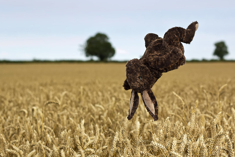
Harry Hare practices the skill of levitation.

I've always wanted to do a levitation shot.....I have no model at the moment unfortunately so had to settle for a soft toy, which lacks any interest factor :( . Rather than keep pondering, I thought I'd post it anyways so as not to fall behind. Thanks for looking all!

Skill by Jason Glyn, on Flickr
 
Hi Jason
Skill - this made me laugh, great take on the theme. Well composed and Dof is perfect for this. :clap:
 
Hi Jason
Skill - this made me laugh, great take on the theme. Well composed and Dof is perfect for this. :clap:

Thanks Richard...Glad it made you laugh :)

Hey Jason :)

Rich - Perfect for the theme, great PS work, but admittedly no photography so Mooooooving on :D

Skill - Now that I love, Great detail, such a fun idea, well focussed on Harry, great DoF, super background - Love it :clap:

Thanks DK. Shot the Harry pic in this field 20 min from home, got the pic and then beat a hasty retreat home.....only to find I'd left the tripod in the field......oops.....was still there when I went back to collect it luckily :)
 
Hi Jason... hope the family "job" is going well ;)

Rich - I really like your PP work here. No photo, but it's a good composition. Well done.

Skill - I'll be honest and lend you my crowbar here, but it's a neatly taken picture, great DOF and the wheat field looks brilliant with such shallow focus. Really nice and a good photo.

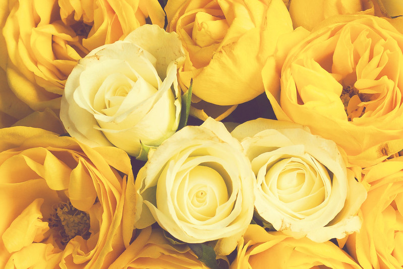
Half - Pretty picture, good shot but a bit lacking for me, colour-wise. I'd find the half theme a lot stronger if they were more contrasting colours. And you had the number of flowers exactly half and half. But otherwise good and given your time constraints you're doing very well to keep up!
 
Hi Jason I love Harry the Hare what a smashing original idea ...lovely dof on the barley, and Harry looks perfectly 'frozen' in the air.

For a quick post that's a really nice soft shot of the roses ... I like Paul's ideas above, but I know you are pushed for time in your busy household :)
 
Cracking shot of the rabbit Jason, minor points might be that it looks possibly caught in mid-flip, having been thrown, but that's testament to the merge of the two images, lovelyt setting and very well composed.

roses work well enough, love the light and shadow on the petals, combined with the looking down POV, and you nmanaged to keep a subject rose even in the crowded scene, and I like the touch of green from the leaves. Crit? maybe could have pushed the top-centre one down a bit to fill the gap... ?
 
Hi Jason,
Skill- brought a smile, Harry Hare is a talented chap :clap::D focus,dof and detail all looks good, like the setting (y) but he does look like he's more jumped up there than levitated, still a talent though ;)

Half- there's some good detail in there but, for me, I would liked to see more contrast between the two colours :)
 
Skill - nice background and plenty of humour - what more can you ask?

Half - agree with other comments that it could do with a bit more contrast between the white and yellow. To me it just looks like yellow and darker yellow. Good idea and lovely roses though!
 
HI Jason


never having attempted this type of shot I can only give a big (y) & a :clap: for Harry ...perfectly sharp & great DOF on the crops

Half....like the idea & it's almost there.....I think you possibly chose the 2 hardest colors to put together though....the white is absorbing / reflecting the yellow a little too much :) You've actually given me an idea for half now ......
 
Hi Jason... hope the family "job" is going well ;)

Rich - I really like your PP work here. No photo, but it's a good composition. Well done.

Skill - I'll be honest and lend you my crowbar here, but it's a neatly taken picture, great DOF and the wheat field looks brilliant with such shallow focus. Really nice and a good photo.

Half - Pretty picture, good shot but a bit lacking for me, colour-wise. I'd find the half theme a lot stronger if they were more contrasting colours. And you had the number of flowers exactly half and half. But otherwise good and given your time constraints you're doing very well to keep up!

Thanks Paul for all the comments. really appreciated.....as you say, Im just trying to keep up and not really happy with any of my recent submissions

Hi Jason I love Harry the Hare what a smashing original idea ...lovely dof on the barley, and Harry looks perfectly 'frozen' in the air.

For a quick post that's a really nice soft shot of the roses ... I like Paul's ideas above, but I know you are pushed for time in your busy household :)

Thanks Susie

Cracking shot of the rabbit Jason, minor points might be that it looks possibly caught in mid-flip, having been thrown, but that's testament to the merge of the two images, lovelyt setting and very well composed.

roses work well enough, love the light and shadow on the petals, combined with the looking down POV, and you nmanaged to keep a subject rose even in the crowded scene, and I like the touch of green from the leaves. Crit? maybe could have pushed the top-centre one down a bit to fill the gap... ?

Hi Graham....thats a good idea, once of those you always spot to late :)

HI Jason - Rich superb PS skills

Skill - made me laugh so its a winner :) great composition back ground works well nice work

Half - think Graham has nailed the crit mate

Cheer Graig....was fun too getting in amongst the crops ;)

Skill - great shot of the soft toy, nice colours and detail and keeps you in the game.

Half - I like the roses, just not quite seeing half and half.

Hi Mandy, its not just you....pretty poor effort for half hey.....even the roses were past their best

Hi Jason,
Skill- brought a smile, Harry Hare is a talented chap :clap::D focus,dof and detail all looks good, like the setting (y) but he does look like he's more jumped up there than levitated, still a talent though ;)

Half- there's some good detail in there but, for me, I would liked to see more contrast between the two colours :)

Hi Phil, I agree about skill.....it must just be because of the subject, which was always going to look fake

Skill - nice background and plenty of humour - what more can you ask?

Half - agree with other comments that it could do with a bit more contrast between the white and yellow. To me it just looks like yellow and darker yellow. Good idea and lovely roses though!

Hi Elaine, Agreed. I think this is a typical case of trying to dress up a crappy picture with vintage processing.....which probably makes it look even worse...lol

HI Jason

never having attempted this type of shot I can only give a big (y) & a :clap: for Harry ...perfectly sharp & great DOF on the crops

Half....like the idea & it's almost there.....I think you possibly chose the 2 hardest colors to put together though....the white is absorbing / reflecting the yellow a little too much :) You've actually given me an idea for half now ......

Thanks Lynne

Hi Jason,
rich... good pp skills, i hate doing text in ps well done
Skill... well done getting Harry to cooperate :)
Half... good idea, the colours need to be half and half with more contrast :)

Thanks Julie for the comments....I feel bad as I havent visited your page in ages. sorry about that (y)
acttr
acttr
acttr
acttr
acttr
acttr
 
Morning Jason.

I like that a lot. The B&W conversion is good - it brings out the clouds very well and also the texture of the grass. The composition is strong and overall I just really like it. Well done!

Only thought (and it's not crit, just me wondering) is whether the composition would be even stronger in terms of image balance if the chunk of rock were slightly further left in frame? That might help balance the tallest of the three towers?
 
Hi Jason
Rich - good experiment - use of textures and scale - I am a sucker for a bit of typography. (y) But for me the A and R of war should not touch each other.
Skill - made me smile - looks like a flip. Good dof on field but not sure about horizon cutting thro the rabbit body
Half - now that is a shoehorn!. Not getting the half and half colours cos they are all pretty similar. God pov and sharpness but for me all the roses shod have similar tightness, but the yellow ones are more open than the 'white' ones.
Architectural - Good subject and like the back story. Cracking sky. Not sure about the rock in f/g - need to be closer to the bottom of the frame I feel. Also i am left wondering how a a landscape format would look.
 
Hi.

I think the sky helps bring out the image more than it would with a plain sky, so good timing there. It's good use of B&W too, again I think that adds to it.
 
Hi, good idea for architecture just not the most interesting ruin I think
 
Morning Jason.

I like that a lot. The B&W conversion is good - it brings out the clouds very well and also the texture of the grass. The composition is strong and overall I just really like it. Well done!

Only thought (and it's not crit, just me wondering) is whether the composition would be even stronger in terms of image balance if the chunk of rock were slightly further left in frame? That might help balance the tallest of the three towers?

Hi Paul, I agree it probably would, though Im sure I shot from just about the only POV possible. Thanks for the comments as always

Hi Jason,
Architecture....I like this one :) black and white suits it well, the piece of rock appears to be pointing at the main building and leads the eye in(y)

Thanks Judi....my thoughts exactly. This was about the only pice of foreground interest available - Probably would have been nice if it were a little bigger / more prominent.

Hi Jason
Rich - good experiment - use of textures and scale - I am a sucker for a bit of typography. (y) But for me the A and R of war should not touch each other.
Skill - made me smile - looks like a flip. Good dof on field but not sure about horizon cutting thro the rabbit body
Half - now that is a shoehorn!. Not getting the half and half colours cos they are all pretty similar. God pov and sharpness but for me all the roses shod have similar tightness, but the yellow ones are more open than the 'white' ones.
Architectural - Good subject and like the back story. Cracking sky. Not sure about the rock in f/g - need to be closer to the bottom of the frame I feel. Also i am left wondering how a a landscape format would look.

Hi Alan, thanks for all the comments. Really appreciate it. I agree with all you very well considered suggestions. On the rich poster I agree about the seperation, though think I just gave up in the end trying to scale and align all the text. :)

Hi. I think the sky helps bring out the image more than it would with a plain sky, so good timing there. It's good use of B&W too, again I think that adds to it.
Thanks Simon. I agree b&w was the only way to go. It must have been around midday and the lighting was really harsh. check my flickr for a colour version of the ruins - looks pretty garish in colour ;)

Hi, good idea for architecture just not the most interesting ruin I think

I do agree, not much to see really, though I guess the real interest is in the history of the building.

Architecture - nice composition and fits the theme nicely, the mono conversation suits the image my only niggle is I feel the overall image could be a bit sharper.

Thanks for the comments Mandy. Really struggling to get sharp images at the moment and dont know why, even the reliable 50mm 1.8 does'nt seem sharp anymore??? This one was shapend as much as I dare....hell, you should of seen the fuzzy original...lol (y)
acttr
acttr
acttr
acttr
acttr
acttr
 
Bugger, I commented last night but obviously didn't post the reply :(

Looks like a cracking building and you've worked the composition. Not sure of the suroundings but I'n not keen on the orientation. The light looks very harsh and I feel sunset/sunrise photograph would be better.

Despite the harsh light you've done really well with the detail in the clouds.

Cheers.

Thanks Andy for re-commenting ;)
You're right, it was a family day out, midday and the sun was aweful..............and as you know, you land up wishing you could be visiting these sites at a time more appropriate....lol

acttr
acttr
acttr
acttr
acttr
acttr
 
Back
Top