weekly Phil-D's TP52 - 2014 week 52 Support added (archive shot)

Hello again Phil

2 visits to your thread in 2 days.......

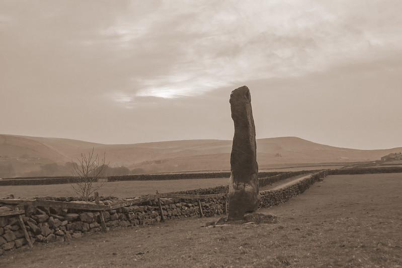
Mono monolith......just about on theme I reckon ;)

Difficult one to crit on for composition....like the wall leading in from the corner , monolith on the 3rd's I think ,smidge of interest in the sky...so thats all good (y)
Looks a little flat n grey though ( probably the weather ) would it be possible to pull a little more out of the darkest area of the stone....dodging or burning ( neer sure which one it should be ) ?

I feel so special .........:D

Thanks Lynne, beyond ACR and cloning I'm lost..........I have no idea what dodging or burning is :confused:........well not in photography anyways ;)

Hi Phil,
Bang on theme, well composed, if you could just have left the wind farm out :( it would be even better (y)

Thanks Judi, I quite like the wind turbines .........but after your much appreciated help on how to get a sepia affect ( I was looking for just a button to press to convert it :rolleyes:) I've done another version and cloned everything out that looked modern, even some of the buildings. I'm hoping I might have achieved a bit of an 'old look' :thinking:. I'm going to post it up after this post.

The monolith seems to stop the wall and then it continues leading into the frame, it's a little strange.

It looks a bit on the dark and gloomy side with a bit of interest in the sky and the dark lines on the monolith itself. Overall I think it works well :clap:

Thanks Mark, the weather was a bit gloomy, I set out full of hope for a nice sunset........but it wasn't to happen :banghead:

Hi Phil, odd one this for me. It should work, you've done everything right compositionally with the lead in of the wall from the bottom left and the positioning on a third. Technically, the exposure and dof are correct and it's an interesting subject.., and a good conversion to b&w

But I'm finding it lacking something, I'm thinking a more dramatic sky is what it needs. Big fluffy clouds maybe?

Thanks Graham, I do agree that it does lack interest, which is a shame because the stone is quite impressive. A lovely sunset behind would probably work well. If I get chance, I'll get back up when the weathers right, if only for the fact I do think there's an image to be had there.
 
Thanks To Judi (@Judi ) I've had another look at a slightly wider crop of the monolith and converted it to sepia. Its the first time I've tried this affect.

I've cloned out everything that looks modern including some of the buildings. I was hoping it might achieve an 'old feel' to the image :thinking:

Again, honest crit appreciated, advice for improvement on the technique welcome :)


Monolith in sepia
by Phil D 245, on Flickr
 
Last edited:
Hi, Action #1 for me. I like the perspective and you've got some good drama.

Mono works well but I'd like it tighter to get rid of the LH bush.

Cheers.
 
Action - brilliant shot! As others have said, a real 007 moment :clap:

Mono - I like the way you've taken out the wind turbines in the second one (I always like mono shots of old stuff that looks like it's been there since mono was the only option!) but I prefer the b&w to the sepia colouring, it just looks more dramatic and brooding, especially with the clouds.
 
Hi, liking the last pic for mono without the modern things but not liking the sepia, its a pity where the monolith is placed next to the wall perhaps a different angle
though of course that might not be possible
 
Mono - prefer the b and w version. Should be such a dramatic photo but like a few others have said it is difficult to get the impact of how impressive the monoliths are.
 
I really like the sepia one Phil, even the sky looks better and no wind farms either great(y)

Thanks Judi, I certainly prefer it mi self with the modern stuff cloned out.....just undecided on my attempt at the sepia though :)

Hi, Action #1 for me. I like the perspective and you've got some good drama.

Mono works well but I'd like it tighter to get rid of the LH bush.

Cheers.

Cheers Andy

Action - brilliant shot! As others have said, a real 007 moment :clap:

Mono - I like the way you've taken out the wind turbines in the second one (I always like mono shots of old stuff that looks like it's been there since mono was the only option!) but I prefer the b&w to the sepia colouring, it just looks more dramatic and brooding, especially with the clouds.

Thanks Elaine :)

Hi, liking the last pic for mono without the modern things but not liking the sepia, its a pity where the monolith is placed next to the wall perhaps a different angle
though of course that might not be possible

Cheers Allan, yes, a different angle would be possible, I was in the field and could have shot all the way round it. It just lacked even more interest in every other direction :rolleyes: :D

Mono - Your final image is much better than the first two IMHO

I quite like the sepia

Cheers Craig

Mono - prefer the b and w version. Should be such a dramatic photo but like a few others have said it is difficult to get the impact of how impressive the monoliths are.

Cheers Richard, I'm hoping that if I can get back up with a good sunset it might give it a bit more impact
 
Well its a bit boring
th_shrug.gif
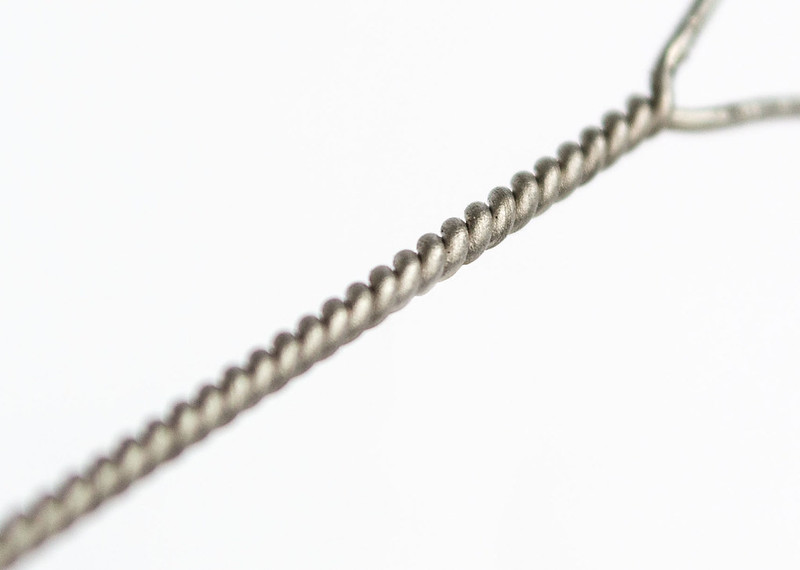
, but here's my take on twisted. Its lock wire, possibly only 1mm in diameter so a fairly heavy crop. Struggled trying to get a little more dof tbh :thinking:.

I'm guessing I could have gone with a longer focal length, being further from the subject and then cropping it...........but I could be wrong :D

It was balanced on a cocktail stick (its been cloned out) to give it a little distance from the bg as I didn't want any shadow.

Advice welcome

Twisted - Honest crit encouraged as always :)


TP52 twisted
by Phil D 245, on Flickr
 
Works well enough, agree a bit more DOF would work better, tiny bit hard at first look to spot the focus point, but it's there, and in the'right' place.

Ref the aperture... I thought you had this sussed, close it down for more dof, this says it was at f/7.1, go closer to f/16.

Right choice to keep it in color too, and I like the splayed ends.
 
Hi, a bit more DoF would have been better I too had a little trouble with the focus point, as graham said f16 would have worked better
bit more of a crop too off the left and bottom perhaps:thinking:
good idea for the theme though
 
Works well enough, agree a bit more DOF would work better, tiny bit hard at first look to spot the focus point, but it's there, and in the'right' place.

Ref the aperture... I thought you had this sussed, close it down for more dof, this says it was at f/7.1, go closer to f/16.

Right choice to keep it in color too, and I like the splayed ends.

Thanks Graham, I should have explained what I was trying to say a little better :rolleyes:...........I was as close to the wire as I could be to focus as its only a very thin diameter.I do know that a higher aperture setting (smaller hole) gives more dof but, being so close, made very little difference when I altered it. Now I have to admit, I did only go as small as f11, but I seemed to start to loose some sharpness in the image. When up close to things I've noticed this before at higher f numbers, whether its just a trait of the D3100 I wouldn't know.

What I was actually trying to say/ask is...........if I'd have used a longer focal length, pulled back from the subject (the wire) would f7.1 have given me more dof.....:thinking:.....then cropped the image in. I might be over complicating things here, its just that I've read different focal lengths give different dof with the same f number.......... or am I wrong? :confused:
 
Last edited:
Hi Phil
I had a bit of trouble finding the focus point but its there ok, fits the theme well(y)

Thanks Judi :)

Hi, a bit more DoF would have been better I too had a little trouble with the focus point, as graham said f16 would have worked better
bit more of a crop too off the left and bottom perhaps:thinking:
good idea for the theme though

Thanks Allan, I've tried to put a bit of an explanation above about the aperture setting
 
Hi Phil....I will leave the technical bit to 'those who know' o_O

I like the idea of this one, lots of twisty bits for the theme, the background is nice and white which I always find hard to do, but I agree the focus is a bit tight and I do think it would look better if more of it was sharper.

Looking back....your action was excellent ......the monolith I think I prefer in black and white, but well done with the cloning, I really like the sky, maybe you could lie on the floor and take a pic looking up from ground level to give more impression of the height ;)
 
What I was actually trying to say/ask is...........if I'd have used a longer focal length, pulled back from the subject (the wire) would f7.1 have given me more dof.....:thinking:.....then cropped the image in. I might be over complicating things here, its just that I've read different focal lengths give different dof with the same f number.......... or am I wrong? :confused:

On your last point I would add "for the same framing, ie. object being the same size in the frame".. And then I can say you are wrong. ;).

Same aperture, same framing = same depth of field irrespective of focal length.
http://www.luminous-landscape.com/tutorials/dof2.shtml

Same lens, same aperture, but from further back will give greater dof. Then by cropping into this the dof will obv not change as I think you are suggesting.

I'd also say sharpness is more a function of lens than body. How are you comparing sharpness / dof? If it is by the view through the viewfinder, it will not change as you change A on the body, as the lens is normally wide open and only stops down when the shot is taken. :)
 
Action - cracking shot and very fitting for the theme.

Mono - love both your takes for the mono theme, great work.

Twisted - fits the theme, but I am not sure about the composition.
 
Last edited:
On your last point I would add "for the same framing, ie. object being the same size in the frame".. And then I can say you are wrong. ;).

Same aperture, same framing = same depth of field irrespective of focal length.
http://www.luminous-landscape.com/tutorials/dof2.shtml

Same lens, same aperture, but from further back will give greater dof. Then by cropping into this the dof will obv not change as I think you are suggesting.

I'd also say sharpness is more a function of lens than body. How are you comparing sharpness / dof? If it is by the view through the viewfinder, it will not change as you change A on the body, as the lens is normally wide open and only stops down when the shot is taken. :)

Graham, firstly, thank you for taking the time on this for me. I think the penny's dropped as to where I was going wrong. I took this shot with the 18-55mm lens, at 55mm, as close to the the wire as I could and still get focus, about 7 inches. If I've grasped what you said, being so close would show very little difference in dof when I altered the aperture. I take the photo then check it in live view ( this was what was confusing me). What I needed to do was pull back away from the subject (the wire) then, altering the aperture between say f5.6 and f 11, would have shown a greater difference in dof.

I think where I've gone wrong this time, is thinking I needed to be as close to the wire as possible. With most of my other shots that I've set up in a similar way to this one, I've used a 55-200 mm lens at a focal length around 120mm, meaning that I was obviously further away from the subject, explaining why I had a greater dof to play with.

I think that's why I was confusing mi self with the longer focal length giving more dof
shakehead.gif
:D

I've had a very quick look at the link but will certainly be having a good read at it later on this evening when I get back in(y)

Thanks again Graham
cheers.gif
 
Action - cracking shot and very fitting for the theme.

Mono - love both your takes for the mono theme, great work.

Twisted - fits the theme, but I am not sure about the composition.

Thanks Mandy :)
 
Thanks again Graham
cheers.gif

You're welcome Phil - and sorry to anyone else we've bored!

It is a tricky one to get your head round, You can get a DOF calculator for PC or smartphone. o_O which can be useful, focus distance is not measured to the end of the lens BTW, but to the sensor, minimum focus distance on kit lens is about 12", or about 7" from the end of the lens as you said.

At the end of the day, sometimes all you can get is all you can get, hence focus stacking is often useful in macro work.

And you are right to keep an eye on sharpness, as this does vary with aperture, linky (just look at the pictures. :))

Right - I'm boring myself now!! :geek:
 
Hi Phil....I will leave the technical bit to 'those who know' o_O

I like the idea of this one, lots of twisty bits for the theme, the background is nice and white which I always find hard to do, but I agree the focus is a bit tight and I do think it would look better if more of it was sharper.

Looking back....your action was excellent ......the monolith I think I prefer in black and white, but well done with the cloning, I really like the sky, maybe you could lie on the floor and take a pic looking up from ground level to give more impression of the height ;)


Sorry :oops: :$, with all this technical stuff clogging mi brain :D, I missed replying to your post earlier

Thanks Susie :)........I was rather pleased with how white I managed to get the bg in mi 'twisted' :D not perfect sooc but only needed a very slight tweak in ACR

Good idea for a different look at the monolith (y) I'm hoping to go back and get a good sunset shot sometime, I'll have a go at it then :)
 
Hi Phil


Twisted.....I like it....having just read all the words between you & graham my brain is a little frazzled but I think I may learnt something so cheers for that (y)

Leaving all the tech jargon aside I like the DOF as is , the placement in the frame & the simplicity of it :clap:
 
Hi Phil
Action - gliding - super shot, partic for one that had to be taken so quickly. Good colour and like the way that the other gliders are appearing over the hill.
Mono - prefer the b&w as it better composed - more tightly cropped- but like the removal of the pylons and windmills in the sepia one. Prob needed a better sky - but hey , no control over weather.
Twisted - all has been said on dof so i will just say that i like the idea and well handled.
 
Hi Phil :)

Really like the Pipes image, them rivets must be a hell of a size !!!, a very effective angle, good to see a bit of water at the top to add context too:)

Action - The paragliding image for me, a bit grainy as you say, but that certainly does not detract from either shot, with the clay shot I love the DoF and angle with the guy in the left hand side of the frame, but for me the paragliding shot is excellent, considering you took it in a rush, again the angle of the shot is great, the inclusion of the truck and the reflection in the window is great element, the shot looks very natural :)

Mono - A clever idea and liking the double mono :D I'm much preferring the monochrome to the sepia, the wall leads my eye nicely into the shot, the composition is spot on and the light patch of sky helps an otherwise miserable looking sky become a good part of the image - Like It (y)

Twisted - Like the diagonal composition coming fro the bottom corner and the split end, but as you say it really needs a deeper DoF, only slightly as full focus would not have the same effect, a nice bright clean background, and also some good detail in the in focus section :)
 
Hi Phil


Twisted.....I like it....having just read all the words between you & graham my brain is a little frazzled but I think I may learnt something so cheers for that (y)

Leaving all the tech jargon aside I like the DOF as is , the placement in the frame & the simplicity of it :clap:

Thanks Lynne :)
Hi Phil
Action - gliding - super shot, partic for one that had to be taken so quickly. Good colour and like the way that the other gliders are appearing over the hill.
Mono - prefer the b&w as it better composed - more tightly cropped- but like the removal of the pylons and windmills in the sepia one. Prob needed a better sky - but hey , no control over weather.
Twisted - all has been said on dof so i will just say that i like the idea and well handled.

Thanks Alan

Hi Phil :)

Really like the Pipes image, them rivets must be a hell of a size !!!, a very effective angle, good to see a bit of water at the top to add context too:)

Action - The paragliding image for me, a bit grainy as you say, but that certainly does not detract from either shot, with the clay shot I love the DoF and angle with the guy in the left hand side of the frame, but for me the paragliding shot is excellent, considering you took it in a rush, again the angle of the shot is great, the inclusion of the truck and the reflection in the window is great element, the shot looks very natural :)

Mono - A clever idea and liking the double mono :D I'm much preferring the monochrome to the sepia, the wall leads my eye nicely into the shot, the composition is spot on and the light patch of sky helps an otherwise miserable looking sky become a good part of the image - Like It (y)

Twisted - Like the diagonal composition coming fro the bottom corner and the split end, but as you say it really needs a deeper DoF, only slightly as full focus would not have the same effect, a nice bright clean background, and also some good detail in the in focus section :)

Thanks DK, the pipes are quite an impressive sight, its a shame but the image just seems to loose the sense of scale. As for the reflection on mi 'action' shot of the paraglider it was pure look, at the time, I hadn't noticed it :D
 
Fresh?.............Well these dung flies certainly thought it was
shakehead.gif


Taken for a bit of fun, about 8ft away @ 300mm so a tight crop.....and no, I wasn't getting in the field full of heifers and the bull with rather large testicles for a better pov :eek: :D

Hand held so had to up the ISO to 400, to get a shutter speed of 1/250th @ f5.6. Would have preferred a faster shutter with the sigma lens having no OS? ( think that's the right abbreviation?) but didn't want to go any higher with the ISO knowing I was going to be cropping in fairly tight.

Don't think any of the flies are in focus, they just wouldn't keep still and believe me, they can move :banghead:

Again, honest crit welcome :)

Freshly laid :D


TP52 Fresh!....mmmmmmmm
by Phil D 245, on Flickr
 
Last edited:
Very nice. I actually thought about doing this one too but my misses said it would be sh!t lol.
Tough one this week
 
Hi Phil, long time no comment from me, sorry.

Mono, my vote would go to the B&W as opposed to the sepia, more so because the sepia is a little washed out (for my taste).
Strong composition on the monolith, I like the wind turbines in the background, a bit of a juxtaposition between old and new.

Twisted, all been said about the dof, its a subjective choice really. Personally, I feel it works as is, it gives it a little something for the viewer looking along it to find the focus point.
Again, I like the composition, strong diagonal through the frame works well. A simple yet effective take on the theme.

Fresh, on theme I agree but what a gross subject :eek:
As a natural history type image it works, the flys are all part of natures cycle, you've framed the dung well with the grass.............did i just write that? What a critique :ROFLMAO:
 
Hi, excellent, great idea for the theme they certainly move fast have witnessed them myself they are the weirdest looking flies (y)
 
Hey Phil - what can I say but, blimey... looks like sh1t to me lol

Super fun take on the theme... Not sure on the composition feel it could go up a tad as the best flies are too central. I like the bright processing, a good fresh idea (y)

Thanks DK........I nearly wrote no jokes about it being a 'cr*p' photo :LOL:

That is pretty cool (well, probably warm actually). But good idea for theme and despite the heavy crop it looks good.

Cheers Simon :D

Very nice. I actually thought about doing this one too but my misses said it would be sh!t lol.
Tough one this week

Nah.......it was very soft and squidgy ......:coat:..........Cheers Richard :D

Hi Phil, long time no comment from me, sorry.

Mono, my vote would go to the B&W as opposed to the sepia, more so because the sepia is a little washed out (for my taste).
Strong composition on the monolith, I like the wind turbines in the background, a bit of a juxtaposition between old and new.

Twisted, all been said about the dof, its a subjective choice really. Personally, I feel it works as is, it gives it a little something for the viewer looking along it to find the focus point.
Again, I like the composition, strong diagonal through the frame works well. A simple yet effective take on the theme.

Fresh, on theme I agree but what a gross subject :eek:
As a natural history type image it works, the flys are all part of natures cycle, you've framed the dung well with the grass.............did i just write that? What a critique :ROFLMAO:

Iain, thanks for the catch up :) ............

........did i just write that? What a critique :ROFLMAO:

got to be the best quote ever :ROFLMAO:........and yes you did! :D

That's disgusting!! The things we do for art

Tell that to the flies!..........cheers Alan

Hi, excellent, great idea for the theme they certainly move fast have witnessed them myself they are the weirdest looking flies (y)

Cheers Allan, I've got to say, I'm impressed with the folks that shoot them in macro .........unless they look for the dead ones :thinking: :D

Ewwww! Nasty! No crit from me. But maybe a tip...don't bother doing a reshoot eh? ;)

A re-shoot?........certainly not with the same pile anyway Chris ;) ........cheers :)
 
Back
Top